Improve the UX Easily: MotoPress Slider for WordPress Version 2.0.0
Have you been waiting for fresh updates of the MotoPress Slider plugin for WordPress? Meet them in a new version of 2.0.0! Now your admin toolkit is more intuitive and more powerful, especially in terms of adjusting the slider to various screen sizes of popular devices. As the recent SEO statistics claim, 60% of American adults use smartphones and tablets to search for local products and services, namely, your business or personal project loses almost half of its potential if mobile and tablet users are not served properly. As on the vast majority of websites, the slider comes first on the front page, the matter of mobile optimization became the main field to act on during recent MotoPress Slider plugin improvements.
So, let’s get down to the updates!
Your slider is more flexible
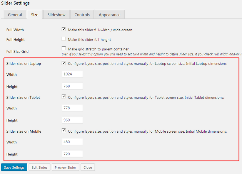
The layers of the slider are now more easily customized for various devices. You are free to manually configure slider width and height for different screen resolutions such as desktop, laptop, tablet, and mobile. To check out the settings, go to your WordPress Dashboard > MotoPress Slider > Size tab in settings. In this area you can tick the needed devices to enable their further editing and set the desired width and height by changing initial dimensions:
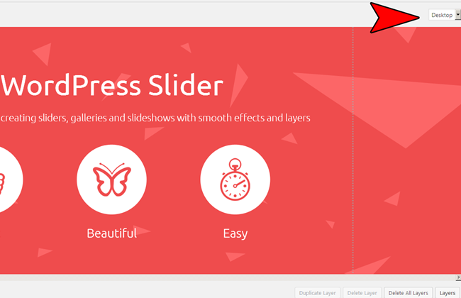
Now you are able to continue adjusting each particular layer of the slider right in the admin area – for this, you need to go editing your slide. Therefrom the right side you’ll see the drop-down menu with all available devices (ticked in Settings). When you need to perform any changes to content elements (layers) of your slide on a particular device, just select the needed screen size from the drop-down menu and edit the slide styles, size, and position.
In this way, you are able to create the most optimal viewing and navigation experience for the users of the particular devices. For example, the landscape desktop view can be replaced with a more suitable portrait view for mobiles. Moreover, you can completely re-arrange slider layers, change their size, and perform any other tricks to make the slider look maximum attractive. You don’t have to duplicate the slider and its content anymore. For example, take this landscape slide viewing which is perfect on a desktop:
And make a couple of changes for the mobile version transforming the layout into a portrait:
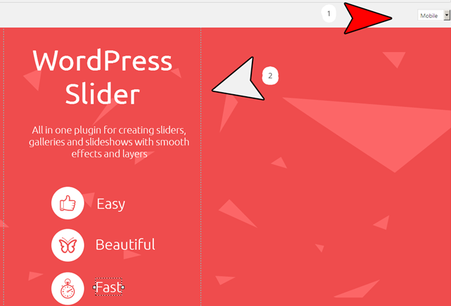
Such modifications help you create the most optimal slider viewing on mobile, laptop and tablet devices. In general, you can customize:
- Layer size
- Layer position
- Font size
- Line-height
- Text-align
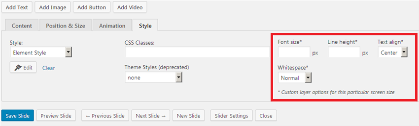
More intuitive interface
All style settings of the layers are now placed under separate tabs for quicker access and easier editing:
More new features
Apart from major updates, you also get the following options:
– You can optionally hide a layer if a current screen width (of the user’s device) is less than set in layer options.
– You are free to disable automatic resizing and positioning of the layer for different screen sizes under the Size tab in Slider settings.
– You get more animation easing effects for the slider.
Conclusions
These updates of the MotoPress Slider plugin for WordPress are beneficial for both sides: website admins save tons of time for customization (backend) and the website visitors definitely get a better user experience (frontend).
Feedbacks or ideas? You know that those are our main fuel for improvements, so don’t hesitate to speak your mind in the comments!