Getwid Updates: Better Content Alignment Options & Improved UI
Table of Contents
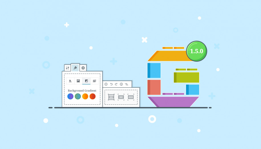
In this post, we’re going to overview the development progress of Getwid Gutenberg Blocks, version 1.5.0. We are trying to embrace the anatomy of the new WordPress editor further and are happy to introduce Gutenberg content alignment and sizing in Getwid enhancements you’ll definitely love:
- The fresh user interface for some blocks will help you easily navigate through the settings and work more productively
- You can now change common units of the block with draggable margins and paddings to tailor spacing and sizing to your needs right in the editor
- Set the max-width content container for a full or wide-width website easier with the Section block
- Add gradient backgrounds by choosing a suitable color scheme from a pre-designed palette.
Let’s get down to the details and examples!
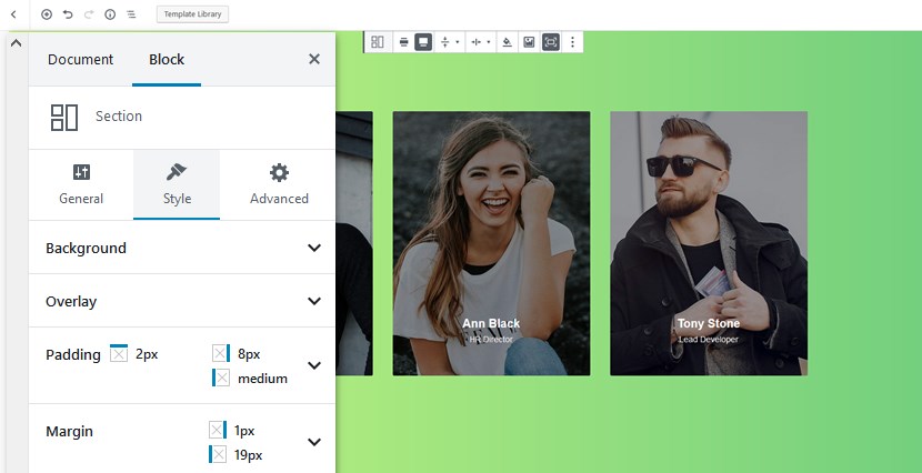
The new UI to help you be more productive
The new version of Getwid ships with the upgraded user interface of the block settings panel – it’s handier and takes just a few minutes to get used to.
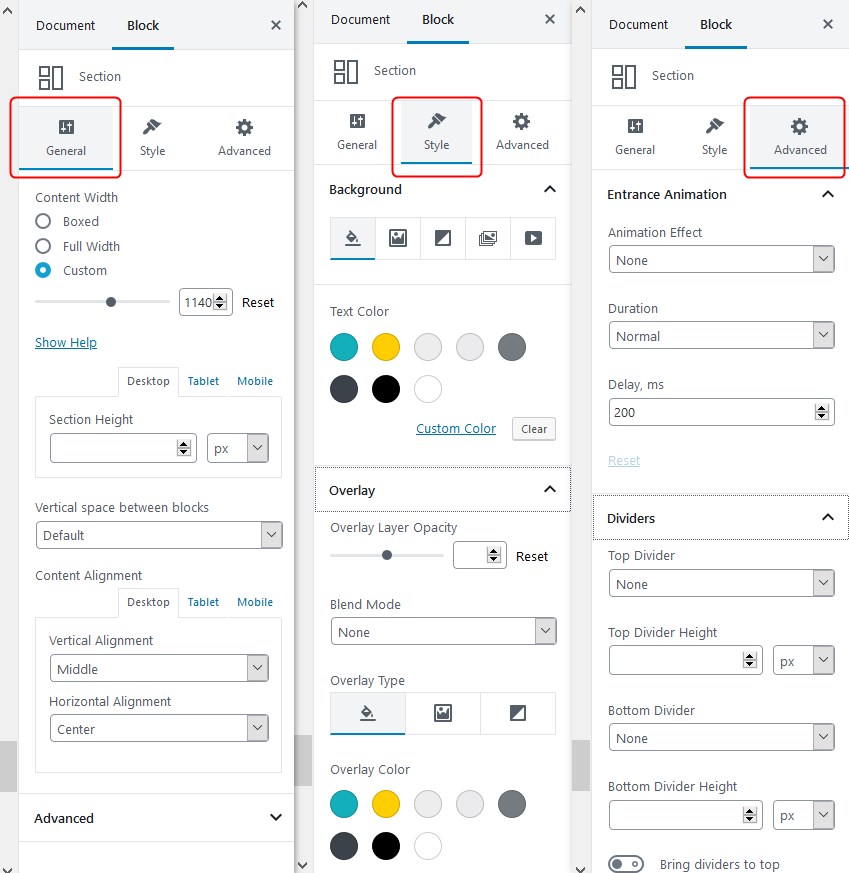
We categorized the settings panel of the complex blocks, such as Section or Advanced Heading, based on their purpose. Now there are semantic tabs for general settings+content, style, and advanced customization you can switch between to make the needed changes.
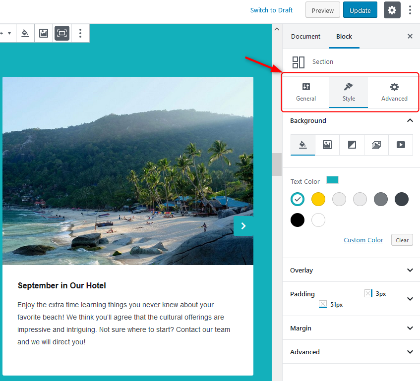
No more scrolling and searches for the needed option!
Start with the Section block easier by selecting preset alignments
When you add the Section block, it’s now easier to go with the right width and height of the block/container right away. You just need to select the needed one from the prompts depending on what you are going to create:
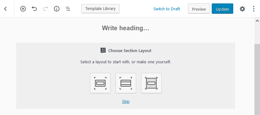
There are a few common content alignment options:
- Wide-screen (a full-width section but content is fixed). This alignment is best suited for banners, images, tables, columns, categories, etc.
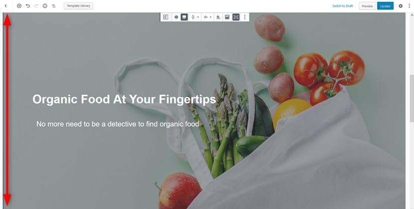
2. Full-width (the section and content span the full width of the screen). You can use it for any purpose, including immersive hero sections, full-screen videos, images, image galleries, etc.
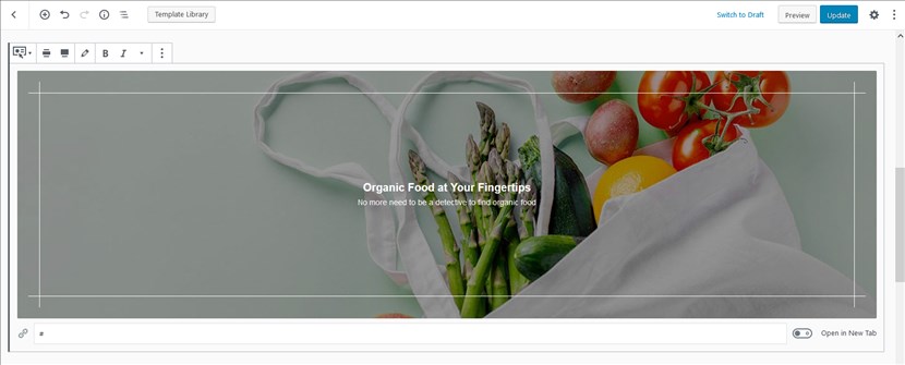
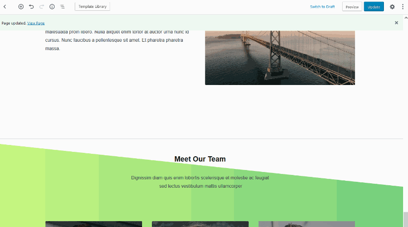
3. Full-screen (the section spans the full screen). You can feature any promo content, galleries, portfolios, post categories, etc.
Although you might easily achieve the needed container alignment in multiple ways – by editing the spacing manually or adjusting the height and width of the block via the block panel, it’s much easier to start with the needed content element with pre-set layouts and let your content sit properly within the chosen bounds.
Moreover, it’ll help you keep a consistent design when splitting content into sections, without manual tinkering.
Please note, in order to use new alignment options, your WordPress theme must support them.
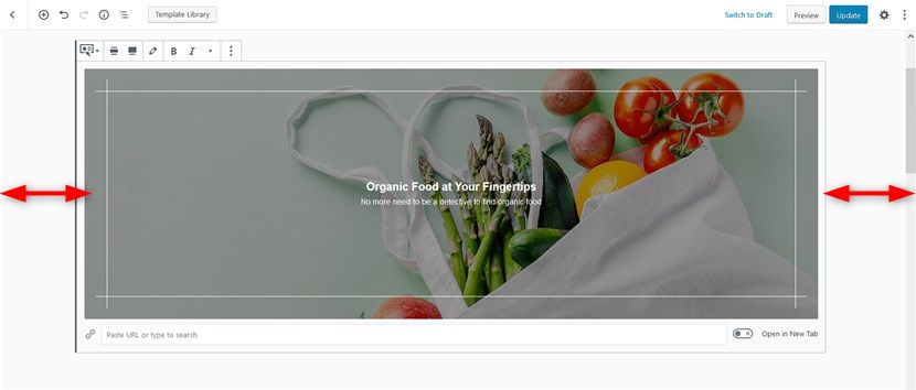
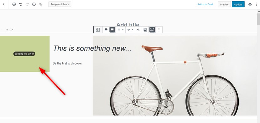
Draggable Section spacing (edit margins and paddings visually)
Adjusting the width and height of the Section block hit a completely new level in Getwid.
Draggable sizing and spacing anchors make it super easy to customize inner and outer alignments (left, right, top and bottom margins and paddings) of the Section block.
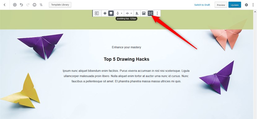
You can adjust blocks right in the Gutenberg editor in real time. Just hover your mouse over either edge of the Section block, click on the anchor and drag it in the needed direction.
For example, edit paddings to align inner Section content:
Or edit margins to customize the space between sections:
In the previous Getwid version, you would normally set margins and paddings via the block settings panel by typing them manually. The settings are still there – you can update them by typing margins and paddings but the biggest limitation of this approach is that you don’t have an instant preview of how the alignment is actually changing. That said, you can modify alignments in any preferable way.
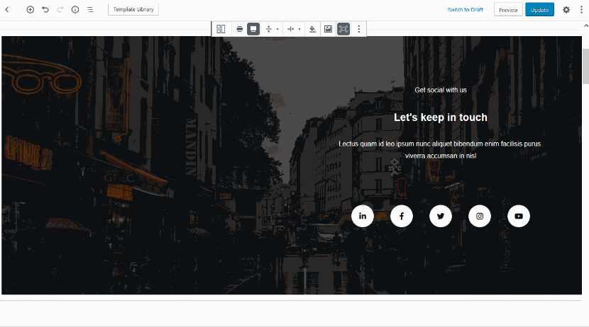
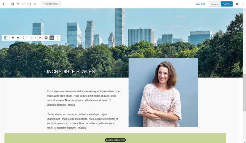
This new way to adjust the spacing doesn’t just simplify the process, it also gives you more flexibility in creating catchy offset layouts with the overlapping effect. For example, add text over the image:
Or add an image overlapping another image (for example, add an image over the background image of the Section block).
If you need more flexibility, you can dd sections inside sections and apply the needed alignment. When playing with spacing, don’t forget to keep consistency and use the same spacing for similar blocks.
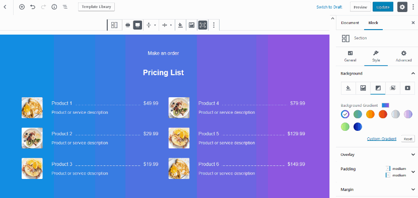
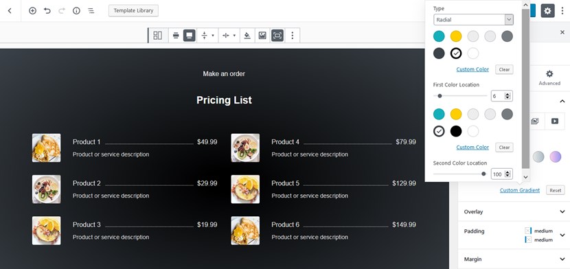
Pre-made gradient palettes for background
Love gradients but can’t get them right in Gutenberg? Getwid will help you do that with less stress by providing a few complementary color palettes for the background of the Section block. You can find them in the Style tab > Background > Gradient.
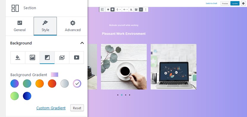
With just a few clicks, you can find the more appropriate color scheme:
But if you want to go with a custom gradient, no problem, just click on the “Custom Gradient” and apply your own.
Check all bug fixes.
Bottom line: Build better with the new Gutenberg content alignment and sizing options in Getwid
Don’t be afraid to build with blocks. With Getwid, we are trying to get closer to what Gutenberg might be, in a perfect world.
You can now modify Gutenberg content alignment without a need to jump to coding, build any layout you can dream of, add a more professional look to your pages by using pre-designed templates and color schemes, and more.
And don’t forget, Getwid is completely free arming you with 40+ blocks and pre-made design templates. Just download Getwid Blocks and start playing.