Getwid Blocks: Button Gutenberg Block
Table of Contents
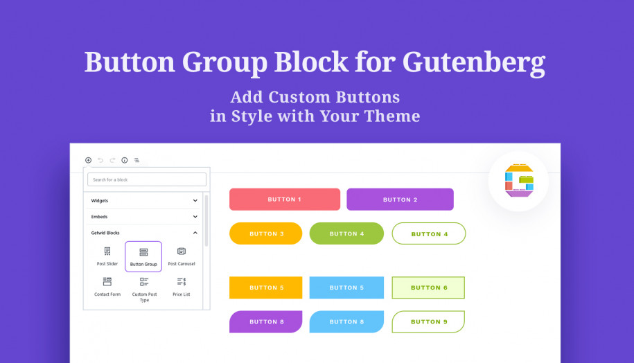
How to add a custom Gutenberg button or a button group to your WordPress site? The Button Gutenberg block by Getwid allows you to do both. With its help, you can add one button or a group of buttons along with any content in Gutenberg. Buttons come in several modern styles letting you create rich visual experiences.
Why Getwid?
For a 100% free WordPress plugin, Getwid makes a contribution of 40+ extra Gutenberg blocks to your current blocks collection. Each element is powered by advanced content & styling features – easy to master by beginners and interesting for pro developers.
But the main highlight of Getwid is the ability of each block to automatically adjust the styling to your active WordPress theme. This means it will output one button or even a button group in style with your overall design, and you don’t need to work around it too much. You might be interested in more examples of how it works in the default WordPress Twenty Nineteen theme.

Button Requiremenents
To make your button group efficient on your WordPress site, they have to correspond to certain requirements:
- Your text message should urge to one action;
- All buttons should be visible. Namely, they need to contrast the background and have a proper size to the neighboring content blocks.
- Choose efficient colors. Such colors as orange and green may work better than red colors associated with negative actions.
- The button placement should correspond to current UX & IU standards.
- The text message inside a button must be short (no longer than 5 words)
Purpose of the Button Group Gutenberg Block
The block will accelerate and simplify the process of adding buttons in Gutenberg. It implies:
- Call-to-action button groups in marketing areas
- Read more buttons
- Buttons accompanying services/projects.
Features of the Button Group Gutenberg Block
There are not a lot of settings for buttons, so you’ll be really quick in setting them up:
- Add any number of buttons (the block adds two by default) and set the spacing between them.
- Designate alignment, direction, and button width for different viewports.
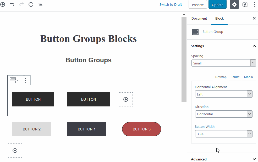
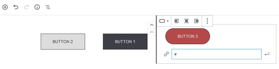
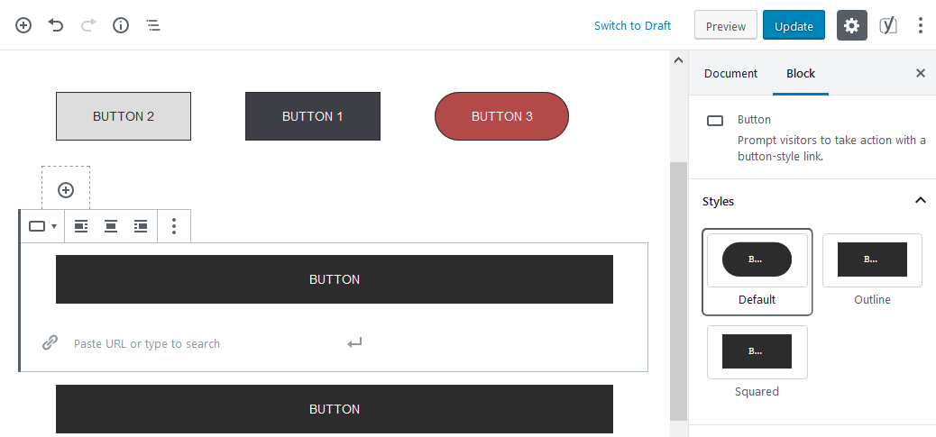
- Select a style for buttons (default, outlined, or squared). You can change the button style inline in Gutenberg as well.
- Set background and text colors.
- Edit button text and links inline.
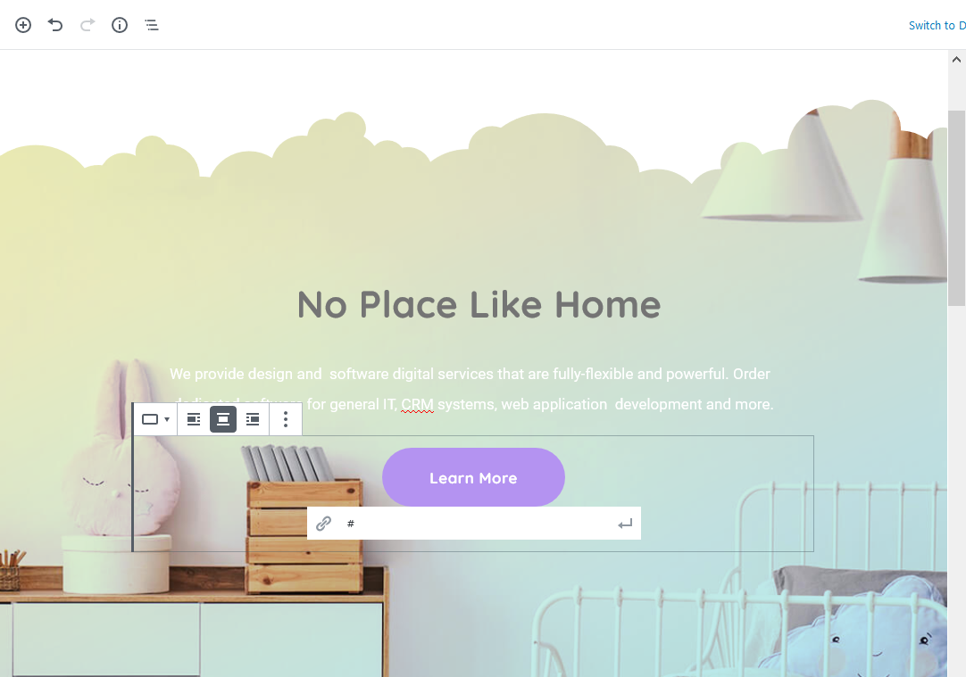
Here are a few examples where buttons are places inside Sections for different purposes:
- Pricing tables:

- Read more buttons:

- Into sections:
Design Tips
- If you design advanced content elements and want to add buttons, use the Section block by Getwid.
- To keep design consistency, try to stick to the following common design practice for button usage: use only one button style and not more than two button colors.
Download Gutenberg Blocks + Fee Starter Theme
If you want to get a professional design built with Getwid blocks and Gutenberg, you’ll enjoy the Getwid Base theme with tons of preinstalled content blocks for projects of different types and scales.
It’s a free theme with a stylish and lightweight flat design, thought-out typography, and, of course, good-looking buttons!
Check out Getwid Demo
Download Getwid Gutenberg Blocks Free
Install Getwid Base Starter Theme for Gutenberg