Twenty Twenty-One Theme Examples with Getwid Blocks
Table of Contents
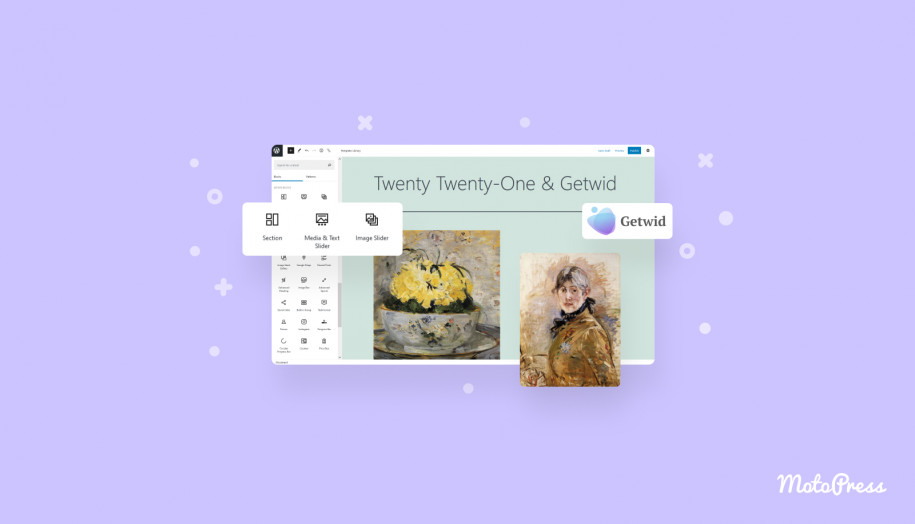
The Twenty Twenty-One theme embraces the fundamentals of the block editor’s anatomy. In simple terms, just like any official WP theme predecessor, this theme is made to work smoothly in Gutenberg.
If you take a look at its demo, you’ll see that it’s a perfect canvas for a portfolio or personal website.
Alongside the development of the block editor came the rise of the block editor addons. These addons offer many more blocks that are not offered by the native WordPress builder.
And in this post, we’re about to discover how the 2021 theme plays with one of them, Getwid, our WordPress blocks library that holds an approval rating of 94% based on 64 reviews and is so far used by 30,000+ people on their WordPress sites. Woohoo!
Getwid will help you add and design many more different functional and creative blocks still inheriting the native styling of the newest default WordPress theme. You are free to resort to it when you lack some particular content pieces or ready-made designs.
![The Twenty Twenty-One theme embraces the fundamentals of the block editor’s anatomy. In simple terms, just like any official WP theme predecessor, this theme is made to work smoothly in Gutenberg. If you take a look at its demo, you’ll see that it’s a perfect canvas for a portfolio or personal website. Alongside the development of the block editor came the rise of the block editor addons. These addons offer many more blocks that are not offered by the native WordPress builder. And in this post, we’re about to discover how the 2021 theme plays with one of them, Getwid, our WordPress blocks library that holds an approval rating of 94% based on 64 reviews and is so far used by 30,000+ people on their WordPress sites. Getwid will help you add and design many more different functional and creative blocks still inheriting the native styling of the newest default WordPress theme. You are free to resort to it when you lack some particular content pieces or ready-made designs. [getwid blocks gutenberg] The key highlights of the Twenty Twenty-One theme Layouts the “wide” block width: 1240px [full width twenty twenty one theme] the “full” block width spans across the entire width of the screen [full width twenty twenty one block] Patterns In order to minimize the misuse of the blocks, the Twenty Twenty-One WordPress theme offers many pre-made patterns you can add to a page in a few clicks: [patterns twenty twenty one] Each pattern comes with its styling toolchain to help you customize it further: [patterns default wp theme] Colors You can choose a different base background color scheme via the WP Customizer > Colors. The theme will automatically choose complementary colors for the typography based on which background color you’ve chosen: [colors] This will save you so much time! The Twenty Twenty-One default theme also supports the dark mode. If it’s enabled, the site visitors will be able to view your site in a dark mode: [dark mode twenty twenty one] Footer widgets The theme supports footer widgets you can fill in with your content, for example, add links to posts, contacts info, images, social media icons and more. An alternative place for your social media links is a Secondary menu above the footer. [secondary menu] Let’s now see what you can create with Getwid and Twenty Twenty-One. More ready-made Getwid templates Getwid also ships with many more design patterns categorized by purpose, for example, you can add hero and subhero sections, call-to-action parts, contacts pages, testimonials and other designs commonly used across different types of websites. [getwid template library] Let’s see how one of them looks with the default Twenty Twenty-One styling: [getwid template contact us] Since you can change the styling of each individual block in this pattern, you can, for example, change a button position, style and color; change background color, and customize the image styling: [getwid styling] The vast majority of these patterns are made with the Section block - a powerful block that can house any number of blocks and comes with a ton of styling features, including the facility to use different backgrounds - gradients, videos, image, sliders and more. It allows you to use any section width: [section getwid] For example, let’s take another pattern and use an image in background: [background color section getwid] Or place a slider in background: [background slider getwid] Another pleasant thing is that you can make changes as for the block positions and alignments in a visual mode just by dragging and dropping the angles: [getwid angles] The section block is so diverse that it can help you add different shape dividers and apply animation effects. For example, let’s add a bottom shape divider: [dividers getwid] Or let’s make it more symmetrical: [dividers getwid2] With a combo of the Section block and the power of the Twenty Twenty-One theme, we expect your workload to be really enjoyable: you can combine different ready-made Twenty Twenty-One theme patterns with the Section block, automatically choose complementary colors via the WP Customizer and add any styling options you want. WordPress has never been easier! Image galleries, pop-up videos and sliders You can add breathtaking visuals, apply animation effects, create videos with Getwid and more. For example, create an awesome presentation with a video - you can also upload your cover image, choose a button style and more: [pop up wordpress block getwid] An Image Hotspot is among the unique Getwid blocks - it allows you to place animated markers over the image so that the site visitors can check out the details of each image part: [hotspot] With the unique content timeline block, you can build a timeline of events in a chronological order. [content timeline] It’s fully customizable as to the colors, styling and the blocks you can use inside the timeline containers. It looks good in the default WordPress Twenty Twenty-One theme: [timeline events wordpress block] Although the 2021 theme itself focuses on galleries and visual, Getwid still has something to offer: [image stack gallery] It’s an Image Stack Gallery which allows you to create a gallery and put images in unusual forms. There are several types of sliders. If you want to create a mere image slideshow, let’s place one inside the Section (and add some gradient background). [image slider block getwid] If you need to add text over the images, the Media and Text slider by Getwid will come in handy: [media and text slider] One more image-centered block is banner - you can several apply animation effects and decorations to it: [banner block] And it looks fine out of the box! You don’t need to sweat over each block for hours. Add functional blocks: the table of contents, tabs and more Getwid ships with numerous blocks to help you present information in a structured way, put information in all sorts of tabs or simply improve the presentation of your feature/offers/services sections. As we can see, most of the times these blocks play nicely with the default 2021 theme styling, so your task is to just add blocks, find the best position for them and probably change text colors if needed. For example, Getwid offers the toggle, accordion and tabs blocks for such types of content as FAQ pages. Here is one them, accordion, in action: [accordion block wordpress] You can optionally leave one tab opened by default, people will click on the rest of them: [accordion getwid] You can also create tables, the tables of contents, and other functional content elements. For example, the Table of contents block will come handy for long posts: [table of contents block] Getwid also comes with many blocks that would fit business websites. For example, there are a number of blocks for creating a countdown timer, testimonials, progress bars, pricing tables and more. For example, here is the pricing table: [pricing table] Getwid even deals with the narrowly dedicated niches, including such list templates you can use for restaurant or cafe websites: [pricing] Automatically sourced posts, pages and custom post types Getwid stands in the vanguard of working with the automatically sourced posts thanks to several dedicated blocks: the Custom Post Type, Posts Carousel, and Recent Post blocks. [custom post types] Going one step further, you can create a custom template for your posts, there are a few templates for this: [templates getwid] So your posts or custom post types will be shown in the format you created yourself: [custom post type getwid] As we know, these blocks are especially loved and used by Getwid users. Build better content in the Twenty Twenty-One theme with Getwid Thanks to the superpowers of Twenty Twenty-One (e.g. automatic color scheme) and the content-rich toolset of Getwid, you have almost no limitations when you need to build a portfolio, a business site or a blog in the block editor. The Getwid blocks most of the time seamlessly inherit the styling from 2021 providing you with awesome, good-looking content out of the box. Getwid WordPress Blocks is free to download, so grab it right away and start building better content in WordPress.](https://motopress.com/wp-content/uploads/2021/01/getwid-blocks-gutenberg.jpg)
The key highlights of the Twenty Twenty-One theme
Layouts
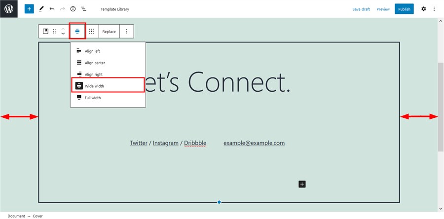
- the “wide” block width: 1240px
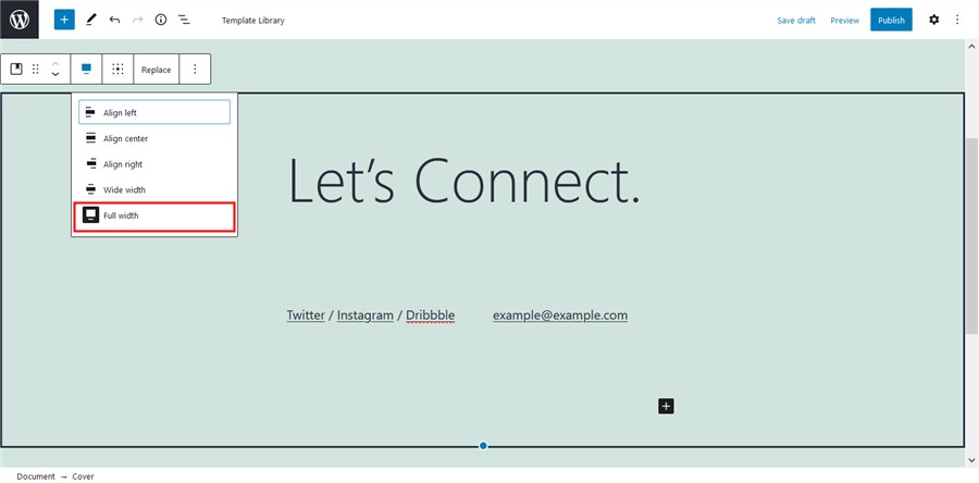
- the “full” block width spans across the entire width of the screen
Patterns
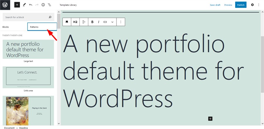
In order to minimize the misuse of the blocks, the Twenty Twenty-One WordPress theme offers many pre-made patterns you can add to a page in a few clicks:
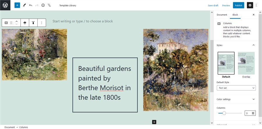
Each pattern comes with its styling toolchain to help you customize it further:
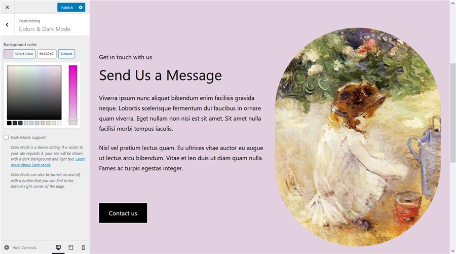
You can choose a different base background color scheme via the WP Customizer > Colors.
The theme will automatically choose complementary colors for the typography based on which background color you’ve chosen:
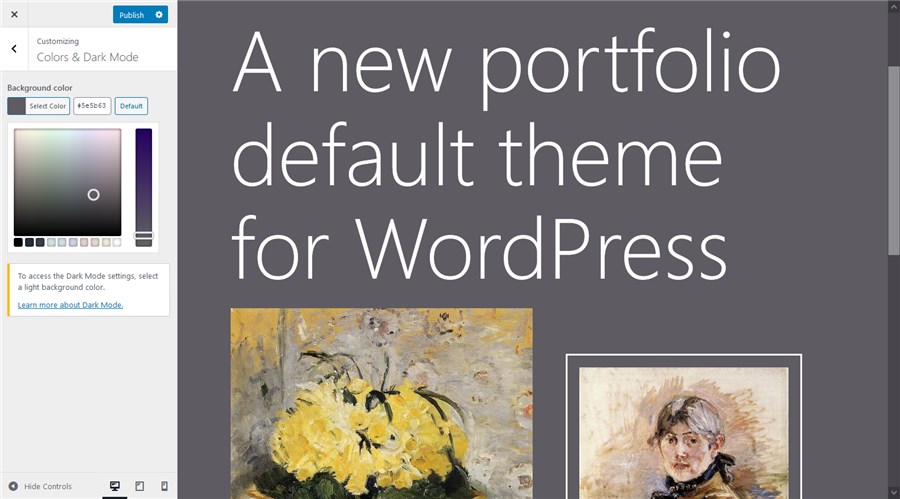
This will save you so much time!
The Twenty Twenty-One default theme also supports the dark mode. If it’s enabled, the site visitors will be able to view your site in a dark mode:
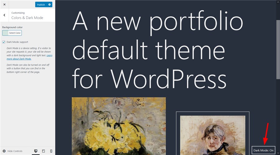
Footer widgets
The theme supports footer widgets you can fill in with your content, for example, add links to posts, contacts info, images, social media icons and more.
An alternative place for your social media links is a Secondary menu above the footer.
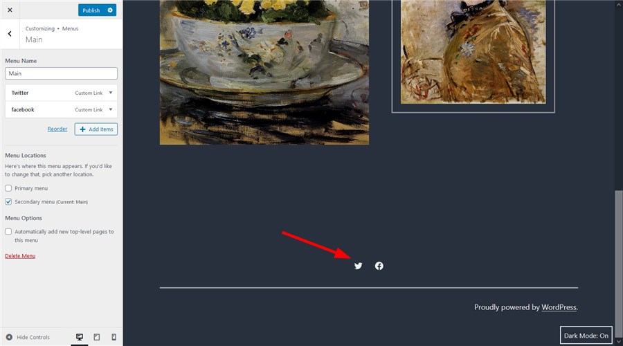
Twenty Twenty-One Theme Examples
Let’s now see what you can create with Getwid and Twenty Twenty-One.
More ready-made Getwid templates
Getwid also ships with many more design patterns categorized by purpose, for example, you can add hero and subhero sections, call-to-action parts, contacts pages, testimonials and other designs commonly used across different types of websites.
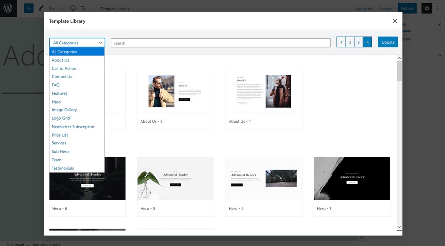
Let’s see how one of them looks with the default Twenty Twenty-One styling:
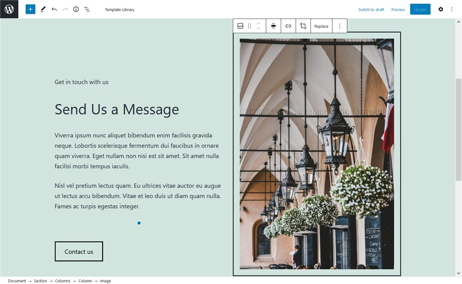
Since you can change the styling of each individual block in this pattern, you can, for example, change a button position, style and color; change background color, and customize the image styling:
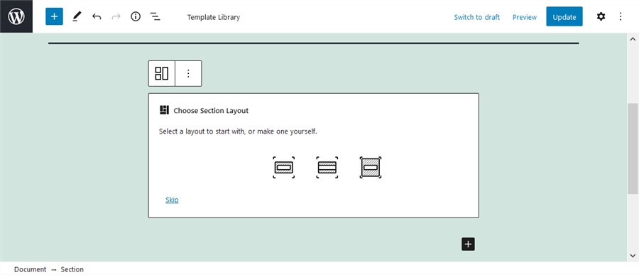
The vast majority of these patterns are made with the Section block – a powerful block that can house any number of blocks and comes with a ton of styling features, including the facility to use different backgrounds – gradients, videos, image, sliders and more.
It allows you to use any section width:
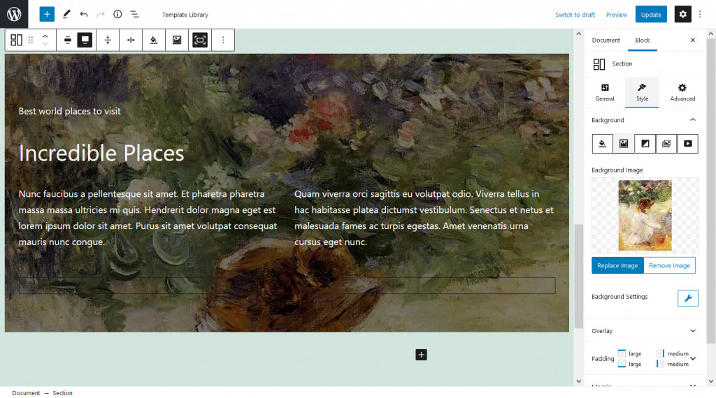
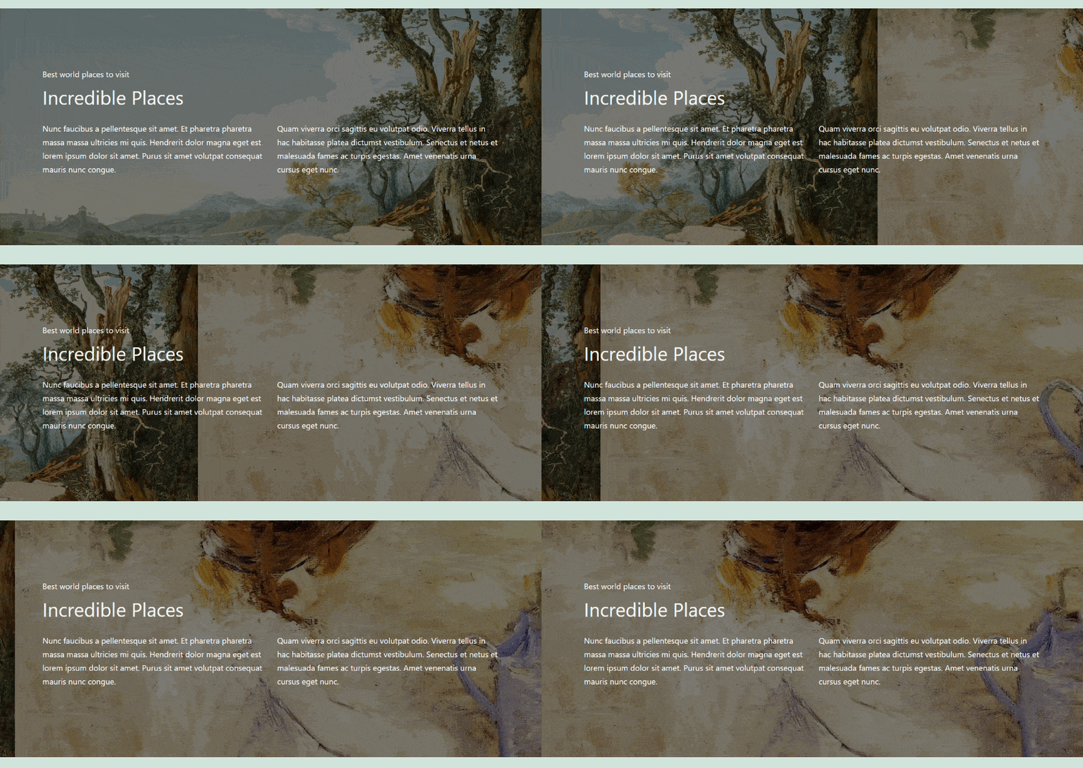
For example, let’s take another pattern and use an image in background:
Or place a slider in background:
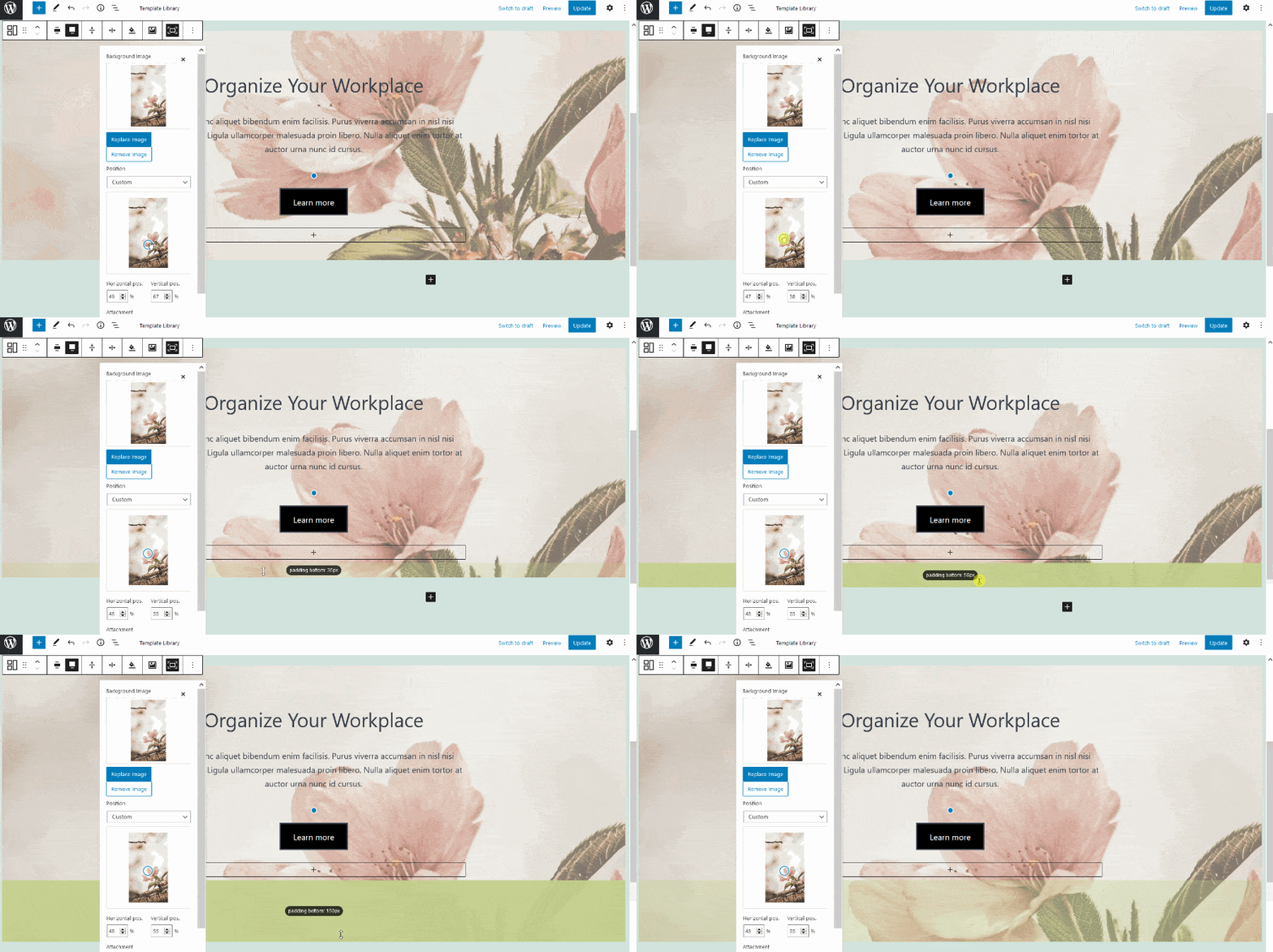
Another pleasant thing is that you can make changes as for the block positions and alignments in a visual mode just by dragging and dropping the angles:
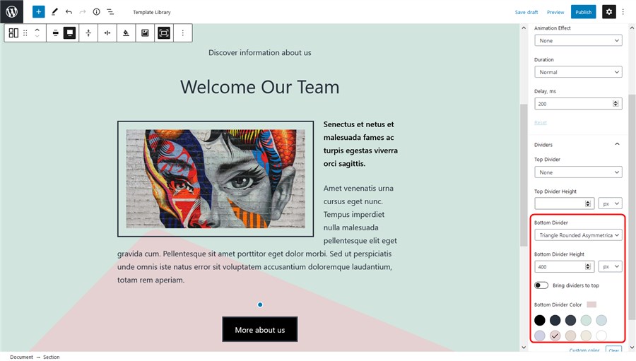
The section block is so diverse that it can help you add different shape dividers and apply animation effects. For example, let’s add a bottom shape divider:
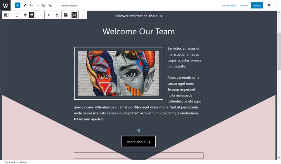
Or let’s make it more symmetrical:
With a combo of the Section block and the power of the Twenty Twenty-One theme, we expect your workload to be really enjoyable: you can combine different ready-made Twenty Twenty-One theme patterns with the Section block, automatically choose complementary colors via the WP Customizer and add any styling options you want. WordPress has never been easier!
Image galleries, pop-up videos and sliders
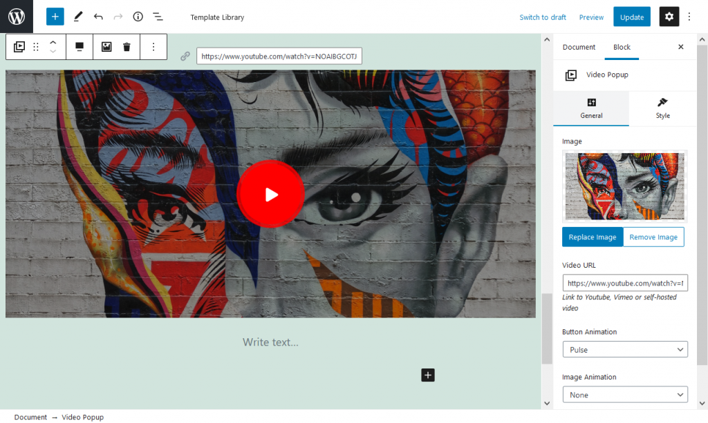
You can add breathtaking visuals, apply animation effects, create videos with Getwid and more.
For example, create an awesome presentation with a video – you can also upload your cover image, choose a button style and more:
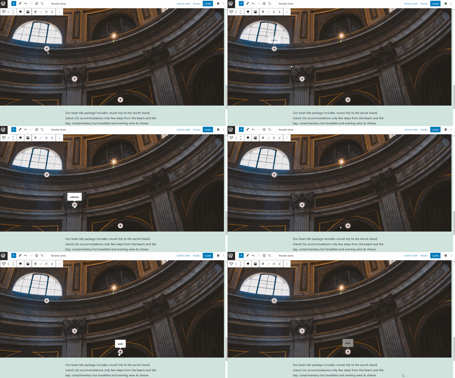
An Image Hotspot is among the unique Getwid blocks – it allows you to place animated markers over the image so that the site visitors can check out the details of each image part:
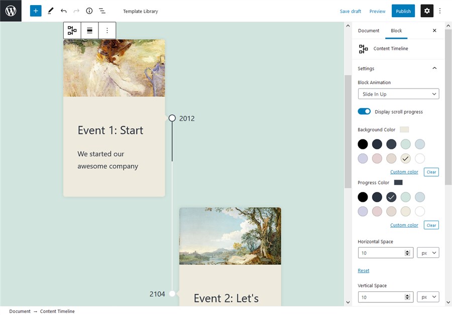
With the unique content timeline block, you can build a timeline of events in a chronological order.
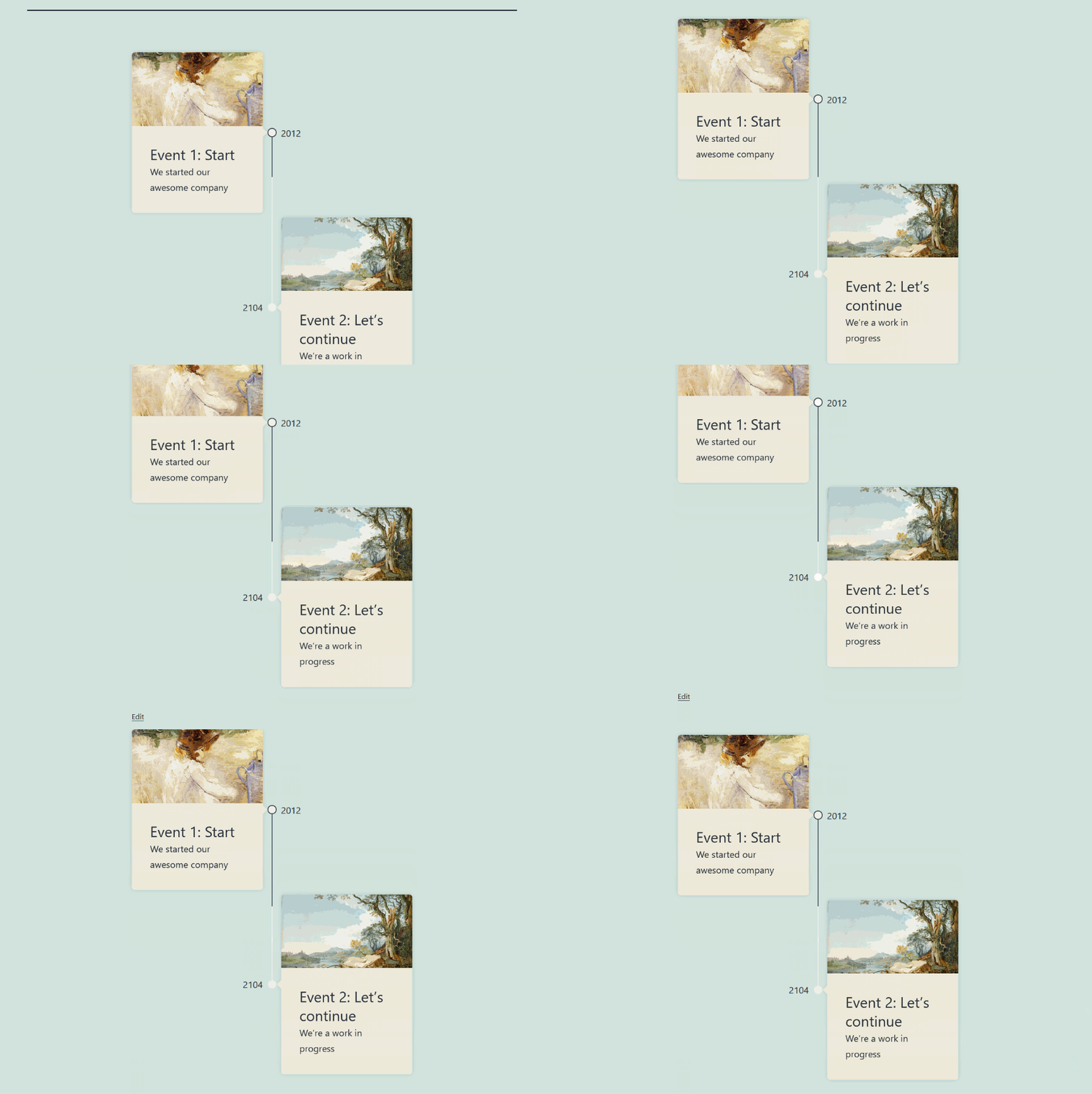
It’s fully customizable as to the colors, styling and the blocks you can use inside the timeline containers. It looks good in the default WordPress Twenty Twenty-One theme:
Although the 2021 theme itself focuses on galleries and visual, Getwid still has something to offer:
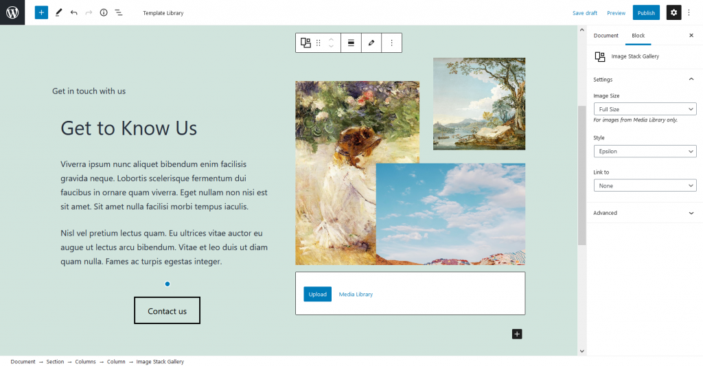
It’s an Image Stack Gallery which allows you to create a gallery and put images in unusual forms.
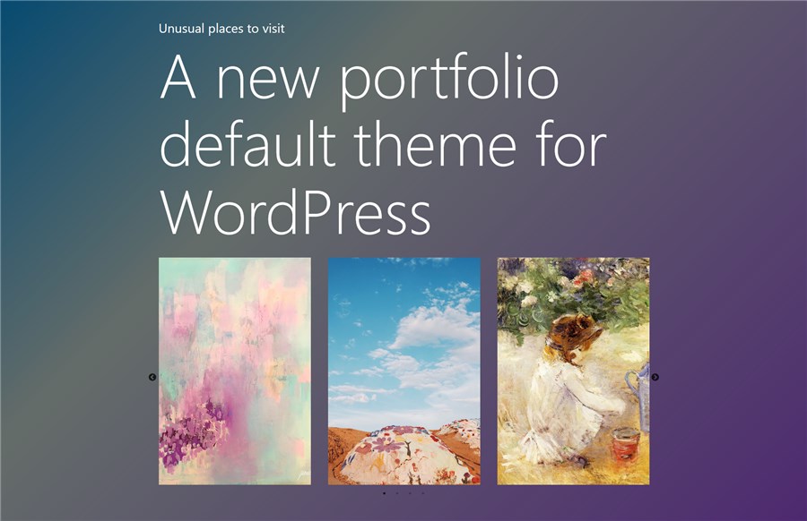
There are several types of sliders. If you want to create a mere image slideshow, let’s place one inside the Section (and add some gradient background).
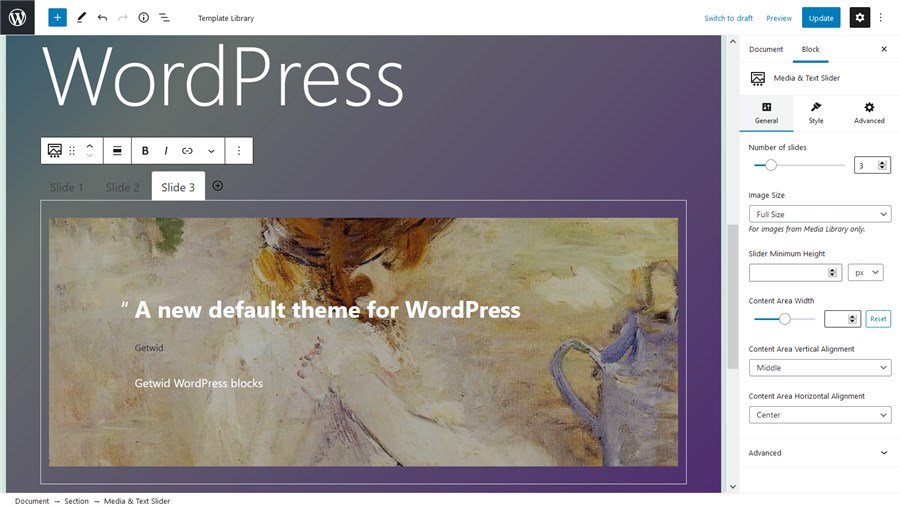
If you need to add text over the images, the Media and Text slider by Getwid will come in handy:
One more image-centered block is banner – you can several apply animation effects and decorations to it:
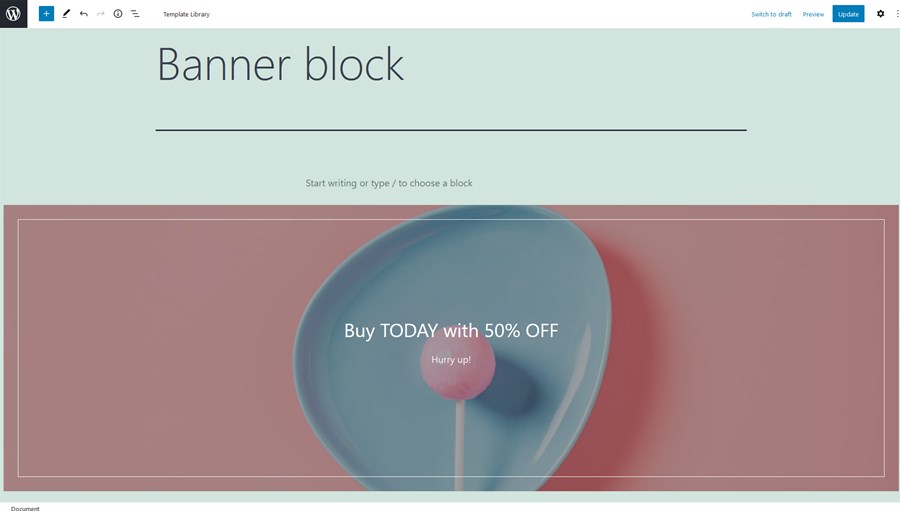
And it looks fine out of the box! You don’t need to sweat over each block for hours.
Add functional blocks: the table of contents, tabs and more
Getwid ships with numerous blocks to help you present information in a structured way, put information in all sorts of tabs or simply improve the presentation of your feature/offers/services sections.
As we can see, most of the times these blocks play nicely with the default 2021 theme styling, so your task is to just add blocks, find the best position for them and probably change text colors if needed.
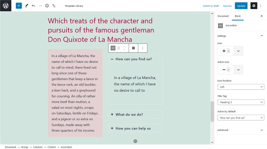
For example, Getwid offers the toggle, accordion and tabs blocks for such types of content as FAQ pages. Here is one them, accordion, in action:
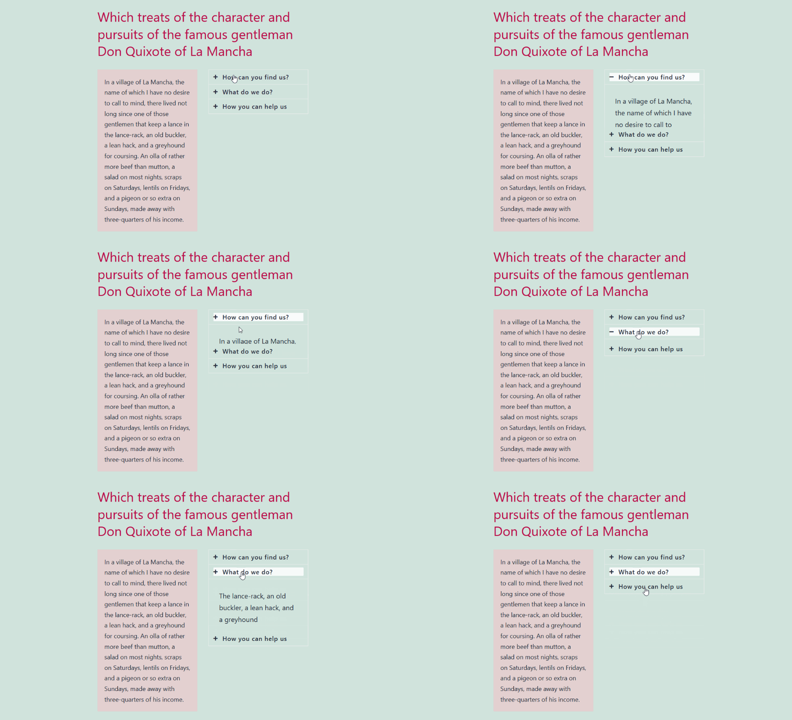
You can optionally leave one tab opened by default, people will click on the rest of them:
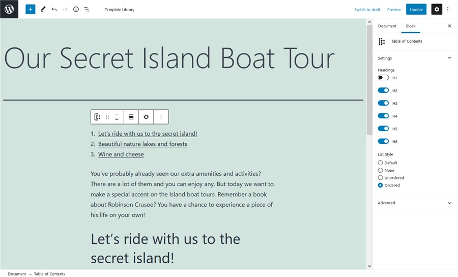
You can also create tables, the tables of contents, and other functional content elements. For example, the Table of contents block will come handy for long posts:
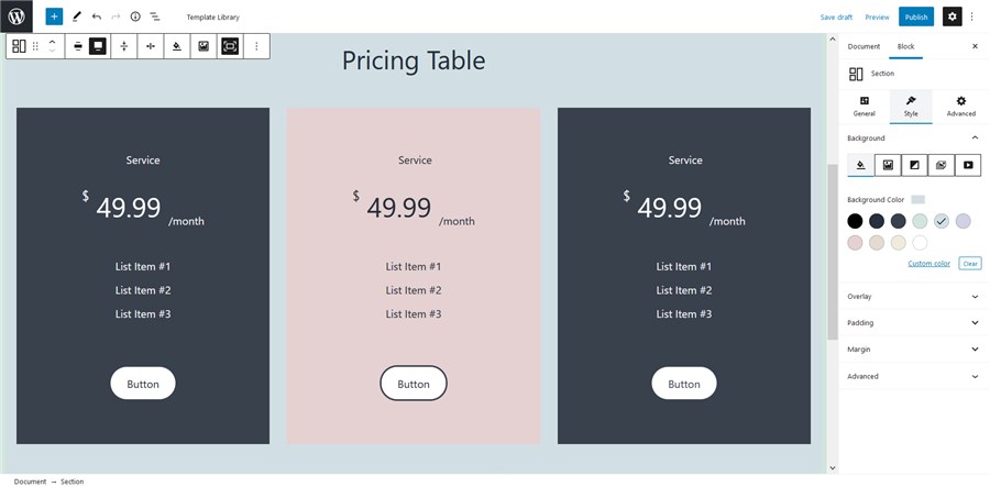
Getwid also comes with many blocks that would fit business websites. For example, there are a number of blocks for creating a countdown timer, testimonials, progress bars, pricing tables and more. For example, here is the pricing table:
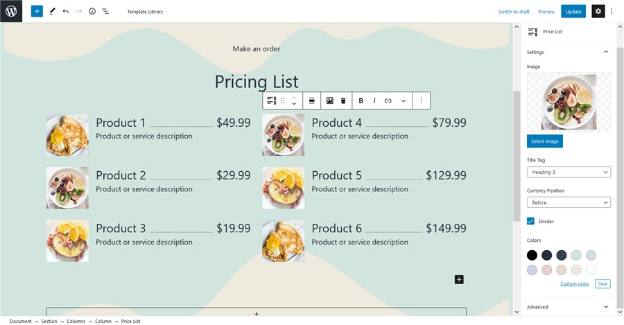
Getwid even deals with the narrowly dedicated niches, including such list templates you can use for restaurant or cafe websites:
Automatically sourced posts, pages and custom post types
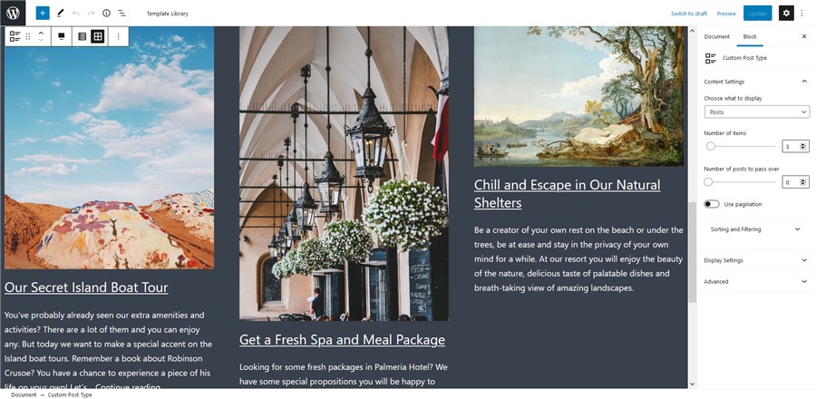
Getwid stands in the vanguard of working with the automatically sourced posts thanks to several dedicated blocks: the Custom Post Type, Posts Carousel, and Recent Post blocks.
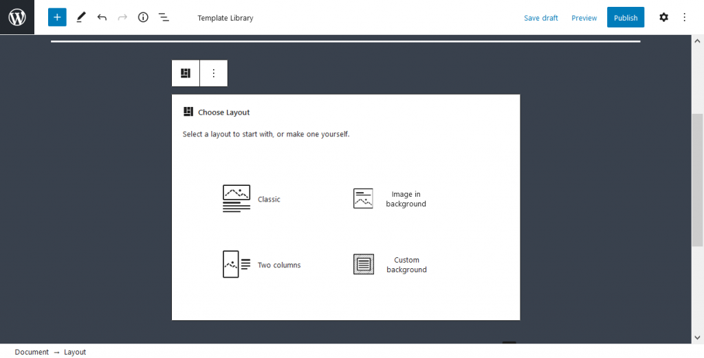
Going one step further, you can create a custom template for your posts, there are a few templates for this:
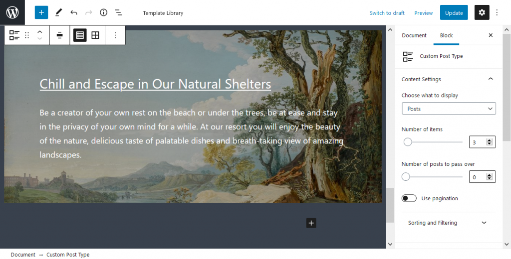
So your posts or custom post types will be shown in the format you created yourself:
As we know, these blocks are especially loved and used by Getwid users.
Build better content in the Twenty Twenty-One theme with Getwid
Thanks to the superpowers of Twenty Twenty-One (e.g. automatic color scheme) and the content-rich toolset of Getwid, you have almost no limitations when you need to build a portfolio, a business site or a blog in the block editor. The Getwid blocks most of the time seamlessly inherit the styling from 2021 providing you with awesome, good-looking content out of the box. Getwid WordPress Blocks is free to download, so grab it right away and start building better content in WordPress.
Where do I edit the layout width of the Twenty Twenty-one theme?
How do I edit the Twenty Twenty-one theme colors?
How well do Getwid blocks work with the Twenty Twenty-one theme?
Hi! Nice tutorial, this tutorial help me to know about getwid and how to use the blocks. it’s an amazing experiance with WordPress book editor and getwind.
Thanks for sharing
Hi Abdullah! Thanks, appreciated.