Meet New Getwid Blocks for Gutenberg: Contact Form, Post Slider and More!
Table of Contents
Since we’ve added five new Getwid Blocks for Gutenberg recently, we can safely say that the Getwid WordPress Blocks plugin by MotoPress offers one of the biggest collections of the free blocks out there!
In this overview, we are going to indulge you with even more useful and powerful blocks for Gutenberg that will allow you to:
- Create mobile-friendly post and custom post type sliders automatically sourced from your website data.
- Build tailored layouts for custom post types.
- Implement a simple WordPress contact form.
- Create a restaurant menu.
We are going to take a closer look at the capabilities of each new block.
So here goes.
Also read: How does the Twenty Nineteen theme work with Getwid?
Contact Form Gutenberg Block
This Getwid block brings a simple contact form functionality to the Gutenberg editor. Since it comes with the most essential form fields only, you can use it for simple website inquires (so far, it doesn’t offer complex functionality).
Available contact form elements:
- Name
- Message
- Text
- reCaptcha (Captcha by Google).
Name, email and message can be marked as required. We recommend setting the fields as required by default for better protection.
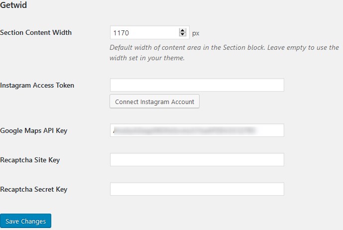
To embed a working reCaptcha (to protect your contact form from spam), you need to sign up for an API key pair, obtain your keys and then embed them via your WordPress dashboard > Settings > Writing > Getwid:
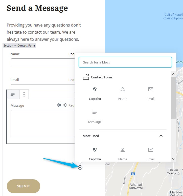
To add available form elements to the form, find and click the ‘+’ icon from the right.
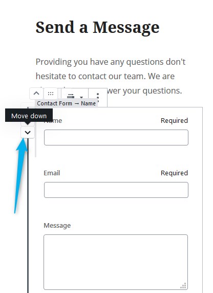
You can of course set the needed order for the form fields by moving them around inside the block.
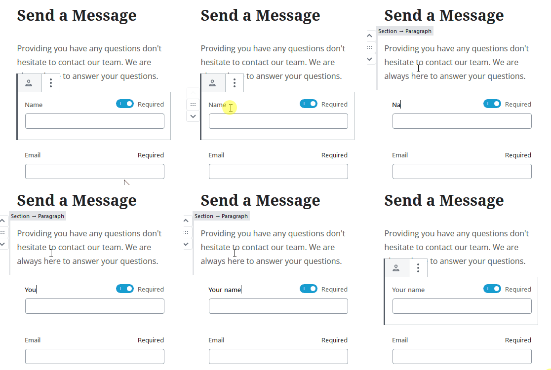
The field labels can be edited inline (right in the visual builder).
Contact form settings:
- Designate email subjects for incoming emails.
- Change button colors (the choice of default colors will depend on your theme).
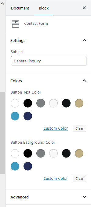
All the submitted emails will arrive at your website admin email address set via Settings > General.

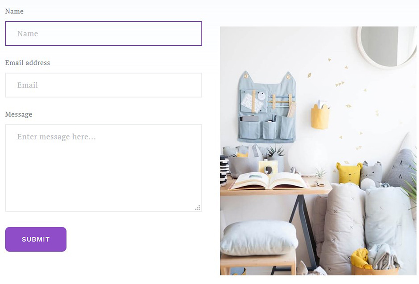
If you want to create a fancy background for the contact form or place it paired with other blocks, use the Section block by Getwid first and the Columns block by Gutenberg to insert different content elements. For example, the form with the image block:
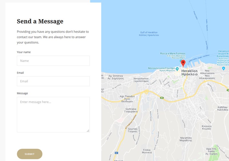
And the form with the Google Maps block:
Post-related Getwid Blocks for Gutenberg
We’ve also made huge progress in the area of improving the style and layout possibilities of the blocks related to posts and custom post types.
So if you already have a good bunch of blog posts or other specific custom post types (e.g. Services, testimonials, shop products) that you want to showcase on any page in style, these new blocks are ready to unleash your creativity and serve your goals!
There are three new dedicated post-related Getwid Blocks for Gutenberg that differ in small features:
- Post Carousel Block
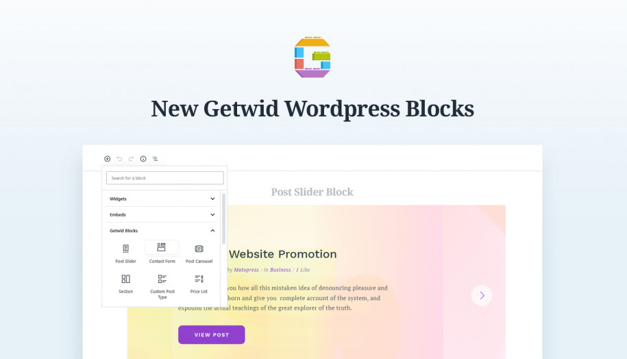
- Post Slider Block
- Custom Post Type Block
Let’s check each of them and highlight the main differences.
Post Carousel Block
The main purpose of this block is to help you feature posts or custom post types in a functional carousel slider (you may also call it a slideshow or a gallery).
Such a slider is a great thing to keep visitors or shoppers view the articles/products without leaving the current page. It also helps people compare things and quickly preview any information.
Block settings:
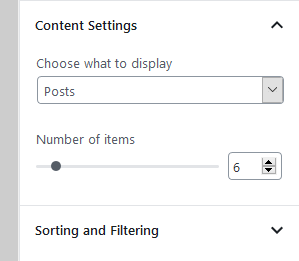
- Choose the type of content to display.
In addition to regular WordPress posts and pages, the custom post types you see in the ‘Content Settings’ drop-down menu are based on the activated plugins, namely, this is automatically fetched data from your website.
In my case, these are Accommodation types and Services. Your list will most likely be completely different.
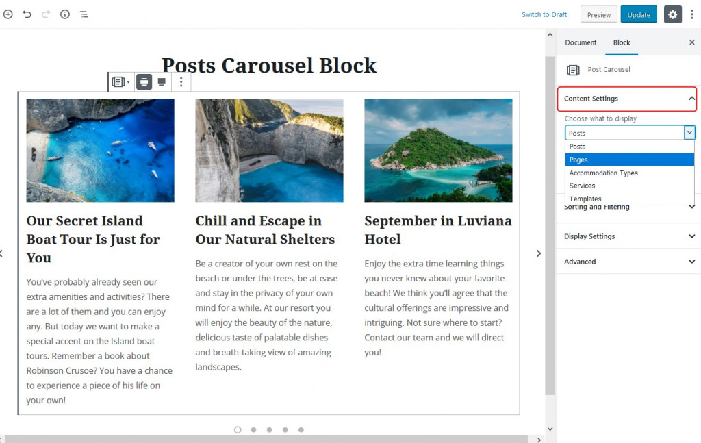
It’s dynamically serving the ‘featured images’ of the posts for the carousel.
You can’t edit the content of the carousel slider directly in the Gutenberg Editor; you need to go to the exact post and apply changes there.
- Designate the number of items to display.
This is the overall number of items that will be slid in the carousel. Obviously, you can’t set more items than you have in the dashboard.
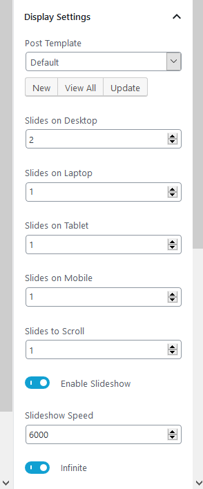
- Customize the look of your carousel slider through the Display settings menu.
Using a default template, you can set a different number of slides to display based on a device, enable slideshow, set the spacing between slides, etc.
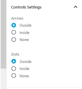
- Change navigation control settings.
Designate where the arrows and dots must be located in the slider or turn them off completely.
- Sorting and filtering options.
Thanks to this menu, you can decide which posts/images/products exactly must be displayed (basically, exclude unneeded ones). You can filter slides by IDs, taxonomies, or terms relations.
What does ‘terms relations’ mean, by the way? In plain words, if you choose to show products from several specific taxonomies (e.g. beige color, handmade tag), you need to also specify whether each product must correspond to both tags (‘Item should have all of selected terms’) or have at least one of them (‘Item should have at least one of selected terms.’).
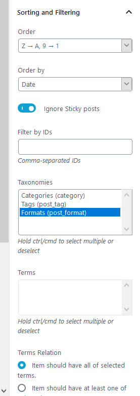
Thanks to this flexibility, you are free to create a category or tag sliders literally in minutes.
- Create your own templates.
A truly unique feature of this configuration (it applies to other new post-related blocks as well) is that you can create a custom look of the carousel using pre-made templates. You just need to click ‘New’ in the ‘Post Template’ settings to see available layouts.
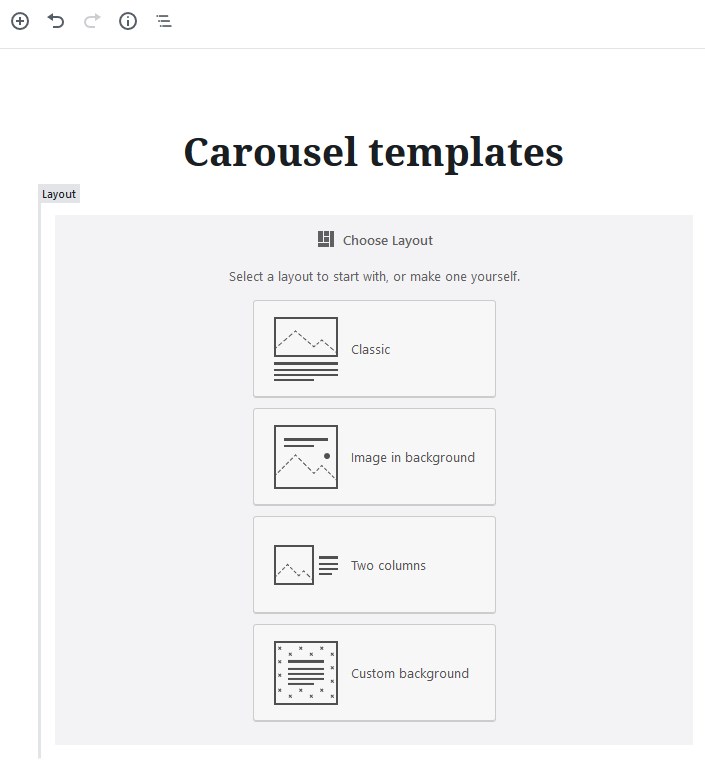
To illustrate it with an example, for my posts carousel slider I chose an ‘Image in background’ layout.
For each of the layouts, there are numerous spacing, alignment, and foreground settings.
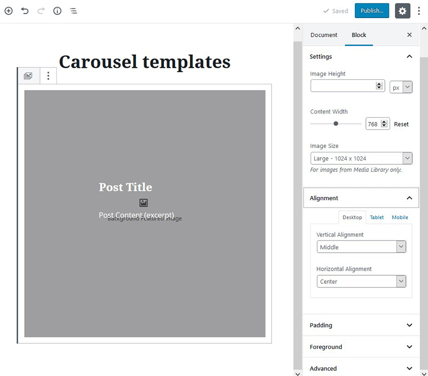
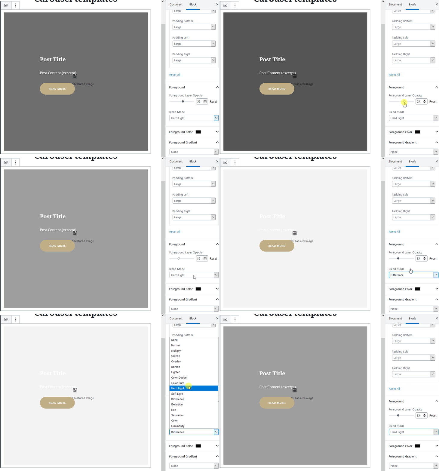
For example, you can change the opacity (to make images of your carousel slider more or less transparent), change padding for different devices, etc.
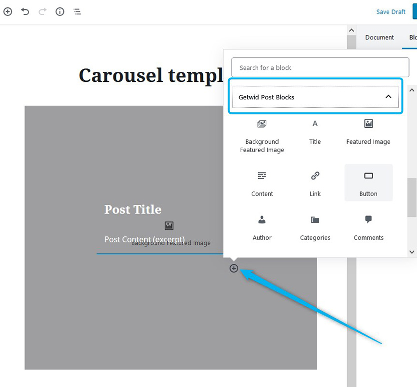
By default, there are post title and excerpt components in the template, but you can choose and add more. There is a dedicated ‘Getwid Post Blocks’ menu, where you can select among such Getwid Blocks for Gutenberg as buttons, categories, author, etc.
Once you’ve applied the needed changes, publish the template, then get back to the original post carousel page. Thanks to React functionality, the new templates data is fetched automatically, so you just need to click ‘Update’ to see your newly created template in the list.
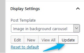
You might need to customize the look of your carousel after the new template is applied.
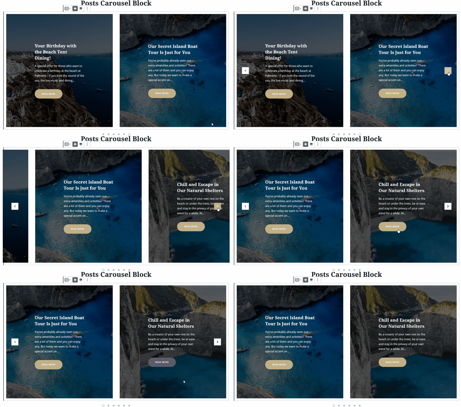
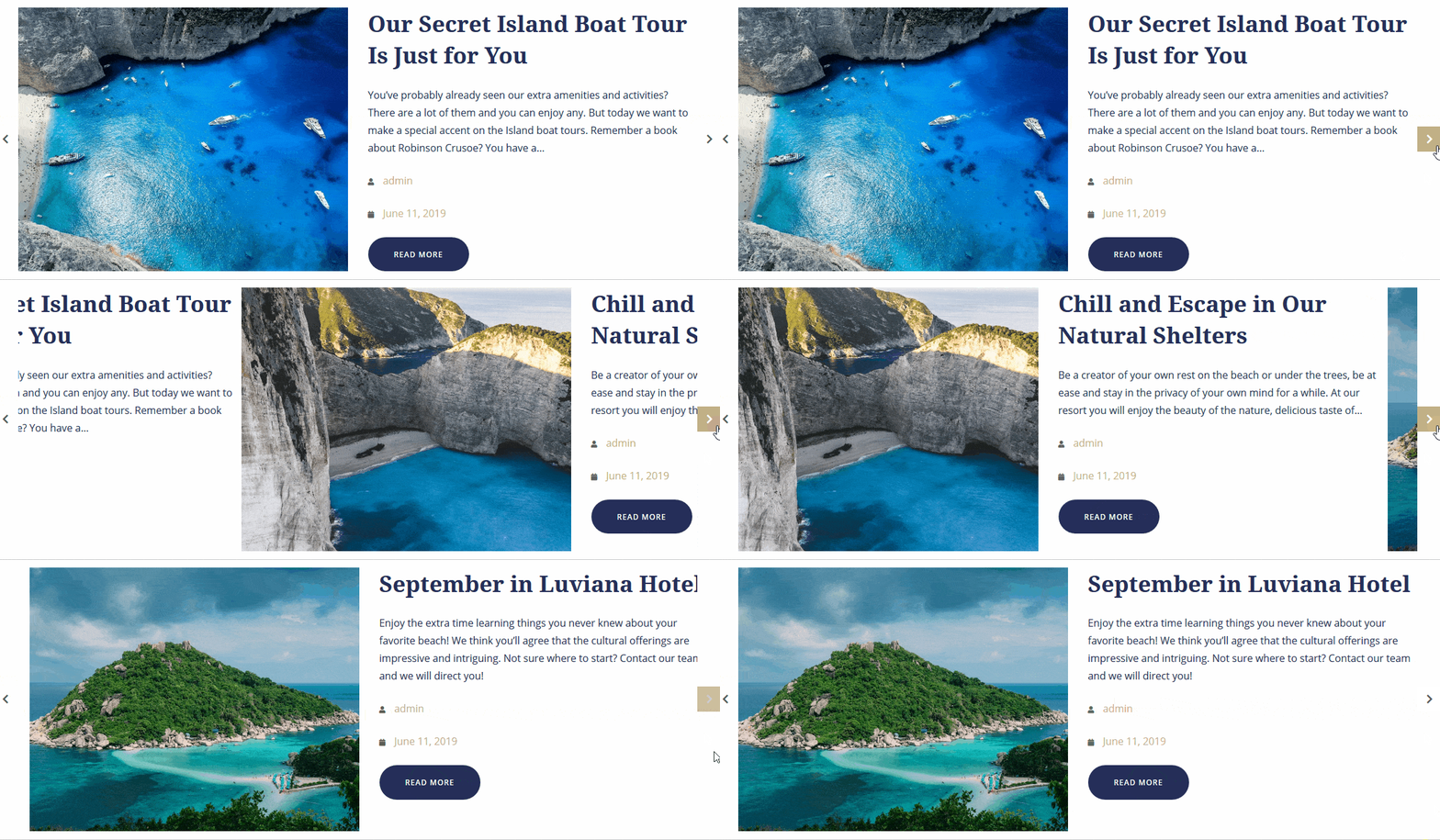
For example, to my ‘image in background’ template for the carousel, I’ve added a read more button, changed the default image transparency, minimized the number of slides to two in a row, enabled automatic slideshow, and placed the arrows inside the carousel.
So we get a completely different look:
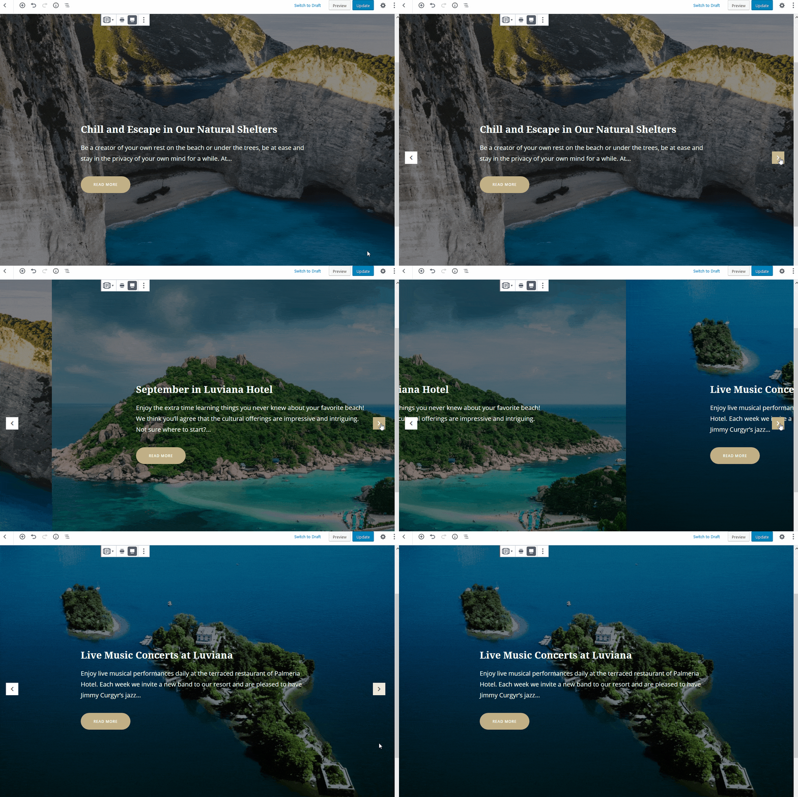
Change it to a one-image slider and set a full-screen layout and you’ll get a pretty traditional post slider look:
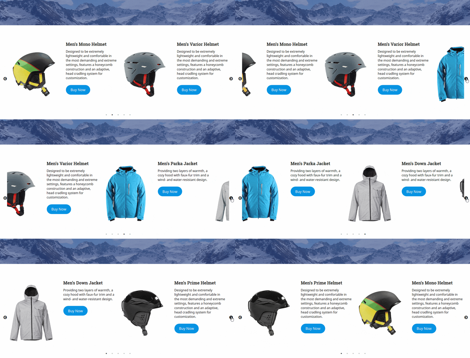
For a WooCommerce shop, I chose the Two Columns layout, so that the image and description are placed next to each other.
So let’s sum where you can use different types of carousels:
- Inside blog posts content (promote other posts more effectively).
- In your home page’s hero section.
- Promote products.
- And more!
Post Slider Block
At its core, the blockships with pretty similar settings as the previous block, but the main difference is that it can’t handle a standard carousel layout and comes with more unique settings. It can be also used with any page, post, or custom post type of your choosing. The custom layout builder is also available!
Here is a default layout (I’ve chosen ‘Accommodation types’ post types, which display the rooms added via the MotoPress Hotel Booking plugin in advance).
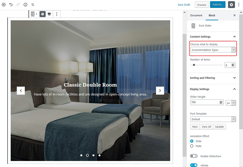
Since we’ve also revised all settings of the similar Carousel block in detail, let’s now focus only on the differences, namely on the extra default settings of this particular block:
- You can designate the height of your slider (compare: with the Post Carousel block, you need to create a new custom template to set custom height).
- Select the either slide or fade animation effects.
The rest of the settings are just the same. Don’t forget that you can also switch the slider width between full-width and wide-width.
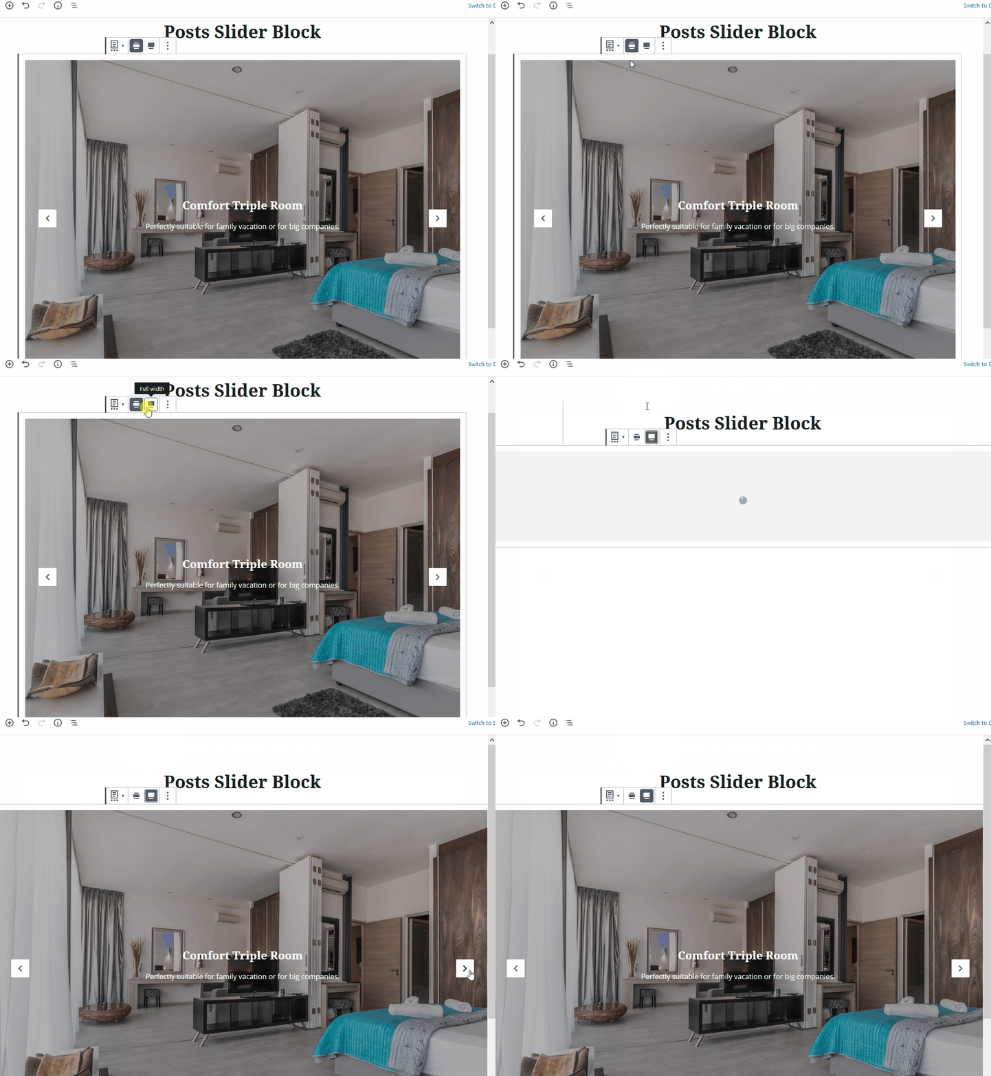
Using custom templates, you are free to build absolutely different layouts of your slider: add content elements, change font size and color, customize the length of excerpt, etc. For example:
Custom Post Type Block
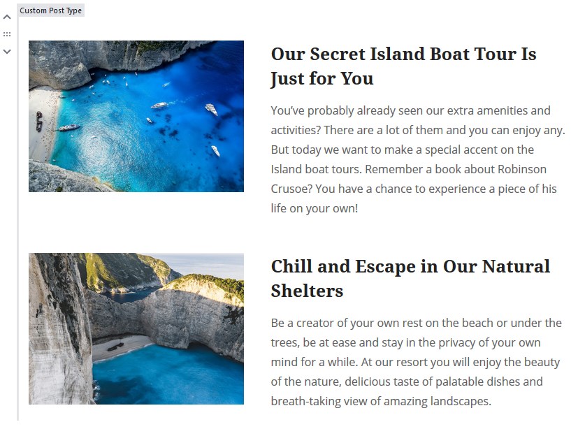
As its name suggests, the block is made to beautify the look of your custom post types as well as other default posts.
The main difference from the previous two blocks is the following:
- You can use a list or grid layouts for your content. For example, this is the list view:
… and the boxed grid view:
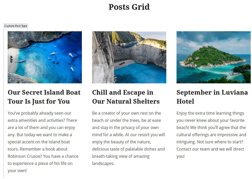
Let’s also take the ‘Accommodation types’ custom post type; the result is quite the same:
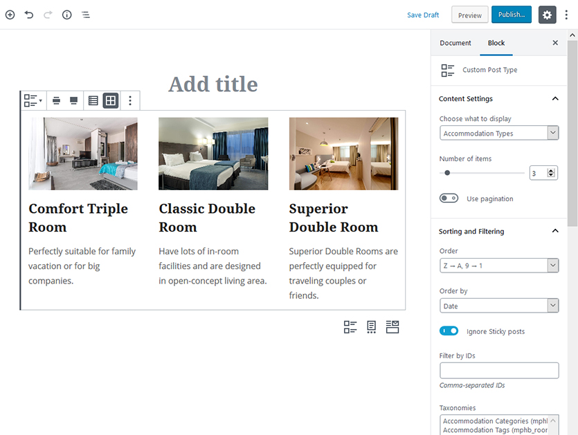
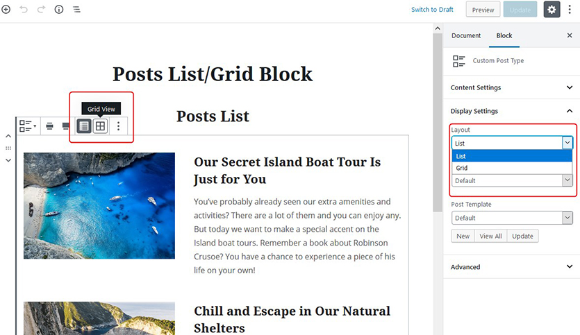
Please note that you can switch layouts either via the block panel or via the right Block configuration settings.
- It doesn’t work as a slider.
The block is, however, still flexible in terms of custom templates, so you can have the same tools for creating content of the preferable look and feel.
Some extra settings also include:
- Update the spacing between posts.
- Apply flexible filtering and sorting options.
- You can turn on/off pagination.
Also, there is one important thing that applies to all post-related Getwid blocks: once you create a new custom template, it appears in the list of all templates no matter which block you edit. That basically means each template has global settings across the website – the ones that affect all blocks that are made with that particular custom template. For this reason, we recommend creating different templates with custom styles for different blocks to make sure you always edit only the current block.
Price List Gutenberg Block
Although the main purpose of this block is to enable you to create nice cafe or restaurant menus with the price lists and food images, you can also use it for building the tables of contents or other structured data lists.
The main elements of this block are a title and description, price, and the dotted line.

Here are the main settings of the Price list Gutenberg block:
- Customizable title size and color.
- Show/hide a dotted line.
- Use images.
- Change/delete the currency sign.
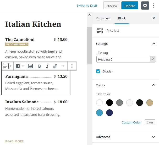
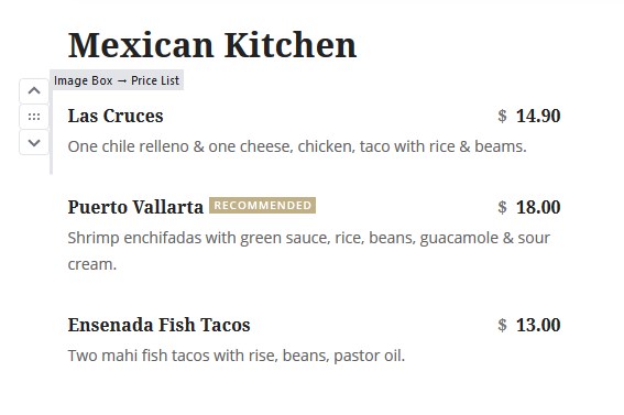
You can have a simplified look with or without a dotted line and images:
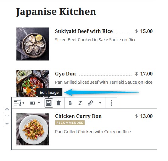
Or you can add an image to each menu item:
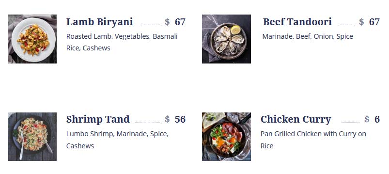
You can also play with the menu layout using Gutenberg columns:
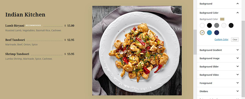
Or use the Section block to create a custom background:
We are also thinking about adding more image styles and customization options to this block!
Final word
Overall, you can do pretty much anything with Getwid Blocks for Gutenberg! Of course, there is always room for improvement, but we are happy with the current result! Especially the post-focused Getwid Blocks for Gutenberg open up unlimited opportunities for building a deeply custom showcase for your pre-existing content. Also, we’re moving in the direction of making Getwid an all-in-one bundle to allow you to eliminate the need to install extra WordPress plugins.
So do you find these new blocks useful for your website? Do you want to suggest an improvement? We are eager to hear new ideas.
Start building with Getwid:

Thanks for sharing this tutorial. Can you also please guide me how can I create a block template? I am doing the same using this resource https://wpitech.com/create-wordpress-gutenberg-block-templates/ but it’s giving an error and I am having some programming lines in front end. This is the code
add_action( ‘init’, function() {
$args = array(
‘public’ => true,
‘label’ => ‘News’,
‘show_in_rest’ => true,
‘template_lock’ => ‘all’,
‘template’ => array(
array( ‘core/paragraph’, array(
‘placeholder’ => ‘Breaking News’,
Hi James! Our tutorials are focused on rather user-friendly ways of working particularly with Getwid blocks, not building custom block templates using code snippets. All the block templates presented in this guide are built visually in Gutenberg with Getwid.