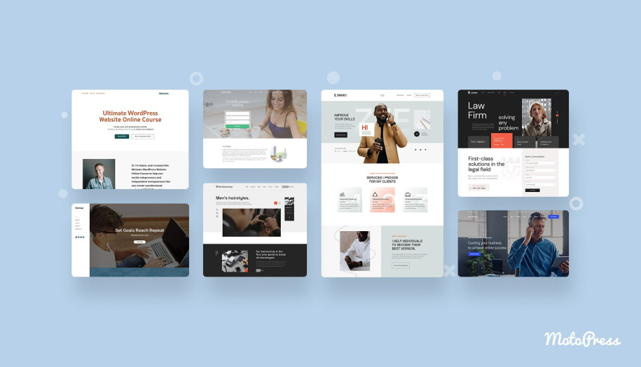
20 Best Contact Us Page Design in 2025. Awesome Examples & Templates for Inspiration
Table of Contents
A fully-fledged website is not only about a beautiful homepage and brand-new product pages. The Contact Us page is one of the most-visited pages. Therefore, it should stand out and make it easy for site visitors to connect with you and look into your business. In terms of design, it needs essential elements and styles going together with your brand’s identity. This article brings the best Contact Us page design examples to inspire and do away with outdated practices. Let’s dive into them!
Why Does The Contact Us Page Matter?
As mentioned, a good website can’t do without a well-crafted Contact Us page. What’s the point? This page is a milestone in your site development to:
- Provide customer support via multiple communication channels;
- Build credibility with site visitors so that they trust you and turn into customers;
- Collect feedback (a contact form does its part in gathering testimonials and requests).
7 Best Contact Us Page Design Practices
Next, we’d like to offer you silver bullets for a good-looking Contact Us page. They include:
- Multiple ways to contact you ASAP (for example, a responsive contact form, phone number, email, and social media links).
- Well-thought-out color scheme (use contrast colors aligning with your brand colors to highlight the information).
- Readable fonts to make the text accessible to everyone.
- Photos of your team members.
- Map and physical address to point out your location.
- Heading with a clear call to action.
- Relevant FAQs or knowledge base articles for customers to find the commonly-searched information without delay.
Also, we’ve prepared 3 extra tips you shouldn’t skip while creating the Contact Us page design:
- Place the link at the top of the website or on the About page to make it easy to find;
- Don’t add too much information not to overload the page;
- Don’t ask for too many details to speed up the communication.
Now, let’s dive into the comprehensive Contact Us website examples picked from popular templates and websites.

Top 20 Best Contact Us Pages
There are many contact page examples to learn from businesses and template developers. Let’s explore them in more detail!
10 Best Contact Us Page Designs: Examples from Real Websites
This section deals with real-life Contact Us webpage examples we’ve curated to highlight their best design practices.
1. Unbounce
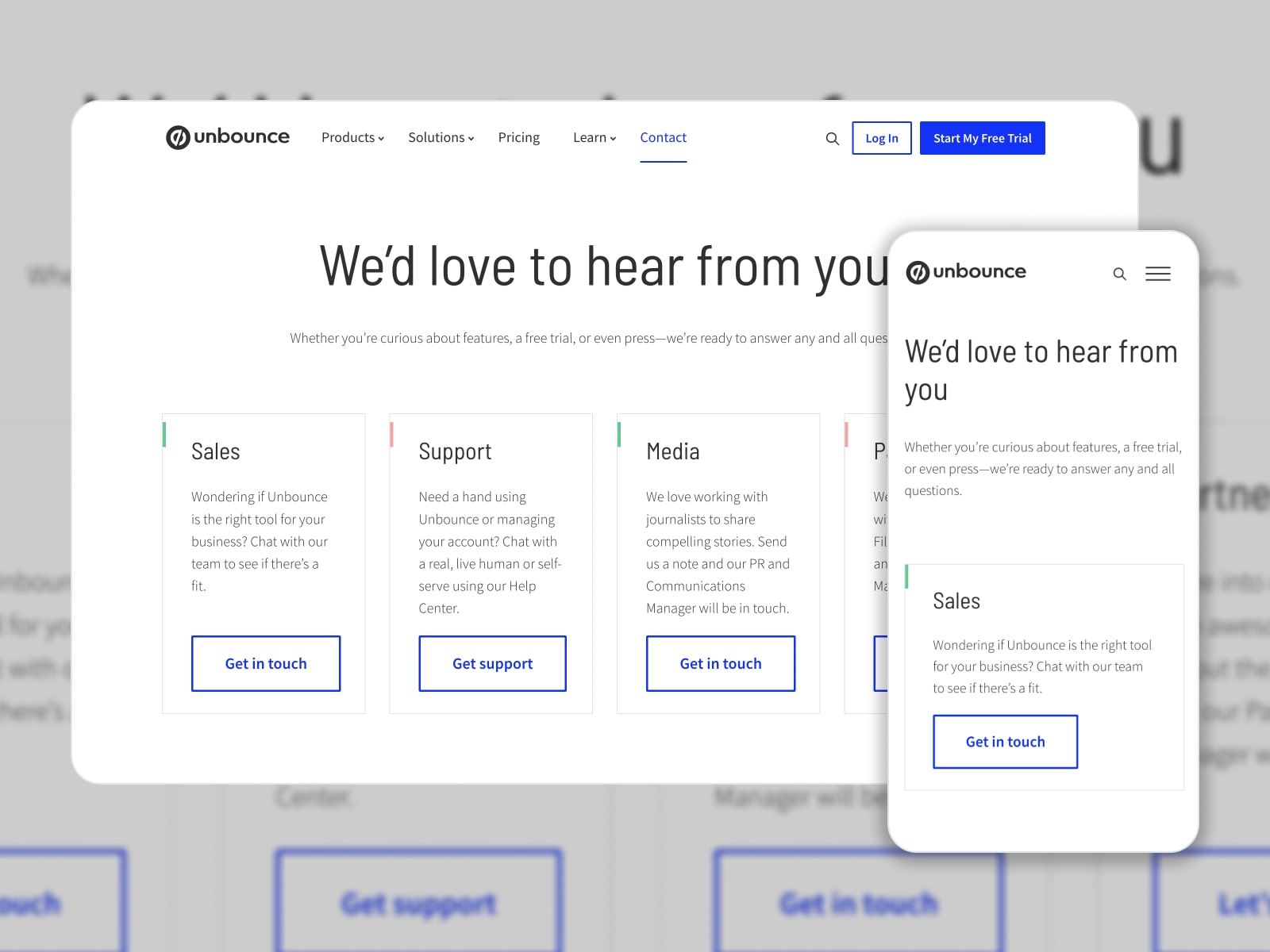
Unbounce is one of Canada’s growing tech companies dealing with landing pages, AI copywriting, AI optimization, and more. Their “Contact Us” page is in a menu at the top. It contains general inquiries customers might be interested in.
What Makes This Page Effective?
It all starts with a welcoming header “We’d love to hear from you” which builds closer relations with users. Then, there are four communication channels to quickly get answers from a particular department via a dedicated button. The next section of this contact page example uncovers office locations and phone numbers.
2. Hubspot
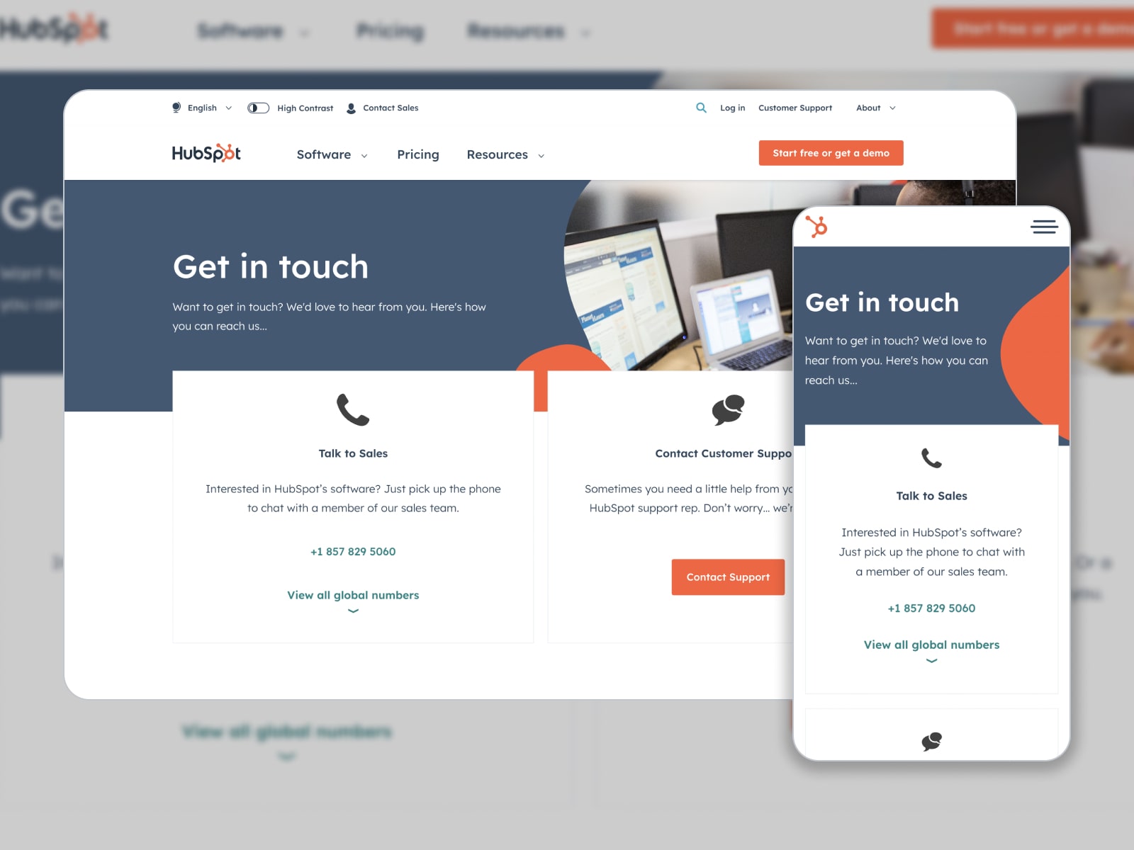
Hubspot is responsible for marketing software and services. And this company has a well-structured “Contact Us” page aimed at selling the products and solving issues. It’s accessible at the top of the page. And customers can reach it in a few clicks.
What Makes This Page Effective?
Hubspot integrates tools to provide the best customer service: friendly tone of voice in sentences, call-to-actions for an immediate connection with sales and support agents, and global & local phone numbers. Also, it’s possible to drop into their headquarters as they embed a map with a direction directly into a website contact page. Since Hubspot has offices in different countries, they’ve added their addresses, contact information, and photos.
3. Zendesk
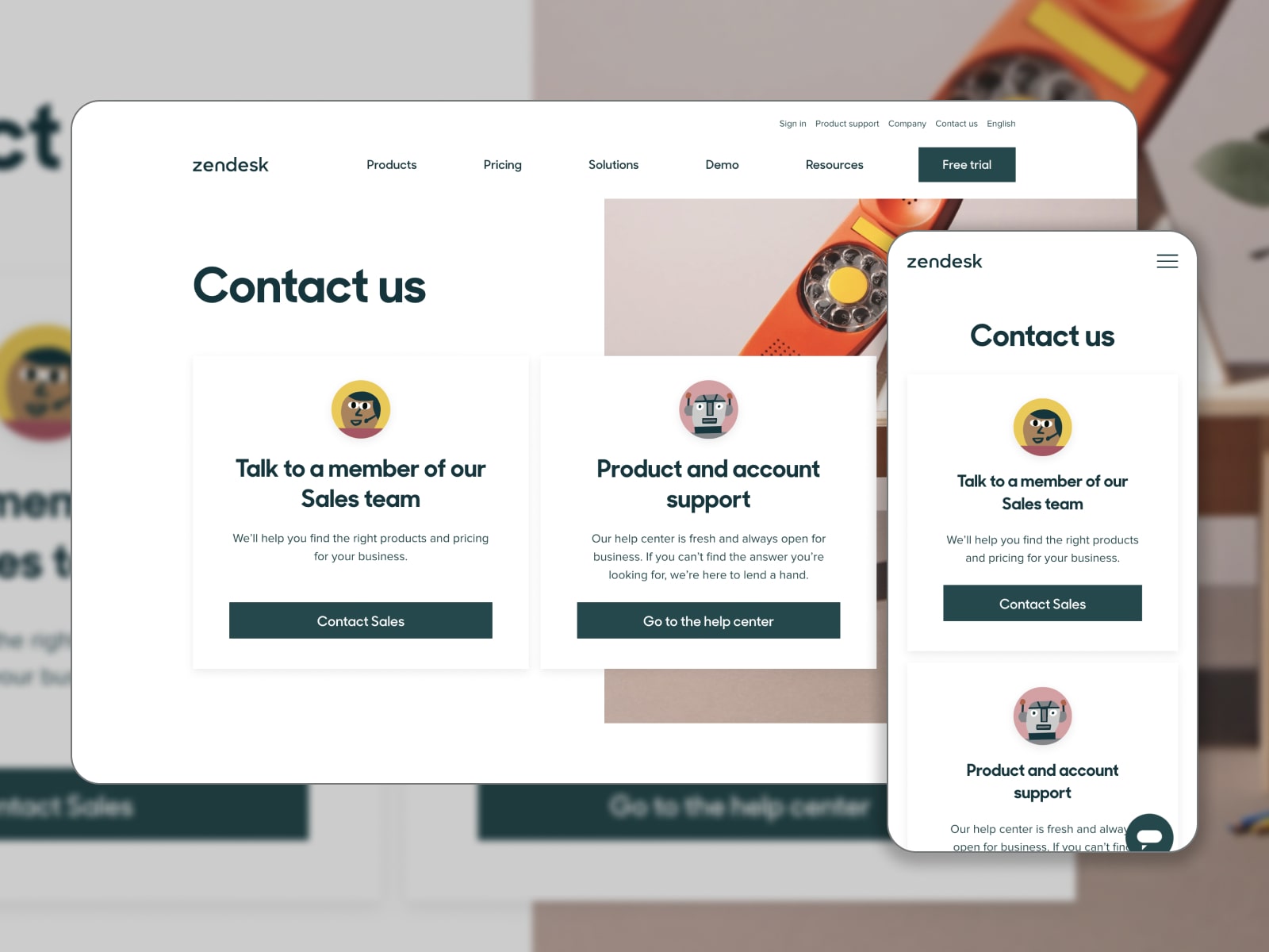
Zendesk develops solutions for services and sales to establish hassle-free personalized connections with customers. Put above the fold, their “Contact Us” page lets customers talk to sales and support teams.
What Makes This Page Effective?
The page has a minimalistic and clean design and comes with easy-to-find contact options. The first one opens a contact form to reach a sales team member. The second one leads to a Help Desk. This Contact Us web design also includes the details (addresses and official websites) of the Zendesk offices around the world.
4. Canva
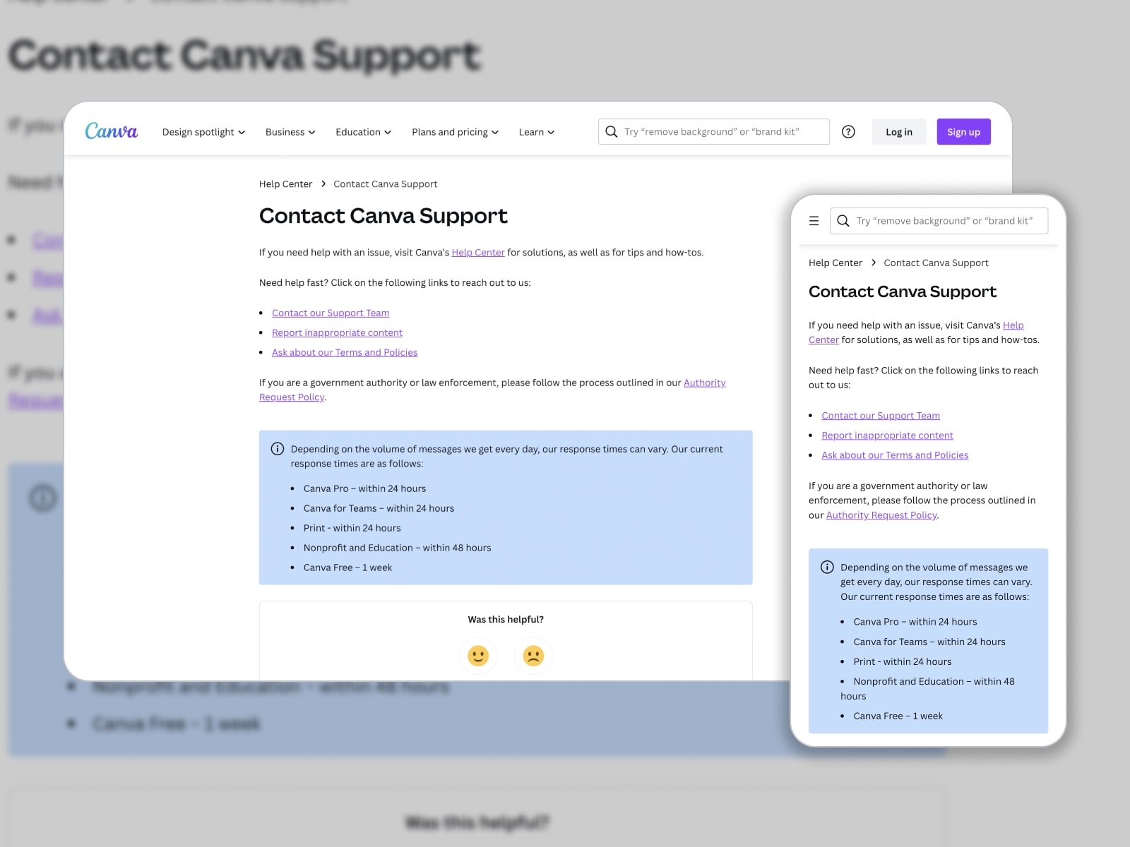
Canva is known for a variety of ready-to-go templates for smooth content creation. Its designs are suitable for multiple purposes. The Canva contact page should cover different support channels to help its users. If you go to Learn > Help Center > Canva support options, you’ll find three links to reach out to their team.
What Makes This Page Effective?
Simple yet useful, this page offers users to launch a chatbot, report any issues with content via a contact form, and send inquiries on the Canva Terms and Policies. Conveniently, there is an average response time in a box with a different background color. Once you rate support options, you’ll get to the knowledge base articles frequently searched by other customers.
5. Spotify
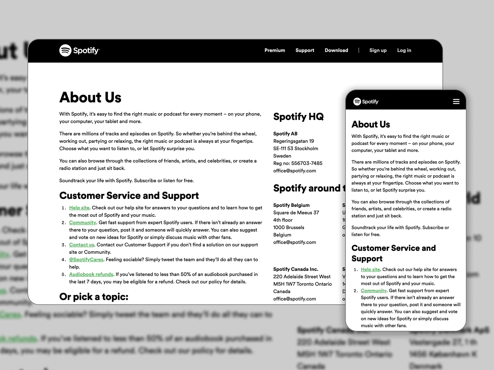
Spotify is a platform distributing music and podcasts available on your phone, computer, tablet, etc. You can subscribe to it or listen to tracks & episodes for free. Contact information is added to the About page in the site footer.
What Makes This Page Effective?
Whether visitors need customer service and support or details on Spotify headquarters, they’ll search them out on this Contact me page. Firstly, there are five linked options to choose from. They include a help site with FAQs, a community page, a contact form for personalized support, a Twitter support page, and an audiobook refund policy. Besides that, the Spotify team lists links to three sections: Advertising, Press, and Jobs.
6. Moz
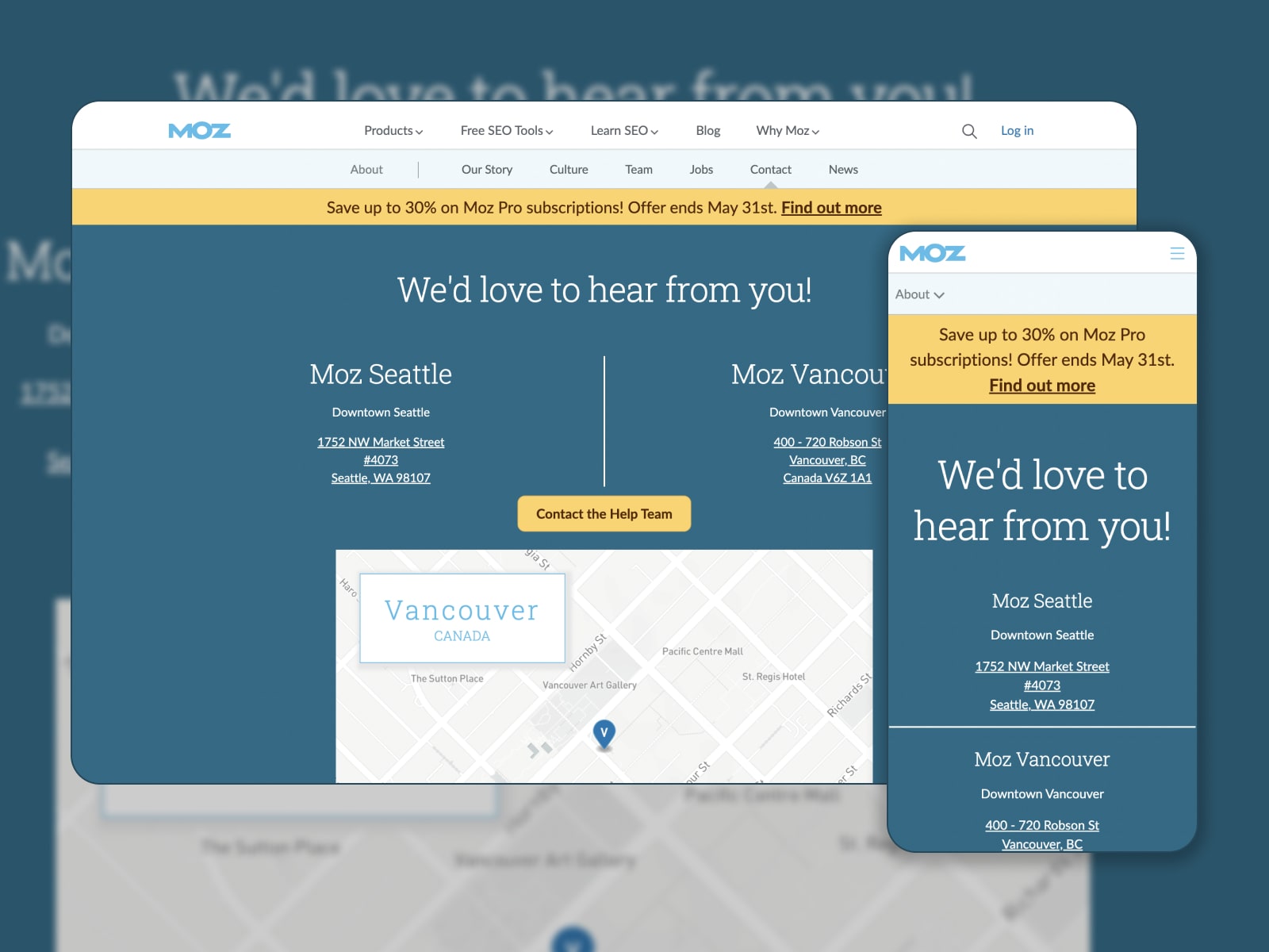
Moz gives out free and paid SEO software to help websites rank higher in search results. The first step in creating a good contact page is making it visible on your website. And Moz does a great job of it by placing the link on the top menu.
What Makes This Page Effective?
In addition to clear information on Moz offices in Seattle and Vancouver, visitors can contact the help team via a yellow button in one stroke. They navigate to a responsive contact form with such fields as a topic, name, email, subject, and details. A map comes in handy to visit the Moz office in person.
7. Scribd
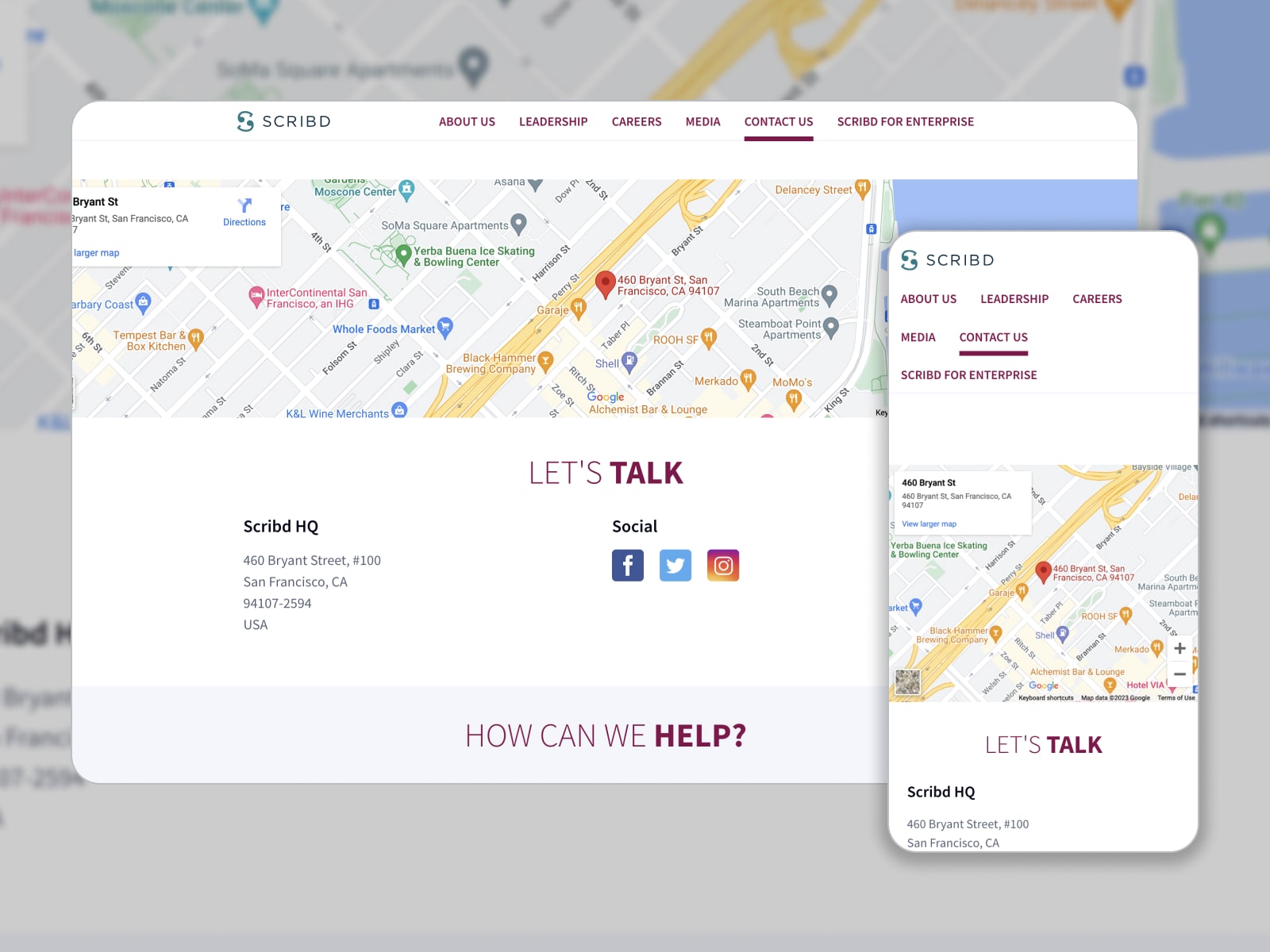
Scribd gives you access to a digital library involving millions of ebooks, audiobooks, magazines, podcasts, and more under one roof. Prioritizing the customer, the team has created an engaging and easy-to-follow contact page.
What Makes This Page Effective?
A defined location on Google Maps, a header with CTA, a physical address, social media links, and help buttons – all these elements make up a unique “Contact Us” page. A color scheme reflects the Scribd brand colors. When you hover over the well-organized buttons, you’ll be able to start a chat with a support team, find the required email, or go to the Copyright and Publishers pages.
8. Search Engine Journal
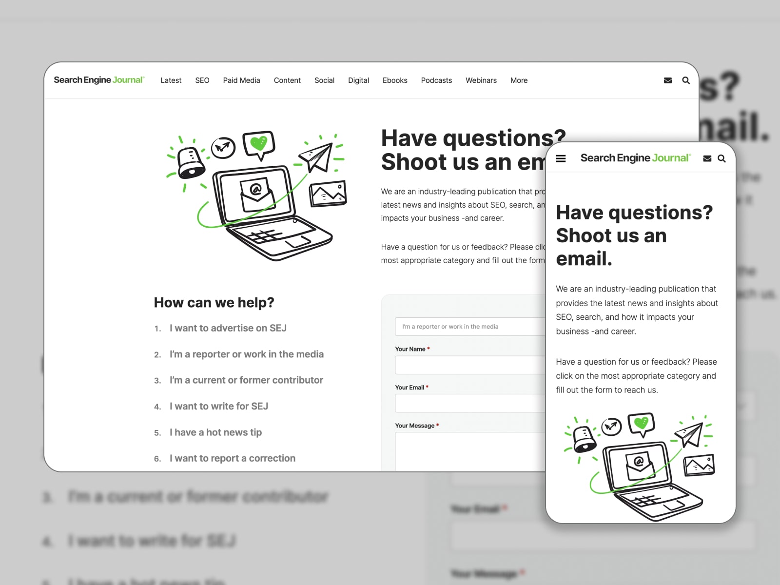
Search Engine Journal is a well-known resource that delivers articles on the best SEO practices, the latest search news, social media, and digital marketing strategies. Beginning with a creative heading “Have questions? Shoot us an email.”, their Contact Us page attracts with a clean design and bold CTAs.
What Makes This Page Effective?
Similarly to the Search Engine Journal website, the Contact Us page is made in green and white colors. After a short description, visitors will see a clear contact form enhanced with a reCAPTCHA service. They can choose the topic by clicking the relevant inquiry on the list. The page also clearly states the SEJ address to mail.
9. Atlassian
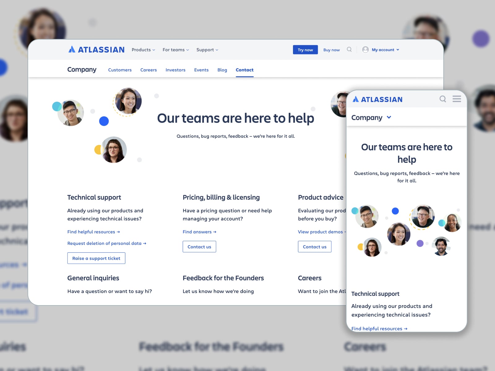
Atlassian aims to develop fully-operating software for companies to manage their workflow and teams. Its products let them facilitate collaboration and organize ideas. The Atlassian Contact Us page is an example of a well-structured, informative, and attractive page.
What Makes This Page Effective?
Atlassian enables its customers to contact its team in multiple ways: a support ticket, a contact form that is simple to fill in, or feedback submitted to founders. Along with office addresses and phone numbers, the company demonstrates transparency via real photos of its team members.
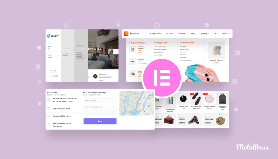
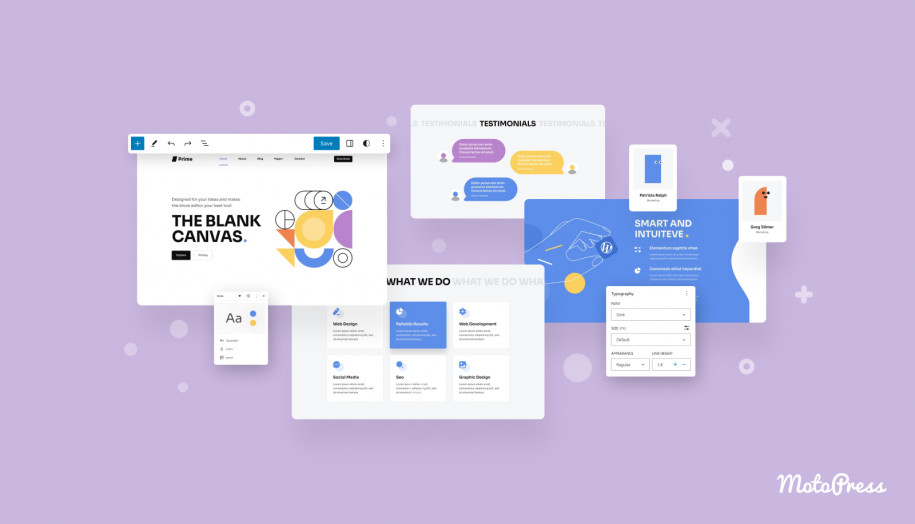
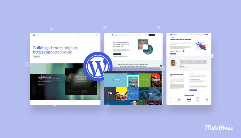
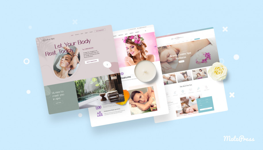
10. MotoPress
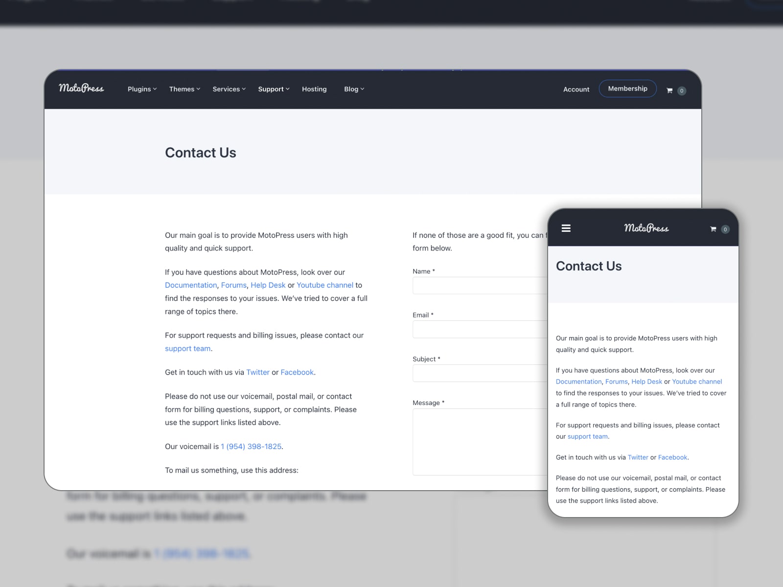
We couldn’t compile the list without talking on the MotoPress Contact Us page. Placed in the footer, it has a minimalistic but clean design with the main elements included. Visitors can quickly sort through this page to gain all the useful links.
What Makes This Page Effective?
MotoPress inserts the links to its documentation, forum, Help Desk, and YouTube channel. Submitting a request regarding support and billing is a piece of cake for customers. Also, there are links to the MotoPress profiles on Twitter and Facebook. You access the company’s voicemail and mail address. If this information on contact pages doesn’t cover your issue, you can send an inquiry via a contact form.
10 Best Contact Us Page Designs: Examples from Templates
Most WordPress themes and website templates are packed with ready-to-go Contact me page examples. Their style corresponds to the overall theme aesthetics and can be tailored to your needs. Let’s have a look at the creative and functional designs crafted by professionals for the Contact Us pages!
11. TheGem
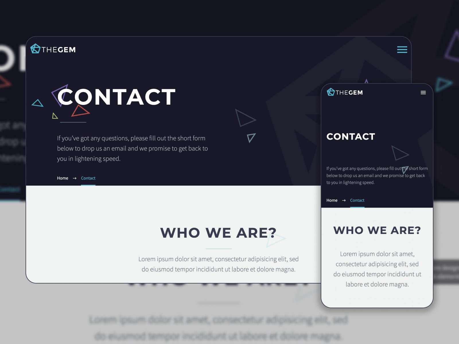
TheGem is a multipurpose WordPress theme packed with templates for different niches. Compatible with Elementor, this theme ensures smooth page editing and customization. You are free to manage your website’s style and integrate custom widgets. Each demo has unique Contact Us page design examples. Let’s consider a digital marketing solution as one of the most popular ones!
What Makes This Page Effective?
This contacts page is made up of a map with a pointed location, contact information (address, phone number, and email), and links to social networks. A contact form is embedded to gather requests on other topics. Bold fonts help visitors find out the required section.
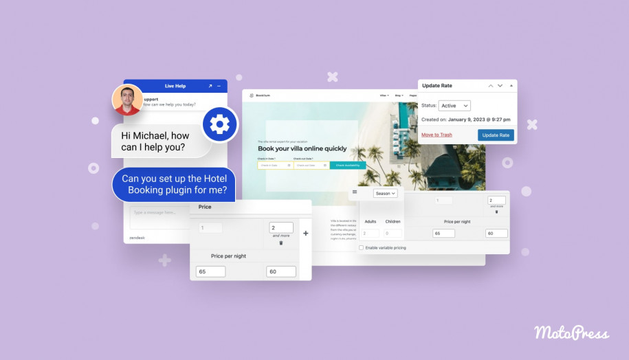
12. Booklium
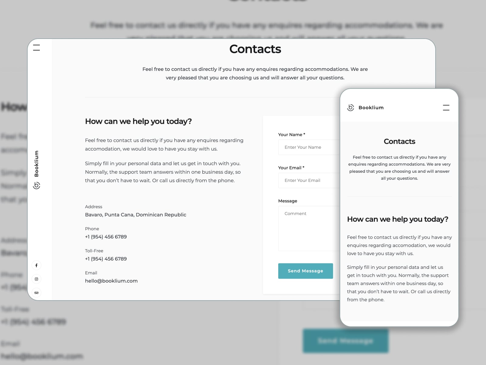
Booklium is one of the best WordPress vacation rental themes bundled with the booking plugin. It delivers 5+ demos for different types of rental accommodations. When it comes to the contact us pages included in the theme package, they are developed with the main property owners’ demands in mind.
What Makes This Page Effective?
Since Booklium is a premium WordPress rental theme, its Contact Us page template gives you the freedom to add an address, phone, and email. It will be easier for guests to get oriented on your property location as you specify it on Google Maps. They can send you a message via a contact form and find answers to the most common questions in the FAQs section.
13. Ohio
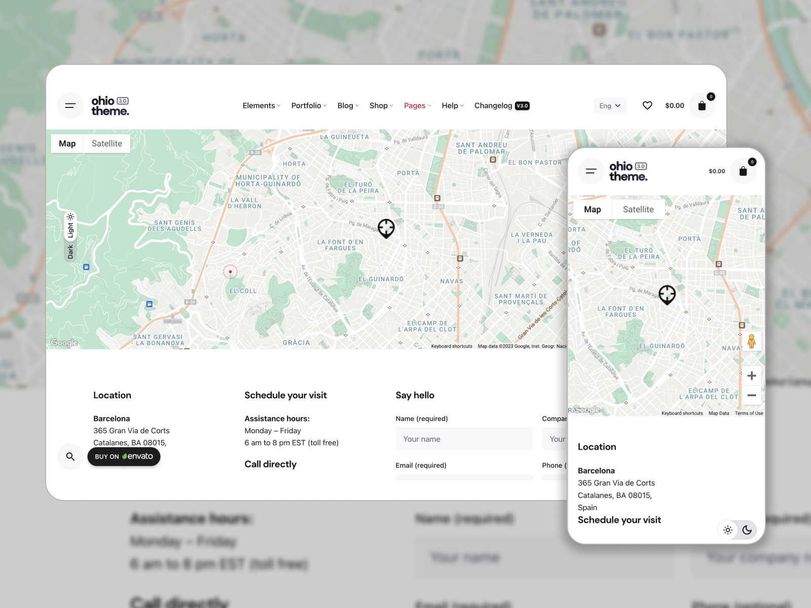
Ohio fits WordPress websites for creative agencies, portfolios, blogs, online stores, etc. You can customize modern and clean layouts with WPBakery or Elementor page builders. Ohio supports popular WordPress plugins and comes packed with pre-made templates, including 6 Contact Us pages of different styles.
What Makes This Page Effective?
A classic Contact Us page design is available in light and dark modes. It allows you to show your location on a map, inform clients about your business hours, and add a phone number to call directly. A brief CTA “Say hello” encourages visitors to get a quote via a contact form.
14. Qwery
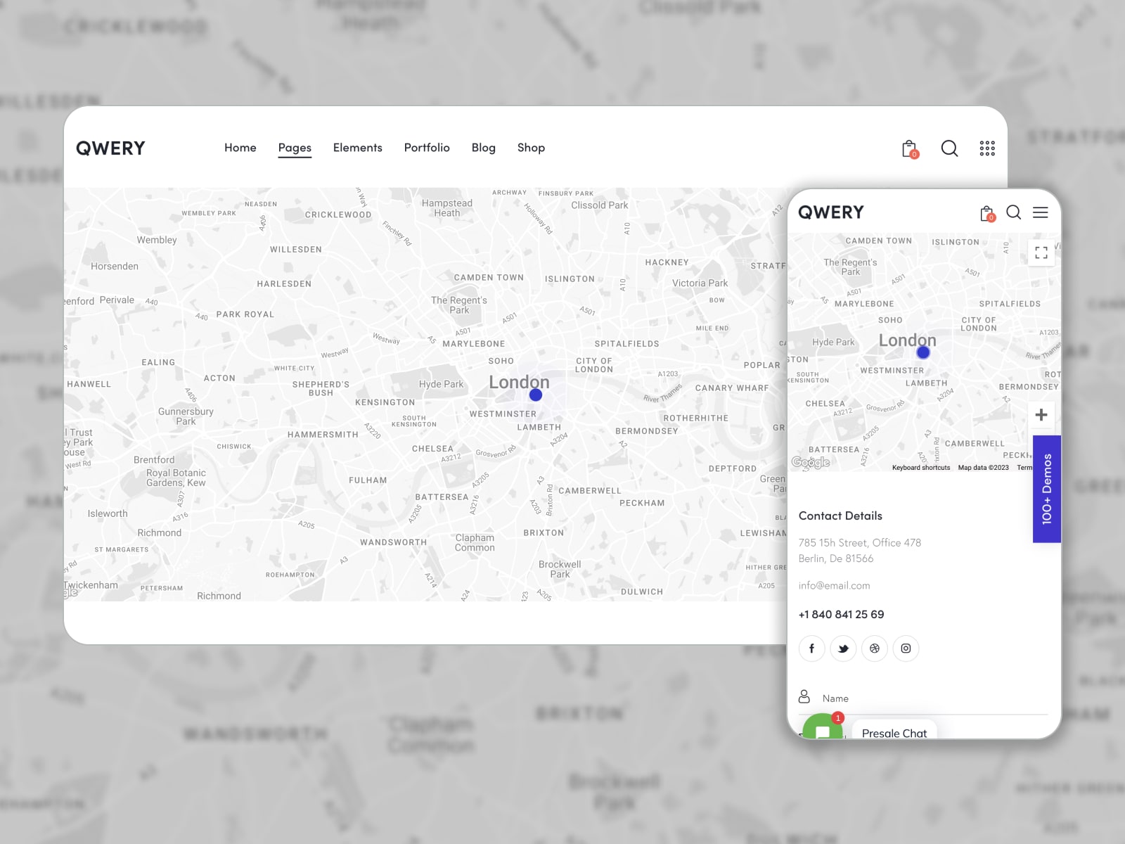
Qwery is one of the best-selling multipurpose WordPress themes with templates for multiple businesses. It combines stylish demos and powerful functionality. Built with Elementor, this theme provides booking options and flexible customization tools. The default skin supplies 3 Contact Us page designs.
What Makes This Page Effective?
Once the location is added to a map, you can display contact details (address, email, and phone number) and a responsive contact form. The latter asks visitors for their name, email address, phone, subject, and message. This Contact Us example page also introduces links to profiles on social media.
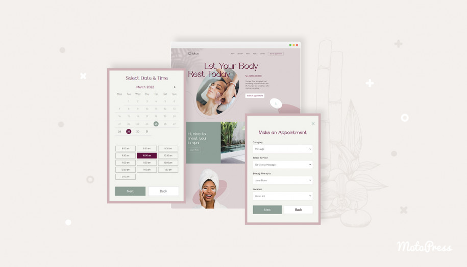
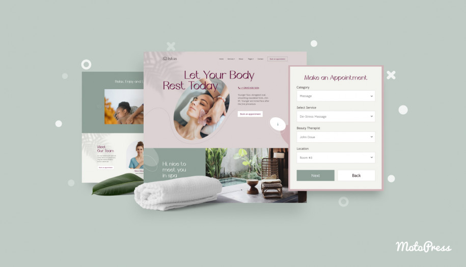
15. Lotus Spa
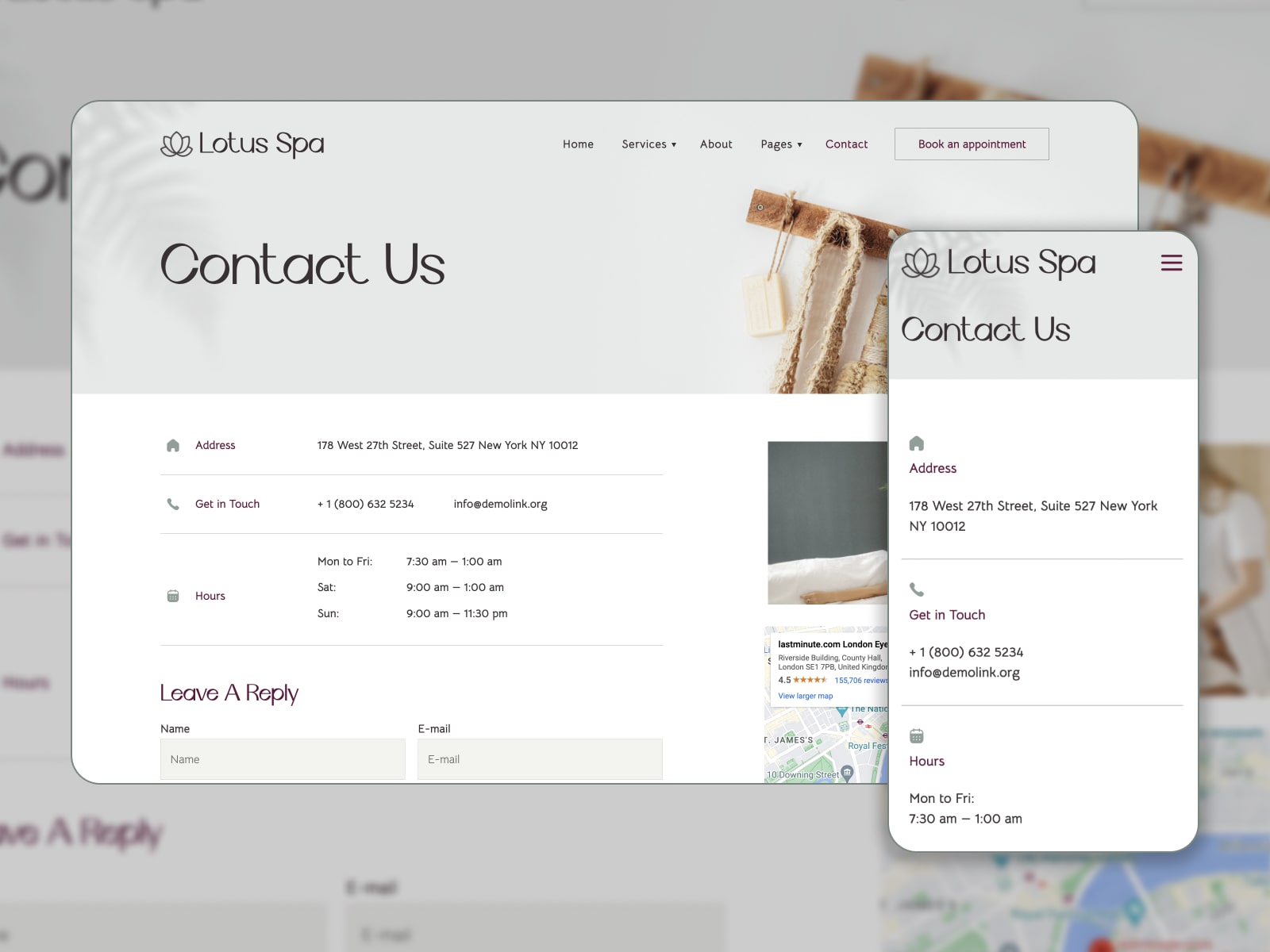
Lotus Spa is designed to build an online presence for beauty and spa salons, wellness centers, nail studios, etc. You get access to pre-crafted Elementor templates and appointment scheduling WordPress functionality. Since Lotus Spa deals with services, the Contact Us page design should take in all the information potential clients might need.
What Makes This Page Effective?
What must-have details on Сontact Us pages can enhance a service business website? A physical address along with a map, phone number to get in touch, email, and working hours. Lotus Spa lets you outline your schedule and accept messages via a contact form.
16. Bridge
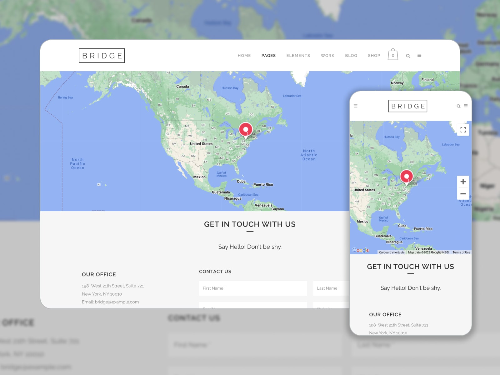
Bridge was picked for this roundup thanks to its collection of multipurpose creative demos designed with Elementor and WPBakery page builders. Responsive and feature-rich, this theme equips your WordPress website with customizable page layouts, flexible header & footer sections, and custom elements. Let’s look under the hood of a Contact Us page in the Bridge original Elementor demo!
What Makes This Page Effective?
The website contact page examples by Bricks take care of office location on a map, address, email, phone number, and fax. Social media links will help visitors find your profiles. A friendly CTA “Say Hello! Don’t be shy.” guides to a minimalistic yet effective contact form consisting of a few fields: First Name, Last Name, Email, Website, and Message. The page color scheme aligns with the website’s style.
17. Bili
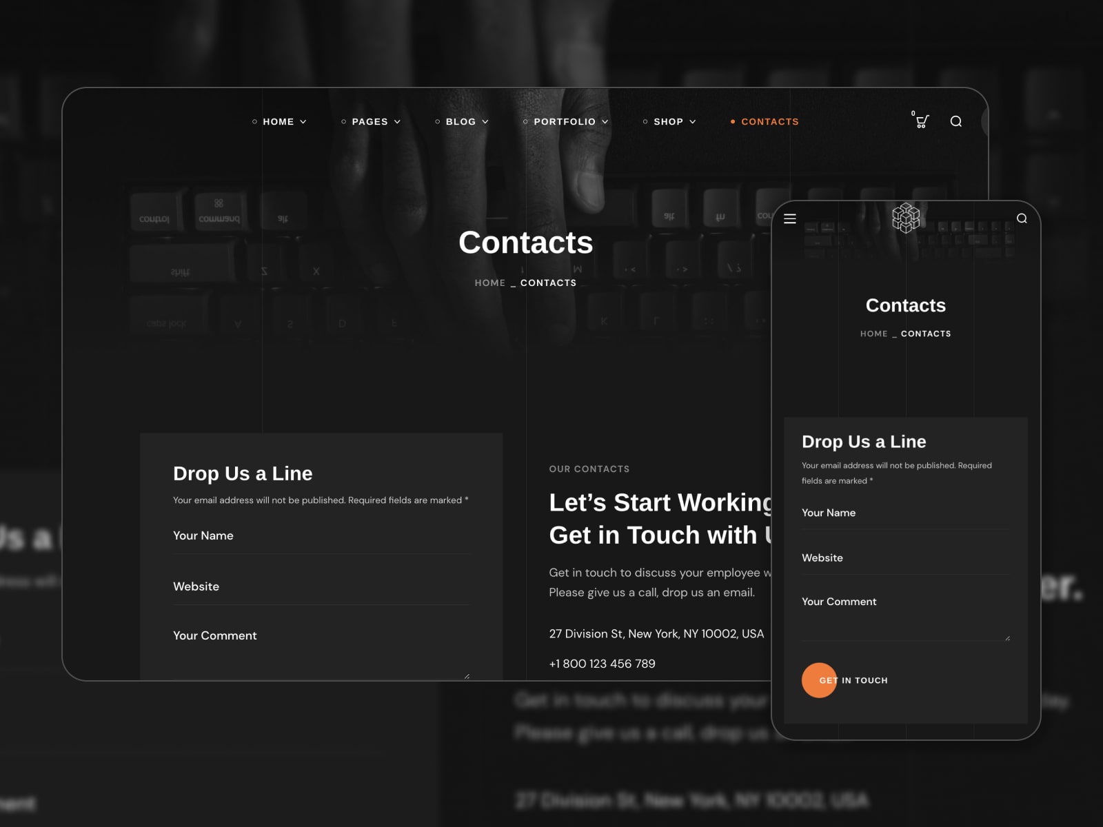
Bili gives everything you need to build a creative agency website: well-developed demos in light and dark versions, pre-designed inner pages (including Contact Us), support for premium WordPress plugins, and customization options by Elementor.
What Makes This Page Effective?
The Contacts page impresses site visitors with a dark color scheme, a welcoming CTA “Let’s Start Working Together. Get in Touch with Us!” and detailed contact information. They can send you a message via a mobile-friendly contact form or visit your accounts on social media. There is a detailed map to clarify the agency’s location.

18. Lumia
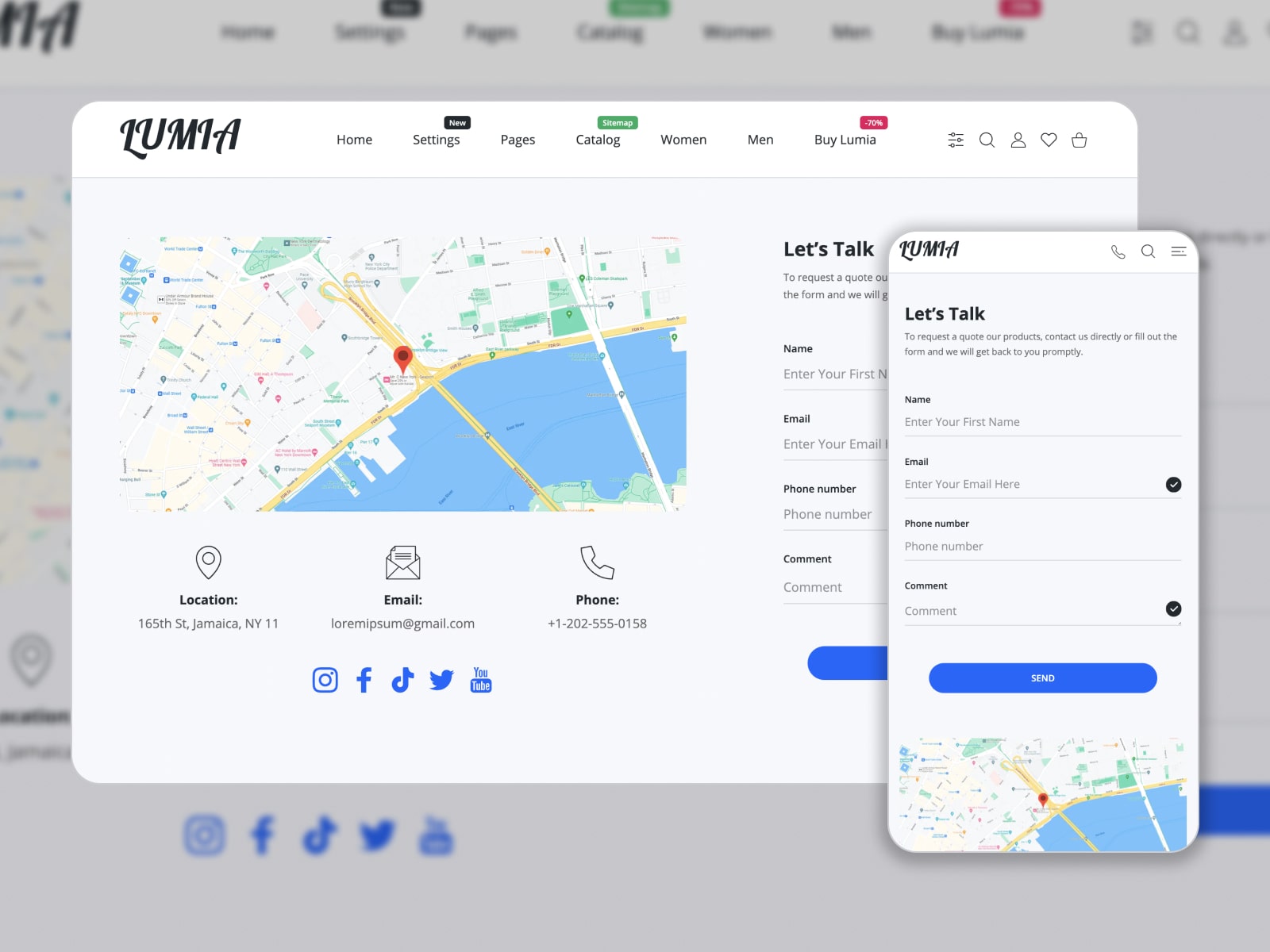
Lumia is a mobile-oriented Shopify multipurpose theme to make an online store website. Its feature list involves a user-friendly product filer, shipping calculator, and subscription options. Switch between classic light and trendy dark modes.
What Makes This Page Effective?
The Contact Us page design by Lumia stands out because customers can contact the team via a contact form, get support via email or phone, or visit a shop directly. Links to social media profiles may help grow the audience and share more absorbing content.
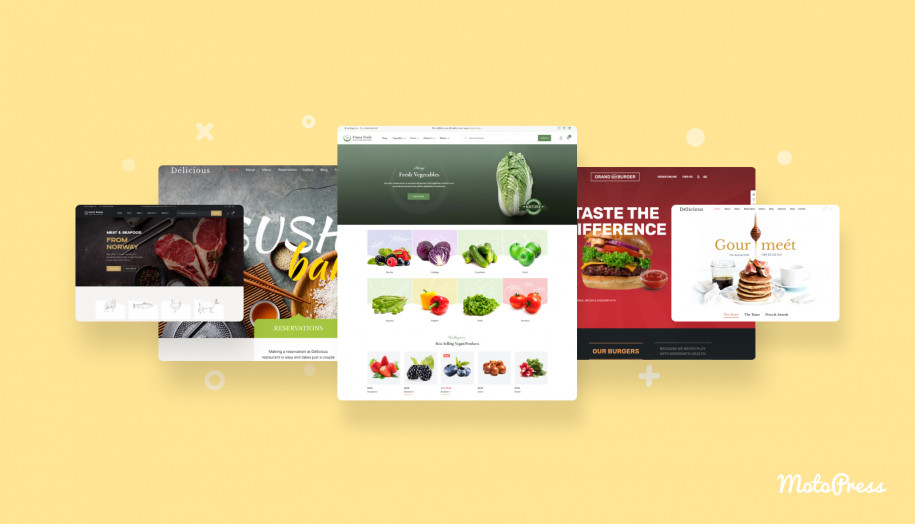
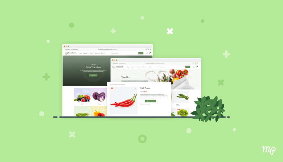
19. Vegist
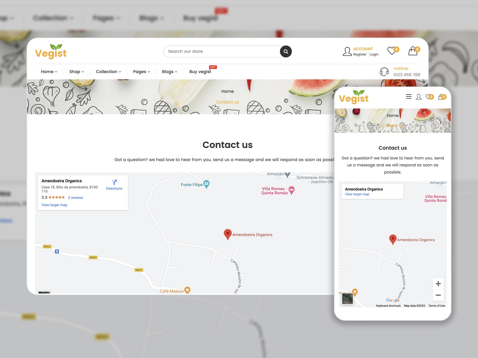
Vegist is a multipurpose e-commerce Shopify theme that matches online food stores, groceries, beauty shops, etc. We’ve listed it in this collection as its contact us page presets follow the best design practices for an e-commerce website.
What Makes This Page Effective?
Tailored to the general website’s outlook, this page incorporates a contact form with three fields, address, phone number, and email. A map on the top of the page highlights store locations. It’s worth mentioning that the contact information and store benefits are displayed on each page in the footer.
20. Drake
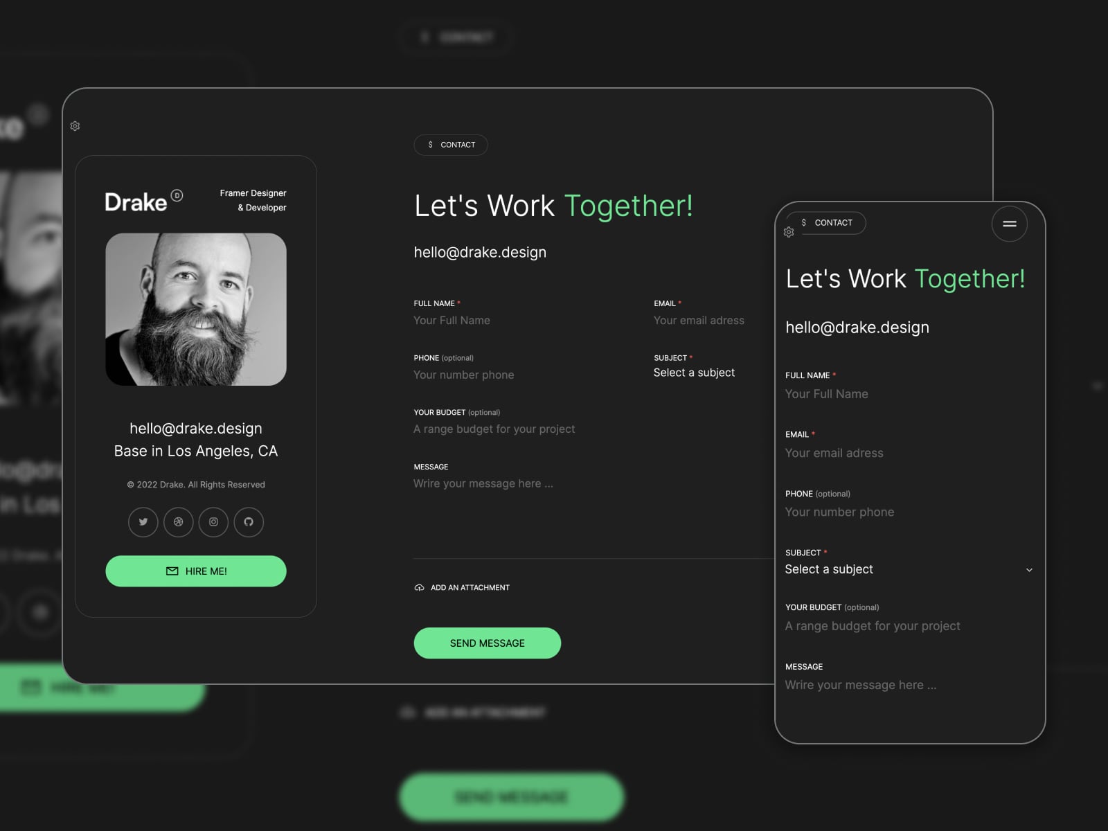
Drake is a one-page personal portfolio HTML template with unique and easy-to-customize layouts. It’s a perfect solution for anyone who wants to showcase their projects, build a professional portfolio, and communicate with potential employers.
What Makes This Page Effective?
The Contact Us section designs are available in dark mode only and focused on collaboration requests. They comprise a clear CTA “Let’s Work Together!”, email address and a contact form. What’s more, you’re allowed to choose a button color among eight options.
What Are The Best Contact Us Page Design for WordPress Practices?
If you choose WordPress as the content management system for your website, you need no coding skills to build a desired Contact Us page design. On top of that, WordPress features many perks such as:
- Ease of use and management;
- Built-in SEO features to create the website visible in search results;
- Responsive designs adjusting to any screen size;
- Customization options to tailor colors and fonts to your preferences and insert different content sections;
- Dedicated themes & plugins (for example, contact form plugins smoothen contact form creation).
It’s worth noting that the WordPress directory provides a wide selection of themes with a sample Contact Us page.
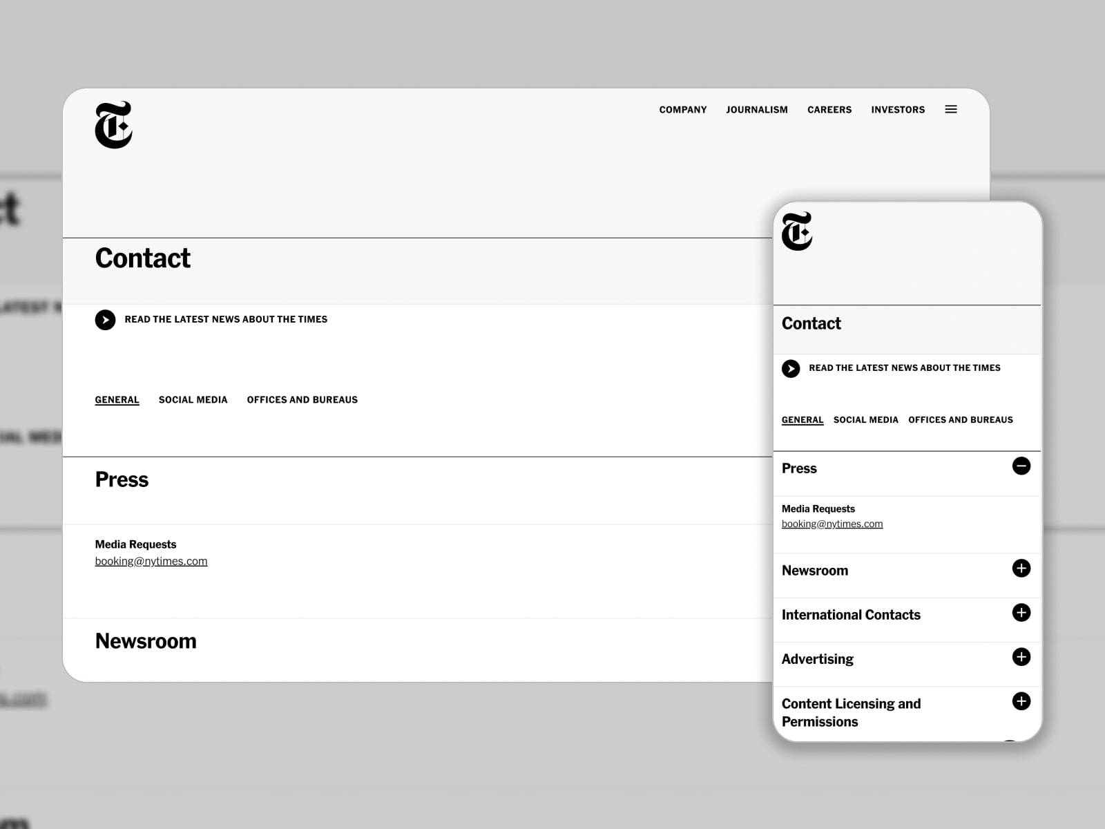
For reference, The New York Times Company website is based on WordPress. Its Contact Us page unveils general contact information, social media links, and office locations. There is a link to read the latest news.
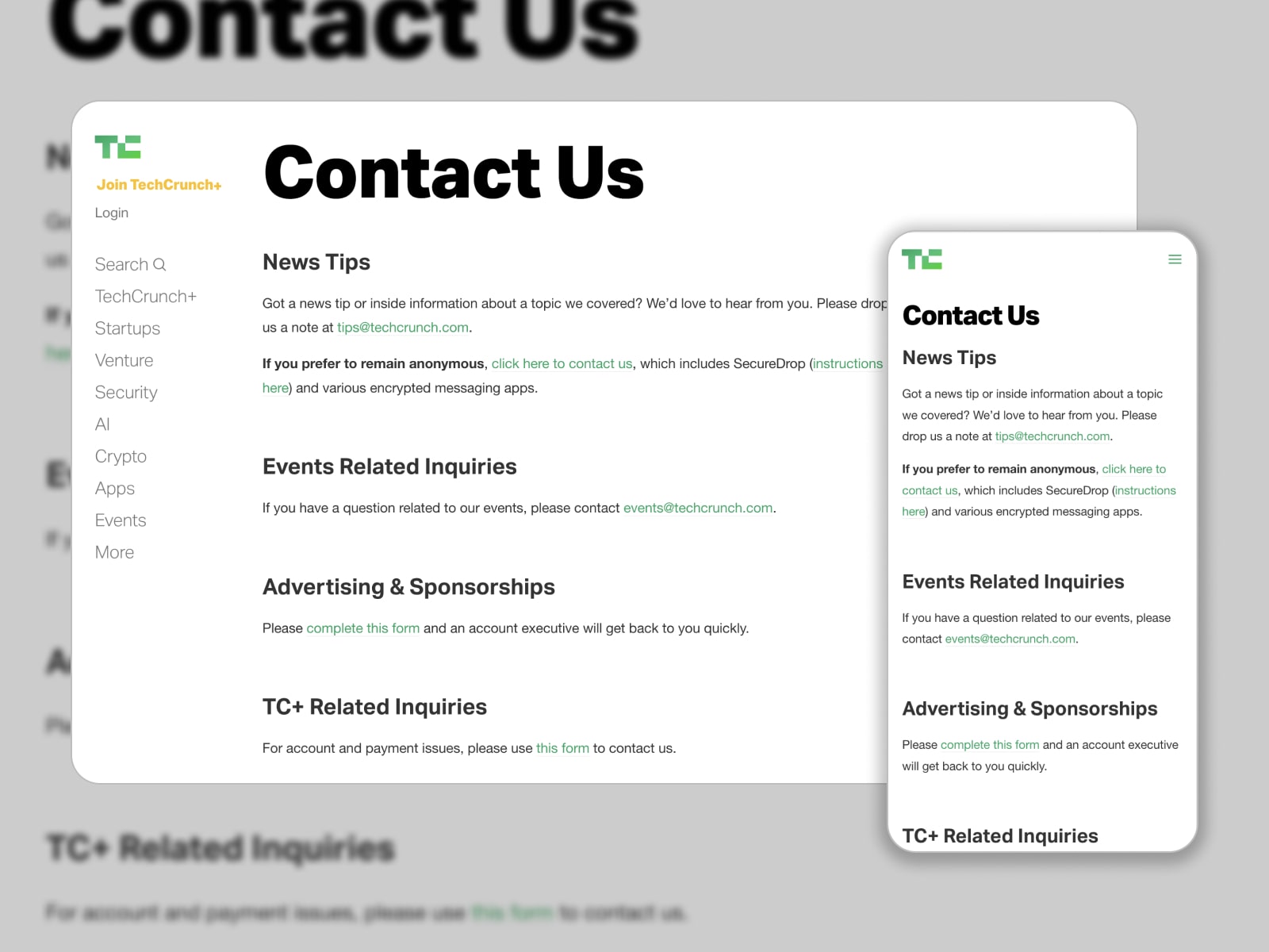
The developers of the TechCrunch WordPress site have turned clients’ requests into a pixel-perfect Contact Us page. It’s divided into different sections: News Tips, Events Related Inquiries, Advertising & Sponsorships, and TC+ Related Inquiries. Other inquiries can be sent via a dedicated contact form.
20 Creative Contact Us Quotes for Website to Inspire From
In addition to easy-to-navigate Contact Us forms, you can choose one of the following quotes relevant to your tone of voice to engage website visitors.
Professional & Friendly
- Have questions? We’re just a message away.
- We’re here to help. Contact us anytime.
- Let’s connect and make something great together.
- Reach out – we’re ready to support you.
- Need answers? We’ve got them.
Funny & Playful
- We don’t bite – drop us a line!
- Let’s make inbox magic happen.
- Your message won’t get lost in our inbox.
- We love messages more than coffee (and that’s saying something).
- We’re fluent in emojis and great ideas – send both.
Clever & Smart
- Good conversations start here.
- It all starts with a “hello.”
- The shortest distance between you and us? This form.
- Connecting the dots, starting with your message.
- Let’s turn your ideas into action.
Inspiring & Creative
- Start the conversation. Create the connection.
- Let’s create something brilliant together.
- Reach out – your story matters.
- The next chapter starts with “Hey.”
- Make contact. Make change.
How to Build Great Contact Us Pages for Different Industries?
In this section, we’d like to share some Contact page ideas geared towards various niches as they feature specific needs.
1. Healthcare & Medicine
Patients often visit contact pages to book appointments, ask medical questions, or find urgent care options.
Tip: Highlight emergency contact options and include a simple form for booking or inquiries, along with office hours and insurance info.
2. Legal Services
Clients seek reassurance, privacy, and clarity when reaching out to law firms.
Tip: Build trust with a clean, professional layout, including attorney names with direct emails.
3. E-commerce Stores
Online shoppers expect quick answers about orders, shipping, or returns.
Tip: Make the contact form highly visible and enhance it with links to returns/refund policies or quick help links.
4. Real Estate Agencies
Home buyers and renters might need direct contact with specific real estate agents or property listings.
Tip: Use a form that allows users to select a property or agent they’re inquiring about, and include agent photos/contact buttons to personalize it.
5. Education (Schools, Online Courses)
Students, parents, and educators visit contact pages to get quick answers about admissions, course details, or academic support.
Tip: Break down contacts by department and include a map.
6. Hospitality (Hotels, Vacation Rentals)
Travelers may look for assistance with bookings, amenities, or special requests.
Tip: Feature contact info by location or property and display response time.
7. Nonprofits & NGOs
Since supporters reach out to donate, volunteer, or partner, you should ensure clear navigation among these options.
Tip: Include a dropdown to route messages, with social proof like recent campaigns or impact stats.
8. Event & Entertainment Services
Event planners and individuals connect about dates, pricing, and custom requests.
Tip: Use a dynamic form on a Contact Us website design where users can select event type (wedding, corporate, etc.), and add a calendar to show available dates.
Contact Page Design: 5 Common Mistakes
What can you learn from the Contact Us page examples described above? They should help set the stage of designing a functional contact page and avoid such mistakes as:
- Lack of clear call-to-action.
- Too many fields in the form.
- Poor mobile optimization.
- Unclear or hidden information.
- Complicated CAPTCHA or security measures.
To Sum Up
- The Contact Us page design does affect the general impression of your website. Thus, you should stay up-to-date with modern design practices and show need-to-know contact information there.
- What are the essential points to bear in mind when building a Contact Us page? It depends on your website goal and business needs. Visitors are likely to make the most of well-organized contact options, easy-to-read fonts, CTAs, maps & directions, social media links, FAQs, and photos.
- In this article, you get acquainted with Contact Us page design examples from ten existing websites of different companies. We’ve described the style specialties that make them effective.
- There are also Contact Us examples from templates (WordPress, Shopify, and HTML) developed for multiple industries. You may select one of them or take them as a model for your website.
- Now, we are eager to pinpoint the top 5 best templates for the Contact Us page design from our roundup:
| Name | Release Year | Official Website | Free/Premium | Color Scheme |
|---|---|---|---|---|
| TheGem | 2016 | Website | Premium | Blue, grey and white |
| Booklium | 2019 | Website | Premium | White, turquoise and yellow |
| Lumia | 2023 | Website | Premium | Grey and white |
| Qwery | 2021 | Website | Premium | Grey and white |
| Drake | 2023 | Website | Premium | Black, white and grey |
Have you found Contact Us form examples suitable for your requirements? Share your feedback in the comments!
Disclosure: this article may contain affiliate links for third-party products. If you click a link and later make a purchase, we may earn an affiliate commission that doesn’t result in additional charges to you.
FAQ
What do you write on contact us page?
- Contact Information: your company’s contact information, such as phone number, email address, and physical address (if applicable). It’s also helpful to include your business hours and time zone.
- Contact Form: a contact form can be a more convenient way for visitors to send you a message, rather than opening their email program.
- Social Media Links: if your company has social media accounts, include links to them on the contact page to give visitors additional options to get in touch with you.
- FAQ: if you receive a lot of common questions, consider including an FAQ section on the contact page to answer them.
How do I make a good contact us page?
- Keep it simple: the page should be easy to navigate and not cluttered with unnecessary information.
Use a clear and concise headline: the headline should communicate what the page is about, such as “Contact Us” or “Get in Touch.” - Add different contact options: email, phone, social media, or a contact form.
- Include a simple and easy-to-use contact form that requires only essential information.
- Display your contact information clearly.
- Provide response time expectations.
- Use a friendly tone to help visitors feel comfortable reaching out to you.
How do you say Contact us in different ways?
What should a contact page have?
- Contact information: phone number, email address, and physical address.
- Contact form including fields for the visitor’s name, email address, and message.
- Social media links if your company has accounts on social media (Facebook, Instagram, LinkedIn, etc.).
- FAQ or knowledge base articles to reduce the number of messages you receive and provide visitors with immediate answers.
- Map and directions to help visitors find you.
- Personalization: consider adding a personal touch to your contact page by including photos of your team, a brief company history, or a message from your CEO or founder.