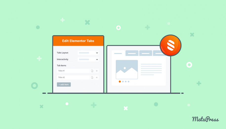
Stratum Widgets: Advanced Accordion & Tabs Elementor Widgets
Table of Contents
If you are looking for a handy design tool to structure large amounts of information, reduce scrolling and categorize data, feel free to present content using the Stratum Advanced Accordion and Advanced Tabs. Both elements are perfect for building an Elementor collapse action in any place of your website.
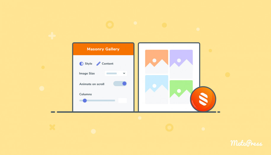
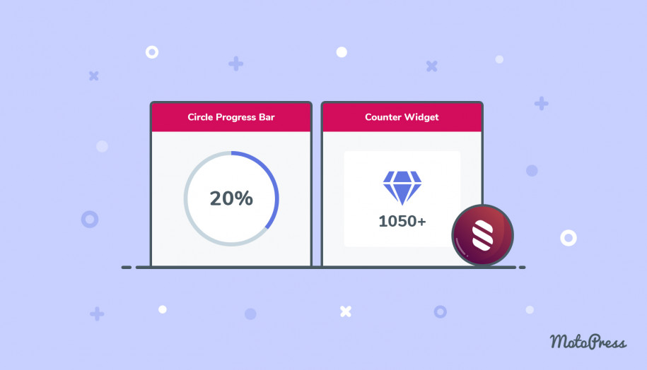
Stratum Elementor Addons contains 20+ advanced widgets for all purposes and business website needs, including the most popular Advanced Slider, Advanced Posts, Instagram, Price List widgets, and many more.
See also: the Tabs block for the block editor (Gutenberg)
The Purpose of the Advanced Accordion & Tabs Elementor Widgets
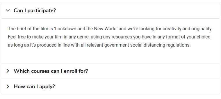
- Build a creative FAQ Elementor collapse section for displaying products or services.
- Create any data section that is more readable and easy to interact with (e.g. news, music archives).
- Create better structure for easier navigation and accessibility.
As you see, you can build advanced tabs without the standalone Elementor tabs plugin.
Key Benefits
It’s easy to create Elementor expandable text. The Advanced Tabs and Accordion Elementor widgets are completely customizable, allowing you to:
- Deeply alter typography, colors, and icons.
- Employ different default tab layouts (horizontal and vertical).
- Use earlier saved Elementor templates as content for tabs.
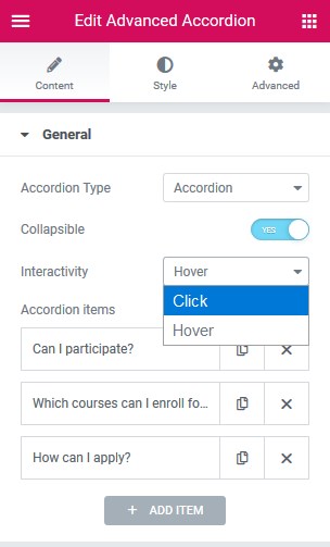
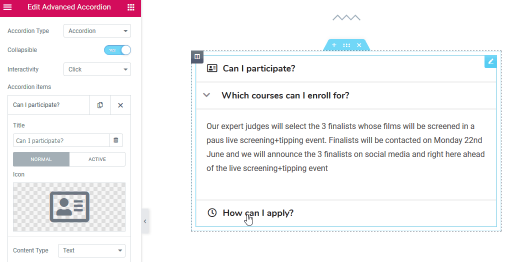
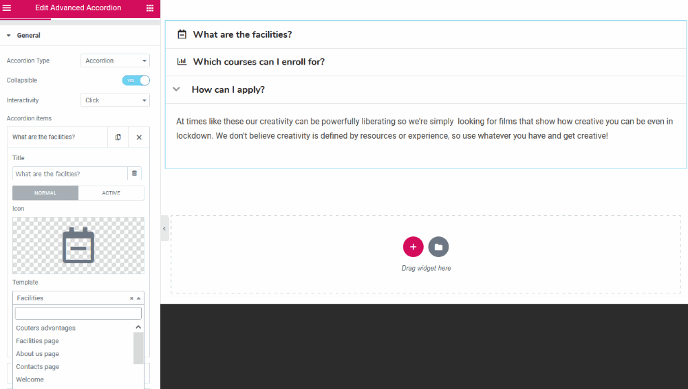
General Features of the Advanced Accordion Widget for Elementor
General
- Accordion type (can be collapsible)
- Toggle type (all tabs can be opened at the same time)
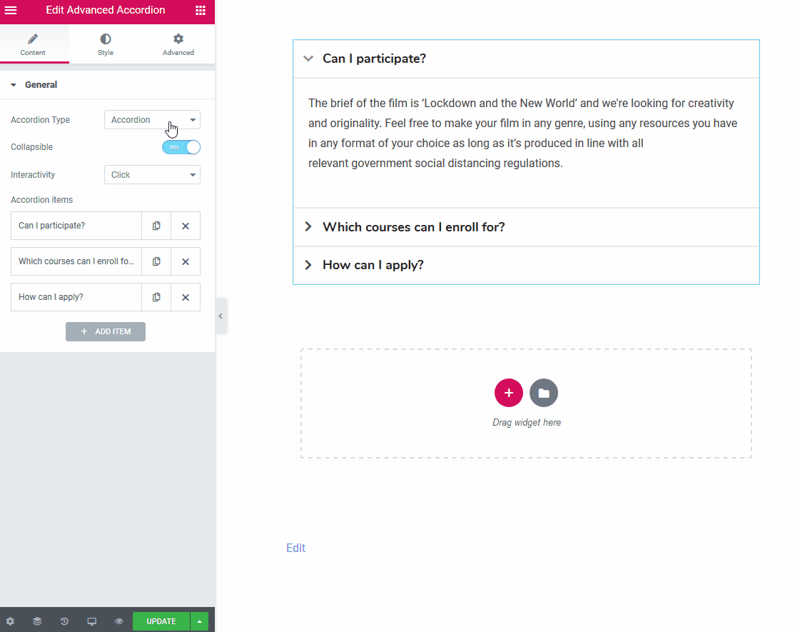
- Interactivity (the tabs are triggered either on hover or when clicked)
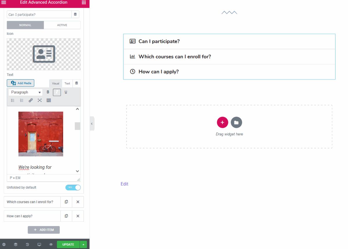
You are free to customize each element of the accordion item:
- Set a title
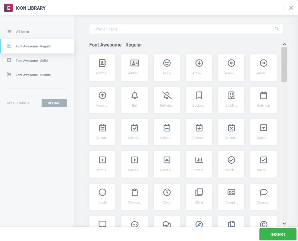
- Select icons, either from the library or upload your own ones in SVG:
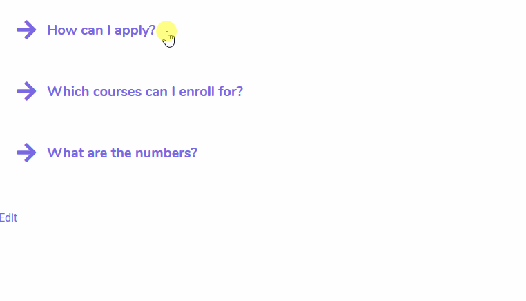
You can set different icons for both folded and unfolded accordion items. If you don’t set any, the Expand icon is used by default:
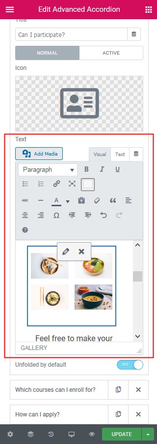
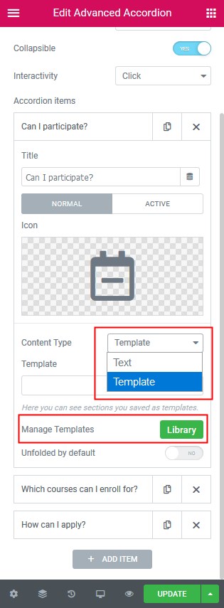
- A text or custom template you saved in Elementor Template Library can serve as the content of the Accordion items.
Opting for text, you can add and format text and images:
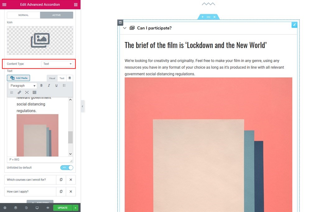 |  |
Default WordPress formatting options are available for the text content type:
You can leave any item unfolded by default.
Manually Curated Posts for You
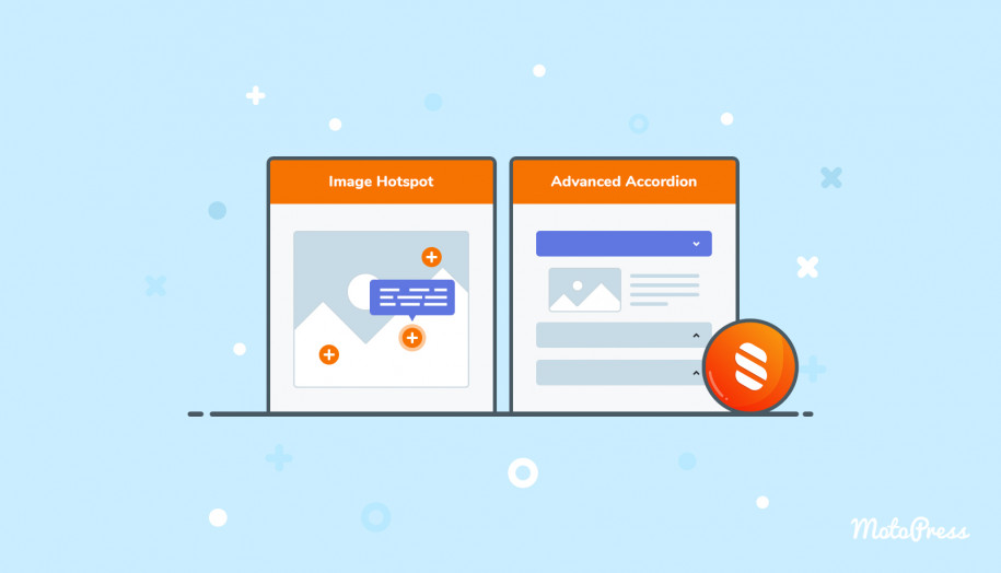
If you want to insert the entire premade sections, you can choose the “Template” content type and add your own or theme-sourced templates into the needed accordion tabs:
For example, this is how I interested an image hotspot, which was saved as a template, into the tab:
Styling the Accordion Elementor widget
General style
- By setting up the equal container height, the tab containers will be of the same height regardless of the content size (the size of each container is automatically adjusted to the biggest content container)
- Spacing between accordion items:
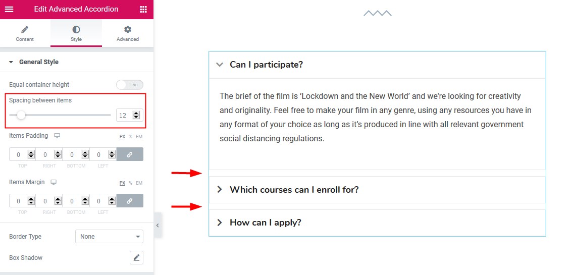
- Paddings and margins to reach the needed alignment and spacing
- Items’ border with the customizable width, color, radius, and shadow.
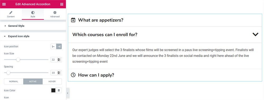
The expand icon style
- Icon position (left or right)
- The icon size and space can be customized for the normal, active, and hover modes.
Header style
- Change the text alignment
- Customize typography
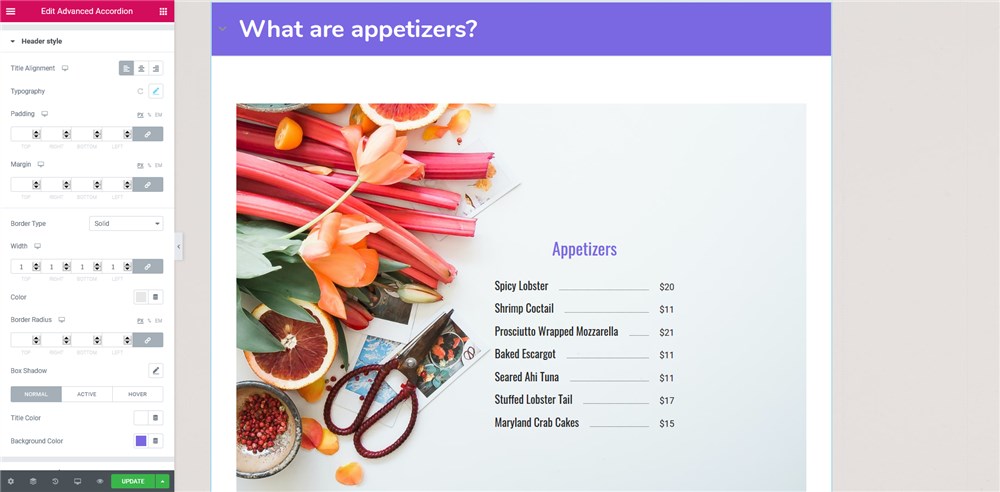
- Set up paddings and margins
- Change border type and color
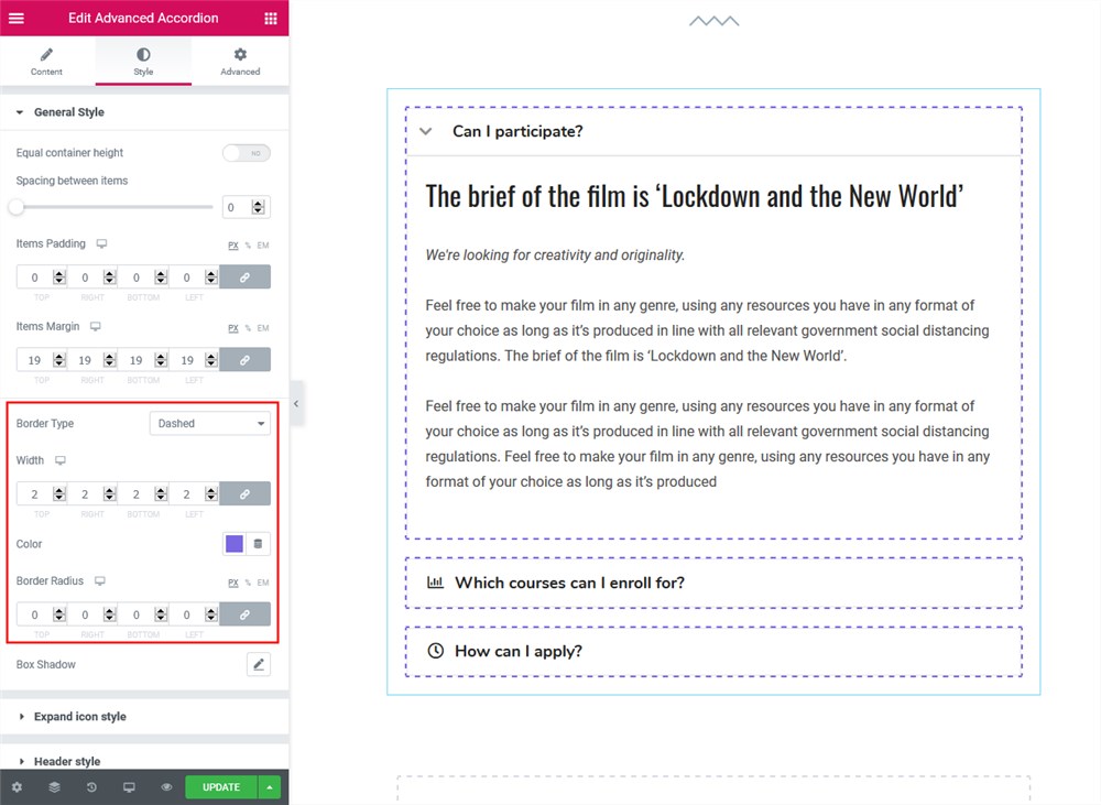
- Add Box shadow
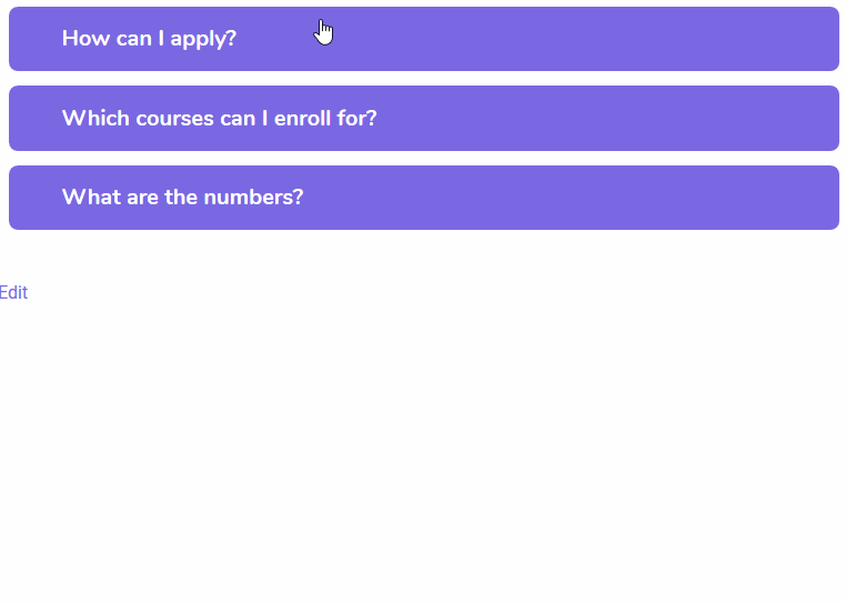
- Customize the title and background colors like in these Elementor accordion tabs:
 |  |
You can make the needed Elementor toggle widget open by default.
Content area style
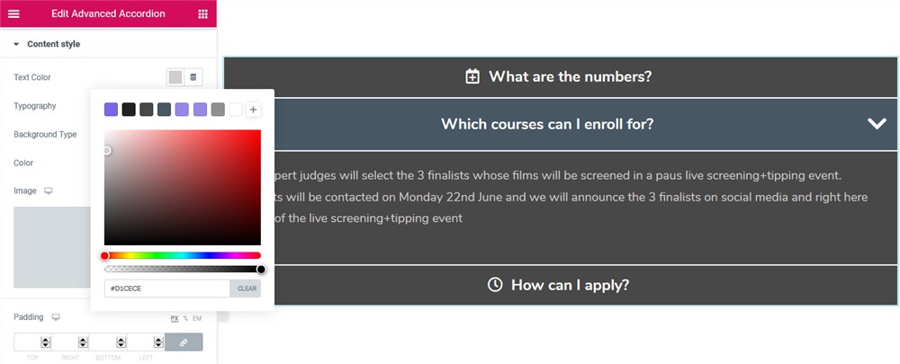
- Text color and typography
- Background color or image
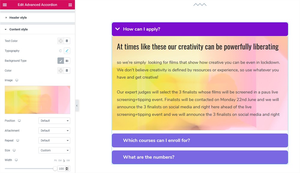
- Paddings and margins
- Border type and color
- Box shadow.
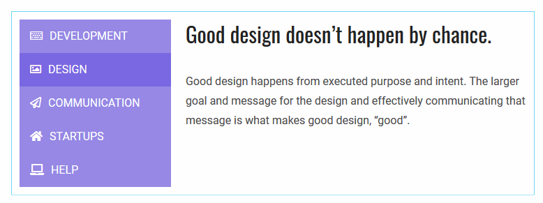
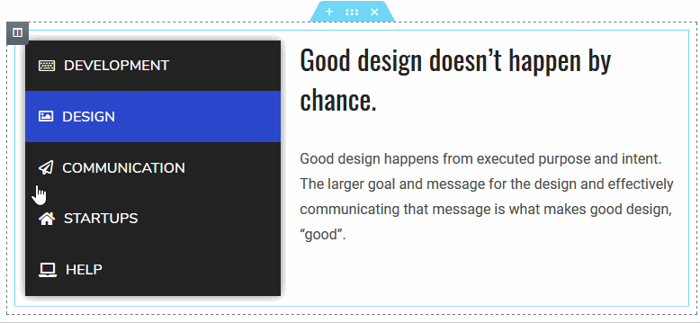
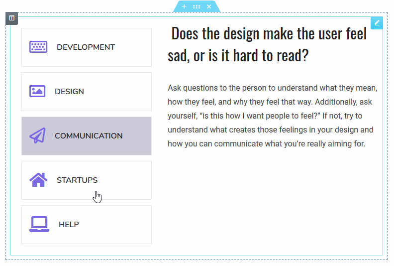
The Advanced Tabs Elementor Widget by Stratum
The Advanced Tabs Elementor WordPress widget allows you to feature content via tabbed widgets. Just like the Stratum Elemenor Accordion widget, it can work with both simple contents and saved templates. The widget supports both horizontal and vertical-oriented tabs.
General settings
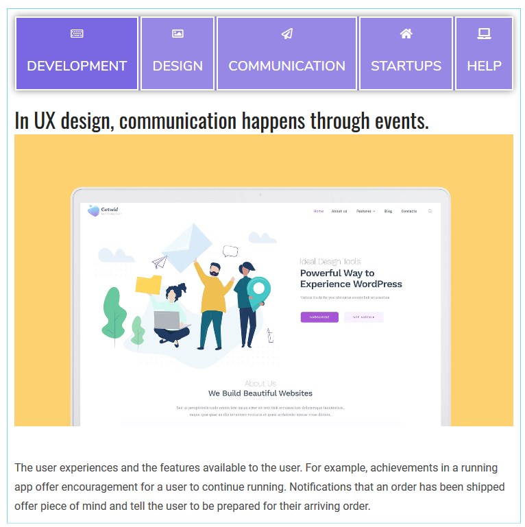
- Tab layout (vertical, horizontal or an icon box)
- Interactivity (hover or click).
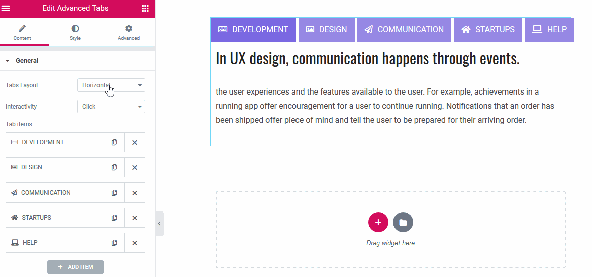
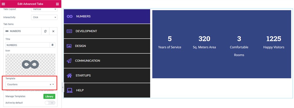
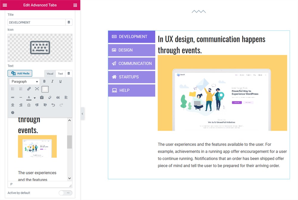
To add content to tabs, you can use either a default WordPress formatting tool, including the ability to upload images, or insert your custom templates from the Elementor Library.
The templates are sourced by either your theme or custom-created templates. For example, here is a theme-sourced section:
Tab icons are optional:
Styling the Advanced Tabs Widget for Elementor
Navigation panel style
- Tab width
- Spacing between tabs
- Tabs on the left or the right
- Tabs alignment with respect to active content
- Paddings and margins to set the alignment between the tabs and content
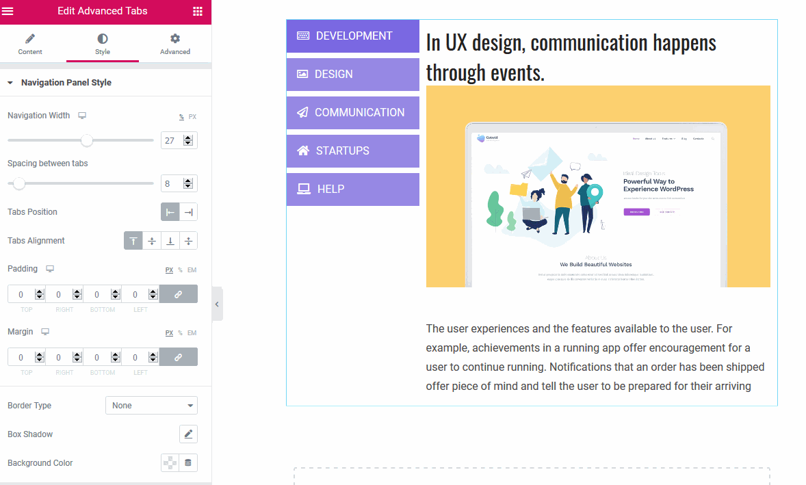
- Box shadow
- Background color.
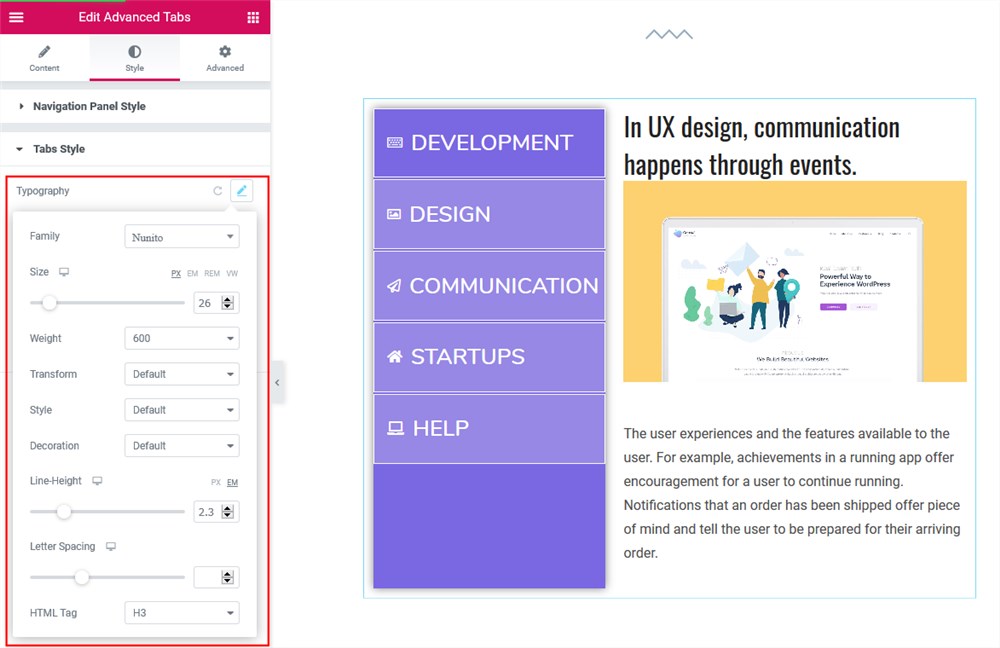
Tabs style
You can change:
- Typography
- Paddings and margins
- Borders
- Box shadow
 |  |
- Title and background color for each box mode (normal, active, and on hover)
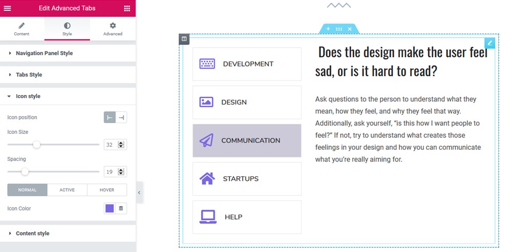
Icon style
- Left or right icon position
- Icon size
- Spacing between icons
- Colors for the normal, active, and hover modes.
Content style
You have a good chance of options here, including:
- Content animation (slide or fade)
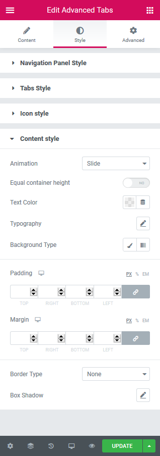 |  |
- Equal content height
- Typography
- Text and background color (color, image, or gradient)
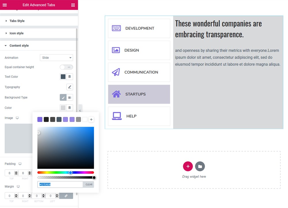
- Paddings and margins
- Border and box shadow.
Download Advanced Tabs & Accordion Elementor Widgets by Stratum
The Elementor Accordion and Tabs widgets give you an instrument to create advance tabs & tabbed layouts to support and empower user experiences across the website. And these easily styled Elementor tab widgets are just one click away:
What is Stratum?
- A free collection of 24+ Elementor widgets (Sliders, Google Maps, Instagram, Pricing Tables);
- A decent alternative to Elementor PRO;
- A flexible tool for pro users (advanced design toolchain) and easy-to-use for beginners (visual customization);
- Integrates with the Elementor template library.
Stratum Free Elementor Widgets Download
View Stratum demo designs here.
After the installation, don’t forget to check Stratum Pro – the extended version of our favorite addon with extra visual effects to go for. With the premium Elementor Addons pack, you will unlock a few exclusive meant for deep widget customization. In particular, you will access the ability to change the content type (image & video instead of just text) for the Accordion & Tabs widgets.
Take advantage of the entire Stratum spectrum of options for an annual price of $19 only! The Pro features will be included directly in your currently installed free Stratum addon – no hassle at all.
Also on Gutenberg? Make sure to check out Getwid – the biggest library of free WordPress blocks.