Twenty Twenty Theme: Blog Better with the WordPress Default Theme
Table of Contents
The Twenty Twenty WordPress default theme is used by casual and hardcore WordPressers from across the web. The main purpose of this theme is to show the power of Gutenberg blocks and help you get used to the new editing experience in WordPress easier. In this WordPress Twenty Twenty theme tutorial, you’ll learn about the features and see how to customize the theme.
It perfectly integrates with the new features and opportunities of Gutenberg and is 100% suitable for creative projects and blogs.
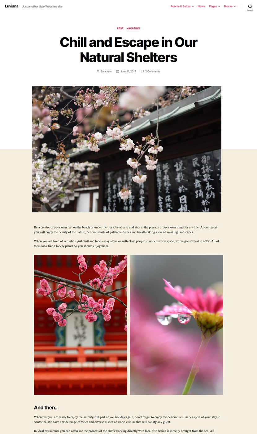
It’s much more exciting to write and build content using blocks and the process is quite smooth in Twenty Twenty. But when you need to go any further, the theme doesn’t even allow you to remove the page title without extra plugins or CSS tweaks…
Since Twenty Twenty solely relies on Gutenberg, it can’t be scaled and customized to the extent proprietary page builders like Elementor provide. Any software is apt to have its limits. Gutenberg is not an exception (at least for now). That’s why the whole new market of Gutenberg add-ons is thriving.
That said, Gutenberg is not unreliable for more complex customization needs but with extra block libraries, you can do so much better.
To fully embrace the Block Editor while working with Twenty Twenty, we’ll show you how to use our plugin, Getwid Gutenberg blocks, to enrich your customization workflow.
WordPress default themes are usually made and used for blogging, we all know that. But you’ll be utterly surprised to see to what extent Twenty Twenty can be modified with a few more blocks and template designs!
Twenty Twenty Theme Review
If you are here still weighing out whether the default WordPress Twenty Twenty theme is a good choice for your next project, let’s highlight its pros and cons first.
The pros of the Twenty Twenty theme:
- It allows you to give your content a more bold and organized look thanks to a sober and slick design
- The theme uses the Inter variable font, which means there is one file with all font variations of a type family (regular, bold, Italics, etc.)
- Perfect readability thanks to a good color contrast
- Default, full-width, and cover page templates for posts and pages to give a choice of out-of-the-box layouts
- Quite handy theme options
- A trump-card of the theme is its fancy cover template with the customizable opacity, which is a Twenty Twenty header image
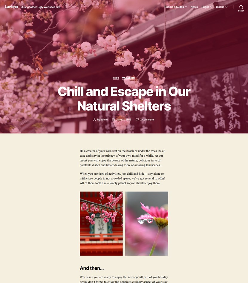
- A good choice of menu styles and locations
- Looks well on mobile devices, including social media links.
The cons of the Twenty Twenty theme:
- Limited WordPress Customizer settings
- No empty canvas template to build your own layout from scratch (no easy way to delete a post or page title to build landing pages or other types of pages from scratch.)
- Only a few pre-built pages are not enough even for a starter website (if you are switching from another WordPress theme, you won’t have access to demo content).
The absence of a sidebar in Twenty Twenty could fit into both categories – it depends on your needs whether it’s an advantage or the disadvantage of the latest WordPress default theme.
By the way, you can find all the needed recommendations in WordPress Twenty Twenty documentation (references to the appropriate size for images, logos, widget areas, etc.) to give your website a more professional look.
We’ll show you that with a little extra help from the Getwid Gutenberg add-on, Twenty Twenty can be even more awesome at landing pages, art projects, business cards, portfolios, etc. You’ll see that with the right tool, there is little you can’t do in Gutenberg.
Although the list of perks of Getwid can be really long, let’s cut it down to the essentials. There are three areas of focus in Getwid Blocks:
- The unbeatable choice of diverse content elements (40 Gutenberg blocks)
- Pre-made layouts of semantic blocks/pages like testimonials, hero, calls-to-action, etc. that automatically blend with the design of your WP theme (in our case, with Twenty Twenty)
- Built with performance in mind to help you create a sustainable and fast website without sacrificing creative and bold design ideas.
The Following 2020 Theme Examples Are Created with Getwid Blocks
So let’s have a look inside and show you some WordPress 2020 theme examples and look at some Twenty Twenty theme tweaks.
Customize Twenty Twenty Theme Using Pre-made Layouts
Although extra attention was given to the Columns and Groups blocks in Twenty Twenty for building marketing-focused layouts, it’s still not flexible enough for complex challenges.
Getwid gives you a ton more options to build more vibrant and tailored layouts.
Build Hero and Sub-hero Section in Clicks
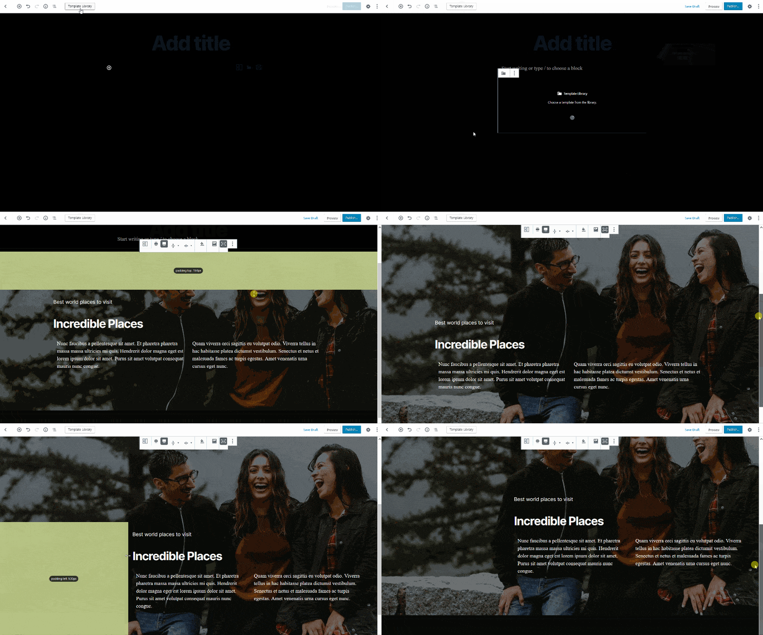
For example, you can start with a ready-to-go layout from the Template Library (there are a few solutions for this category).
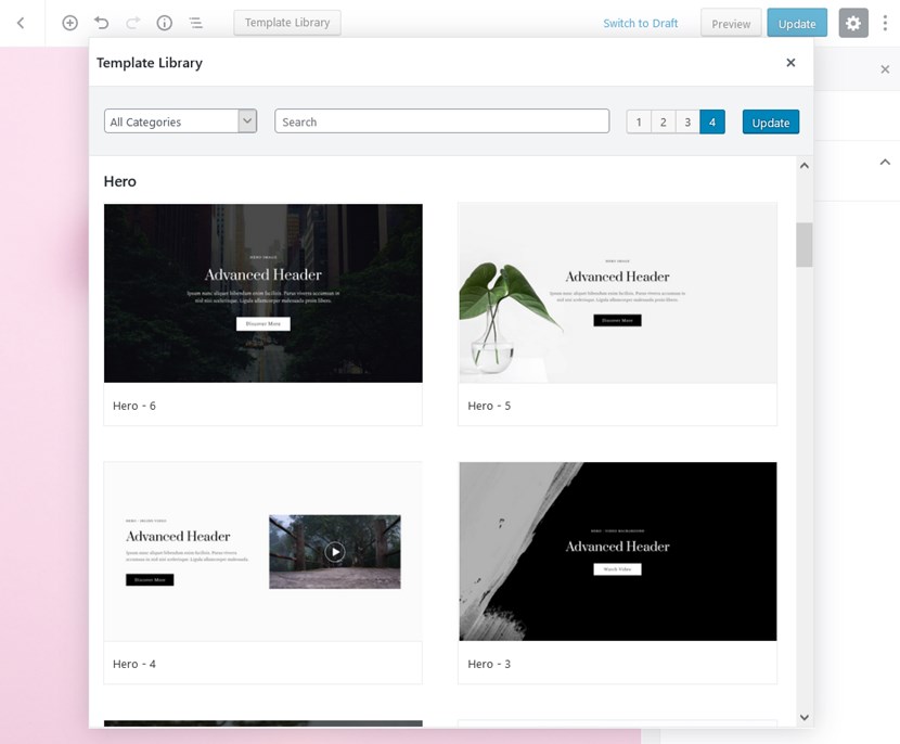
You just need to pick the needed layout, insert it and start replacing sample content. Let’s check some WordPress 2020 theme examples with Getwid templates:
- Text blocks with an image or video alongside
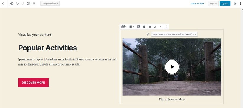
- Video in background
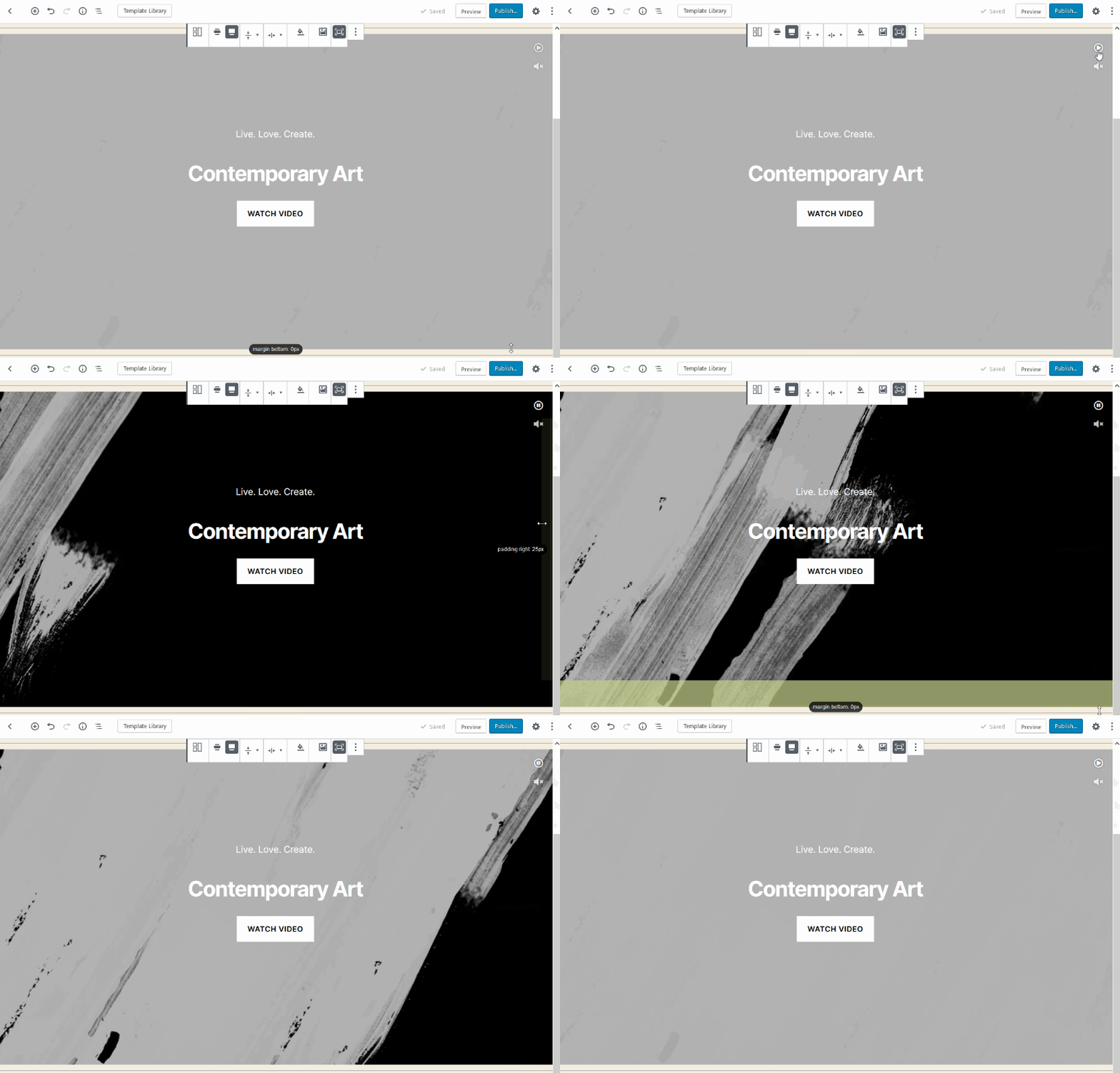
- Accent on the key message or story
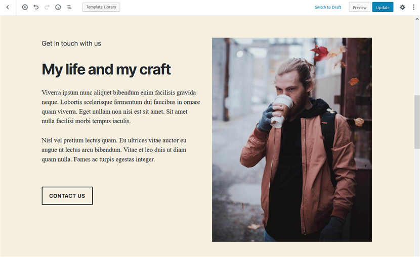
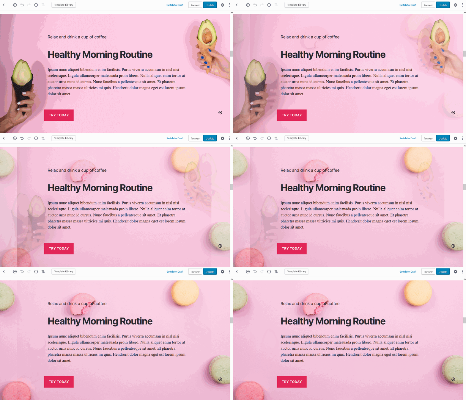
- You can also add a slider on the background with the Section block.
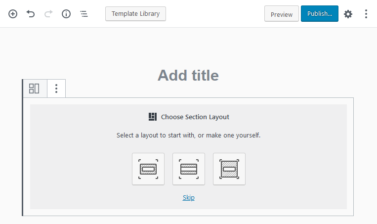
Almost all templates in the Template Library are created with the Section Getwid block as the most advanced and feature-rich parent container. You can play with it as you wish starting with a blank block or start with the already pre-built sections from the library.
The updated UX of Getwid allows you to easily navigate through the settings to change design, buttons, backgrounds, and more.
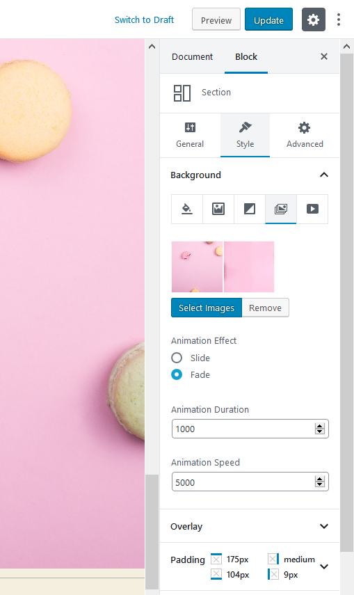
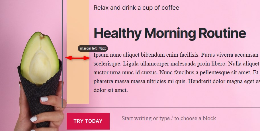
Don’t worry about the spacing, Getwid allows you to easily handle it in a preferable way:
- By adding custom spaces between simple blocks with the Spacer block.
- By editing the Section block paddings (inner spaces) and margins (outer spaces) with draggable controls.
- By editing spacing for the Section blocks inside a parent Section block.
Getwid also allows you to go with any website width to create a suitable layout for the preferable Twenty Twenty template.
Add Call-to-action Sections with Buttons
The plugin comes with a set of call-to-action sections, which you can insert and customize in real-time: 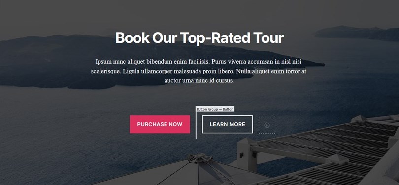
Let’s add a bit of the WordPress theme Twenty Twenty style by changing opacity color and buttons of the section:
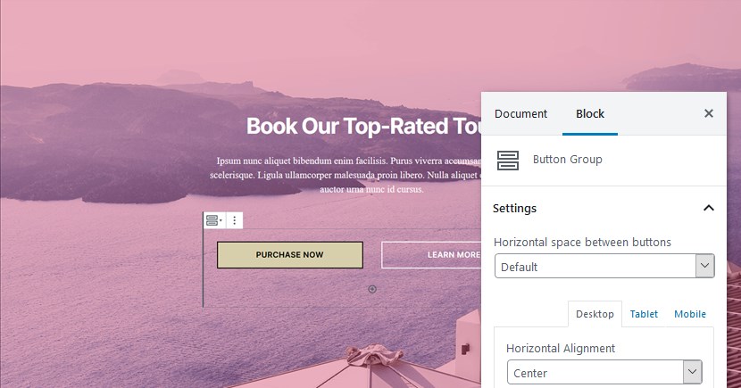
You are free to create landing pages for any type of project with bold and dynamic layouts with animation, perfectly structured services, image galleries, portfolio items, videos, etc.
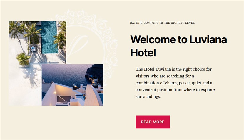
Combine Getwid Gutenberg blocks for any bold idea:
- Sliders on custom backgrounds
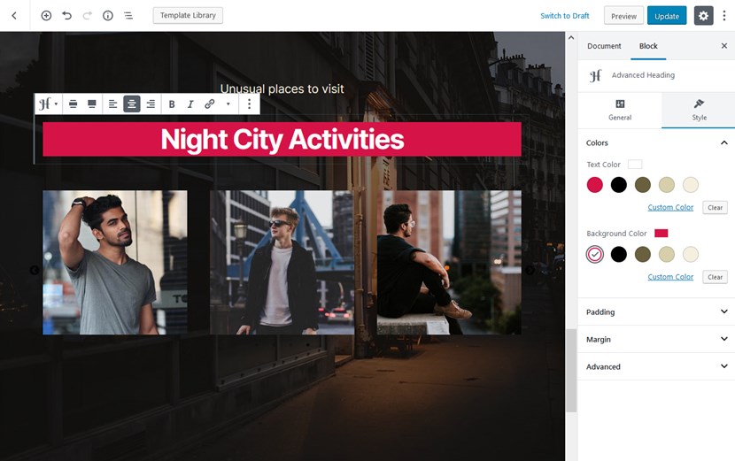
- Portfolios can be created with a combination of different blocks
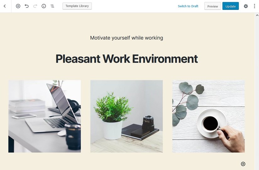
- Add dividers to create a more fancy look:
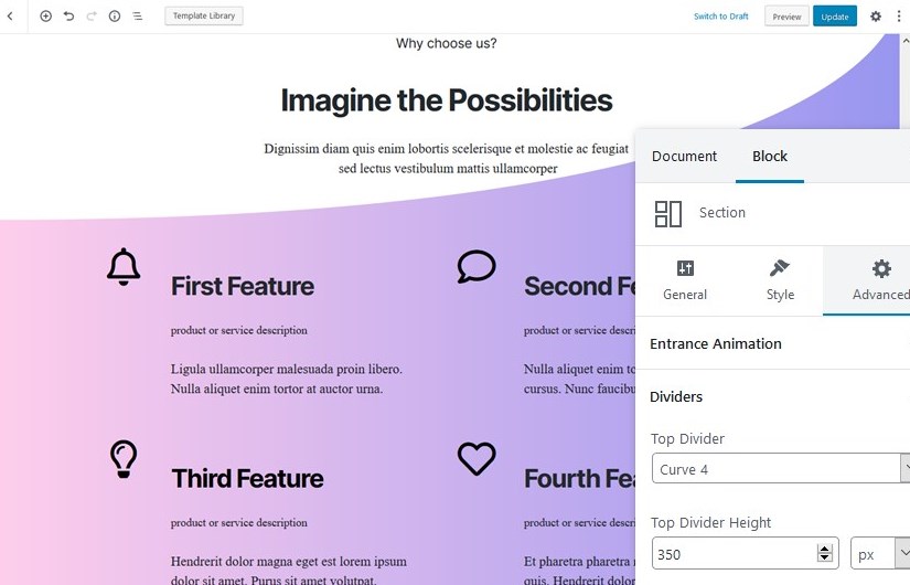
There is (almost) no limit to what you can create with Getwid – it’s super block-rich and flexible in terms of adjusting individual content elements. Just perfect for the landing pages.
Build Grid-style Blog Posts Showcase and Archives in Twenty Twenty
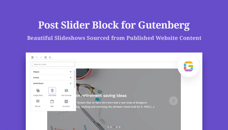
Getwid is probably one of the most powerful Gutenberg add-ons when it comes to featuring posts and custom post types. It comes with several post-dedicated blocks that allow you to create slides, grids, and lists of post and custom post types automatically sourced from your website data. You may feature the latest posts on the front page, inside the post to promote other articles, or showcase them anywhere.
You can go a minimalist view and create a post archive page for your photography pages, portfolio, blog posts, or whatever. For example, going with a custom post template, you can create a stylish grid for your archives, posts, or portfolio items:
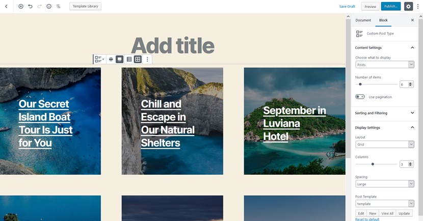
Getwid block: Custom Post Type
Settings: Page: full-width, Layout: grid; Column: 3, spacing: large, Custom template: image in background.
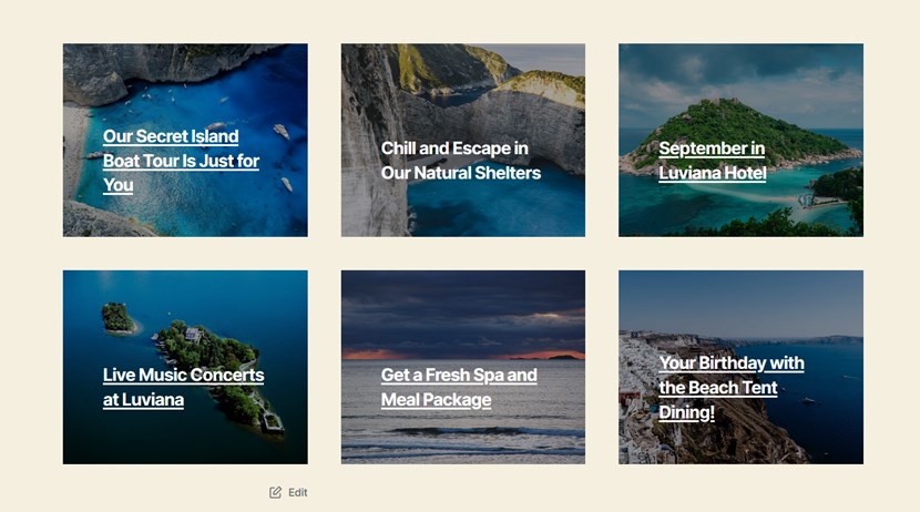
There are numerous spacing, alignment, and foreground settings allowing you to completely alter the look of your posts. You can even create your own template to display your posts:
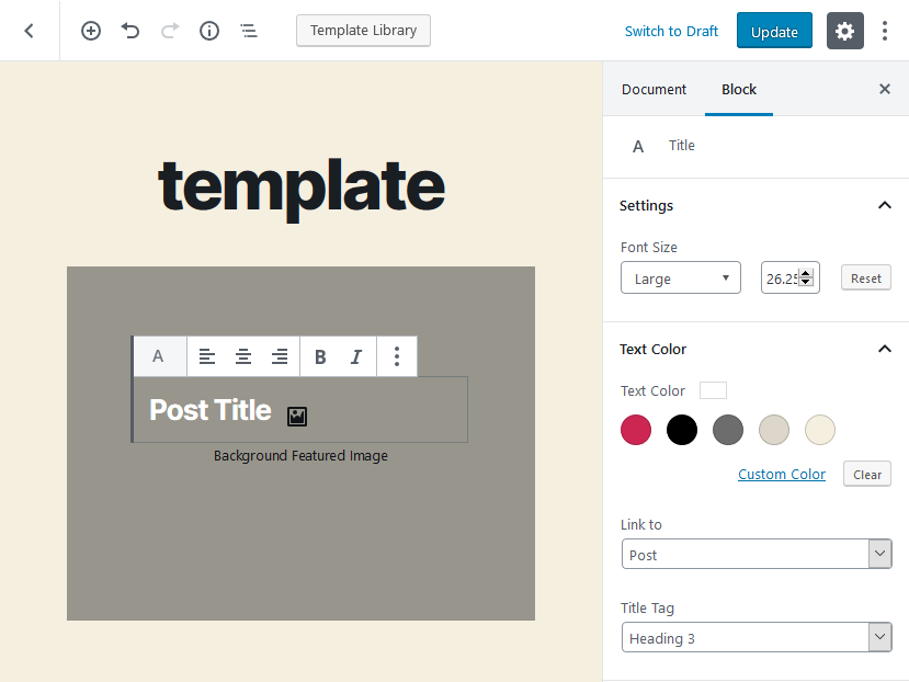
Just pick the layout, fill it in with the needed elements and output on the website. For example, the Recent Posts block in a list format:
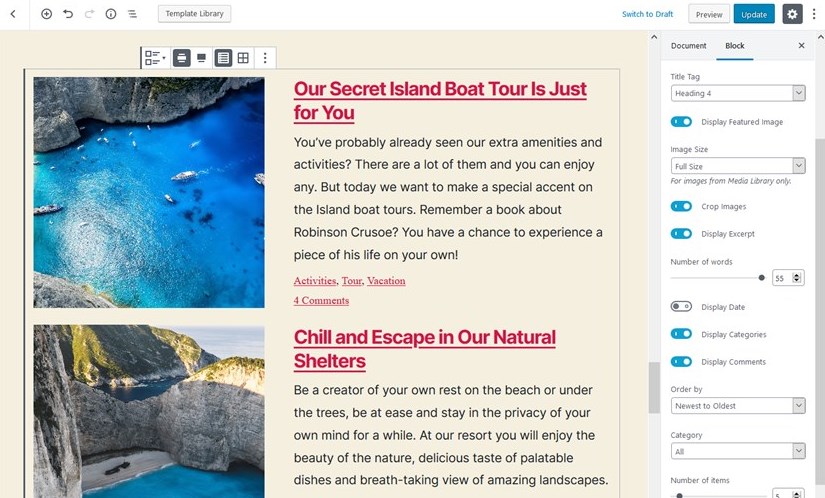
Pull Image Galleries
There are a few blocks that allow you to organize linked or unlinked images. The Image Stack Gallery is among the most interesting blocks; it is bunched with several fancy layouts. You’ll only need to upload your images and select the layout style that fits your website best.
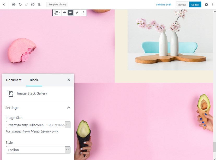
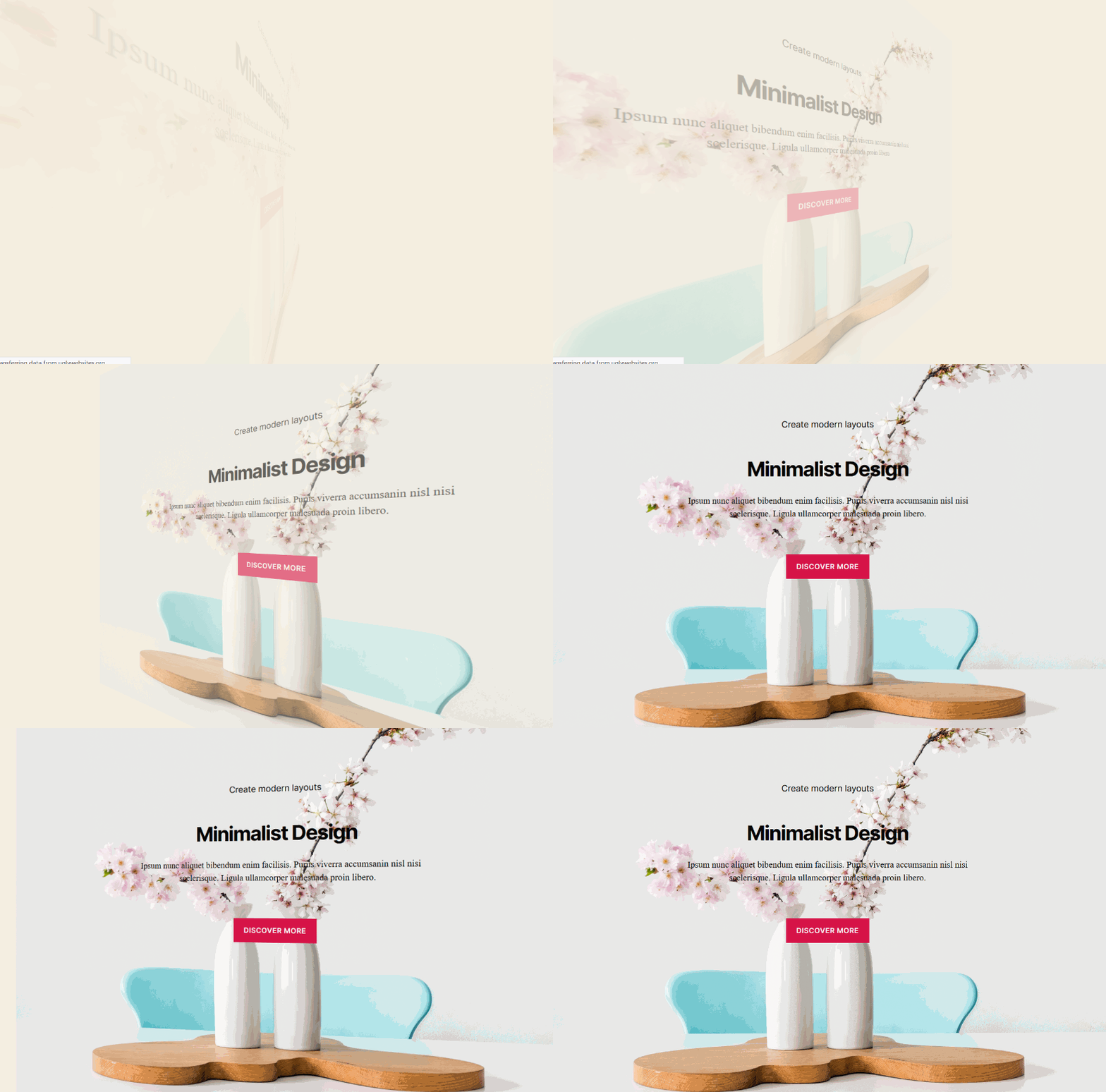
Create More Dynamic Layouts With Animation
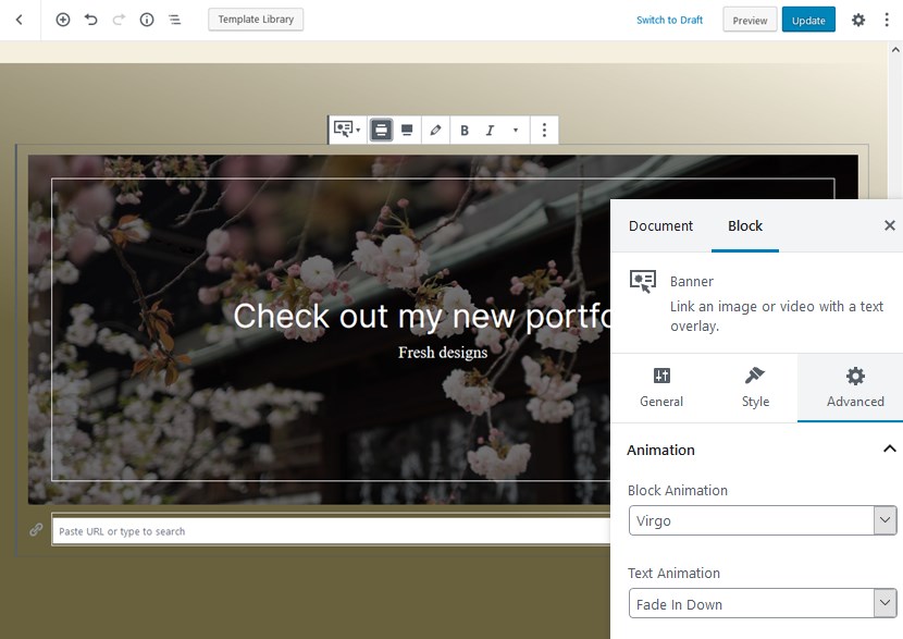
You can add animation effects to animate Sections blocks (which can be both small and big) or sections inside sections.
Add Dedicated Content
Since Getwid is aimed to be an all-in-one solution for the most common website pages, you’ll find blocks and pre-made pages for tailored needs, for example:
- Pricing tables (let’s use default Twenty Twenty colors)
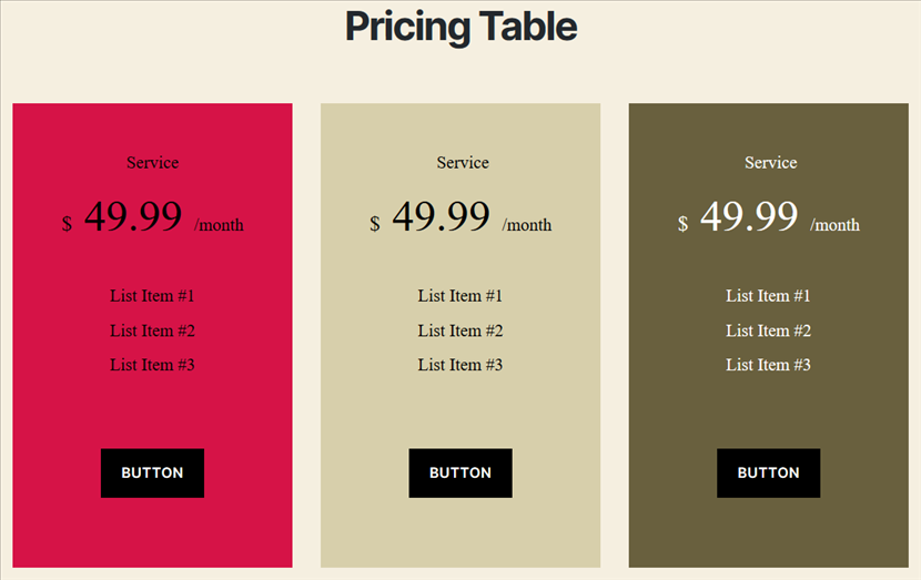
- Pricing lists
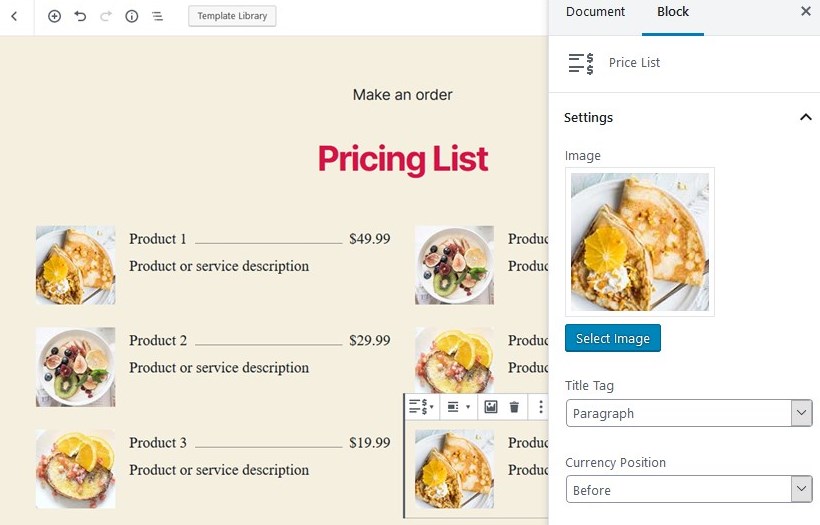
Play with it as you want:
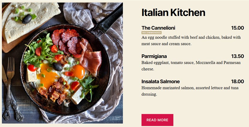
- Promo banners or just animated blocks to catch people’s attention
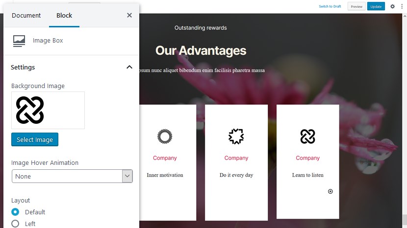
- Create sections showcasing your services with icons (Image Box block) and descriptions or optionally upload your images.
- Structure data with tabs and toggles.
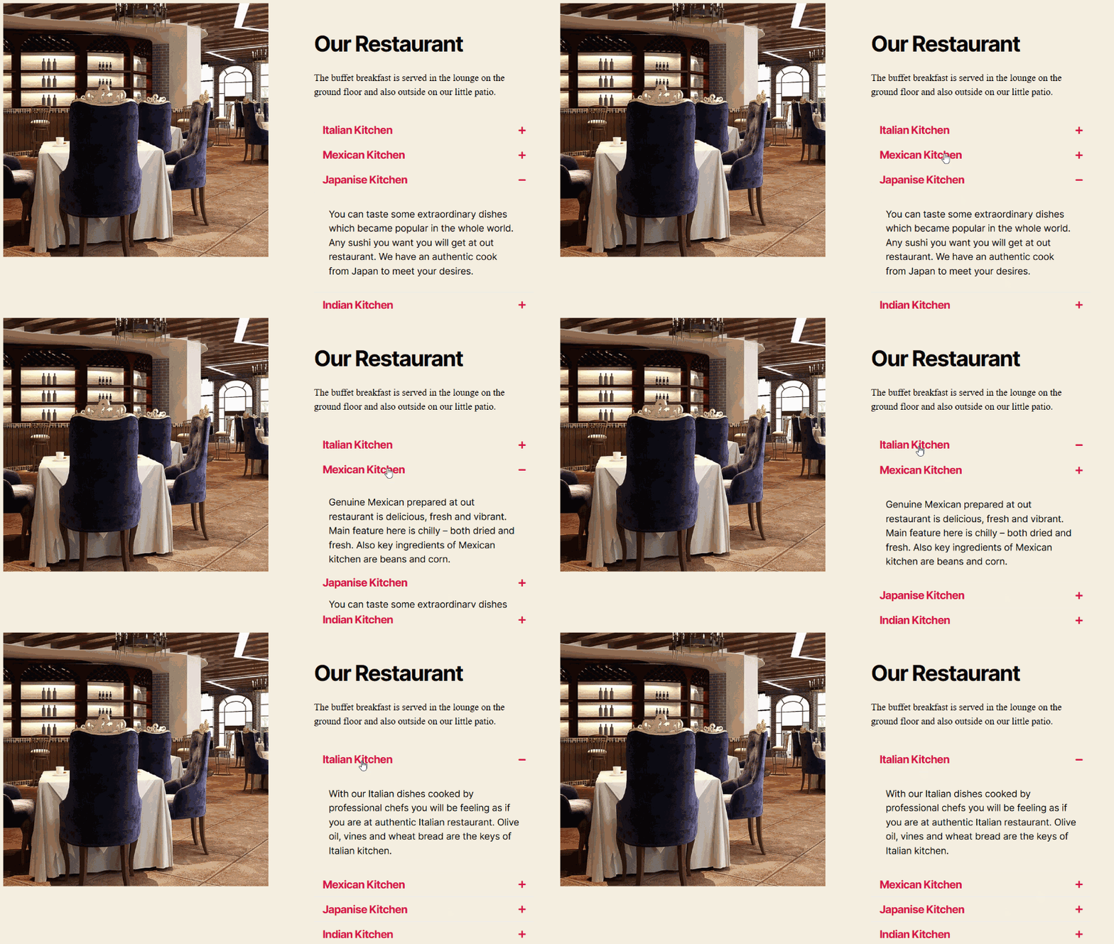
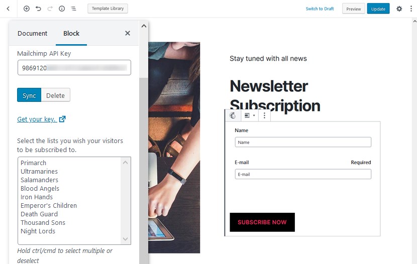
- Connect Mailchimp and output a subscription widget (you don’t really need any extra plugins to do it).
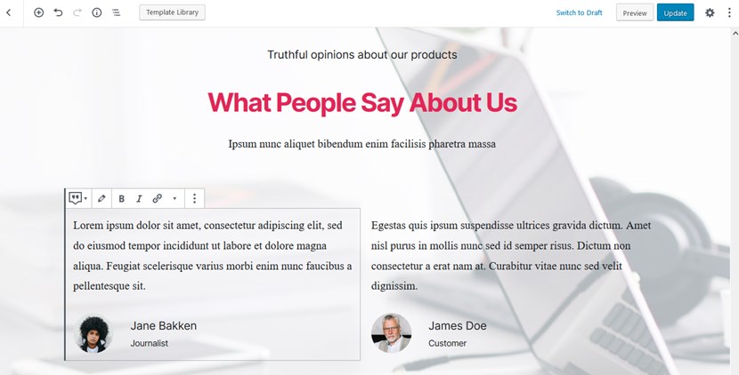
- Showcase testimonials (added by the website administrator)
- Pre-built contact pages.
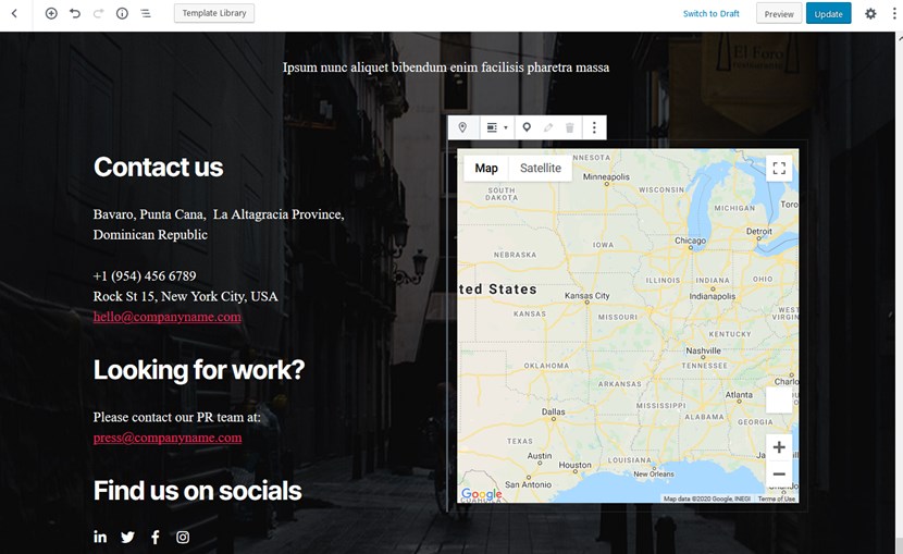
Thanks to the blocks that provide third-party integration with popular services, there is no need to install more plugins and rely on more providers. You get almost all basic and common tools with Getwid in one plugin (so forget about the Classic Editor plugin).
In the Twenty Twenty WordPress default theme, almost all blocks look great out of the box so you have a little left to do – pick colors, add images and play with layouts. If you want to get more details about each block, there are to-the-point guides.
Conclusion: Build Better in WordPress Twenty Twenty with Getwid
Since the 2020 theme is meant to be used with the Block Editor, you have a chance to take full advantage of its awesome design and the modular anatomy of Gutenberg blocks.
The Twenty Twenty theme surely works for blog-centric websites out of the box but paired with Getwid, the whole process becomes not just less stressful but even fun! Not to mention the complex types of pages and layouts you’ll be able to construct for multiple projects.
Building with Gutenberg feels better with Getwid – give it a try (the plugin is free) and share your feedback.
For which type of site can I use Twenty Twenty?
What page layouts are available in Twenty Twenty?
How to speed up my work with the Twenty Twenty theme?
