Awesome Wedding Website Examples Packed with Features and Style
Table of Contents
A well-crafted wedding website can set the tone for your big day if you provide guests with all the need-to-know details. With countless designs at your fingertips, the challenge is to find one that perfectly captures the essence of your celebration. Having looked through dozens of websites, we’re eager to share the most inspiring wedding website examples!
The right website will guide guests through everything from venue details to gift registries with ease. Let’s explore these examples to create a website that makes the planning process a breeze!
15 Best Wedding Website Examples to Inspire from
The featured websites are built with different content management systems: WordPress, Squarespace, Wix, Webflow, etc. Let’s find a website that combines a stunning design and feature-packed functionality!
Humayra and Henri
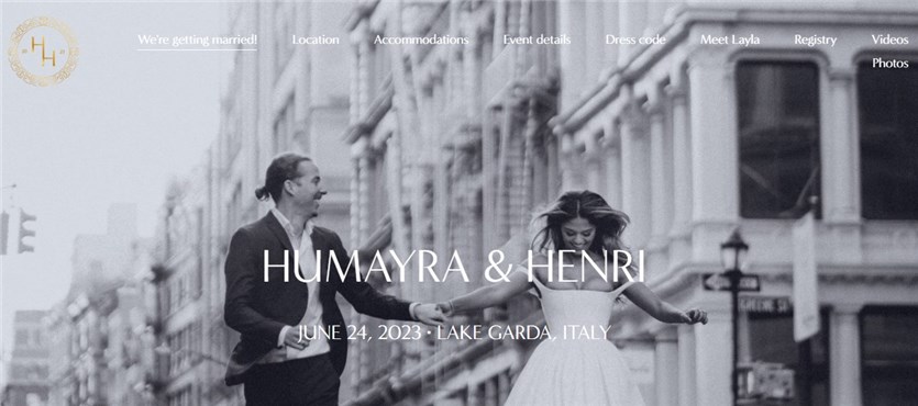
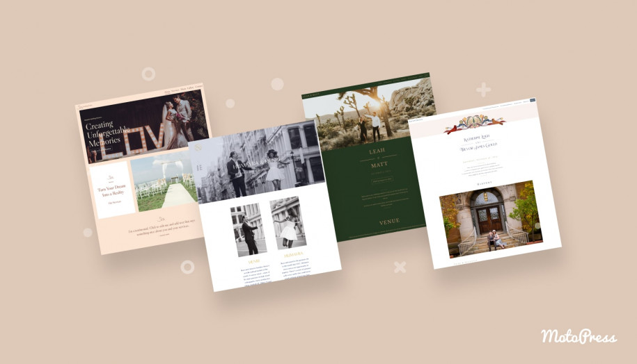
You can take inspiration from Humayra and Henri’s site as one of the trendy love story examples for wedding website. In addition to black-and-white photos and golden fonts, you’ll discover beautiful pages with location, accommodations, event details, and dress code. They’ve even dedicated a page to Layla, their Cavapoo puppy.
What Do We Like Most?
- Detailed information about location;
- A wide range of nearby accommodations;
- Pre-wedding festivities page;
- Limited access to videos and photos from the party and wedding.
Jess & Chris Forevz
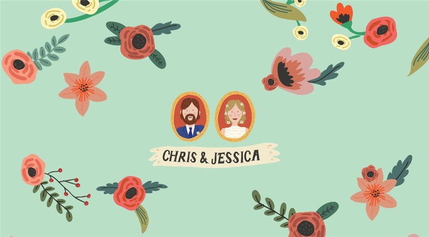
Chris and Jessica chose a creative image for the homepage consisting of cartoonish pictures. Then, you reach one of the best wedding website story examples. Even if you’ve never been to Austin, you might be impressed by how Chris and Jessica invite their friends to join their celebration in a beautiful place and have a nice holiday there.
What Do We Like Most?
- Wedding party section with funny photos;
- Full-sized photos;
- Guidance & recommendations for a trip;
- Links to the venue and accommodation websites.
Kate & Trevor
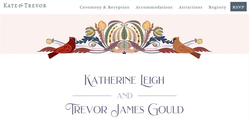
What about romantic love story examples for wedding website? From the first meeting to a proposal, you’ll dive into Kate and Trevor’s story like a novel. Then, a Wedding Announcement button leads you to the invitation page with details and an RSVP button. It’s easy for guests from other towns to book accommodation on a dedicated page.
What Do We Like Most?
- A Pride and Prejudice style in texts and photos;
- Ceremony and reception page with all the details;
- Highlighted attractions in the town;
- A registry page to select gifts or send wishes.
Leah & Matt
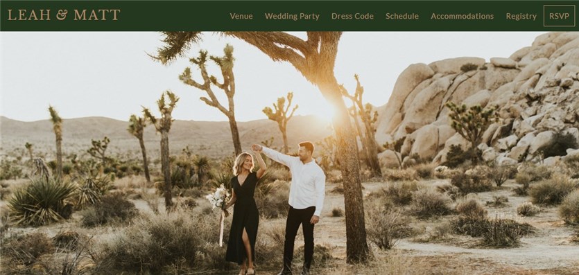
We’ve included this website in the collection of the best wedding website examples thanks to a clear structure, professional photos, and beautiful fonts. It takes a few clicks to explore the main guests of a wedding party, visit a registry list, and find a venue location. Leah and Matt pointed out a dress code for their big day.
What Do We Like Most?
- Inspiring photo on the homepage;
- Color scheme consisting of soft neutral colors;
- Schedule with dates, time slots, and images;
- A discount for booking an accommodation.
Daniela and Moe
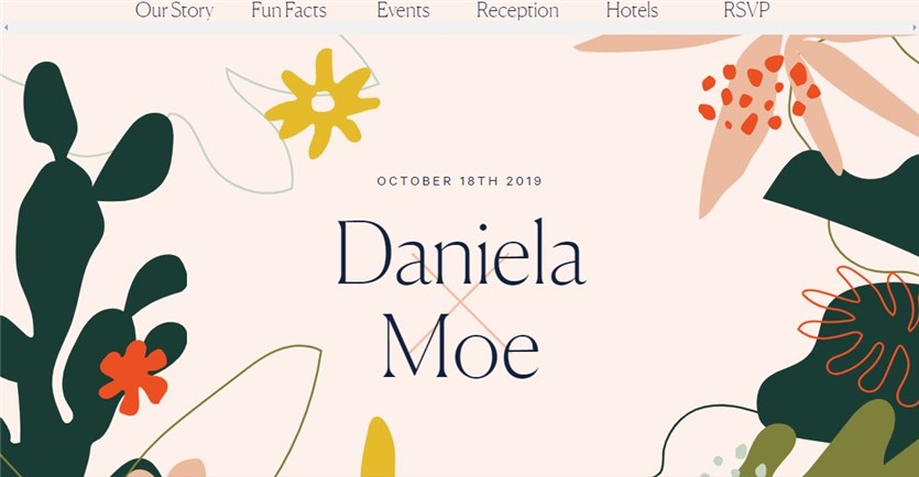
Have you considered wedding website about us examples with fun facts about the couple? Daniela and Moe add interactivity to their website with cards you can hover over to read about their dream house, favorite spots, comfort food, etc. They invite their guests to California for a wedding party and all the weekend events.
What Do We Like Most?
- Creative LA map;
- Detailed schedule with events;
- Accommodation options;
- A comprehensive RSVP form.
Michelle & Tonye
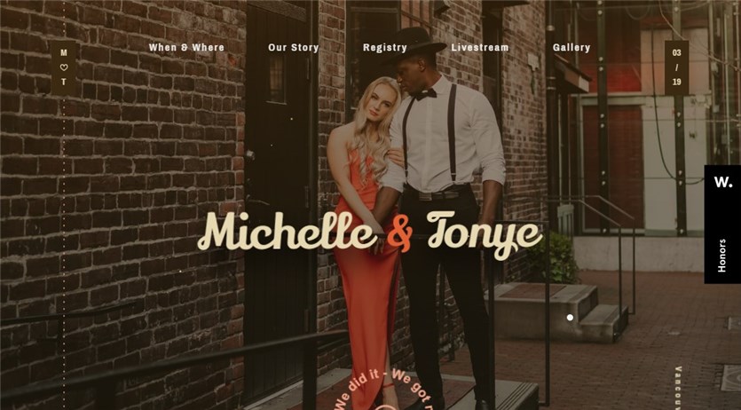
Michelle and Tonye have a website full of animation effects and colorful pictures. You should scroll down to look into the venue location, registry, and gallery of photos. Their story is described in a few sentences. Guests could join a live stream via Zoom when the link was active.
What Do We Like Most?
- Bold and italic fonts;
- Animation effects;
- Eye-catching buttons and content elements.
Mary Jo & Adam
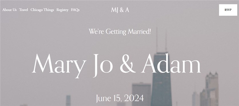
This website features an elegant and minimalist design in light blue and white colors. Made with Squarespace, it includes the main details about the welcome party, ceremony, and reception. The couple adds brief descriptions to each page along with the relevant images. Since there is an FAQs section with 9 points, we’ll consider it one of the top-notch wedding website Q&A examples.
What Do We Like Most?
- Clear structure;
- Page with their favorite things;
- Lodging recommendations;
- Contact info in the footer.
Alex and Bailey
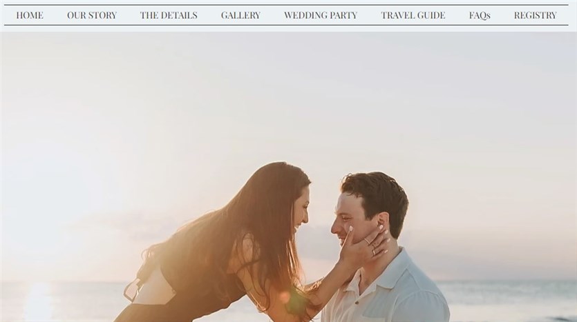
Alex and Bailey take care of everything if you’re looking for our story wedding website examples with all the dates in a timeline. They share not only the event information but also a travel guide. It deals with lodging, transportation, places to eat, and things to do You can get acquainted with guests in advance and find answers to the common questions.
What Do We Like Most?
- Animation effects;
- Wedding registry section;
- Party details;
- Gallery with black-and-white photos.
Alex and Andrew
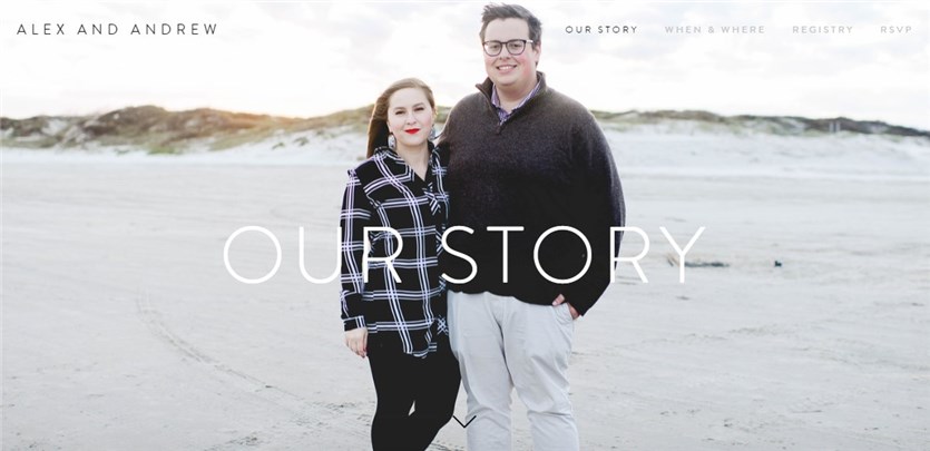
The next site is listed as one of our story on wedding website examples as Alex and Andrew devote the homepage to their love story. They don’t provide much information so as not to distract visitors. If you navigate to other pages, you’ll find details about their wedding and registry. The RSVP form requires a guest’s email, name, and message.
What Do We Like Most?
- Full-sized photos;
- Parallax effects;
- Minimalistic design;
- A full love story with texts and images.
Felicity & Alex
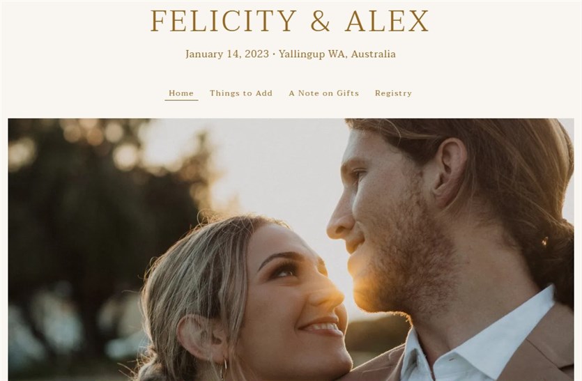
Felicity and Alex use The Know services to create a simple yet modern website to invite guests to their wedding. The homepage covers the event date, place, and photo. Also, they recommend rental accommodation, transport, and recovery drinks. Felicity and Alex warmly ask their guests to prepare the toast and leave their cards in a wishing well.
What Do We Like Most?
- A note on gifts;
- Well-structured wishlist;
- Elegant fonts.
Kaila & Michael
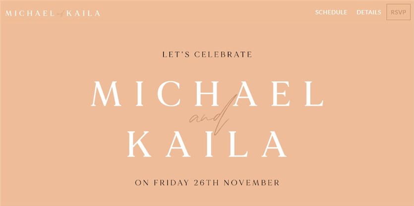
Kaila and Michael have created one of the minimalist wedding website intro examples. It relies on event details, a timeline schedule, and photos. Due to the pandemic, they’ve decided on an intimate event with a bridal party. An RSVP button on the top menu navigates you to the dedicated page. You should fill in your first and last name to confirm your registration.
What Do We Like Most?
- Google Maps section;
- Clear event schedule;
- The ability for guests to choose music;
- Outfit recommendations.
Rush & Danit
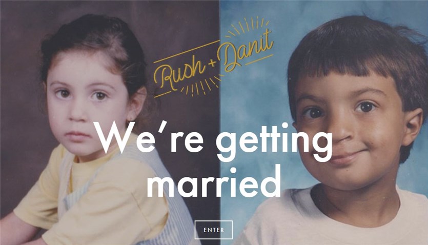
Rush and Danit’s website homepage displays their cute childhood photos, names, and the headline “We’re Getting Married”. Once you click the Enter button, you’ll find the event information. For example, the wedding agenda, location, places to stay in Brooklyn, and more. Rush and Danit tell how it all started adding their funny photos.
What Do We Like Most?
- Agenda with beautiful icons;
- Newsletter subscription form;
- Brooklyn spots page;
- Gift notes.
Sam + DJ
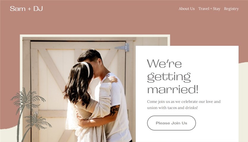
Sam and DJ highlight the main details of their wedding on a vivid website. They’ve added romantic photos to a true Tinder love story. The travel section incorporates flight options and rental accommodations near the venue. The registry page encourages guests to contribute to a honeymoon fund.
What Do We Like Most?
- Pastel colors on all pages;
- The friendly tone of voice;
- Personal touch to headings, fonts, and texts.
Alison Bryan Destinations
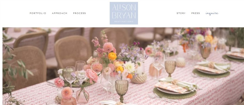
Why does Allison Bryan Destinations belong to the best wedding party website examples? It’s a wedding agency dealing with full-service event planning and multi-day celebrations. Regardless of your location, they can organize your wedding taking into account your preferences, guests, and aesthetics.
What Do We Like Most?
- Links to social media;
- A full approach description;
- A story behind the agency;
- Case portfolio from different venues.
Wonder Events
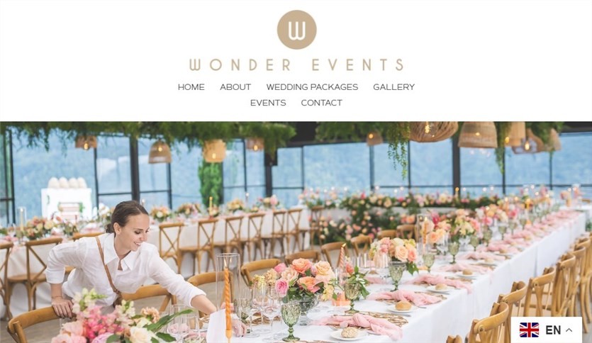
Wonder Events is one of the best wedding website examples for planners and event agencies. Their site sheds light on service packages, organized events, and contact information. A gallery page uncovers the most beautiful wedding ceremonies in various locations. The Wonder Events website is available in English, German, French, Spanish, and Italian.
What Do We Like Most?
- Light color scheme;
- Full-sized images from events;
- Captivating About Us story.
5 Wedding Website Templates for Your Website
Do you need a ready-to-use template to build an online wedding invitation with no hassle? We’ve handpicked solutions for popular content management systems you can get started with. Let’s have a look at them!
Gutenix
| Name | CMS | Price |
|---|---|---|
| Gutenix | WordPress | $69 |
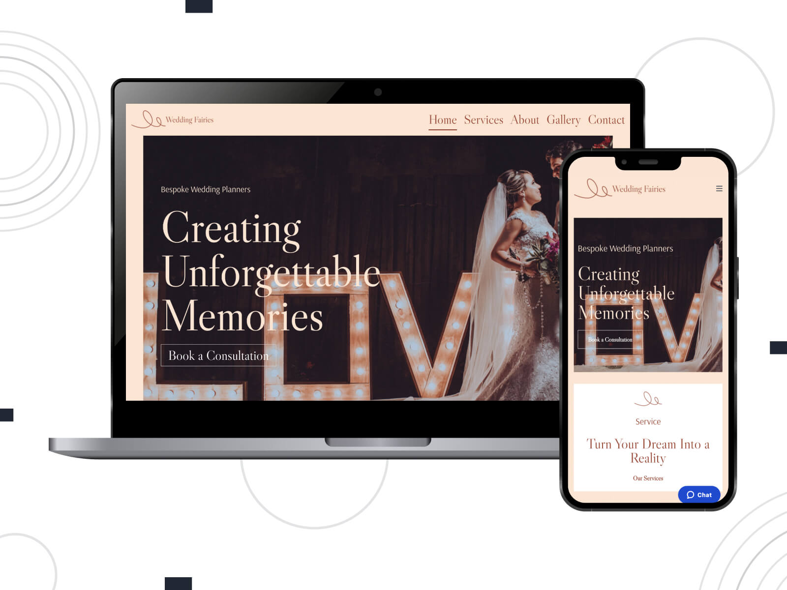
Gutenix is a multipurpose WordPress theme applied to build a website for a wide range of industries. Its package includes a WeddingFairies template designed for wedding invitations and event planning services. Crafted with Brizy, this template ensures visual customization and ready-made pages. You can tailor colors, typography, header, and footer to your needs in a few clicks.
More Features:
- 47+ multipurpose demos;
- One-click demo installation with Gutenix Wizard;
- Hassle-free customization;
- Fast-loading and SEO-optimized templates;
- Flexible layouts.
The Aisle
| Name | CMS | Price |
|---|---|---|
| The Aisle | WordPress | $69 |
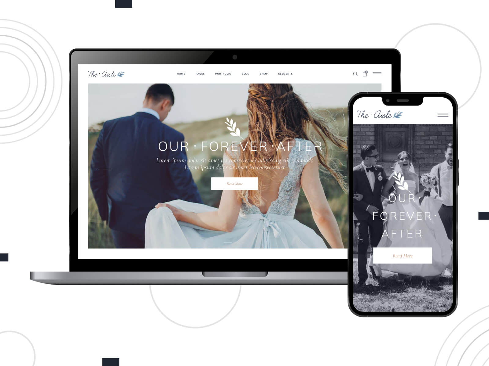
The Aisle delivers attractive website examples compatible with Elementor and WPBakery page builders. Packed with numerous content elements, it allows you to create a wedding announcement, invitations, RSVP pages, galleries, etc. The Aisle involves a set of shortcodes and blog layouts to enhance your website.
More Features:
- Photography and gallery pages;
- WooCommerce-compatible templates;
- Multiple header styles;
- Extensive color and typography options;
- Social media share functionality.
Wedding Theme
| Name | CMS | Price |
|---|---|---|
| Wedding Theme | WordPress | $54 |
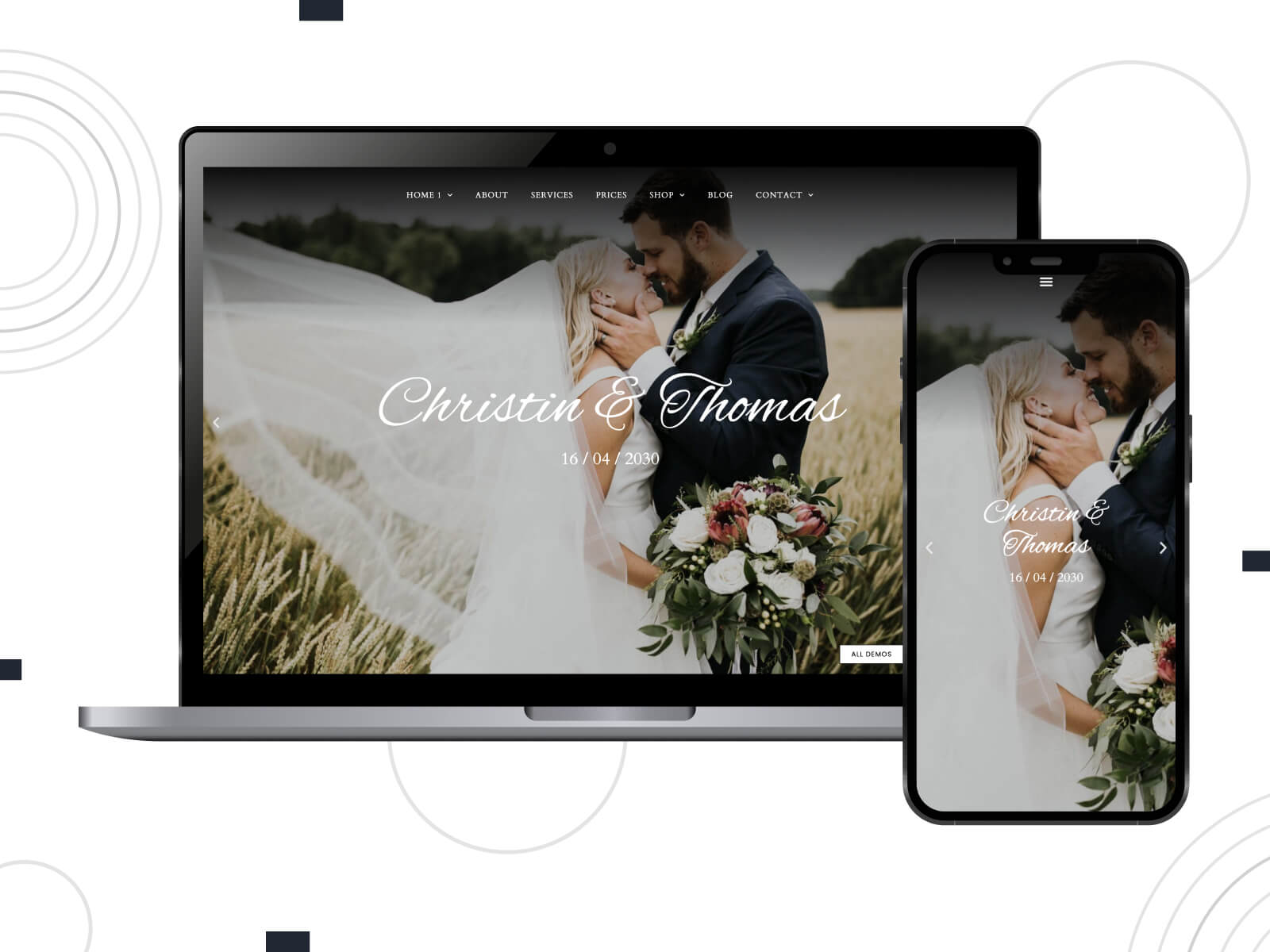
Like other templates from this list, Wedding Theme is geared towards any wedding-related niche. You can import one of the demos and customize pages with Elementor. Also, it equips you with a header & footer builder and flexible style settings. Wedding Theme is compatible with WooCommerce, Contact Form 7, Events Calendar, and more popular WordPress plugins.
More Features:
- Integrated Cost Calculator plugin;
- Shop and registry page templates;
- Included custom forms;
- Multiple gallery styles.
Dario
| Name | CMS | Price |
|---|---|---|
| Dario | Squarespace | $16-$52 per month (Squarespace subscription) |
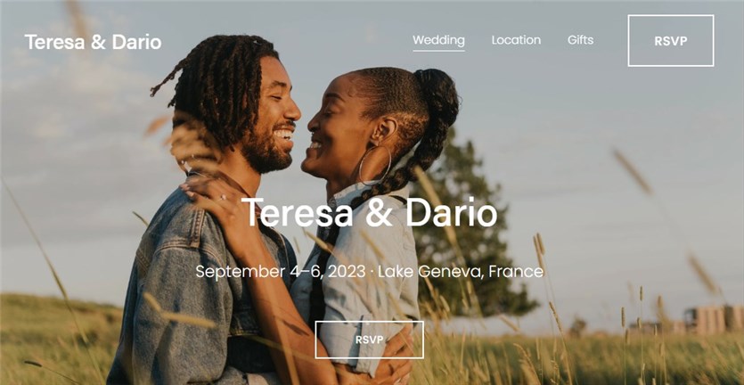
The Dario template comes in handy to build a wedding website powered by Squarespace. It covers the main content elements and customization settings. Start your free trial to get access to color presents and popular templates.
More Features:
- Wedding agenda on a homepage;
- CTA buttons;
- RSVP and Gifts pages.
Wedding Invitation
| Name | CMS | Price |
|---|---|---|
| Wedding Invitation | Wix | $7-$46 per month (Wix subscription) |
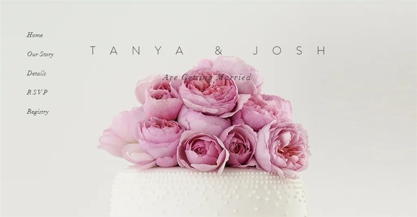
Wedding Invitation by Wix is another example of a flexible wedding website template. Stylish and vivid, it enables you to create a responsive site with multiple sections: Our Story, Event Details, Registry, and RSVP. Upload custom photos and replace texts to announce your wedding.
More Features:
- Beautiful combination of colors;
- Contact Us info in the footer;
- A package of Wix templates;
- A set of extra Wix tools.
Conclusion
So, how to leave your guests counting down the days until your big celebration? Let’s sum up the key elements:
- Keep an eye out for the layout and easy navigation. Guests should find their way around without a hitch.
- A visual style should mirror a wedding theme and color palette.
- High-quality images are a must as a picture is worth a thousand words.
- Include essential information like RSVPs, travel details, and gift registries.
Do you like any of the wedding website examples highlighted above? Share your thoughts in the comments!
Disclosure: this article may contain affiliate links for third-party products. If you click a link and later make a purchase, we may earn an affiliate commission that doesn’t result in additional charges to you.
FAQ
What should be on our wedding website?
What is the best wedding website builder?
Is a wedding website a good idea?
