MotoPress WordPress Slider Version 1.3.3 Released
The MotoPress team has found one extra way to make your website storytelling more visually effective with the new options of the Responsive Slider! The plugin now offers more flexibility of the layout structure such as a full-screen mode that will present the content of your slider in the full browser height or full-size grid. We also made sure it looks awesome on tablets and mobile devices!

Why is this update so important? Today, more and more designers and website owners tend to use full-screen images, videos, or sliders to make a stronger focus on the website idea, brand, team, or whatever presents who you are and what you do. Within the MotoPress slider, you are free to apply this option to any slider type: custom, posts, or WooCommerce one. Take advantage of using this awesome tool by ticking a couple of needed boxes in the Slider settings.
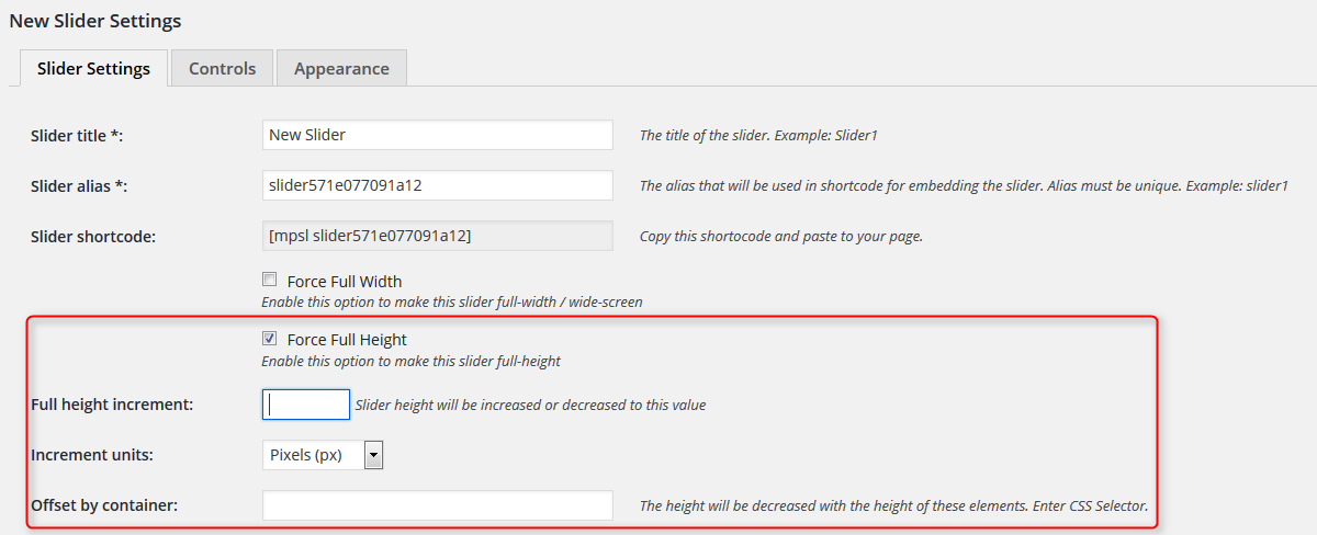
To enable any of the new options, find MotoPress Slider on your WordPress dashboard > choose any of the early added sliders or click Create Slider button. Then go to the Slider shortcode and tick any of the following settings:
- Force Full height.The slider will be adjusted to the full height of the content. You’ll also need to set a full-height increment – simply set the height of the needed content elements to present them in their actual size.

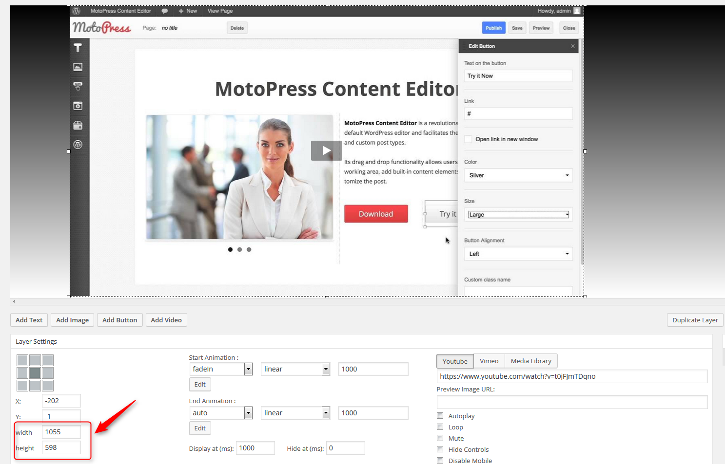
- Force Full size grid. Switch this option on to make grid stretch to parent container. You’ll also need to input Grid width and height to change the initial layer sizes and apply the custom ones.

Note, If you already checked Force Full Width and/or Force Full Height options, the slider will be stretched to screen edges.

We hope that this update will help you feel no limitations and present an idea in a more holistic and insightful way!
