How To Create An Efficient Sales Landing Page In Elementor?
Table of Contents
For this tutorial, we will tell what it takes to create a sales landing page for a business product in Elementor. Also, you will get acquainted with tools that enhance the page builder in terms of website & landing page development.
What Makes a Good Landing Sales Page?
A sales landing page is a one-page website designed to sell a particular product/service.
A good landing page demonstrates the best of your brand and sells your product more effectively. Users come across an online ad, click the link, and get to the landing page. While scrolling the site, they learn more about the product’s benefits, evaluate its quality and get to know its value through social proof. By the end of the site journey, customers are heavily convinced to make a purchase, even they weren’t intended to.
Of course, a good sale page will never work on its own. To ensure effective sales, you’ll need to:
- study the needs of your target audience;
- create a high-quality and demanded product/service;
- obviously, create a convincing landing page;
- establish a constant traffic flow to the finished landing page.
Why Use Elementor To Create Landing Pages?
Elementor has a distinct advantage over other WordPress page builders. Users have free access to 30+ core widgets, and their functionality is fairly rich. So far, it has the smoothest drag-and-drop experience. The Elementor AI alone is a big deal for the website creation workflow:
Also, Elementor works with almost all themes and plugins, including third-party collections of advanced widgets & elements.
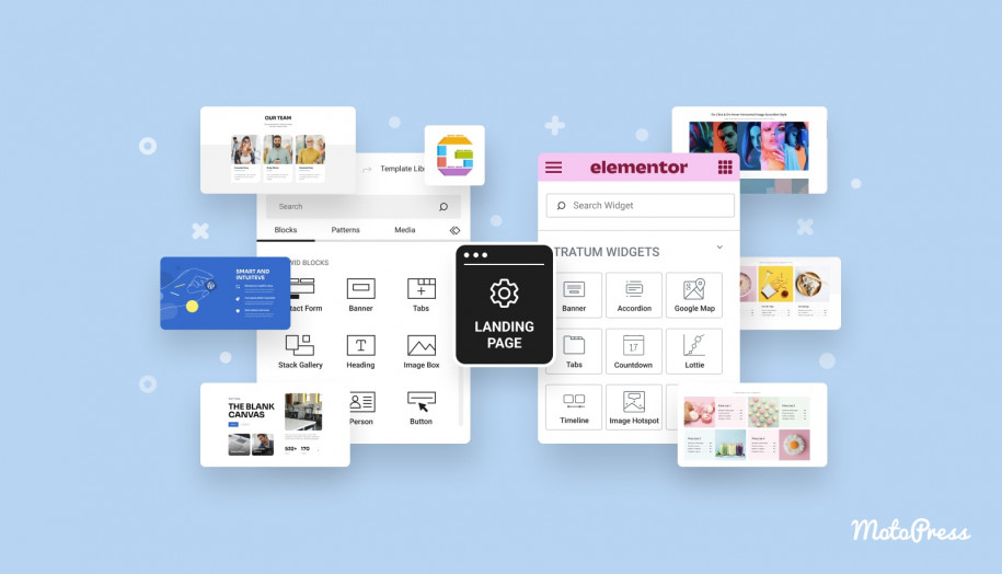
Stratum Elementor Addons is one of those handy addons for building efficient landings. Currently, the plugin provides 26+ advanced Elementor widgets for business and personal needs.
While Elementor offers us a decent set of standard widgets, Stratum extends the list with more creative, interactive, and feature-oriented elements.
View Stratum DEMO.
Compared to alternative addons, Stratum provides free access to all advanced widgets for free. But with the PRO version, you’re unlocking extended settings for each widget.
See also: 12+ Free Addons for Elementor: Which One to Choose?
As you may guess, the TWO plugins – Elementor and Stratum – will be enough to design a special offer landing page. And it does not matter if you use free or PRO versions.
We assume that you already purchased a domain name & hosting, set up WordPress, and installed all the needed plugins. But if you are struggling, read our similar guidelines on how to create a WordPress service website.
Sales Landing Page: Key Elements
The not-so-obvious secret behind every special offer page is the structure. Let’s uncover those common elements (listed in order):
Offer In The Hero Section
Here comes about a unique sales offer located in the hero section – the first visible area for users as they visit a landing page. The offer is typically included inside a dynamic media display (slider or banner) and followed by a brand name, preferably a logo, and CTA buttons:

Source: Elementor library
Pay maximum attention to the offer section as the most voluminous element of the entire page. It’s not enough to focus user attention on the “first screen” – it’s more important to urge interest in the offer. You must convince users your product/service has a big value. List the key benefits, close objections, and provide them with all information urging them to make a purchase.
To represent an offer, you can choose one of these forms:
- 3D model of the product – this is not the easiest type of a hero page, yet not so widespread meaning it will stand out;
- List of benefits – tell users how they can “use” your product or service to solve their problems:
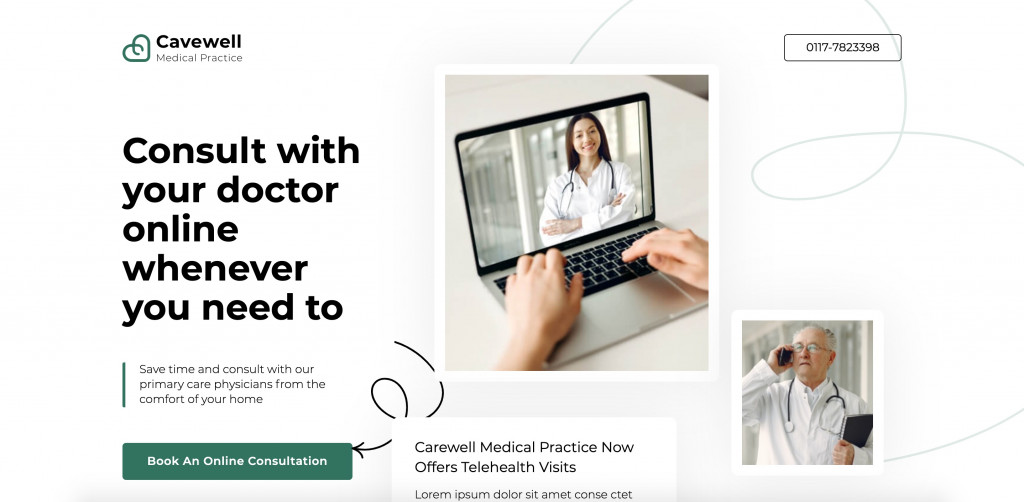
Source: Elementor library
- Technical parameters – perfect for niches with a prevailing tech aspect. When it comes to gadgets, instruments, and physical tools, the first thing customers want is to learn their characteristics.
- Options, discounts, extra bonuses – all of this stimulates you to make a purchase right now and right here.
- Calculator, converter – perfect to find out if your service is suitable for client needs, budget, etc. Common in B2B, it will accelerate the process of establishing cooperation, even before the “first dialog” with a client.
How To Build a Hero Section With Stratum?
The Elementor library of free widgets is not enough to create a dynamic hero section and cover the offer. With Stratum free widgets, you can design attractive sliders, banners, galleries, and more.
The Banner widget lets you create animated sections for promos, announcements, as well as your landing page. It will immediately add action to your WordPress page and promote several offers at once.
The banner widget content includes title, description, a link, and of course, a background media file (image & video)
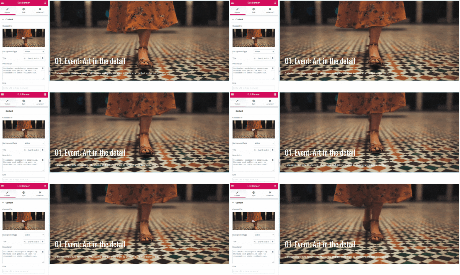
Some flip box styles can fit into the main section of your landing page. The Stratum widget currently offers 6 flip effects (zoom in & out, slide, flip-up & down, left & right)
![]()
Learn more about the features of the Banner & Flip Box widgets and how to style them for your website.
The image accordion allows you to include a catchy call-to-action title, text description, and a CTA button. On top of that, it compacts several attractive images and creates instant interaction between users and your page:
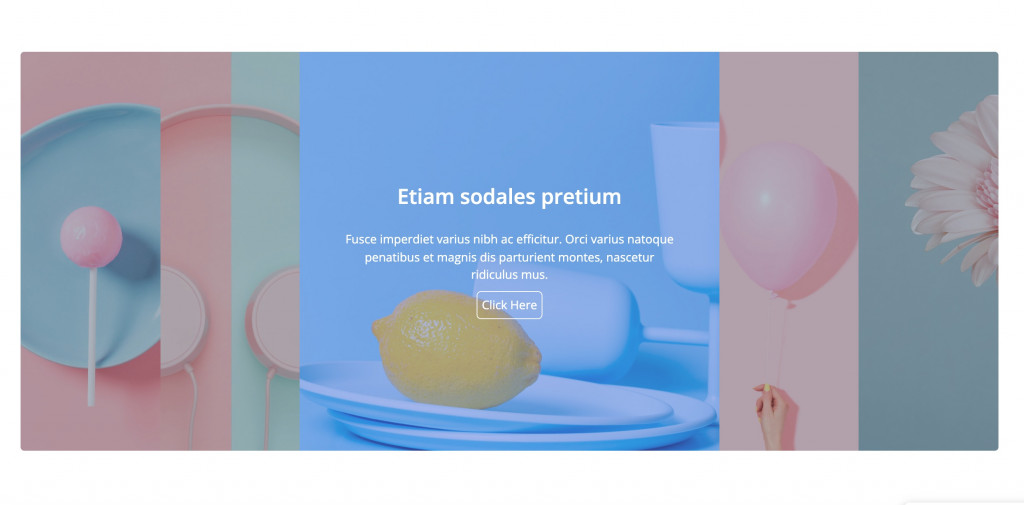
Learn more about the features of the Image Accordion widget and how to set it for your website.
Finally, here comes the perfect widget creating a vibrant hero section – the Advanced image slider. With Stratum, you can make responsive full-screen sliders with text and a CTA button:
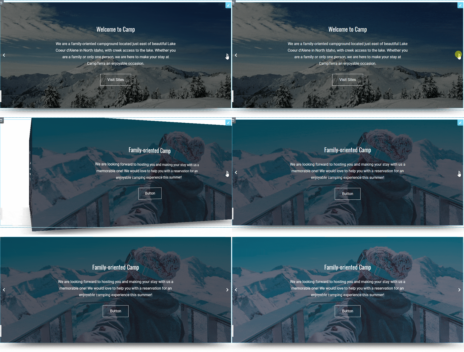
It features advanced typography, color & background settings, animation effects, alignment & pagination settings, multi-column slider layout, and more.
Learn more about the features of the Advanced Slider widget and how to set it for your website.
Details
Next comes one or more sections with the details on the selling product or service.
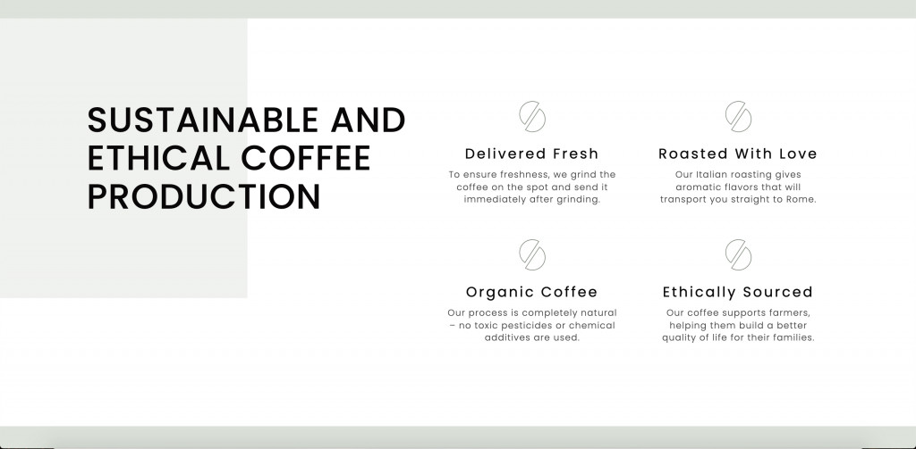
Source: Elementor library
When it comes to tech products, it makes sense to explain the principles of work or include an instruction.
For this purpose, you can use the Image Hotspot widget offered in our Stratum collection. When users click a certain area of your image, they will be able to read the description. It’s helpful when you need to explain the technical characteristics of your product or even include a step-by-step guide:
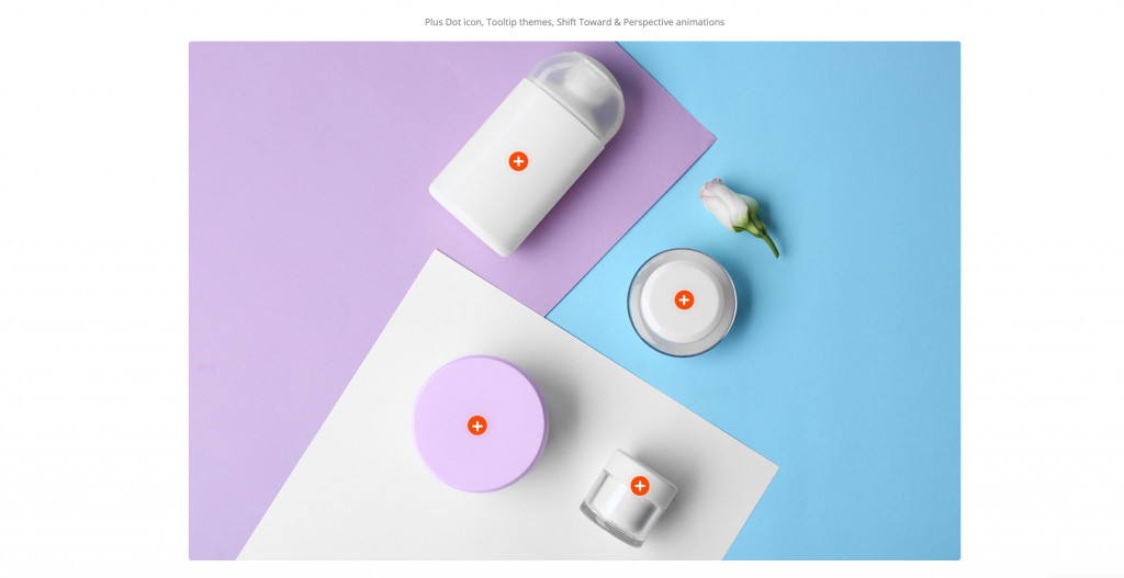
More information on the Image Hotspot features is down this link.
When it comes to non-tech products that bring emotions, you may urge shoppers with your inspirational mission. For this purpose, the Ultimate addons Elementor by Stratum offers you the next widgets:
Both vertical & horizontal timelines will help you visualize the sequence of events, showcase achievements, project tasks, or anything based on stages/points. This dynamic element displays useful information in an organized way and makes it easier to perceive.
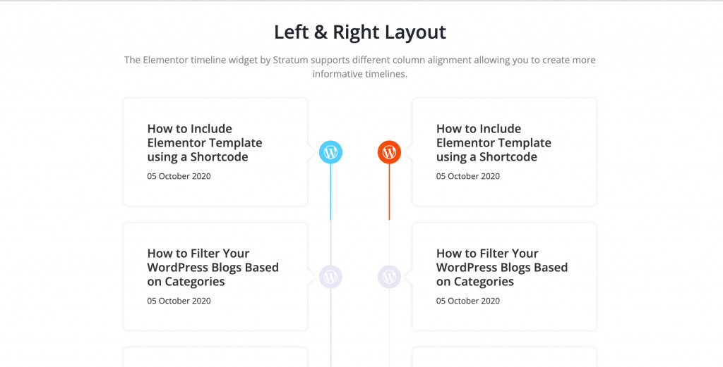
Learn more about the settings of the Elementor timeline widgets here.
Galleries are the best ways to share emotions through images. Depending on the selling product/service, you can include photos of you, your clients, events, before/after images, etc.
Stratum offers a more advanced gallery display through the Masonry Gallery widget:

Click to learn how to customize the Masonry Gallery element.
The default progress bar looks quite plain. If you want a more vibrant display of your progress (measurable in figures/percentages), choose the Stratum circle progress bar.
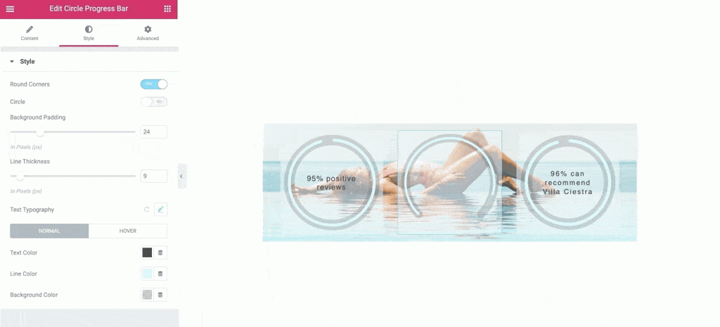
Click to learn how to customize the Circle Progress Bar element.
Social Proof
The concept of social proof is when people make decisions based on the opinions and actions of others. That’s why every efficient sales landing page must display reviews, cases, diplomas, and awards of your organization.
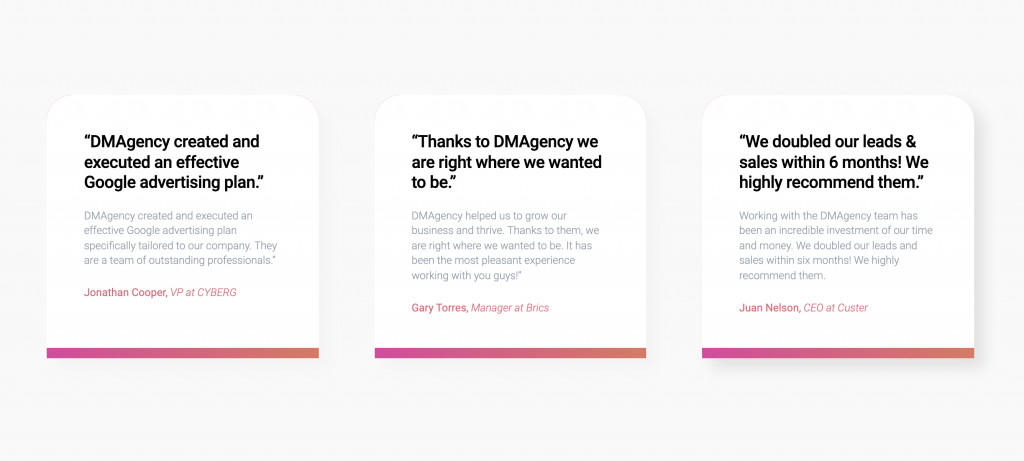
Testimonials work as the best social proof.
Source: Elementor library
When posting reviews, consider these rules:
- At least 3 testimonials from real people
- Real client photos
- Easy-to-read text
- Contacts of the person giving the review
Among the offered Stratum solutions, you will find a Testimonial Carousel widget. It will help you showcase testimonials in a space-consuming way and easily style them up.
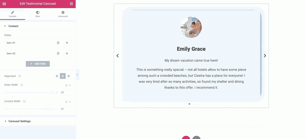
Learn more about the features of the Testimonial Carousel widget and how to set it for your website.
FAQ
Something that seems obvious to you an owner, is unknown to users. Customers purchase things they are 100% sure about. The FAQ section lets you clarify a lot of hidden moments that users want to know.
The FAQ section typically looks like a drop-down list because it looks neat and saves extra space on the web page. Users click on the question – and the answer comes out.
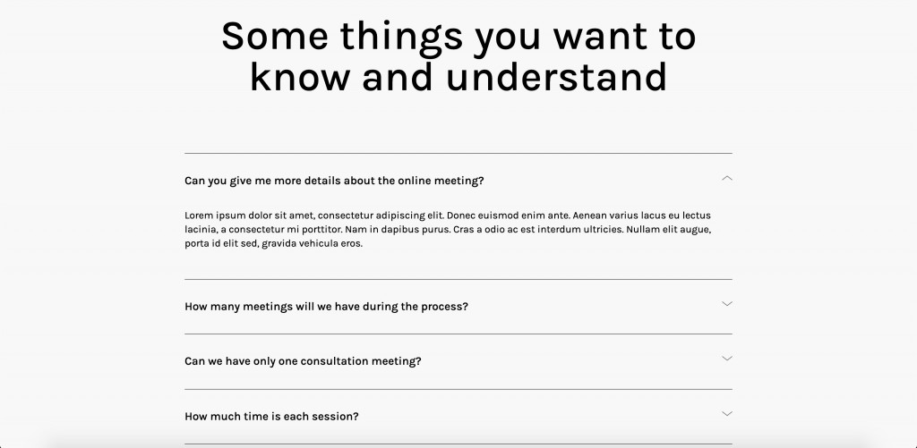
Source: Elementor library
Hopefully, Stratum offers a great solution for displaying FAQ as an advanced accordion.
The Advanced Accordion widget is one of the essential addons Elementor can offer. It has options for 2 accordion types and interactivity. Each accordion supports two- or three-column layouts, text content, single images, sliders, Google Maps, and more.
![]()
Learn more about the settings of the Stratum Advanced Accordion widget.
Pricing Block
After all the offers and arguments, it’s time for customers to learn the pricing options. As mentioned earlier, you can include the cost of your service or product in the hero section to emphasize the discount. However, a pricing table is a must-have for any sales landing page.
In a pricing table, you can highlight a discount price, different plans, and mark down the most popular pricing option among customers.
The “Buy” & “Order” buttons included in this element are the most important CTA element of all.
The Stratum Price Table widget covers everything we pointed out above. It provides a pre-built template with sections (price, price description, list items, button caption, etc):
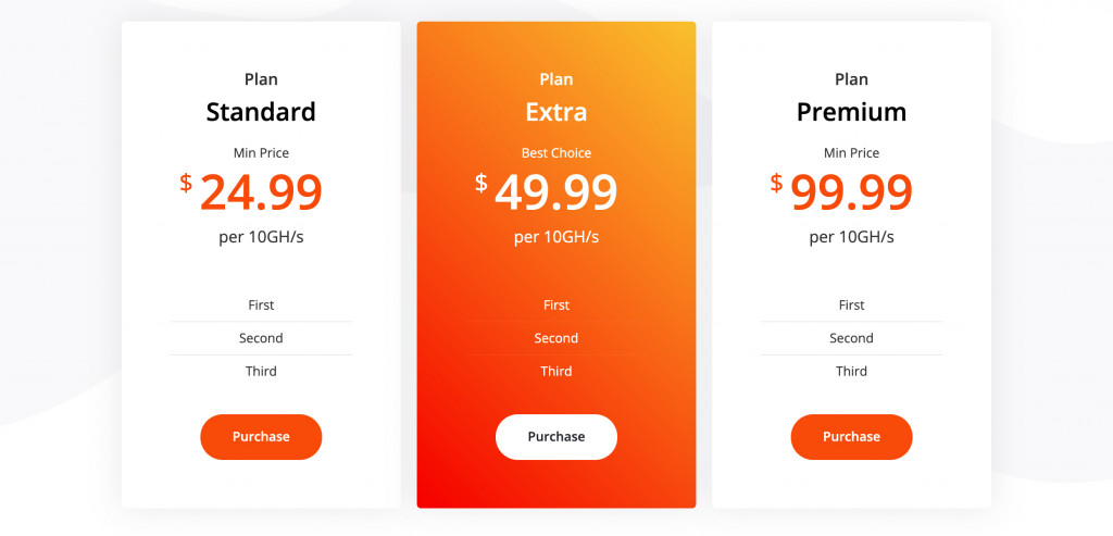
Learn more about the features of the Price Table widget and how to set it for your website.
Limited-Time Offer
Limited-time offers urge visitors to make a purchase faster. Use the countdown or timer elements for a visual representation of a time limit:
Source: Elementor library
Use the Stratum countdown widget and create times in a form of a circle or box:
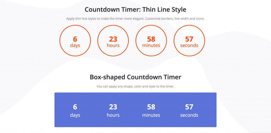
Click for more settings of the Stratum countdown timer.
Contact Form
The goal of some landing pages is to collect user data, so a contact form will come in handy. The type of form depends on your end purpose: registration, scheduling an appointment, subscription, or more.
The form is typically followed by a strong CTA phrase:
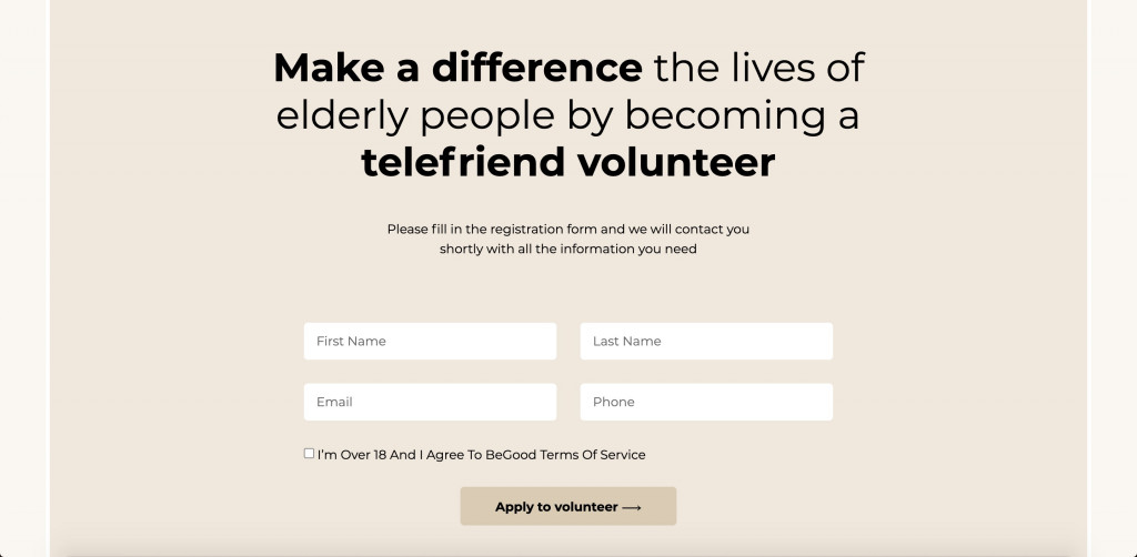
Source: Elementor library
Although Stratum does not offer a contact form widget, you can use quite a popular Contact Form 7 plugin for all kinds of forms.
But it’s likely you’d want to mention your contact information (location, social media icons or support page built with the WordPress helpdesk plugin). Our addon provides some good options for displaying Google Maps and an Instagram gallery.
Unlike the standard Google Maps widget from Elementor FREE, this one comes with a few extended options. You can display unlimited locations using custom markers, adjust a default map interface with regard to user interaction, and choose the likable map styling:
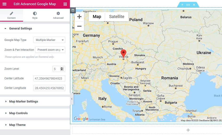
Click to learn more about the Advanced Google Maps widget by Stratum.
Many brands actively promote their Instagram pages and want to expand their audience out of all possible channels. An own website is the best place for new users to the social media page.
With this widget, brands can highlight their vibrant Instagram gallery. The feed is updated automatically with every new post. Besides, you can display any number of posts and change the number of columns if you don’t want to stick to a classical 3-column display:
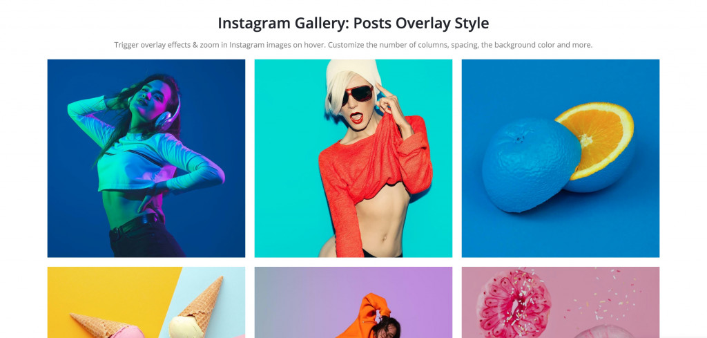
Here’s an instruction on how to connect your Instagram account to the Stratum widget.
More Tips To Boost Sales On A Landing Page
- CTAs (calls-to-action) should be short, clear, and located at the top of the page, in the footer, and on average every 2 blocks.
- The more hidden objections you can contradict – the higher the conversion. The most common hidden client objections are: “I don’t believe you”, “I don’t make the decisions”, “I don’t have time for your offer” and “I don’t have the money.” Give our facts and arguments, create logical chains in order to convince visitors that it’s what they need. The best way to answer those objections is in the FAQ section.
- There will be tons of information to fit in just one page, so be concise. But you better minimize the text by substituting paragraphs with visual media content: videos, galleries, icons, flip boxes, timelines, etc.
- Create separate sales landing pages for each audience group. Users of different ages or completely different interests have different triggers urging them to make a purchase.
Conclusion
Now you know more about Stratum as an instrument for creating beautiful and most importantly efficient special offer pages.
The Elementor + Stratum duo can save you time and effort, it’s a one-time option or you use both plugins on a regular basis. Not only that, both products are supported by WordPress experts with years of experience.
In case of any issues, they are ready to give you proper assistance.
P.S. Of course, Stratum has plenty of decent alternatives. The top 4 addons worth being mentioned are:
