MotoPress Content Editor Version 2.0.1 Released
We are heading in the direction of making the MotoPress Visual Page Builder more powerful and easily operated! It took time to update this plugin to the today’s level, but quality work always requires a lot of time and efforts. And today we are pleased to share all the considerable and awesome improvements that took place during the latest updates.
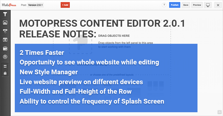
New refreshed editor comes with the following outstanding features:
Improved plugin launching time
Now it loads up to 2 times faster! It means your customization work is quicker and more efficient. Enjoy!
Totally viewable website page throughout the editing process
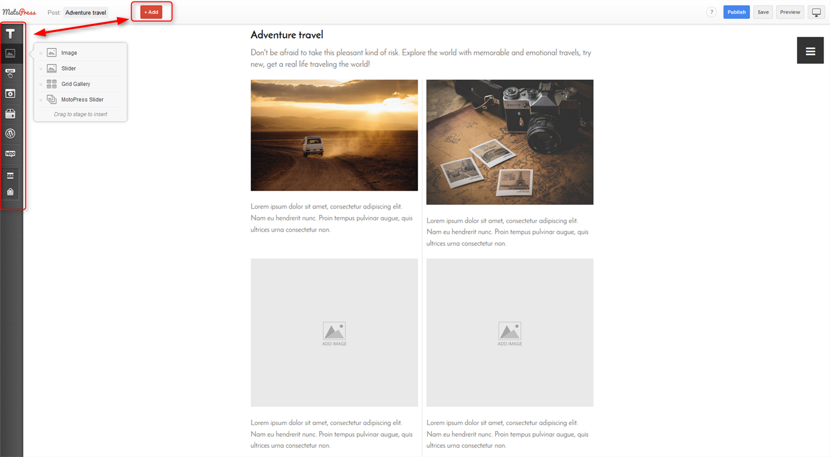
This update is a real tipping point in the changelog of the MotoPress Visual Page Builder plugin. It gives you an impressive feeling of the frontend WYSIWYG editing, which definitely simplifies and increases the productivity of your work. Now, instead of the usual admin backend you see the actual website page and the editor toolkit that can be either hidden or displayed for handy customization (click +Add red button on top to show/hide the tools). The final result of your updates is perfectly visible even without going to preview page.
New Style manager
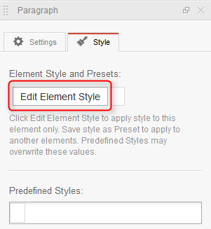
New style manager comes with dozens of cool possibilities! It allows you manually create, save and reuse the styles you applied with a help of intuitive tools. To start creating and using the styles, simply click on any added content element > go to Styles > Press Edit Element Style.
Using this Manager, you get freedom to modify the following parameters of the content element:
- Background color
- Text color
- Background type (image, gradient, none)
- Paddings
- Margins
- Border styles (default, solid, dotted, dashed, double, groove, ridge, inset, outset)
- Border parameters, radius and colors.
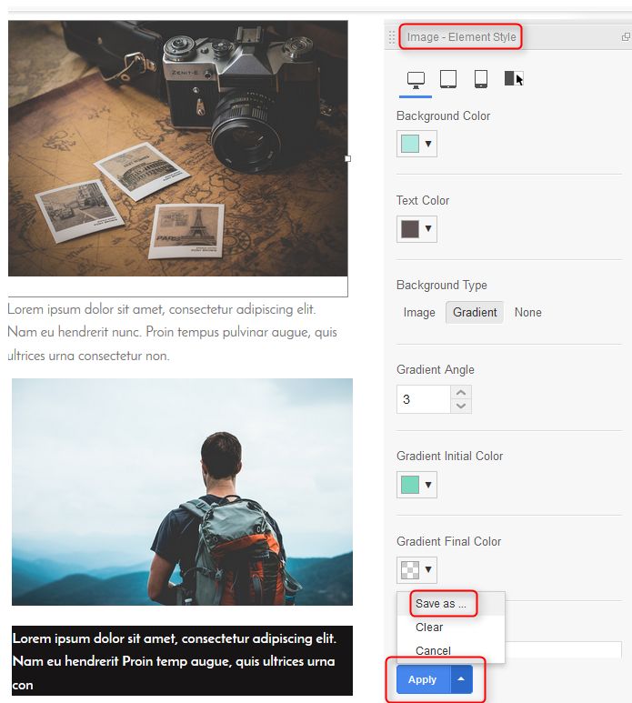
If you wish to apply the same styles to any other content element, don’t forget to save it: after setting up the new styles click Apply > choose Save as. Each set of styles will be saved as a new preset stored under the Element Styles and Presents in Styles tab.
Online preview on various devices
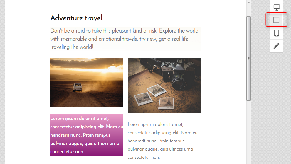
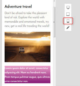
Embedded emulation environment into the editor tools runs a one-click preview of your site page on desktops, mobile phones and tablet devices. Feel the usability of online emulators right in the admin area by clicking the Responsive Preview button at top of the window and choose the needed device to preview your website.
Full width and full height of the row available
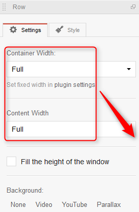
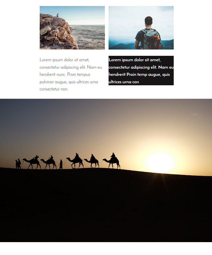
Today, fullscreen solutions are very popular. They are used to highlight any part of the site, to present the images in details, to contrast the parts of design elements. You may stretch the row of the content block you are editing till the edges of the viewport screen by applying a full width or full height of the row. The content block will be adjusted to various browsers and devices for proper viewing. To set any of the mentioned options, click on the Row icon directly in the content area > go to Row settings > choose Full in the Container Width and check ‘Fill the height of the window’.
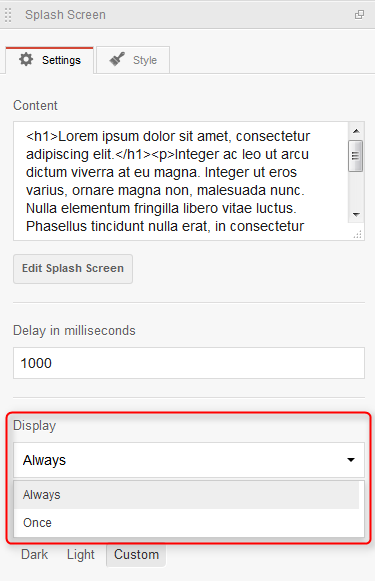
Control over the frequency of opening a Splash Screen widget
If you use a splash page to run any large application, software or simple page, you can control how often the splash page widget should appear on the site. Simply go to the Content editor toolkit, add a Splash page widget > go to its settings from the right and find Display option: set whether it should appear always or once.
This is a result of hard work to ensure that the Visual Page Builder users never run into any limitations. Stick around a little bit, try all new options in action and share your experience with us!
Some great updates there! Looking forward to trying it out today!
Dane, hope you enjoy working with the updated functionality. Have a good day!