MotoPress Content Editor 3.0: What’s New?
Table of Contents
It took a little bit more time than we initially planned, but the Content Editor 3.0 has finally arrived! There are no revolutionary changes, but I hope that jumping to the updated WordPress Page builder will get you a much larger performance bump, a more intuitive user interface, and more automation options.
Back up your website before updating the plugin as you are going to work with a completely new thing!
Now let’s get started.
The new WordPress Page Builder UI
First off, we understand that a user interface is a critical part of working with the tool. It’s almost everything for your productivity. So, we’ve freshened up the UI after handling lots of design variants!
There is no “Add” button in a new interface, but don’t worry! It appears only after you add columns. All settings for individual elements are hidden until you need them. It will provide you with great destruction-free editing.
It may not seem that intuitive instantly for experienced MotoPress users, but I believe once you understand the new logic, you’ll love it. Such a new interface makes it possible to make the builder more lean and fast; it enables you to build more structured and professional layouts without extra drag-and-drop efforts.
Basically, to add any content element to the page or post, start with “Add section” (for fresh content) or “Add template” (choose from the library of the earlier saved custom-built templates).
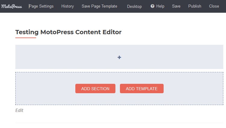
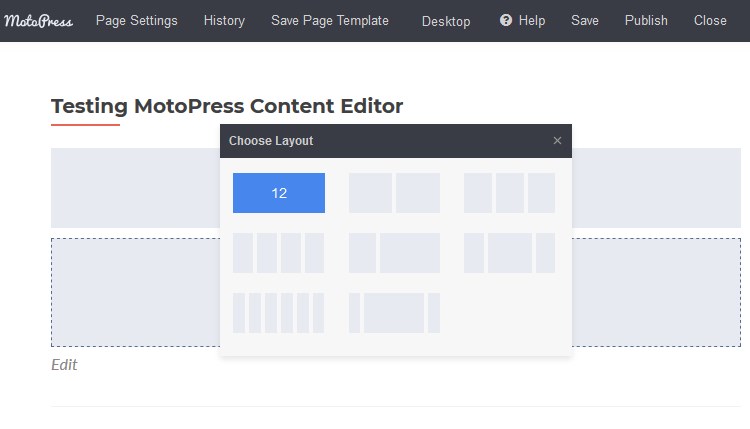
To help you easier deal with columns, you’ll need to start with a layout selector – you can go and choose the layout you are going to work on. Don’t worry, you’ll be able to change the chosen shape of your layout later.
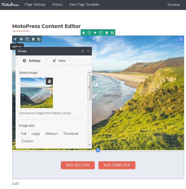
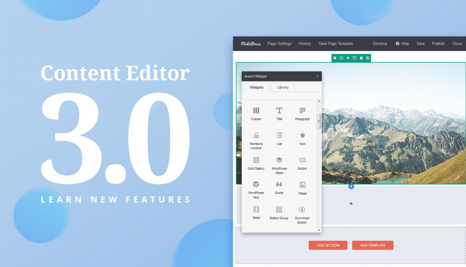
After that, you should simply click the “+” icon to see the list of available content elements. Pretty intuitive, isn’t it?
An object styling is the same. But now all individual elements have their controlled properties. Once you’ve added the element, you can style:
- Individual content elements – a gray settings panel
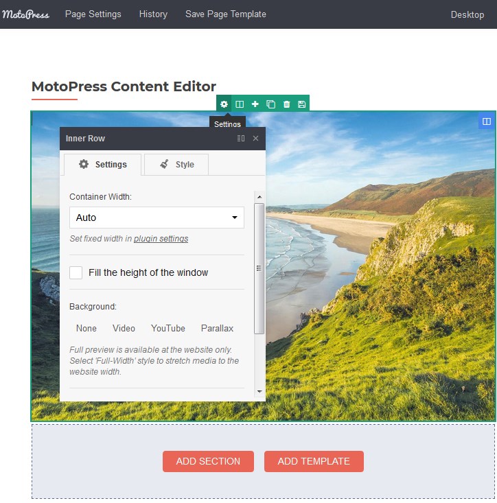
- The row – a green settings panel
- A column – a blue settings panel.
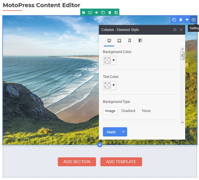
You simply need to hover over the element to see all available settings. From the UX perspective, this way you’ll have quick and more intuitive access to each element or section.
Another useful improvement, which I briefly mentioned, is the ability to reconstruct the already created sections. For example, you can manage columns of the row by changing their structure (e.g. change one-column layout to a three-column layout).
- If you increase the number of columns in a row, new columns appear.
- If you reduce the number of columns in a row, you won’t lose any content – it will be moved down.
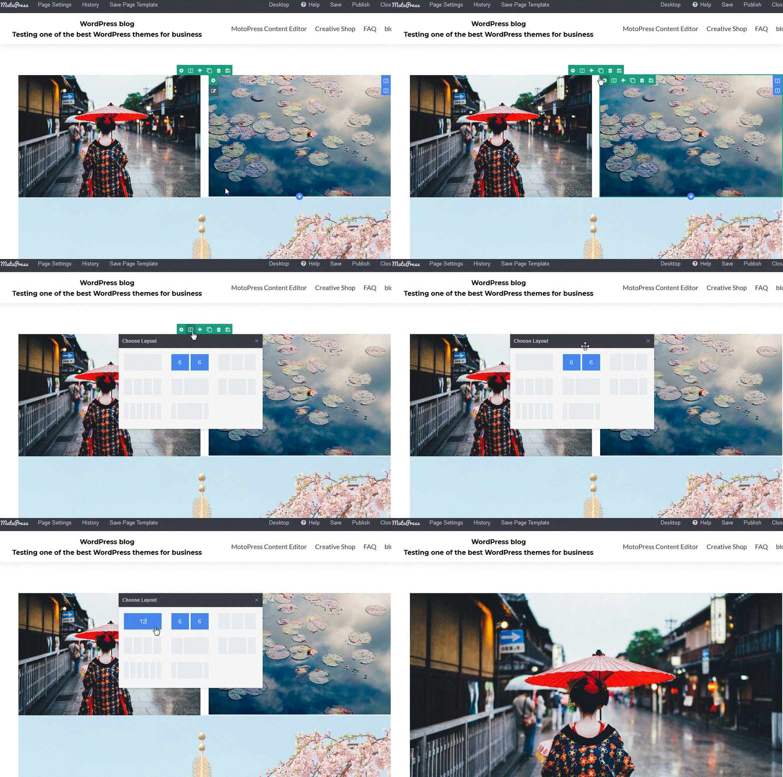
Managing rows, you can now add extra rows above the already added rows and columns or inside them. This new feature also makes the layout structure more flexible.
Build pages and posts completely on the frontend
With Content Editor 3.0, you are no longer editing the pages on the backend. You’ll be able to enjoy a perfect WYSIWYG experience and real front-end editing.
To reduce your back-and-forth work, we’ve also moved some native WordPress settings right into the Content Editor interface, on the frontend. For example, now you can use the “Page Settings” options on the top builder panel in the following cases:
- To change the page template with a help of page settings (page template options depend on your WordPress theme)
- Change or completely hide a page title
- Set a page status (choose from standard WordPress options).
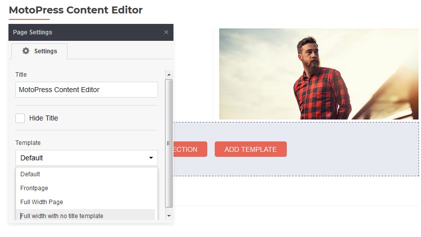
Once you are done with the content customization, you can publish it instantly or save it without leaving the builder.
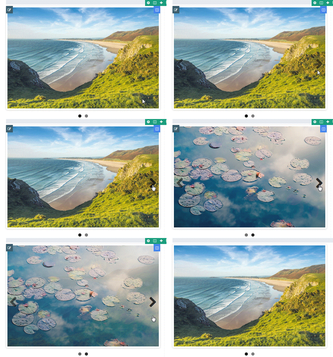
Thanks to the frontend editing, it’s now easier to test the behavior of the interactive content elements like slider or button hovers, with no need to preview the page (as you are already on the frontend!) Once the element is added to the page, you see how it’s functioning in real-time.
The only downside of this feature (moving to frontend) is that you can’t add shortcode generators because this functionality of the TinyMCE feature is left on the backend (but it will be also unavailable in Gutenberg editor). So, for now, you’ll need to add shortcodes in a traditional way by simply copying and pasting them in a text editor.
Drag-and-drop and click-to-add ways to manipulate the content
You are well familiar with drag-and-drop content editing. It’s not going anywhere in the new editor version. Additional click-to-add technique makes it easier to create on-balance layouts, which will look great and not messy on the desktops as well as on mobile devices.
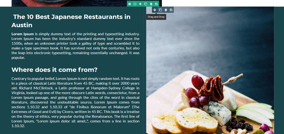
A huge benefit of the click-to-add technique is that it gives a better sense of a page structure and lets you see what you do. You don’t need to guess where you should drop your elements. Furthermore, it provides a more intuitive and quick editing experience thanks to the step-by-step blocks building.
This way to manipulate content is also handier for touchscreen devices.
The legacy of the previous Content Editor version, the ability to drag and drop elements to the needed place and still keep the perfect layout structure, is still at your disposal. You are still free to layout your content the way you need with the draggable borders of the columns. Plus, you are provided with a more streamlined editing process thanks to the click-to-add technique. How do you like this combination, by the way? Is it now more intuitive for you?
Mobile-first editing
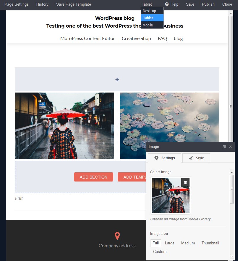
MotoPress Content Editor 3.0 lets you edit website content on a mobile or tablet device in real-time! We’ve made it possible thanks to breaking down the editing area and the settings panel into two different things.
The pop-up window of the individual element properties (which is now displayed in an iframe) is not stuck into the editing area, it’s easily movable around the page, so you can see all element settings properly and edit the page comfortably for any device. It’s in the first place a handy thing for those MotoPress uses who want to get different styling for different viewports. Moreover, I believe it will significantly ease the work of small laptop users by giving more space for editing the content.
Reuse your custom widgets, sections, and pages
You should now feel more productive with a great bunch of automation tools. Go to an individual widget, column, row or page you created and save it to be able to reuse later. And not only on the current page but on any other page of your website as well.
This opens up lots of new opportunities for those who create massive websites as well as a simple blog with lots of repetitive elements.
For example, you can create a button with its own styles, save your custom widget and then reuse it on any other page. To use any section or widget, use the “Save to library” option from the settings panel of the element or section. To use the entire page, use the “Save page template” option from the top panel.

When you need to add your saved templates and even entire sections, use the “Add template” option when you start constructing a page.
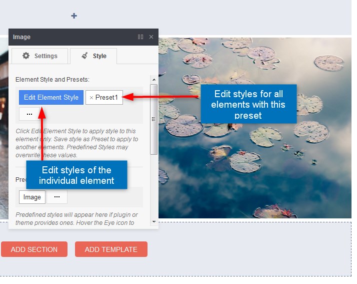
If your widgets are saved with custom styles, they will be automatically saved with preset styles. When you reuse your saved widgets, you can edit either individual elements in “Element Style” or preset to change the styling for all sections that use this preset.
More options for the Templates Library will be released in the next updates.
Revisions history
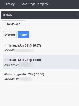
If you’ve made any mistake or want to revert your content to the previous version, you can work with the new Revisions history panel. The main thing to remember is, don’t forget to save the page each time you need it! Only saved page versions will be available in the Revisions history and you will be able to apply them. So, try to hit “Save” more often. Just in case!
Final word
I really hope the updated Content Editor will be a joy for you! It still comes with some limitations, but there are more pros and, of course, more opportunities to build a better WordPress website yourself. Whether you love or hate the update, we want to hear your opinion!
I haven’t had any luck getting my revisions history to save, no matter how many times I press save. Is there a setting somewhere else that I’m missing?
Hi Hilary,
We have tested revision history option locally and it worked properly. Make sure you use up to date WordPress version. Also there might be conflict with some third party plugin or theme. Try to deactivating some and test it again.
Hi,
congrats to the new version . Looks like a layer above ELEMENTOR ?! What are the benefits using your version instead of ELEMENTOR directly ?!
$regs ray
Thanks for commenting, Raymond! We don’t think it’s a features competition with Elementor or with any other of one hundred builders available now. The UI of Elementor, Divi, WPBakery and the rest of popular solutions is quite similar because there are some best design practices for a functional interface.
Still, every customer simply has its favorite tool that is the most suitable for their particular needs. MotoPress has been popular for more than 4 years thanks to the simplicity of use and the most affordable Pro version (still being on an equal footing with others in terms of features). And now we’ve made it even better and more intuitive following a popular UI design approach that communicates clarity and better usability.
We’ve managed to optimize the UI – you are not distracted with any side panels and use them only when you need to configure the element or section properties. You have a much more flexibility in managing columns and moving the elements around the already built sections. We provide a real frontend editing, lots of great automation features, a breeze customization from your mobile phone, etc. But after all, it’s up to you 🙂
Add shape divider.
Elementor, Visual Composer & Divi all have it.
Hi Saiful,
Thank you for your suggestion. We’ll keep this in mind.
Dear Motopress users,
Would be interesting to discover if anyone has managed to get any version of Motopress working in a localhost environment.
I tried with V2 with the Bitnami WP framework but support advised old versions will not run with latest version of WP.
Thanks…
Hello Geoff,
We have found out that you used IE browser while working with Visual Builder but this type of browser is not supported. Please try using some other browser to launch Content Editor.