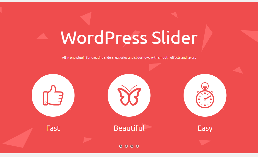
By default our WordPress slider is responsive and will look good on any device be it a mobile phone, a tablet or a desktop. However, sometimes the content of your slides may be difficult to read and view on different devices: too small font for mobile view or overlaying layers, heavy videos. So you can adjust each slide to look properly at all devices. Below are steps to get this done.
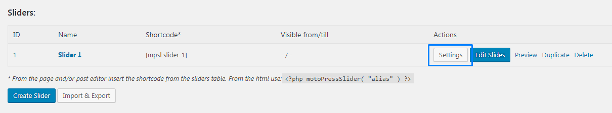
- Under MotoPress Slider, find the slider you want to edit and click Settings.
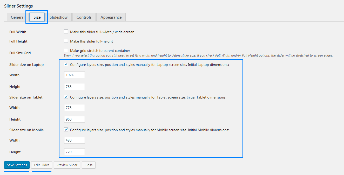
- As soon as you enter Slider Settings, go to Size tab and check the boxes Slider size on Laptop, Tablet, Mobile. (If your slider needs improvement on certain device you can enable its size only)
- To make things easier for you we have already preset Width and Height values for each device, so they will appear automatically. Save the settings and you are ready to Edit Slides.
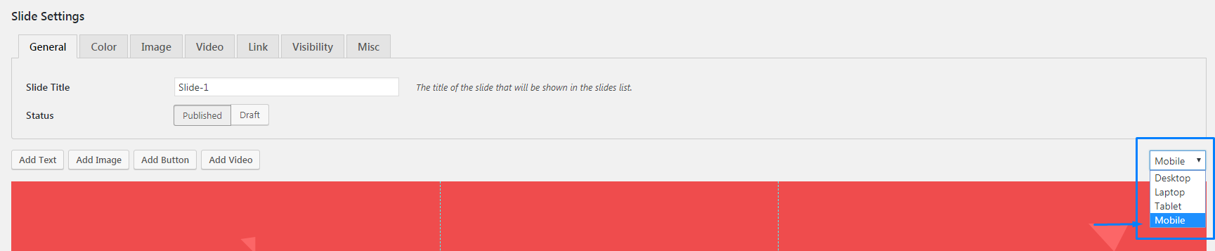
- These settings enable a dropdown menu with layouts for each device in the slide editing screen. You can switch among them to rearrange the layers’ position, change font sizes, line heights, text alignment and whitespace for separate layers.
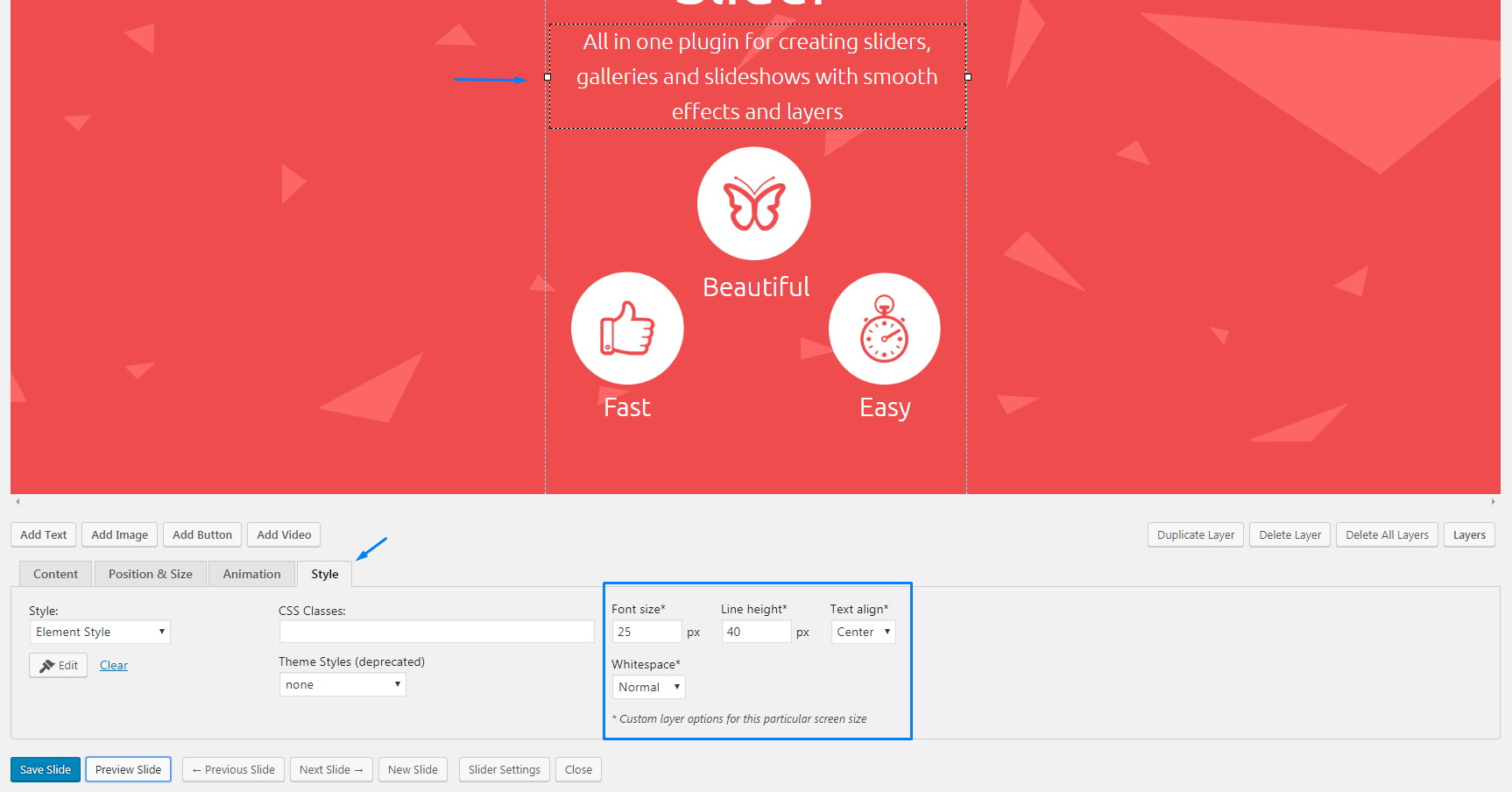
- When you have chosen a device layout, by dragging you are able to move the layers and change completely the way they are viewed on different screen sizes. Pick a layer and under the slide you will see Style tab with Font Size, Line Height, Text Alignment and Whitespace fields that define styles for a particular layer on a particular screen type.
- Do not forget to save the slide when you are done editing. As a result your slide will look different on each device type:
Desktop
Tablet
Mobile
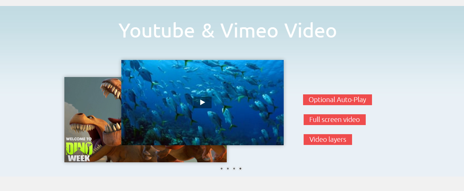
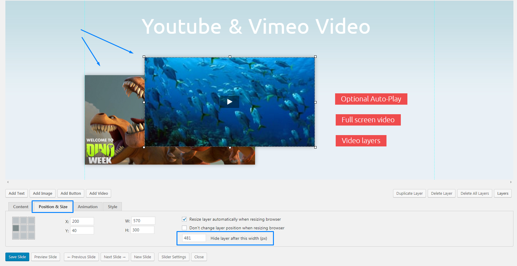
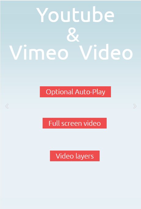
You can also hide some slide layers on certain devices. For example, the initial slide for desktops is shown below, but with a few steps we will make the videos disappear in mobile view.
- Pick your slider and start editing the slide you need to change. Pick a layer that needs to disappear and below you will see Position & Size tab. There, set Hide layer after this width (px) value to 481 to hide it on mobile (769 for mobile and tablet)
- Save the slide and view the result on a mobile device:
Hello,
My slider seems to be grey on iphones, but if it turn the iphone on it’s side then reload the page it works?
Can anyone help . http://www.durhamglamping.co.uk/
Hi, I’ve checked this page http://www.durhamglamping.co.uk/ and could not find any slider there. Could you describe the issue providing steps to replicate the issue? Thanks.
hey, i have created slider for my website home page. but it,s not working on mobile. plz suggest. Check my website http://hetpatel.online/
Hi,
I’ve just checked your Home Page and I could see the slider on the mobile device. Have you managed to sort this out?
I’m using Moto Press Slider Lite on my e-commerce site. I adjusted all the slider settings according to your guide. Slider layout looks great on Desktop but it doesn’t work on mobile devices. When I load my site on Android phone the only thing visible is the background – text, button and other aren’t visible. Why?
Hi Hunter,
Could you specify what other parts of the slider are not visible on a mobile device? Can you see it well previewing the slider at the back-end and viewing it in mobile mode? Could you provide a website URL where we can take a closer look at the slider?
Using motopress slider for a long time now. I have a strange issue.
Slider works perfectly on Desktop and Tablet but on mobile devices the slides get a grey overlay (like when something is disabled).
There are no settings for something like that and I haven’t changed anything in the code.
How can I change that ?
Hello Simon, could you please specify where the grey overlay appears: on the front or back-end?
If slides get grey overlay on the front-end, could you provide us with the link to the page with the issue?
In case grey overlay appears on the back-end, please, submit a ticket here https://motopress.com/support/ for us to have a closer look at the issue.
I have motopress premium and trying to adjust some of the layers for mobile view but i don’t seem to have the drop down menu where i can view my slider in mobile or tablet view? it just seems to be in desktop for editing all the time. Can you advise please?
Hi David,
Thank you for your question. Please make sure you followed the guide on this page and did not miss step #2 – enabling sizes for devices you’d like to adjust layers for. Once you enable sizes and save changes you will have drop-down to select a device type.
I am running into an issue where my MotoPress slider works perfectly on my computer and my iPad, but it is not showing up on my Android or my wife’s iPhone whatsoever. Seems rather strange to me. Any help on this would be much appreciated!
Hi Michael,
Thank you for reaching us. Do you mean slider just disappear on mobile devices? If it is so please try to navigate to Settings of this certain slider>Appearance> and check Visibility parameters. If there is any value added please try to remove it, save changes and check your site on mobile device again.
Is moto press a WordPress plugin? I couldn’t find it there
Hi Kamal,
Yes, MotoPress Slider plugin is an extension for WordPress CMS. Could you specify where you could not find it?