Meet Creatista: Our New Creative Portfolio WordPress Template
Table of Contents
If you love to sketch, have fun drawing caricatures, create immersive 3D images, help build a brand identity with your design solutions, these are things to admire!
Cause the designer’s eye is not something trivial. And if you are reading this, you are probably thinking of sharing your works with the world, creating a designer’s portfolio, and enjoying the feedback and interaction.
Behance is not the last place for this, for sure… But if you want more freedom and independence, WordPress is an absolutely right choice! It’s affordable, flexible, and absolutely stunning software for launching a website.
Portfolio Theme for Creatives – Short Characteristics
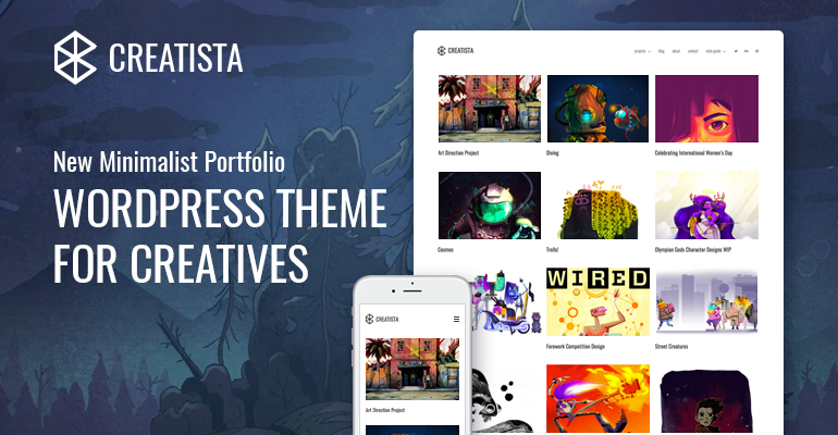
Let’s prove this fact by learning from example. And the example is our new WordPress portfolio theme for creatives – Creatista.
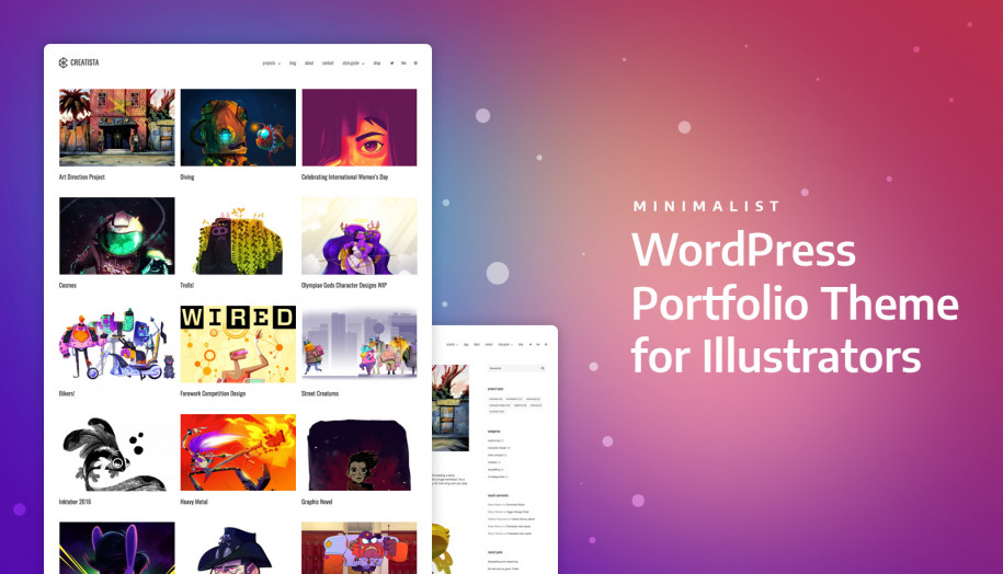
In short, the Creatista WordPress theme is a minimalist, white design for any type of creative project. The theme is not overloaded with tons of “configuration” and “decoration” plugins (you’ve probably seen tons of multipurpose theme beasts out there?).
It does at its fullest just what it should do thanks to the core elements: a customizable portfolio showcase, a distinctive blog with search engine optimized architecture, a smart contacts page, and some other helping elements.
It is a responsive and mobile-ready theme, delivering sharp content across different devices.
If you are new to WordPress, the theme is easy to install and start working with. However, you might need a quick guide of how to start a WordPress website first. Also, Creatista is supplied with the detailed docs so you may address it when needed (for example, you might want to take a look at how to import sample data to the theme.)
Let’s check the theme essentials!
WooCommerce setup for beginners – video tutorial
Get started with WooCommerce!
Front Page of the Portfolio WordPress Template
Here is the example of the front page – a balanced grid with featured images of your projects and mid-size fonts for titles – a smart balance in everything.
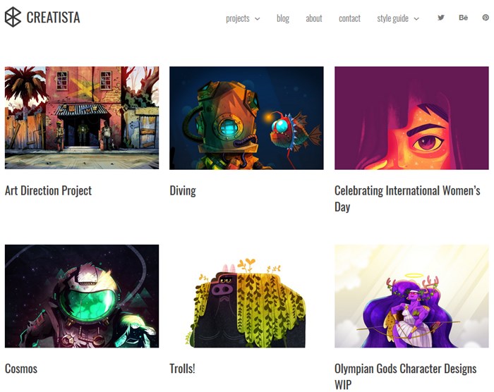
Your portfolios on the front page and other pages are powered by a reputable Jetpack plugin, which gives tons of customization options and lots of other useful tools you may optionally use.
Jetpack is a true Swiss Army knife plugin for WordPress – it’s hard to find a function it cannot perform. This all-in-one professional and the lightweight plugin is a great tool to power a theme and not destroy its SEO and performance. That is why it was chosen was powering Creatista.
On the front page, you may customize the number of columns and the info about projects you want to show. For example, configuring a simple portfolio Jetpack shortcode, I’ve changed the front page layout to 2 columns and output the tags:
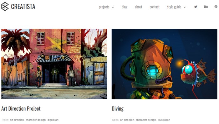
To get your works on the front page or any other page, at first you’ll need to add your projects via Jetpack portfolio, and then customize their appearance.
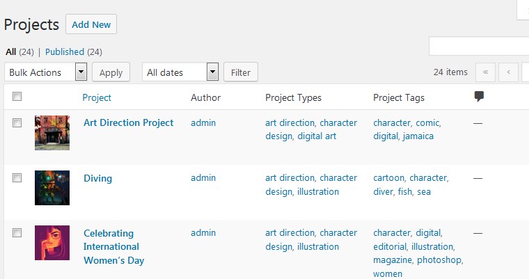 You’ll see that it’s ease and entertainment to work on the projects presentation.
Projects
You are the boss when it comes to presenting an individual project and you may play with the position of elements any way you like (they are also customized with the Jetpack plugin). You may add high-quality images, videos, texts, etc.
You’ll be able to easily categorize the projects by tags and categories (and then feature the projects by these tags and categories on the live site):
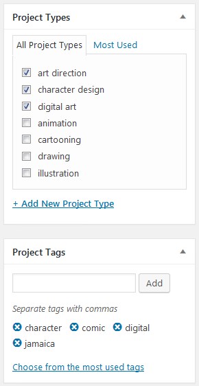
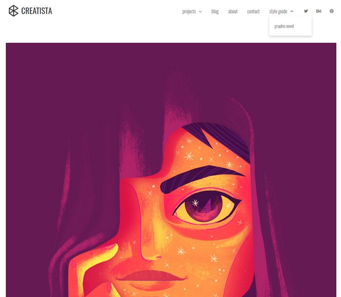
Just free your imagination when you’ll be working on the project layouts. For example, a project with a wide-screen images and (probably) texts:
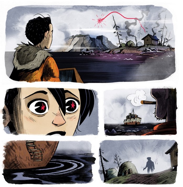
A graphic novel:
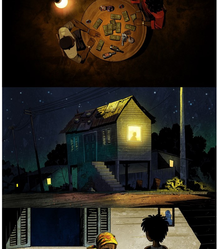
A list of images (you may list them with or without spaces):
And more variations like detailed product design charts, or any other creative field.
If you turn on the Jetpack lightbox feature, images that are linked to the “Attachment page”, will be opened in the lightbox, so people can leave comments and view different sizes of images.
I’m not trolling you! Take a look:
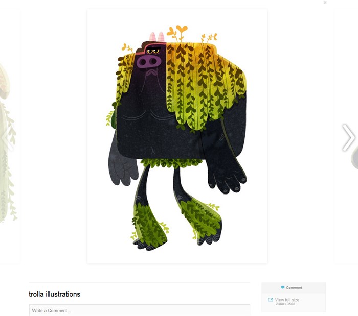
You can also feature your images in different Jetpack galleries, modifying their layout and organizing huge images wisely.
For example, you may use thumbnail grid gallery, tiles mosaic, square tiles, circles, and tiled columns:
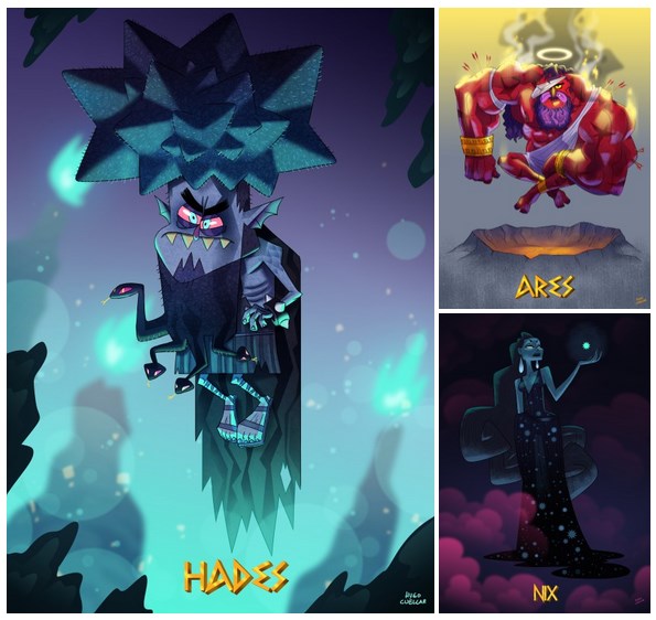
And the black and white images with transparent background look really nice:

Such kinds of galleries can be suitable for featuring portraits:
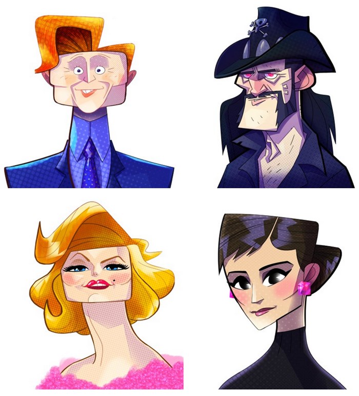
…as well as product design charts and lots of other types of works.
Looks quite interesting, agree?
Social icons
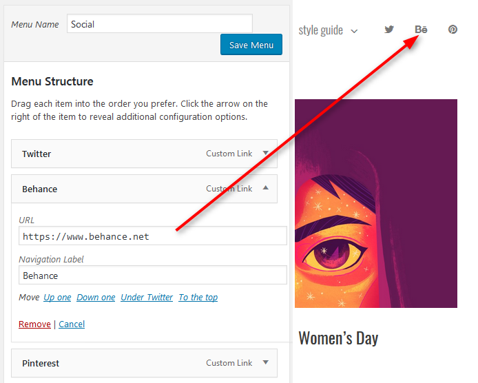
The social icons are built into the menu, so you’ll just need to specify which icons you want to feature and add the links to your social media accounts or other websites like Behance or Facebook:
Blog Section of portfolio WordPress template
Want to tell more about your projects or their creation in a handy format? Creatista’s blog is what you will enjoy:
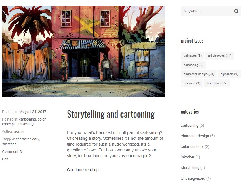
You may create a killer sidebar and put the sidebar widget with multiple categories, tags, subscription boxes, and all other info you may need in the blog sidebar.
This is gonna be really handy for your readers. As for customization, you’ll simply need to drag and drop the needed sidebar elements to be able to output them on the live site:
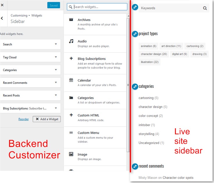
Blogging with Creatista is as rich as creating individual projects.
As for the other pages, you’ll find those needed ones easy to edit (like Contact).
Conclusions
If you were looking for a great WordPress portfolio theme for your creative works, grab Creatista or at least bookmark it; you’ll definitely want to get back! For all MotoPress Club members the usage of the theme is free.
Got a question about the portfolio WordPress template or want to share the idea? We are listening!
P.S. Special thanks to Hugo Cuellar who creates a whole new world with his imagination (his images are used in the theme).


Sometimes it’s much better to keep things clear & simple. Also, I like the fact that the theme is not overloaded with plugins and extra features, which WordPress newbies can find very difficult to use.
Exactly! this is what we try to do – separate design and functionality, leaving only the meaningful tools. This is how it should be, but it’s hard to spread this idea. Too many providers create multipurpose “monsters” making many users think it’s a ‘standard’.
They’re trying to cover as many niches as they can with one theme only. I’m using WordPress since 2007, and even I sometimes find those themes hard to use…