WordPress Twenty Nineteen & Gutenberg: How to Create Better Content with Getwid Blocks
Table of Contents
If you are on the WordPress Twenty Nineteen default theme, you have already experienced the power (as well as flaws) of the Gutenberg editor.
No doubt, even despite limitations, Gutenberg unlocked more customization opportunities and brought the kind of UI that is much more user-friendly for the everyday workflow. No need to wrack your brain around adding a good-looking button or complex custom post types while staying in the visual mode.
The number of the core blocks is, however, still limited; layout and styling settings also leave much to be desired. That is why the market of extra Gutenberg blocks aimed at enhancing Gutenberg is thriving so far.
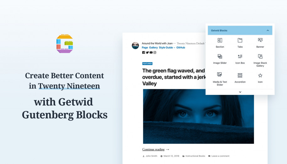
But in this guide, we’re going to show you how the WordPress Twenty Nineteen theme works with just one of them: Getwid. This is our collection of (so far) 34 free extra Gutenberg blocks!
WordPress Twenty Nineteen is very easy to customize for blogs, but using Gutenberg paired with Getwid, you can also scale the template to any sort of project.
After revising the most popular extra Gutenberg block plugins, it turned out that those that flawlessly work with Twenty Nineteen are in short supply.
I mean, if I just want to add any block that by default contains a button (e.g. a call-to-action) in Twenty Nineteen, it should be added as a normal brand theme button – or at least very close to it. Shouldn’t it?
But not each third-party plugin does it well: here are just five random default blocks with buttons from five different Gutenberg plugins:
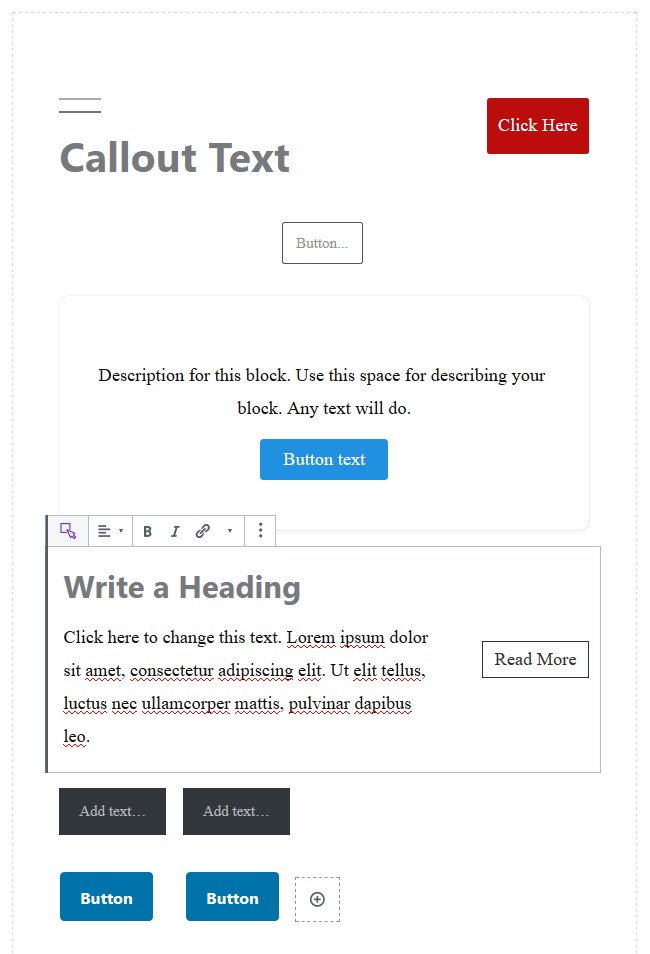
Which one does look more familiar for the Twenty Nineteen users? The last one, obviously, is the default Button Group block by Getwid.
What’s happening with the others?
The rest of the plugins simply add their own styles, which is not the best way to go if you want to maintain a website design consistency and spend less time on workarounds and tweaks. On the contrary, Getwid’s block has inherited styles from the WordPress Twenty Nineteen theme, so you get a piece of content that immediately adjusts to the styles of your template.
But this is just one example to show you that the vast majority of Getwid blocks play nicely with the Twenty Nineteen – by default.
So if you are looking to engage your readers with more compelling articles, improve the conversion rate of your website, and just build content quicker without a feeling that you are just messing around, you may find our tips helpful.
We are not going to describe each block, though, but only those that can most benefit blogs and small business websites.
Let’s dive in.
Create hero headers and landing pages with custom background
Thanks to the Section Getwid block, you can give your content a more inspiring and professional look.
You can start with adding a section, optionally insert columns for columnized layouts, insert any blocks and then start working on the general settings.
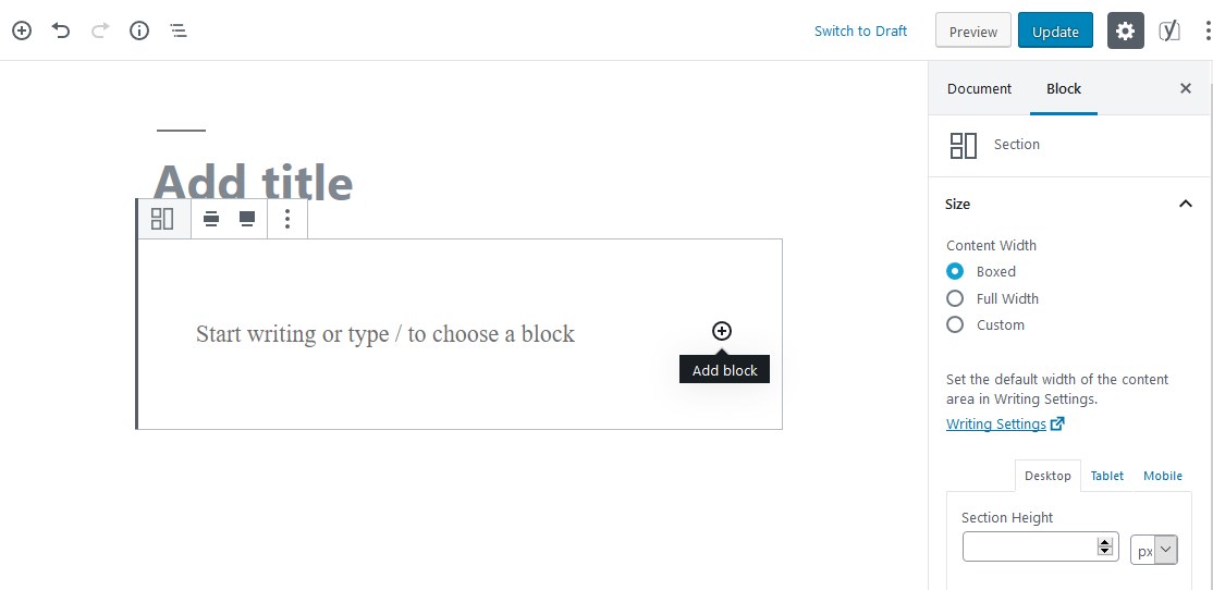
The section is a multi-element container that you can improve with:
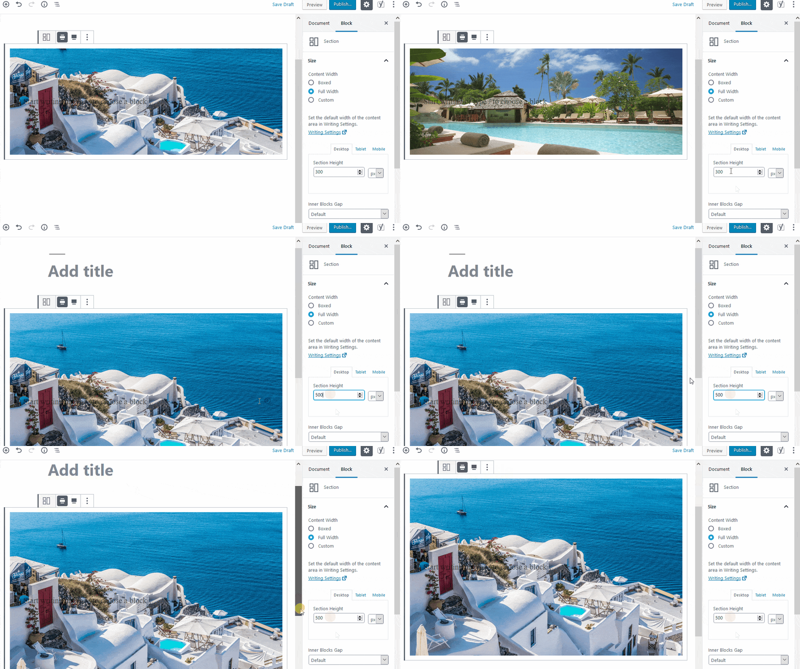
- Image, slider, or video background with tons of customization settings.
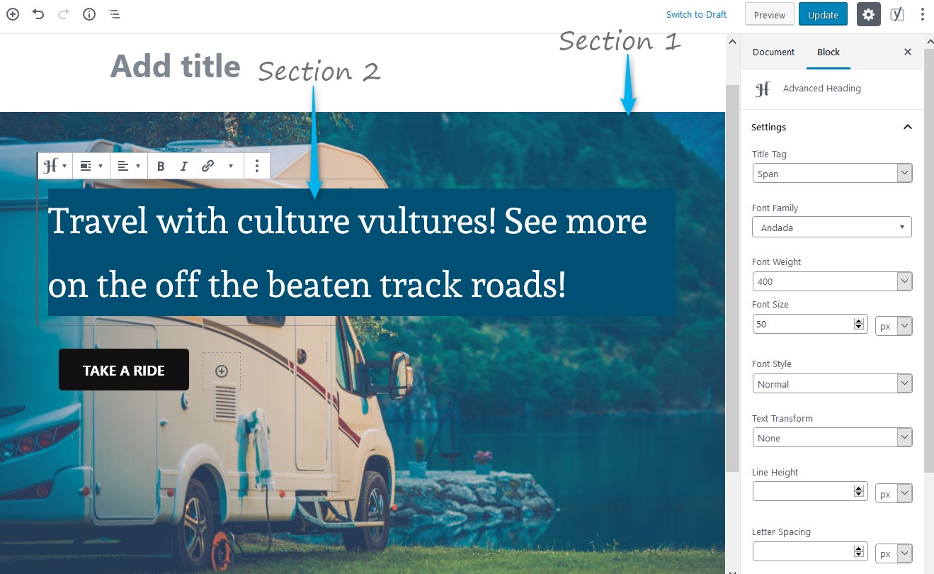
- Full-width, wide-width and custom-width layouts.
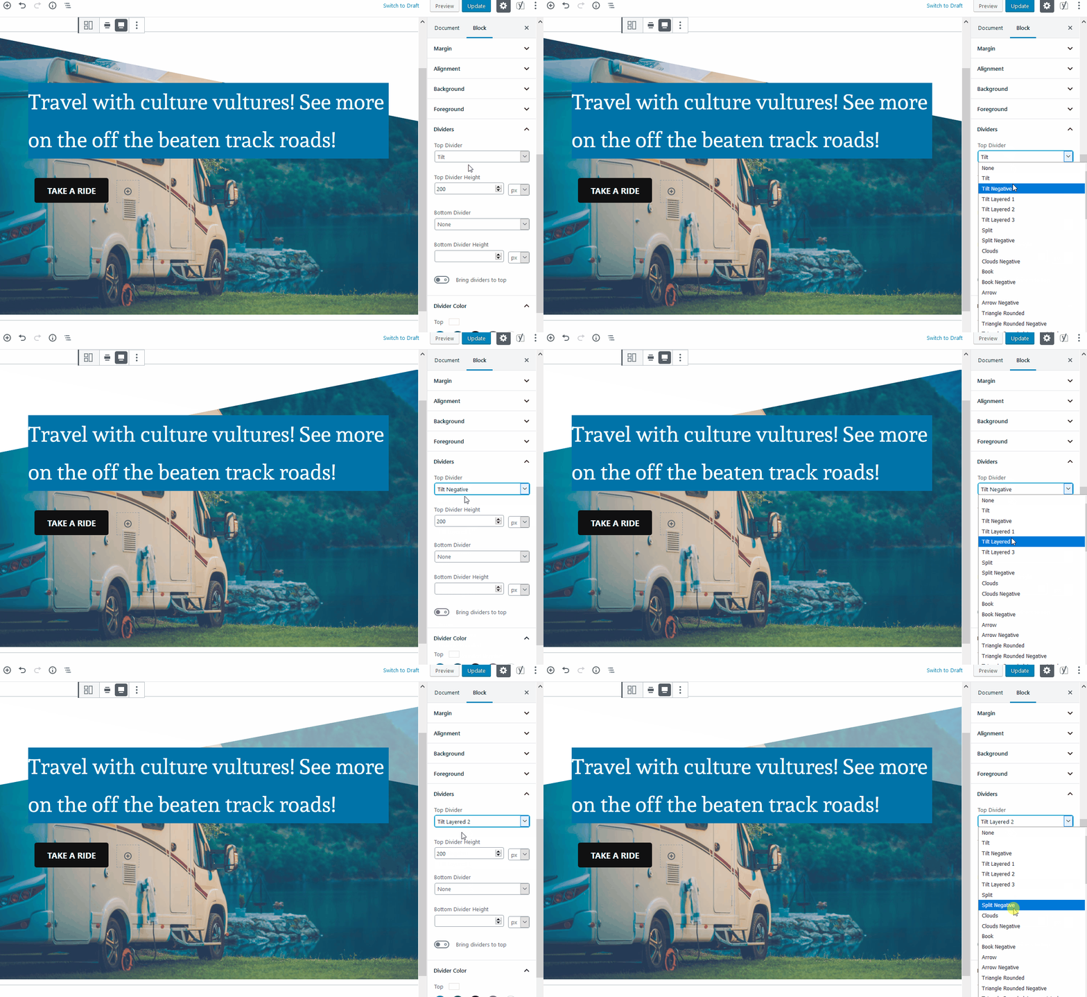
- Split content with dividers or create fancy shapes of the block.
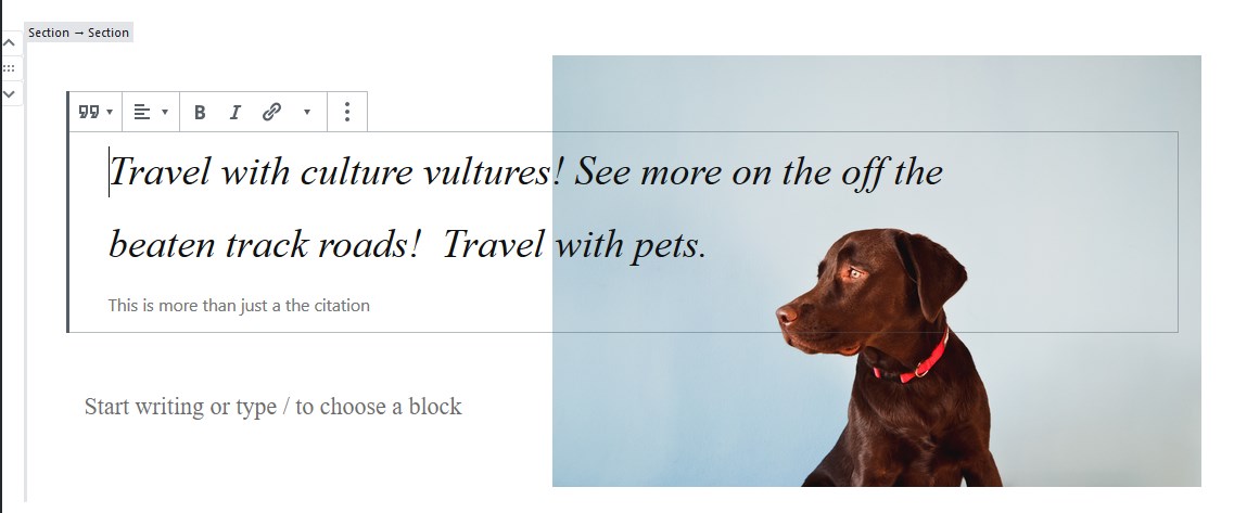
- Create cool offset layouts (Quote and Section blocks).
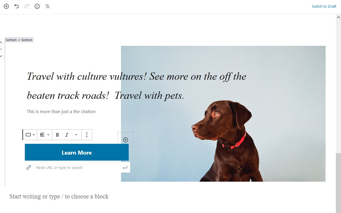
Even with buttons (the buttons can be of different sizes).
- Animate content (Columns, Icon Box, and Section blocks).
![]()
Or animate the whole sections:

- Play with the foreground styles.
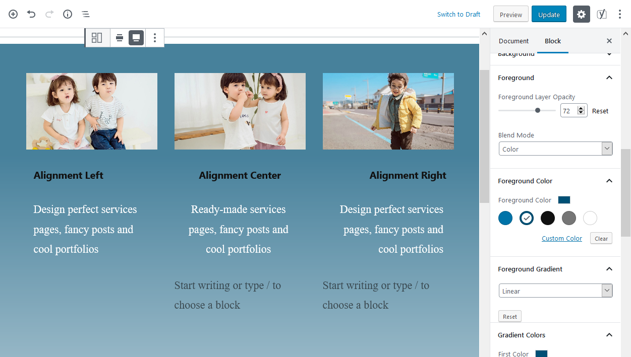
- Using a fixed position background, you can make the whole page more alive and dynamic (so the image in the background isn’t moving while scrolling).
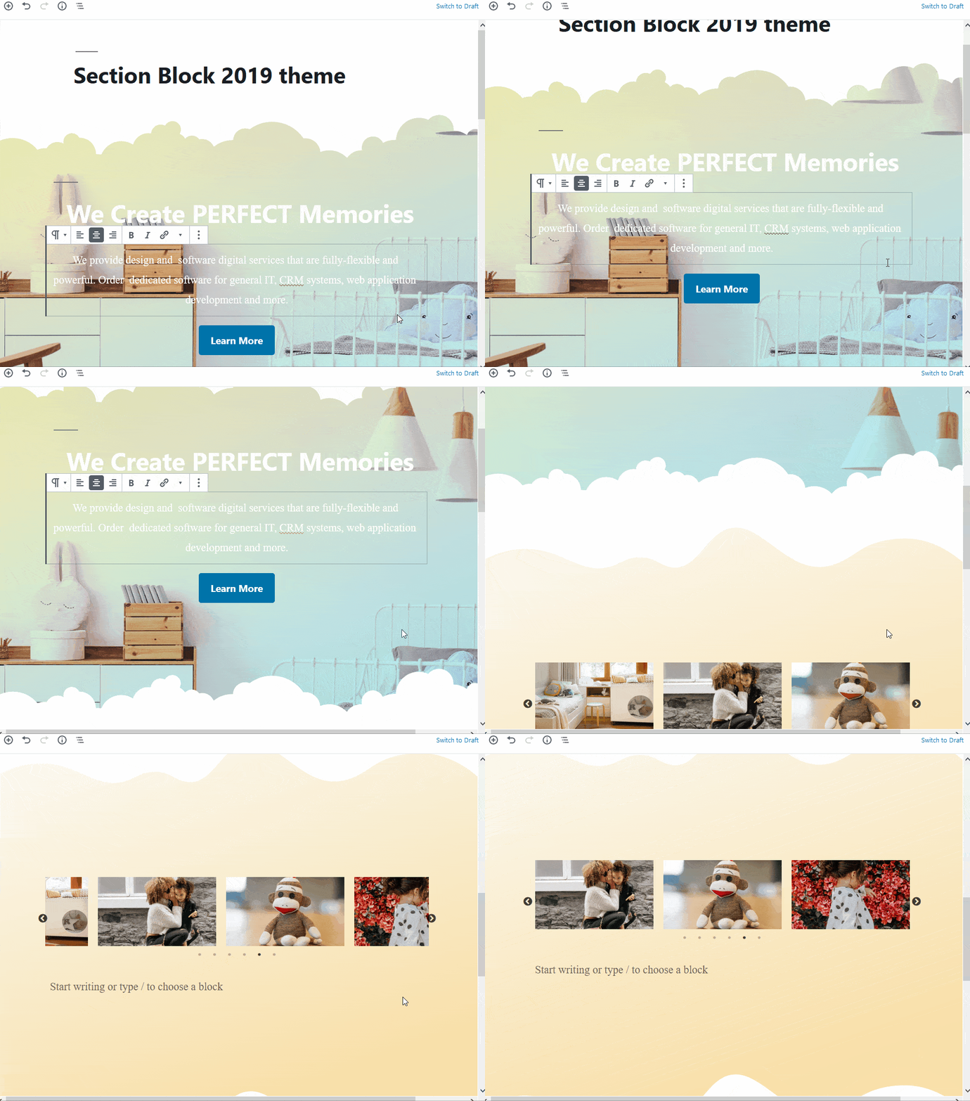
We’ve just scratched the surface on some of the most used features of this block and its possibilities.
Thanks to the power of other blocks you can put inside Section, e.g. Advanced Heading block with tons of typography settings, your options are much wider. If you are curious, take a look at the detailed video overview of the Section block in the Getwid Base theme:
Visualize data
Either in pages or posts, you can feature different data in a more simplified and engaging way. Getwid comes with several purpose-oriented blocks that help you present that information in any suitable way:
- Visualize data with progress bars (Progress Bar and Circular Progress Bar blocks).
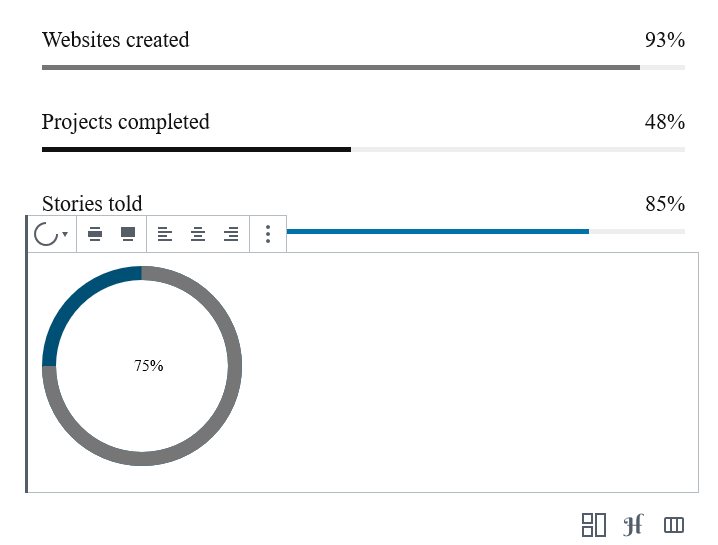
- Create comparison tables of your services, products, or projects (Price Box block).
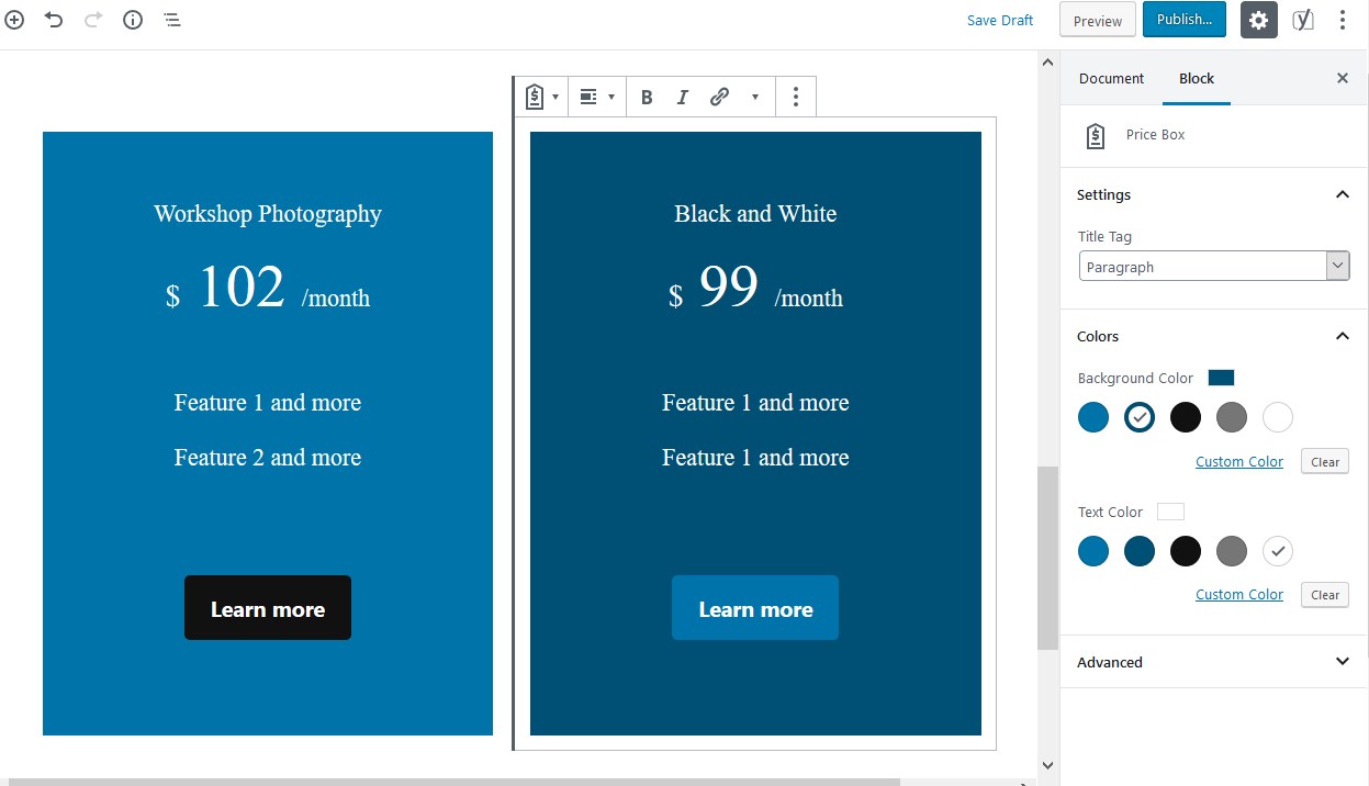
- Use Icon or Icon Box blocks to create more friendly and modern layouts that communicate ideas clearly.
![]()
The settings of the icons make it possible to go with various shapes that suit your current design most: circle, square, rectangle, and diagonals.
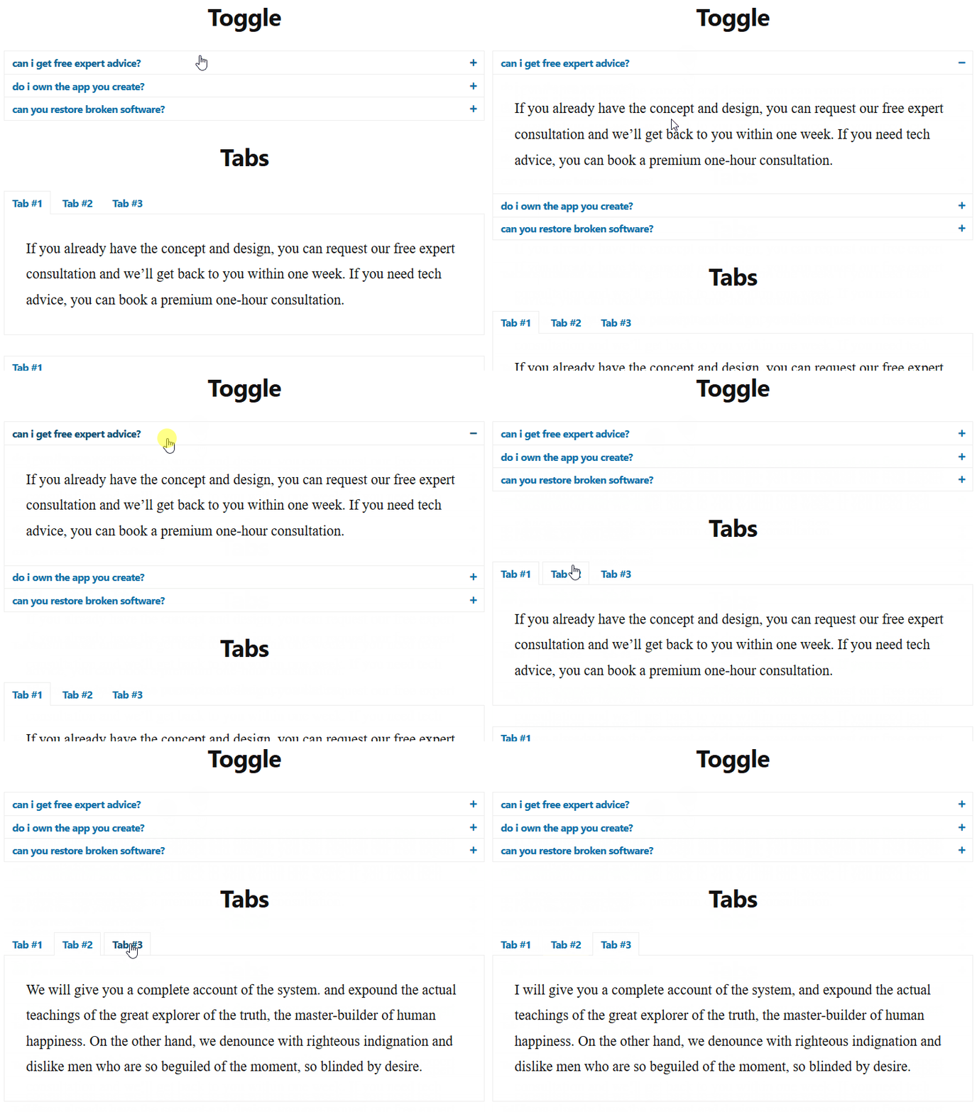
- Structure information with tabs and toggles.
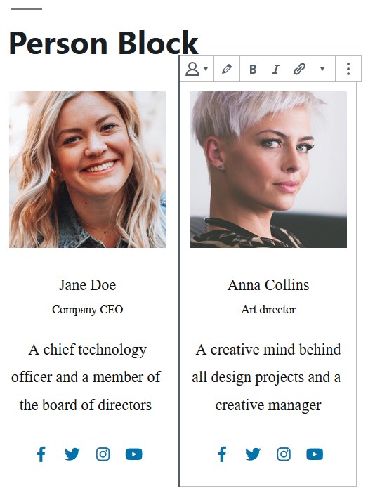
- Showcase your team.
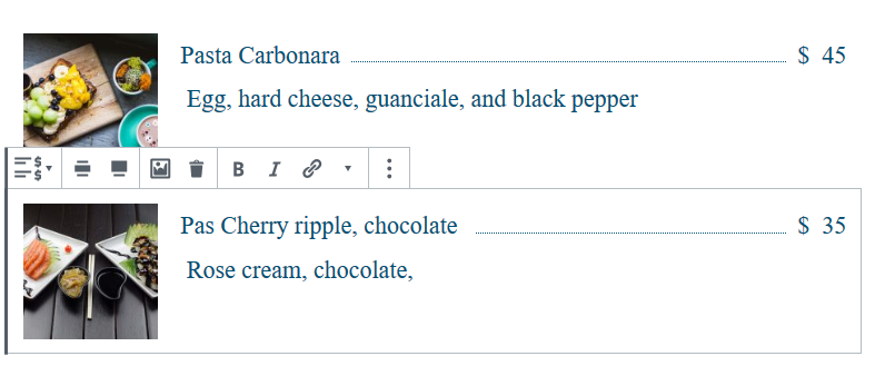
- Create tables of content or pricing lists (like restaurant menus).
Create catchy promo banners or promote posts
For your marketing efforts, there is a dedicated Banner block that can be primarily used for putting some hot offers or services in the spotlight. They are usually very dynamic thanks to the animation settings.
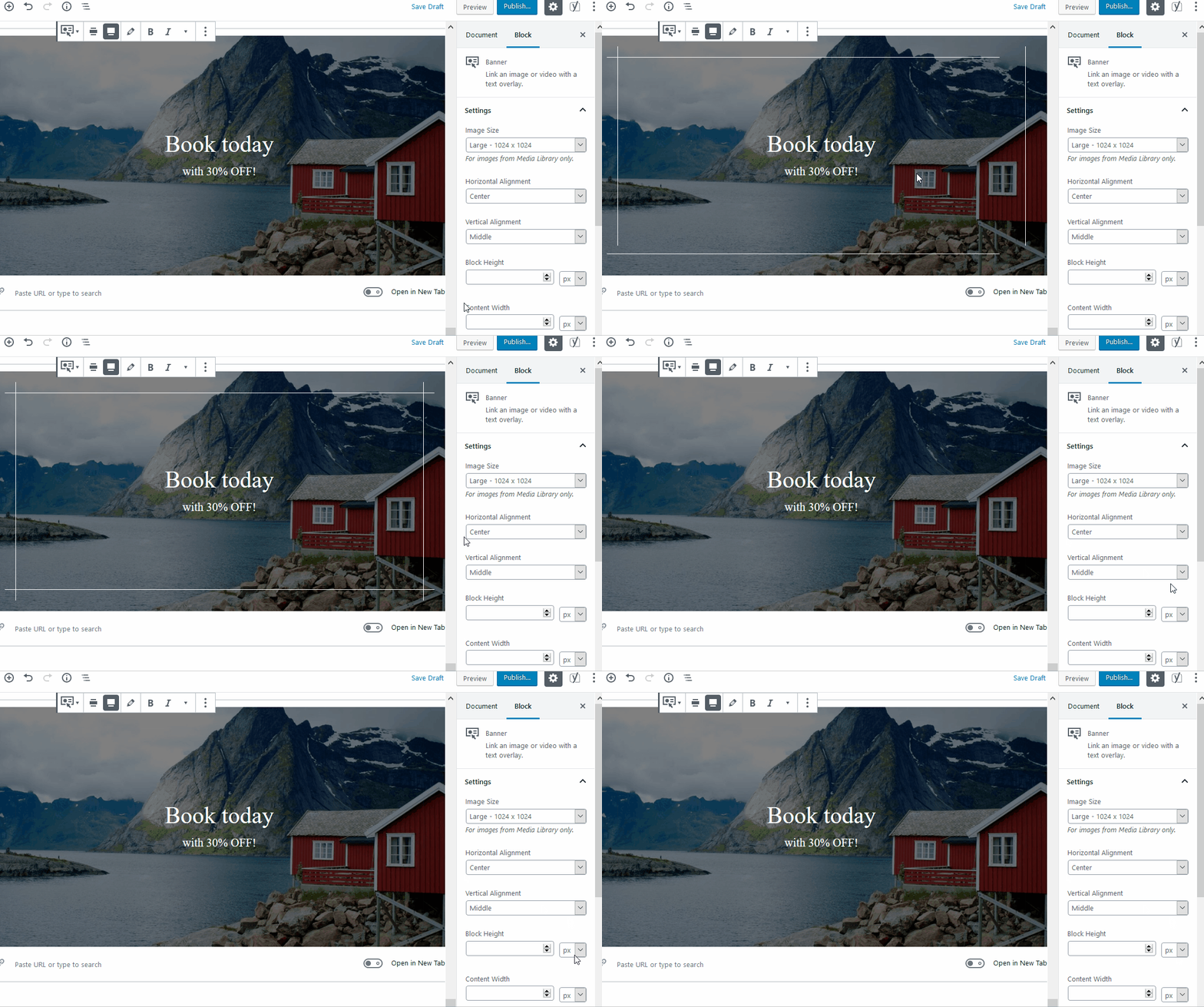
They can be either full or wide-width. You can apply different types of animation, play with the size and spacing, adjust colors and opacity, and more.
However, since you can put links inside the Banner block, I think they are also perfectly suitable for any other content like blog articles. You can manually curate articles that you need to promote or that are directly related to the current article and let the block do the job! It’ll surely get your reader’s attention.
Showcase post carousels and post sliders
This is a massive deal for blogs or those who have a lot of custom post types. Getwid ships with probably one of the best bundles of the post-related blocks, which allows for presenting your blog posts, pages, or custom post types in different formats:
- Post сarousels
- Post sliders
- Lists and grids view for custom post types
- Recent posts.
Any of these blocks basically fetch data from your posts and automatically add it to your website in the chosen layout.
Although each of these blocks comes with a default template and settings (to speed up your work), you can still give them a tailored look by creating a custom template. There is a layout selector and a bunch of settings for going about custom looks.
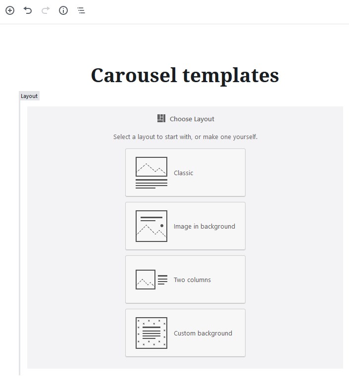
For example, here is a default view of the post carousel block:
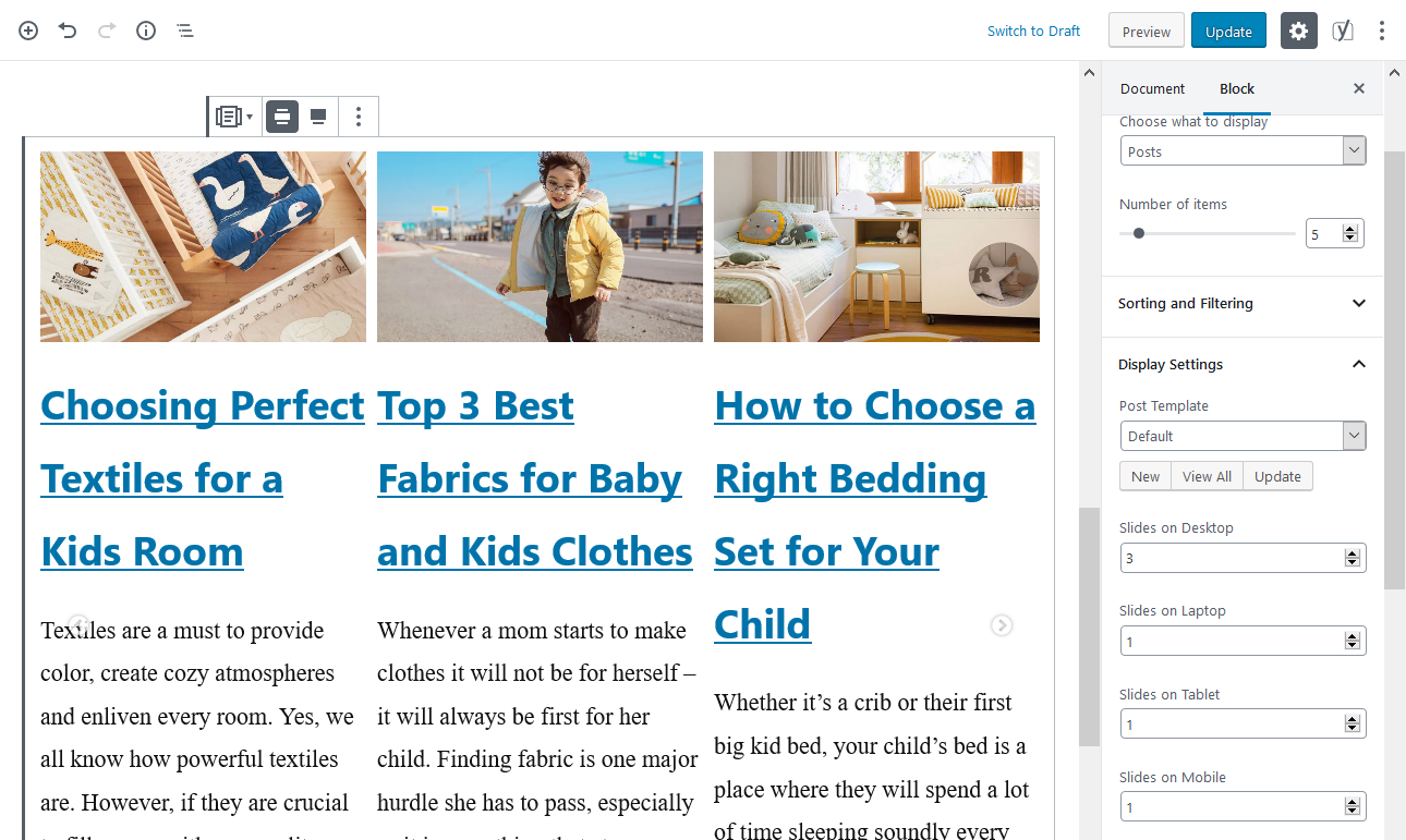
You are free to set a different number of slides to display based on a device, enable slideshows, set the spacing between slides, add slider arrows and dots, sort and filter the posts by IDs or categories, etc.
However, you can completely change this look with those custom templates. For example, let’s make it a two-column layout, slightly tweak the typography, and a Read more button (oh yes, you can even add extra blocks to your template!).
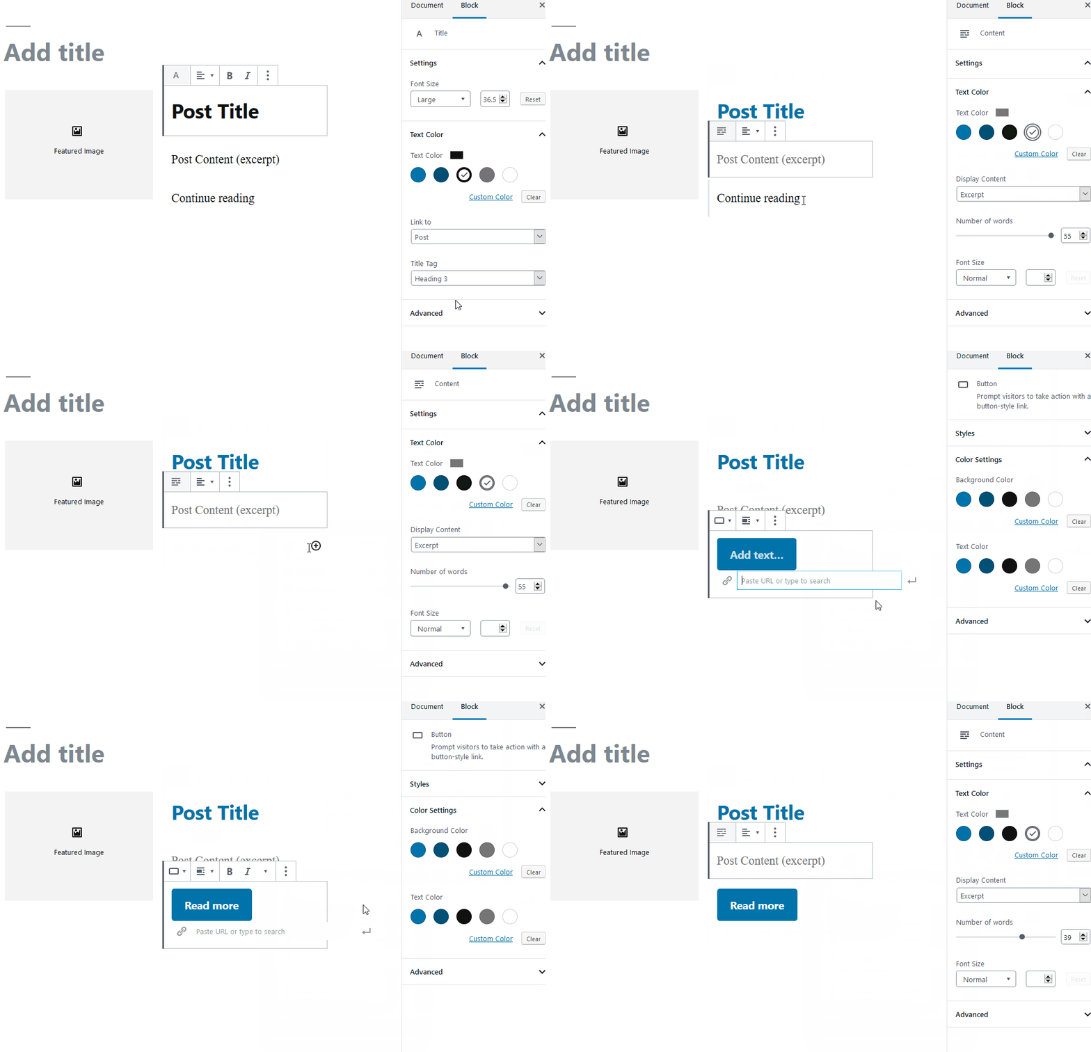
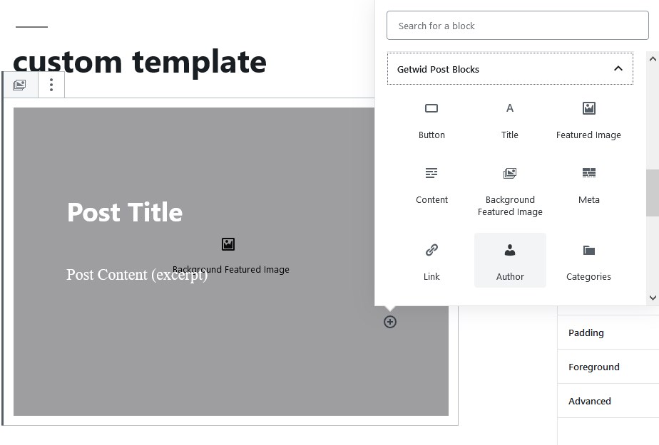
And here are some post-related blocks you can add:
So we get a bit different post slider in result:

There are several 2019-native button styles you can select from in Getwid:

Or go with the image in the background layout to build a more traditional carousel.
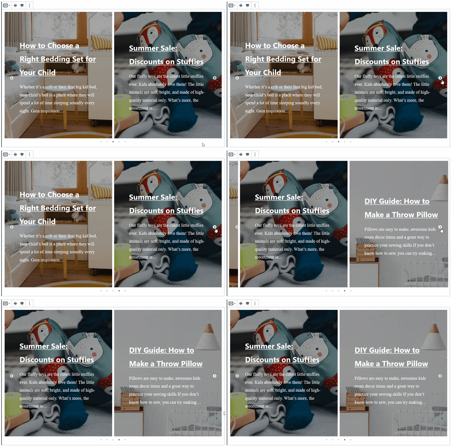
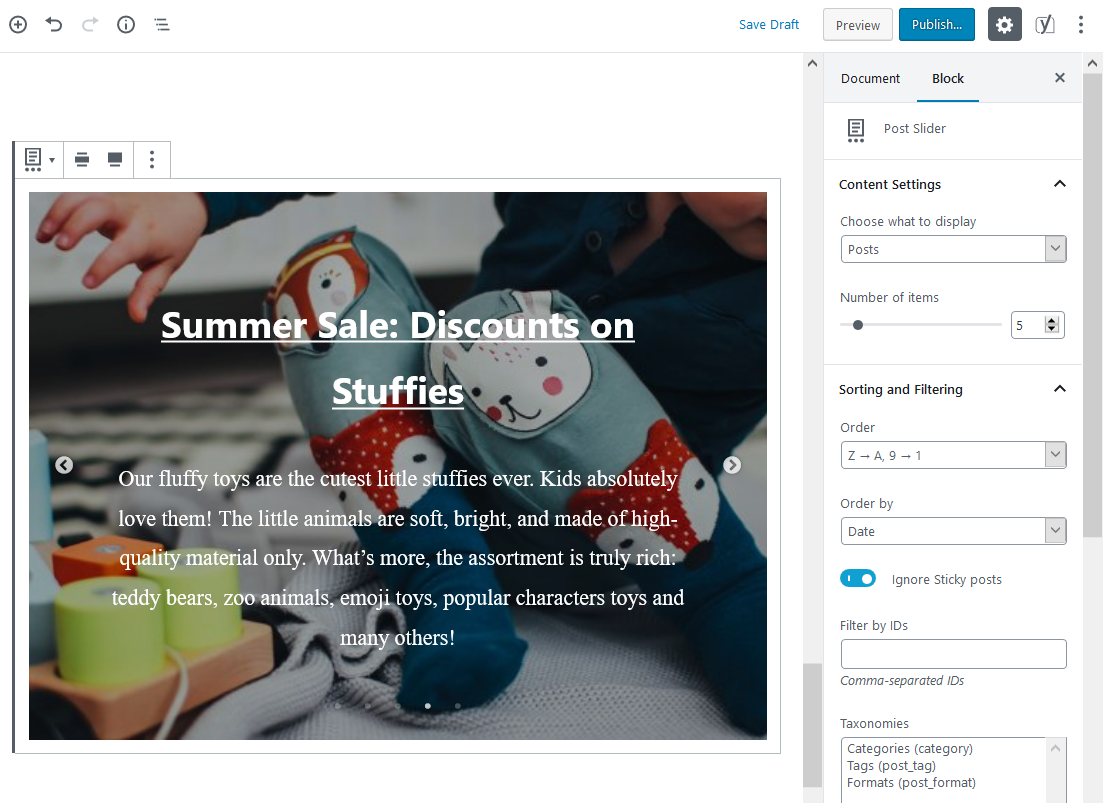
In the same way, you can customize custom post type sliders and simple post sliders. Additionally, in the post slider block, you have access to more unique settings, but the default layout is a traditional full-screen slider you can use for hero websites sections or product sliders you can place on the front page as well on the inner website pages.
For example:

In this type of slider, by default, you can change the height of your slider and apply different animation effects. If you want to update colors, font size, the length of the excerpt, and other text content, you’ll need to create a custom template.
The post type block allows you to output any custom post types, e.g. WooCommerce products in a list, grid, or custom format:
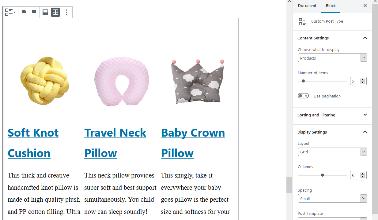
They will help you automate your workflows with posts, shop products, or other data, so you can create content you and your visitors will love.
Feature creative galleries
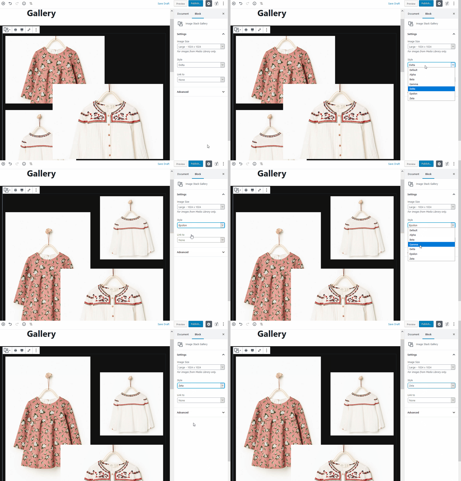
If you want to showcase image galleries in a non-trivial way, the plugin offers some cool gallery layouts you can switch with a button click. You simply need to decide on the default size of images and choose the style
Start easier with the pre-made Gutenberg block templates available in Getwid
Since version 1.4.0 of Getwid, WordPress users got an awesome opportunity to create content with pre-made layouts available in the Template Library! So you may not even need to create a page from scratch, just pick the needed template and your well-organized layout is ready! There are around 35+ templates so far:
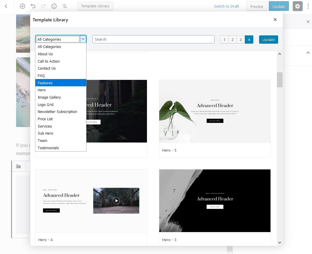
The best thing about it? Of course, it will blend with the default 2019 styles! For example, let’s insert one:
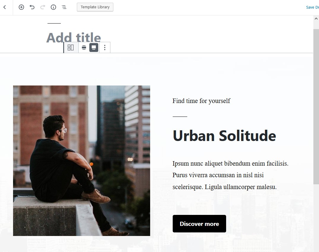
As you can see, the font and button style looks like a native 2019 thing! And I just clicked one button.
Final word: Getwid & Twenty Nineteen are a perfect combo
This is how you can employ Getwid with the Twenty Nineteen theme, without a single custom class or addressing the HTML editor.
So here are three major reasons why you might consider Getwid as a supporting plugin for the WordPress Twenty Nineteen theme:
- It offers a huge library of useful free Gutenberg blocks for any purpose.
- Getwid offers a deeply 2019-native experience: it’s one of those few plugins that work seamlessly with Twenty Nineteen thanks to the way it inherits styles (design) from the theme. But this compatibility is not a limit – you can completely change the look and feel of the WordPress 2019 theme thanks to the great layout and design settings that Getwid offers. The awesome library of pre-made templates makes it even easier to create pages and posts without the mess.
- Getwid is super lightweight and adaptable to any WordPress theme, so be prepared to have a similar seamless editing experience with a WordPress theme of your choice!
