Visual control parameters
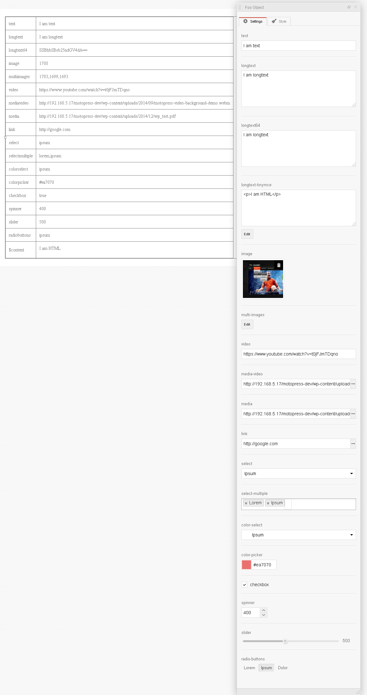
- type (string) (required) The type of visual control:
- text – a simple input field.
- longtext – a simple textarea field.
- longtext64 – a textarea field with Base64 encoding.
- longtext-tinymce – a textarea field with button for text editing in the TinyMCE editor.
- image – a button to invoke the Media Library dialog box for selecting an image. Add key ‘autoOpen’ with the value ‘true’ to parameters to open dialog automatically.
- multi-images – a button to invoke the Media Library dialog box for selecting some images. Add key ‘autoOpen’ with the value ‘true’ to parameters to open dialog automatically.
- video – an input field to insert links from Youtube or Vimeo.
- media-video – an input field to insert links for video with ability to select it from Media Library.
- media – an input field to insert links for media file with ability to select it from Media Library.
- link – an input field with the ability to call WordPress link dialog.
- select – a dropdown list with the set of available options. In order to set values to the element of array parameters you should add the element with
listkey that includes associative array where key is a value (that is set to shortcodes attribute) and value is a text for preview. - select-multiple – a dropdown list with the set of available options and multiple choice ability. In order to set values to the element of array parameters you should add the element with
listkey that includes associative array where key is a value (that is set to shortcodes attribute) and value is a text for preview. It returns the selected values – separated by commas. - color-select – is a dropdown list of color choice with set of available values. The function of the value is the same as for select one.
- color-picker – a simple color picker.
- checkbox – a simple checkbox.
- group – accordion for nested objects. In order to describe the nested objects for element of array parameters you should add element with
itemskey. The function of button text is the same as for longtext-tinymce one. - spinner – in order to set minimum value to element of array parameters you should add element with
minkey. In order to add maximum value you should use element withmaxkey and for setting step value you should add element withstepkey. - slider – a simple slider with
min,maxandstepvalues like in spinner. - radio-buttons – a group of buttons. The function of value is the same as for select one.
- label (string) (required) the title of control
- default (mixed) the default value of control
- description (string) human friendly description of your control
- saveInContent (string) if ‘true’ the value will be saved inside shortcode, ex. [code]value[/code]
- dependency (array) brings dependency logic to controls. An array with parameter=>value format, where