How to Add a Navigation Menu in Full Site Editor (WordPress Tutorial)
Table of Contents
If you’ve ever spent too long refining your website’s menu, you’re not the only one. I used to find it overwhelming and time-consuming, that is, until WordPress launched the Full Site Editor (FSE) and the new Gutenberg Navigation block, making it a piece of cake to design your website visually and keep it going.
In today’s post, I’ll walk you through how to access and edit the Header template, manage your navigation menu, and customize down to the smallest detail, like adjusting colors and fonts. I hope this WordPress navigation menu step-by-step guide will help you build a website menu that works for you: one that’s easy to manage and update.
Full Site Editing: flexible, dynamic, truly custom
Full Site Editing gives us the flexibility to design and structure our websites without relying on external theme settings or plugins. Think of your website as a digital Lego, you can edit every element of your site using blocks.
The responsive Navigation block makes this process even more visual and intuitive. A wealth of customization options is available for your menus, which you can now add to your Header, Sidebar, or Footer.
If you use FSE themes (for example, the Twenty Twenty-Five WordPress theme or Prime FSE), designing your site’s header and navigation has never been easier.
Getting Started: Accessing Your Header Template
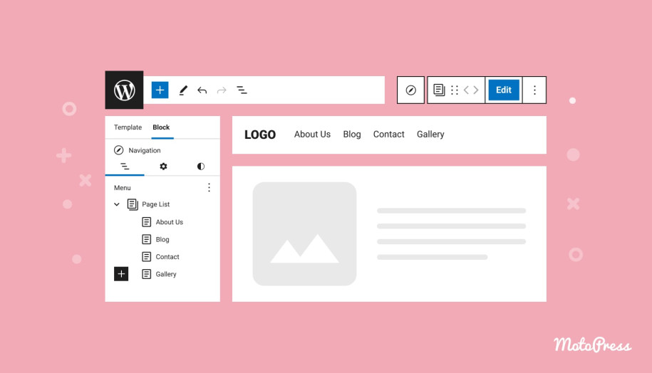
Before you start working on your menu, you’ll need to access your theme’s Header template. Just a heads-up, these instructions work if you’re using an FSE‐enabled theme. First things first, you need to open the Site Editor. Log in to your WordPress dashboard and go to Appearance > Editor. There you’ll see a preview of your site and a sidebar with all the elements that make up your design.
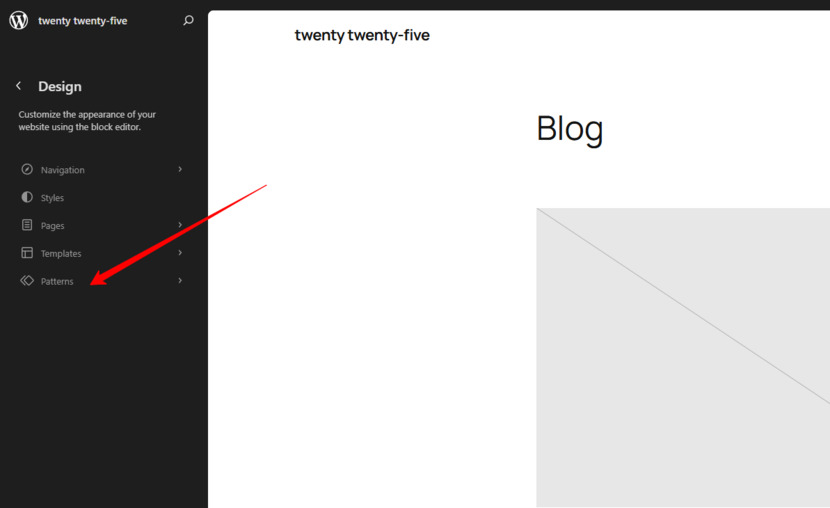
Now, find the Header: In the sidebar, click on “Paterns”, under “All Template Parts” and select the “Header” template to access the site’s menu. The List View (the icon with three horizontal lines) shows you all the blocks nested within your template, so you don’t lose track of where things are placed.
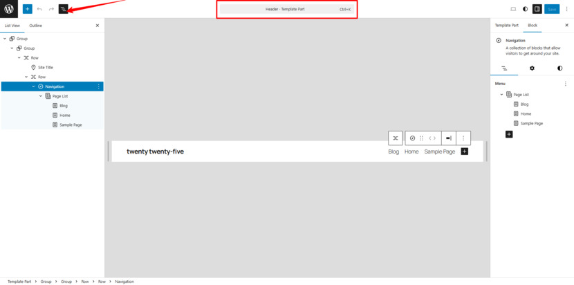
Time to begin editing: In the Header template part, click the area where the existing menu is to start editing. This is the fun part, you’re now ready to manipulate the elements in your Header. The next section explains how to work with the Navigation block.

Understanding the Navigation Block
Here’s what you need to know: the Navigation block is an advanced block designed specifically to manage your site’s menu in the site editor.
Key Features of the Navigation Block
- Automatic Menu Generation: When you first add the Navigation block to your Header, it will turn your published pages into a list, updating it systematically whenever you add a new page. That is, until you convert the menu to manual mode.
- Customizable Items: Once you click “Edit” on the Navigation block, you can manage each menu item on its own. You can add, remove, and reorder items, modify their labels, include extra links, and even create submenus.
- Nested Menus: The block allows you to create drop-down submenus, suitable for larger sites with multiple categories or sections.
Switching to Editing Mode
By default, the Navigation block automatically imports your published pages into the Page List block. Although this is convenient for a quick setup, it does not leave room for change.
To enter Edit Mode, click on any section of the default menu to reveal the option labeled “Edit” in the toolbar. Hit the “Edit” button within the toolbar or in the Settings to convert the menu into a customized list of links.
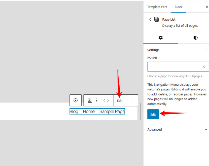
At this point, your menu will no longer be updated with new pages. Within a custom menu, you can reorder your menu items, remove pages that you don’t want to display, add links to external resources, create drop-down menus, etc.
Note: Once you convert your menu, it will no longer be routinely updated by WordPress, meaning you get to keep all your changes. This conversion is an essential first step. Once complete, you have full control over your menu’s layout and content.

Rearranging Your Menu Items
With your custom menu in place, the next step is to reorder items so they display your preferred site’s hierarchy. With the Navigation block, there are multiple ways to do this:
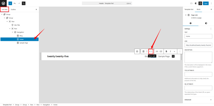
- Toolbar Arrows: Click on a menu item, and little left/right arrow icons will appear. They allow you to shift an item one spot to the left or right. They’re super handy for minor adjustments.
- Drag-and-Drop Functionality: For large-scale changes, look for the six-dot icon on the menu item (visible when you hover over it). Click and hold this icon, then drag the item to the desired position. I find this method the most intuitive for moving items with ease.
- Using the List View: The List View in the Site Editor is a lifesaver. It displays your entire menu structure in a hierarchical format, making it easy to see the bigger picture for complex menus and adjust at once the placement of multiple items, such as submenus.
Now you can get your menu order the way you want visitors to navigate your website.
Removing Unwanted Menu Items
Not every page belongs in your main navigation. Fortunately, the Navigation block makes it quite simple to remove items you don’t need. Select the item you want to remove by clicking on the specific item directly in the Navigation block or selecting it in the List View. Then, click on the three-dot icon (more options) and choose “Remove.” The item will no longer be displayed in your menu.
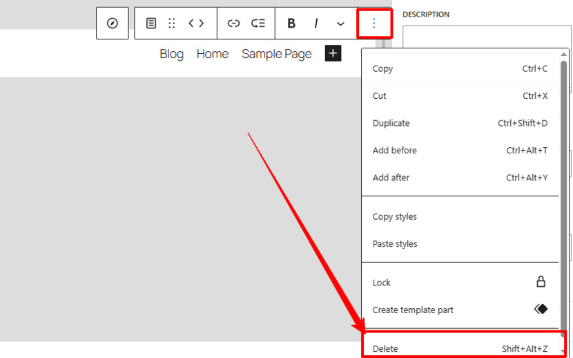
When you keep your WordPress navigation menu simple, you make it easier for visitors to see only the most important links.
Building Sub‑Menus and Drop‑Down Menus
One of the remarkable features of the Gutenberg Navigation block is its ability to create nested menus or drop-down menus. These submenus help you categorize content without cluttering your main navigation bar, creating a cleaner navigation interface, and making your website easier to digest.
To create a Sub‑Menu, the first step is selecting the Parent Item by clicking on the main menu item under which you’d like to add a submenu.
To add a Sub-menu item: find an icon resembling three horizontal lines with a curved arrow in the toolbar. When you click “Add link,” it allows you to insert a submenu item beneath the chosen parent one. You can then search for the specific page or post you want to add as a sub-menu item. Here you can also add categories or tags if necessary.
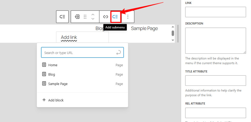
Repeat as Needed: You can continue adding more by pressing Enter on your keyboard or clicking anywhere outside the submenu area.
Drag-and-Drop Management: after adding submenu items, you will see them indented under the parent item. To further adjust the hierarchy, drag and drop items within the List View.
When you opt for nested navigation, you keep your menu organized for visitors to easily find the content they are looking for, significantly improving their user experience.
Embedding Custom Links in Your Navigation Menu
Sometimes you need to link to a page that isn’t part of your site, e.g., an external article, partner page, or social media profile. The Navigation block makes it simple to embed custom links into your menu.
Here’s how: select “Add a new link” by clicking the plus (+) icon in your Navigation block. In the field provided, type or paste the URL you want to link to. Click on it to bring up editing options to change the link’s label (the text visitors see) and specify if you want the link to open in a new tab (toggle the appropriate setting). To confirm and save, hit Enter or click outside the submenu area to add the link.
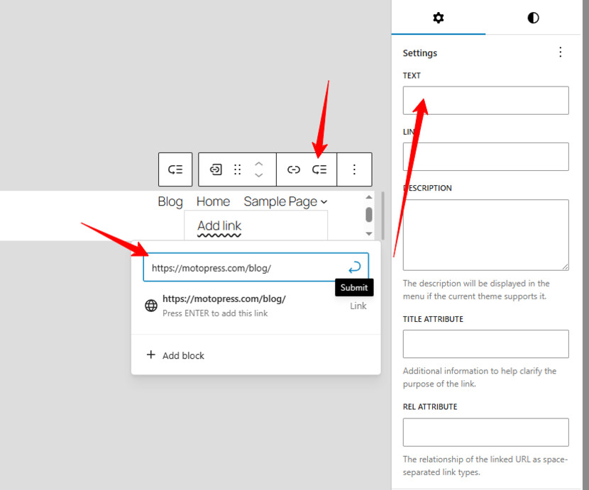
Now you can easily include external sites or promotional pages in your menu, providing direct access to important external resources. Custom links add a personal touch to your navigation, directing visitors to exactly where you want, even if it’s not part of your site.
Adding New Parent Items to Expand Your WordPress Navigation Menu
If later on there is a need to introduce new content, you can add brand new sections (a.k.a. parent items) to your menu by following the steps. Click on the plus icon (+) within your Navigation block to insert a New Parent Item. You can now search elements by name and add any page, post, category, or tag available on your site, or manually type or paste a custom link. After adding the link, customize it as needed to make it a top-level entry in the menu.
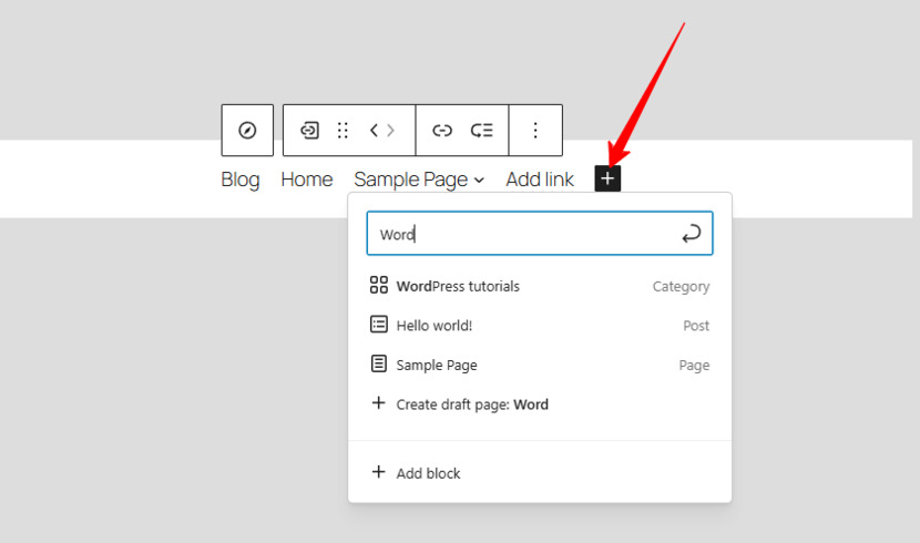
In some cases, you may want the top-level menu item to serve solely as a header for a drop-down menu, with no attached link. In this case, add a new block and simply type the text. This label can then serve as the title under which you nest additional submenu items.
Enhancing Your WordPress Navigation Menu with Additional Blocks
The Gutenberg Navigation block isn’t limited to just text links. You can enrich your menu with:
- Social Media Icons Block: Add buttons that link directly to your social media profiles.
- Site Logo Block: Embed your site’s logo directly within the navigation to boost your brand recognition.
- Search Block: Include a search function directly into your menu, especially if you have a content-rich website. You will make it easier for users to find what they are looking for on your site.
With these special function blocks, you can create an engaging navigation menu that enhances both site usability and your brand aesthetics.
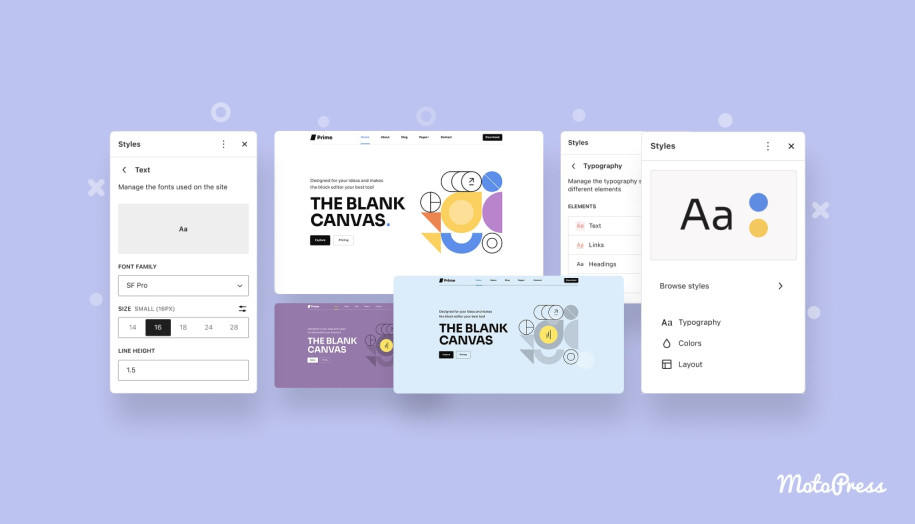
Customizing the Navigation Block Settings
What is great about the Gutenberg Navigation block is that you have even more settings to play with. Customizing WordPress options appear in the right sidebar when you select any part of the block. They may vary, but here are some of the most helpful settings:
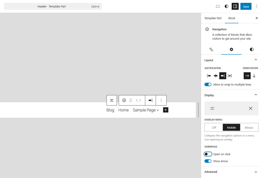
Layout and Orientation
- Justification: You can align your menu items to the left, center, or right. However, the justification setting may depend on your chosen theme, and some themes lock the item position.
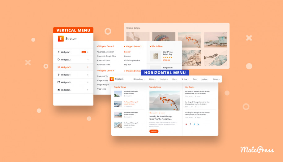
- Orientation: You can choose to display your menu horizontally or vertically. Horizontal menus are great for desktop sites, whereas vertical menus work better for mobile or sidebar navigation.
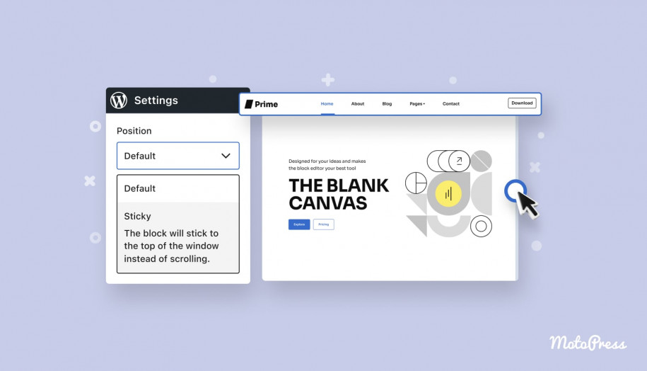
- Overlay Menu Options: On mobile devices, space is everything. The Navigation block lets you collapse your menu behind a “hamburger” icon—this is the overlay menu. You can configure it to display only on mobile devices, to be always visible, or to remain off entirely.
We suggest you experiment with your WordPress navigation menu in the full site editor and find what looks and works best.
Navigation Menu in WordPress Styling Options
- Colors: The settings panel allows you to choose the colors for your menu text, background, and even submenu items. Consider using high contrast to improve readability.
- Typography: Adjust font size, style, and weight for a cohesive look that matches your site’s style guide.
- Dimensions: Manage the spacing of your menu items by adjusting the padding and margins for your menu items. Your menu should have clear visual separation with each element properly aligned.
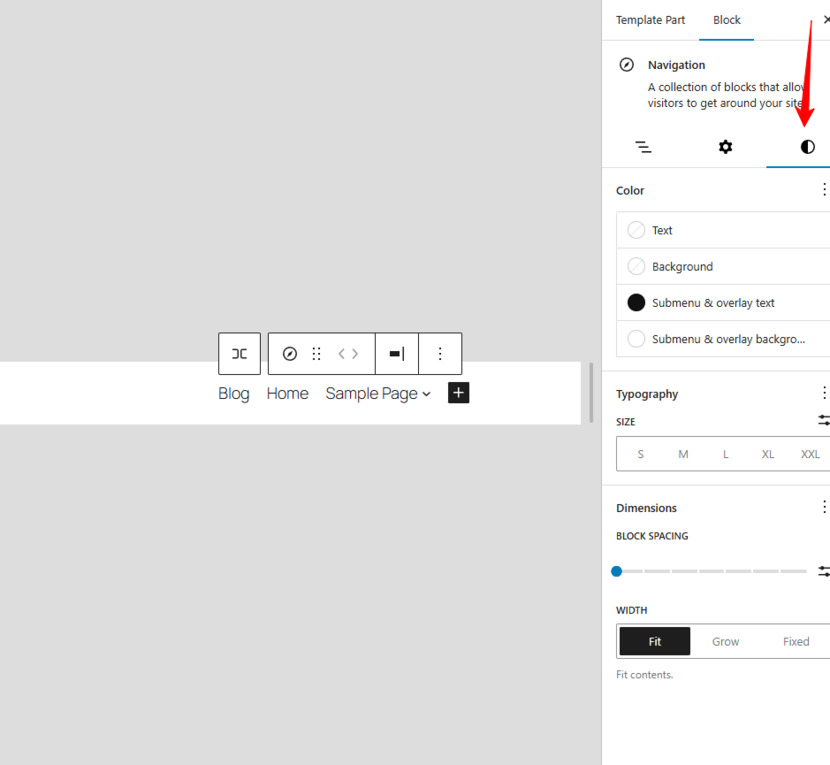
These options can help you consistently style your menu to reinforce your branding and align perfectly with your vision.
Final Touches: Review, Save, and Test
After making all your WordPress navigation menu changes, take a moment to review the entire menu. Here are some steps to follow before you hit “Save” :
- Double-Check Your Layout: Every menu item should be in the right order, with submenus accordingly nested. The List View in the editor comes in handy for this—it gives you a global overview of your entire menu structure.
- Test Your Links: Click each link to confirm that it directs your visitors to the correct pages, especially if you are using custom links and external URLs.
- Preview on Different Devices: We advise you to preview your site on various screen sizes, as the menu should be functional and visually appealing on both desktop and mobile devices.
- Save Your Changes: Once you’re satisfied, click the “Save” button in the top-right corner of the editor. Your Header template—and in its turn, your customized navigation menu—is now live.
With these guidelines, you can create a menu that is not only aesthetically pleasing but also highly functional.
Final Thoughts on the Navigation Menu in WordPress
The Navigation block boosted WordPress site development. No more rigid theme settings or limited customization, you have direct control over your site’s layout.
To get you started, this post has walked you through every step: accessing the Header template, editing the automatically generated Page List menu, rearranging items, adding custom links, and applying advanced settings. Your WP navigation menu is often the first interaction visitors have with your website, so make it count! With these tools at your disposal, you can create a responsive and visually appealing menu.
Thank you for reading! If you found this post helpful, please leave a comment below with your experiences or any questions you might have. Feel free to check out more tutorials and tips on our blog as you continue to explore the world of Full Site Editing. Also, don’t forget to share this guide with anyone looking to upgrade their WordPress menu experience using Full Site Editor.
FAQs
What is the Navigation Block?
The Navigation block is a versatile Gutenberg block designed for building and managing your site’s menu. It automatically generates a list of your published pages, which you can then convert into a fully customizable menu. This navigation menu WordPress block helps you create navigation that’s visually appealing and easy to update.
How do I convert the auto-generated menu into a custom menu?
When you add the Navigation block, it initially displays all your published pages using a Page List. To personalize it, simply click on any menu area to open a pop-up window, hit “Edit,” and the menu transforms into a custom version. This change lets you rearrange items, edit labels, add new links, or remove items as needed.
How can I rearrange my menu items?
Once you’ve converted the menu to a custom one, rearranging items is straightforward. You can use the toolbar arrows (left/right) to nudge items into position, or simply click the six-dot icon to drag and drop items into your desired order. The List View in the editor is also a helpful tool to visualize and adjust the menu hierarchy quickly.
How do I add submenus or drop-down menus?
Creating submenus is easy. First, select the parent menu item where you want to nest additional links. Then, click the icon (often represented by three horizontal lines with a curved arrow) to reveal the “Add link” option. You can search for pages, posts, categories, or even add external links. Each added item will nest under its parent, forming a drop-down structure.
How do I incorporate custom links or extra blocks, like social icons or a search bar?
To add a custom link, click the plus icon within the Navigation block, enter or paste the URL, and then set a custom label that visitors will see. Additionally, you can enrich your navigation by adding special blocks (social icons, a site logo, or a search block, etc.) to provide extra functionality and reinforce your brand identity.
Thanks, it’s a useful tutorial. However I often have problems with the mobile / overlay menu, especially on IOS devices. (Just ugly, or sometimes too wide for the screen.) Hope it will develop soon.
Thanks for sharing your experience! We appreciate your feedback. The mobile menu on iOS can be unpredictable. The Navigation block is still evolving. In the meantime, a few small spacing or width adjustments in the block settings can help. Otherwise, you can add a bit of custom CSS to make it look better for now.