How to Set Wide or Full-width Content Alignment in Gutenberg
Table of Contents
How to create full-width / wide-width containers in Gutenberg without coding? How to turn Gutenberg elements and text to full width? We have answers in this post. You might need them for headers, promo sections, and other content areas that you want to highlight. Wide and full-width content alignment in Gutenberg can also work for building visual hierarchy between sections and making some of them stand out.
Note that you can align content for both pages and posts in WordPress.
Theme support for full-width alignment
The trick is, if you really need a no-brainer solution, this feature (the ability to span the full website width) must be supported by your WordPress theme by default. That is since it’s an opt-in style, theme developers must declare it via add_theme_support (‘align-wide’) in functions.php if they consider it to be a reasonable addition.
If you are okay with getting your hands dirty, you can add WordPress theme support for full-width alignment yourself. As far as I know, there is no full-width plugin WordPress that can do the job.
Also, some WordPress users tend to question the align items vs align content difference.
The align-item property allows you to align elements vertically. It applies to containers only and determines how flex items are aligned within a flex line and along the cross-axis.
Meanwhile, the align-content property lets you align elements if they are on multiple rows. It also applies to containers only but defines how flex lines are aligned along the cross-axis.
Set up different Gutenberg layouts via the block settings
So the following guide will work for you if your theme already supports it. To check whether it does, insert the top-level (a parent block that can host multiple blocks) Group Gutenberg block and then navigate to the “Change alignment” setting:
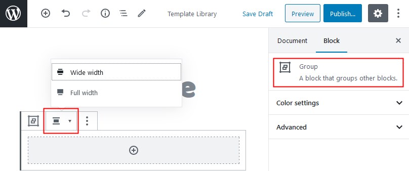
Let’s emphasize on the difference between these content alignment options in Gutenberg:
Full-width containers – both the section and content span the full width of the screen (WordPress alignfull)
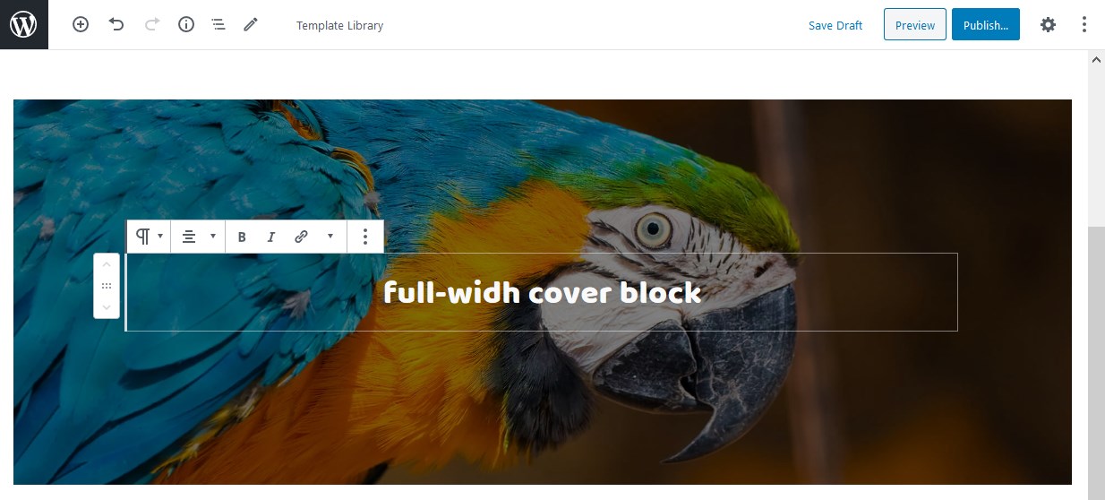
Wide-width containers – the section is full-width, but the content is fixed (WordPress alignwide)
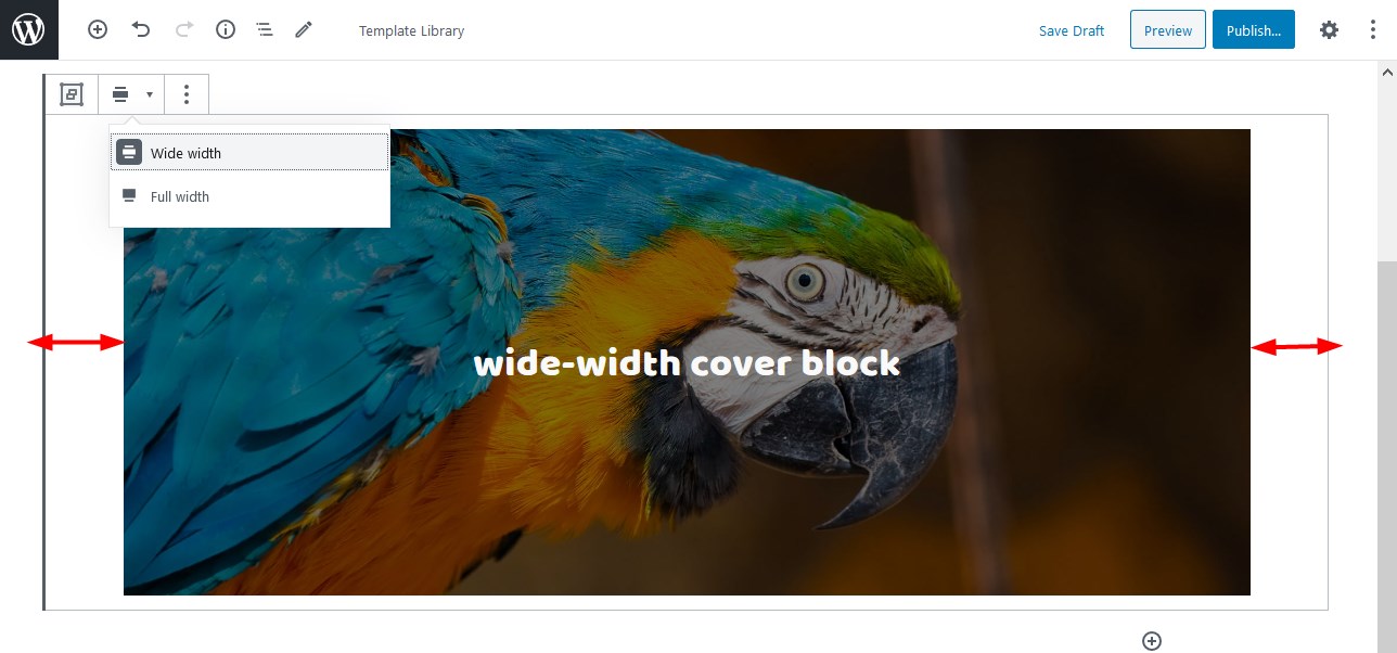
Moreover, some default Gutenberg blocks, e.g. the Cover block (which in its turn can hold multiple blocks) and the Gallery block, support different alignment options out of the box. In other words, you don’t need to put the Group block first to set a full-width alignment in Gutenberg.
Hand-picked Gutenberg Themes
You can change container alignment in Gutenberg WordPress for both pages and posts. If your posts/page layout is designed with a sidebar, the full-width container should span the content area without overlapping a sidebar (still make sure to test this out).
For example, let’s check the full-width layout of the Cover block in the GeneratePress theme to see the difference:
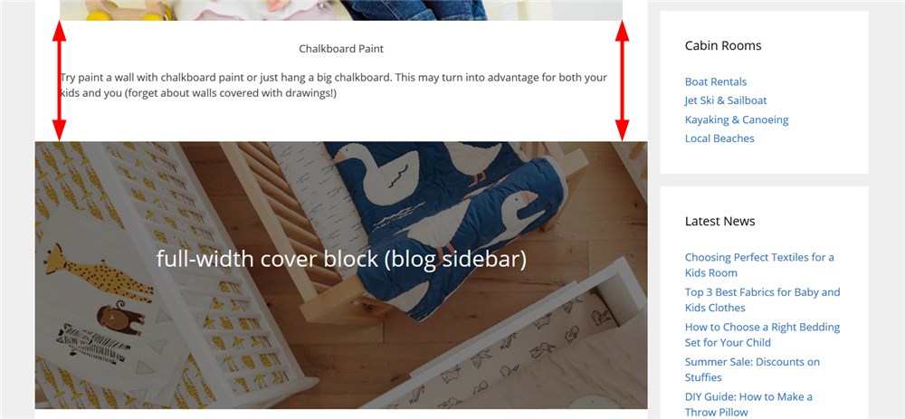
Please keep in mind that to make your pages more lightweight in terms of CSS, steer clear of using different alignment options for the pages with sidebars.
If you are on third-party Gutenberg addons, each can also provide its own way to deal with the align options. For example, in Getwid, you can set a preferred alignment for multi-block containers by starting with the Section block:

Conclusion: How to Set Wide or Full-width Content Alignment in Gutenberg WordPress
Stretching your Gutenberg website containers to the full-width and using full space text with wide-width layouts is easy. And the only instrument you’ll need is the WordPress block editor. What’s more, Gutenberg is getting easier with every core update.
Some essential layout and alignment settings in Gutenberg rely on the crucial theme support concepts, so you first have to make sure that your WordPress theme is capable of handling different alignment options (otherwise, you need to add them yourself). Thoughts, questions?
Where do I change the site content width?
How can I change the layout width with Getwid?
How do I change the width of my theme?

