How To Structure Your Site Correctly With Elementor?
Table of Contents
Today we’re speaking about the custom structure of Elementor websites. It’s been a long time since websites looked like an unclear canvas with two columns and a piece of text in the middle. Now websites imply a wider range of goals. They work as an online portfolio, an online magazine, a platform that sells all kinds of products & services, and more.
As websites started to serve greater goals, there came a necessity for advanced management tools, and a more complex site structure.
Good website navigation is more than just “a convenient feature for visitors”. Indeed, first-time visitors should quickly access information about the product, its price, and contacts. What’s also important for SEO is an easy-to-navigate custom structure Elementor. Not only does it prevent a resource from a bunch of errors but also, contributes to better ranking in search engines.
What Stands Behind Elementor Structure?
Creating a site structure means building a well-defined hierarchy of URL addresses. It simply does not matter if it’s a three-page website or a complex platform with multiple pages inside.
The more logically you connect inner pages between each other – the more correctly search engines will scan your content. The more correctly they can scan your site – the better index it gets. The better index it gets – the higher ranking it will have in search engines. Accordingly, more people will reach your website on a specific request.
If scanning a website takes longer, search engines will likely place it in lower positions.
How To Edit Site Structure In Elementor?
With Elementor, building a proper site structure is an easy task. On top of that, the page builder itself offers a number of widgets to easily structure any website regardless of its type:
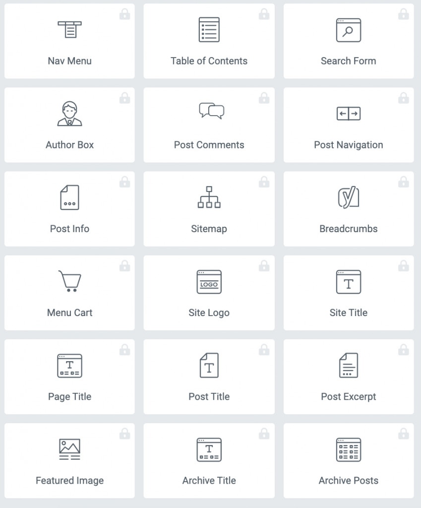
In case you don’t always have to think of building new layouts from scratch, you can use solutions that offer their own custom structure of Elementor. Here at MotoPress, we provide free & premium Elementor templates for different niches and website types.
Among the recently released Elementor tools, AI is really a game-changer.
Below are the top 7 must-have elements for improving the site structure and how you can build them using Elementor.
1. Header
A header element is located at the top of the page:
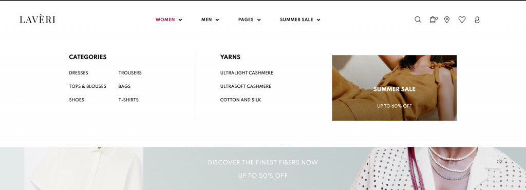
Source: Laveri – Fashion WooCommerce theme
The header content is permanent for all pages, and may contain:
- Distinctive corporate identity: logo, name, motto, brand character;
- Navigation (mega) menu with dropdown lists consisting of important website sections;
- Contacts: phone, address, working hours, contact form;
- Search field for improving site navigation. The search bar is often located on the right side of the header;
- Buttons for switching languages, entering your personal account, selecting a location, a version for visually impaired users;
- Shopping basket is typically shown as an icon.
You must not fit all the elements inside one header. The way you design a header for your website depends on the niche, brand activities, and other aspects. However, a traditional set of elements includes brand identity, company name, and a website navigations menu.
In order to create a website header for custom structure Elementor, you can use the next instruments:
- Theme Builder (available in PRO)
- Live Customizer
- SITE widgets (available in PRO)
- Elementor addons (e.g. mega menu builder)
If you don’t own Elementor Pro, you can use such instruments as Live Customizer and third-party solutions (megamenu builders, extra collections of Elementor widgets).
Live Customizer allows you to change your brand identity (logo, title), header image, as well as create a navigation menu and do other theme settings for the custom structure of Elementor.
Additionally, you can use addons that provide more diverse functionality compared to settings in Live Customizer. For example, you’d want to use a complex navigation menu that implies more multiple content displays.
Fortunately, MotoPress offers a great plugin for designing responsive & content-rich menus supporting all types of content – Stratum Mega Menu for Elementor.
About Stratum Mega Menu
The Stratum addon for mega menus suits everyone who wants to build website menus with multiple contents inside and do in the visual mode only. Elementor is all about making site customization easier. That’s why our megamenu builder turned out 100% flexible in all aspects:
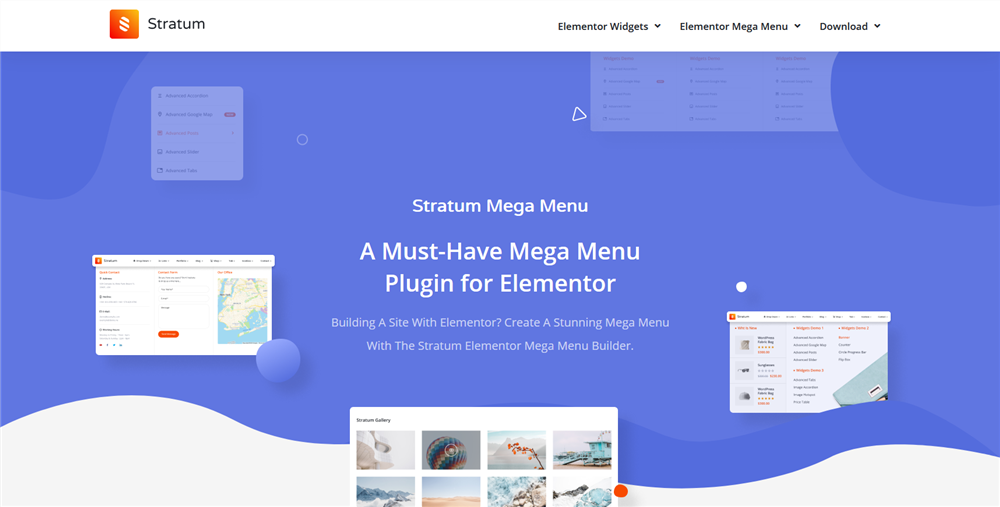
Click this DEMO to view website navigation examples built with Stratum.
Highlights:
- ANY content type in submenus (store items, images, maps, etc);
- Customizable tags or icons (e.g. Hot, New);
- Advanced styling settings (typography, colors, alignment) for each content type;
- Horizontal & vertical menus;
- Mobile-friendly (automatically transforms into a hamburger mega menu);
- Mega menu animation effects.
Click to learn how to build a WordPress Mega Menu with Elementor & Stratum.
2. Footer
Although footers are located at the very end of a website, it makes sense to mention headers and footers alongside. They work as a frame of your website and do NOT change from one page to another. Both elements help users navigate the site better:
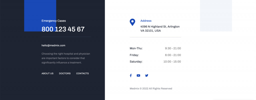
Source: Medmix – Medical Theme for Elementor
There are no particular rules for which elements can fit in the footer. For websites of enterprises and organizations, a footer should cover details of the company, contacts, address, and links to service & pricing pages. For personal websites and blogs, it will be enough to just duplicate the website navigations, place links to newsfeeds, and insert the Subscribe button.
Overall, footers can fit the next elements:
- Sitemap – a list of all or at least most important sections, pages, or site categories (e.g. popular blog posts);
- Contacts – more extensive contact information (phone & email) and/or a map pointing the exact location;
- Social media links;
- Copyright symbol.
Just like headers, there are a few options for how to style up your footer. If you don’t own Elementor PRO, you can do it in Live Customizer (Menu, Widgets, Theme Settings). Many Elementor themes, including ones by MotoPress, provide Header & Footer builder, which makes the job even easier.
Read also: Customization via WordPress Customizer
3. Body
A body contains content that varies from one page to another. The article you are currently reading is on the body of the site:
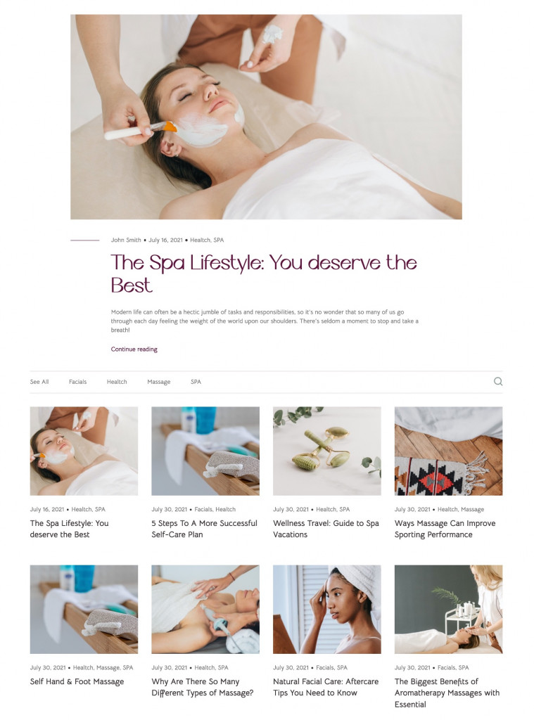
Source: Lotus Spa – Beauty Salon Theme for Elementor
The body contains all types of content: from headings, images, and posts to media sliders, galleries, and more.
If you are using pre-made site templates, you will not need to design the page elements from scratch (unless you want to redo or make changes to its design & structure). What’s left for you to do is to replace text and media content with your own.
If you design an Elementor page from scratch, you will likely utilize Elementor widgets. In most cases, a package of standard Elementor widgets available for free is not enough to build an eye-catching website.
Even if you don’t want to purchase Elementor PRO, you can take advantage of third-party addons to diverse your opportunities. Today users have a wide choice of plugins referred to as libraries of Elementor widgets.
One of such addons is Stratum Elementor Addons.
About Stratum Elementor Addons
Aside from the mega menu builder, the Stratum line-up offers a collection of multipurpose content widgets. They will help you build content for all different kinds of projects, whether you own a blog or a complex eCommerce store:
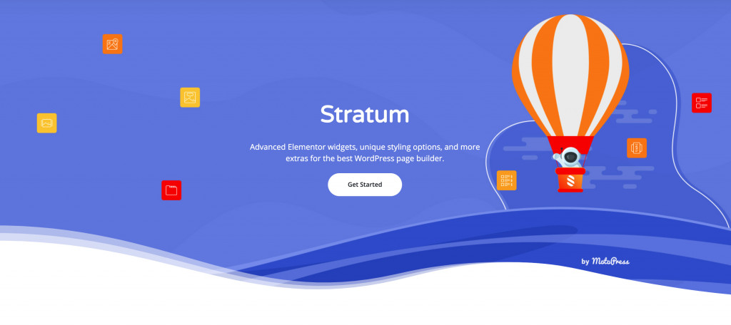
View Demo.
Highlights:
- 24+ content widgets for Elementor;
- All widgets available in the free version;
- Adjustment to the visual styling of your current theme;
- Advanced design toolchain;
- Elementor template library integration.
Here’s a list of Stratum widgets you may consider adding to the body of your website:
4. Sidebar
Sidebar is a column with extra content located on the right, left, or both sides of the page:
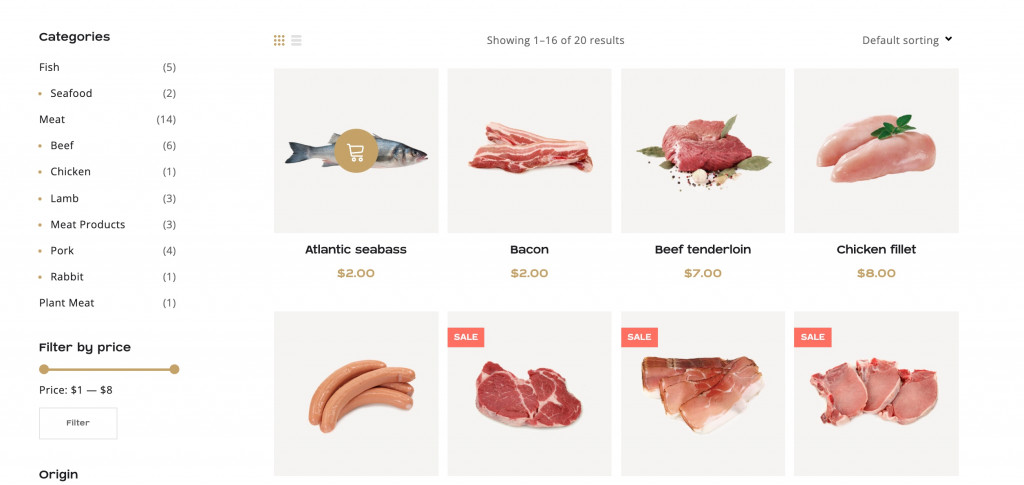
Source: Carni Rosso – Meat & Fish WooCommerce Theme
The sidebar content may be:
- Navigation menu: either an additional or the main menu removed from the site header. Sidebars are common for online stores that use categories and filters on the page;
- Popular or new posts drawing attention to certain articles. This is typically common for news resources and blogs;
- Ads promoting their own products/services or third-party brands. It’s recommended to use ad layouts that do not distract attention from the main content;
- Functional elements: shopping cart, subscription form, etc;
- Social media icons.
In the mobile version of a website, a sidebar is typically placed at the bottom. In some cases, they stay hidden on mobile screens. The reason for it is that sidebars are not more important for a website if compared to headers & footers. One-page sites, landing pages, and other websites featuring minimum content are less likely to need a sidebar.
To add a sidebar to your Elementor website, use the Sidebar widget or go again to Live Customizer > Widgets.
5. Breadcrumbs
The next significant element of websites navigation is breadcrumbs. Breadcrumbs refer to a navigational chain that shows a path from the main page to the current page/section.
Typically, you may find breadcrumbs at the top of the page:
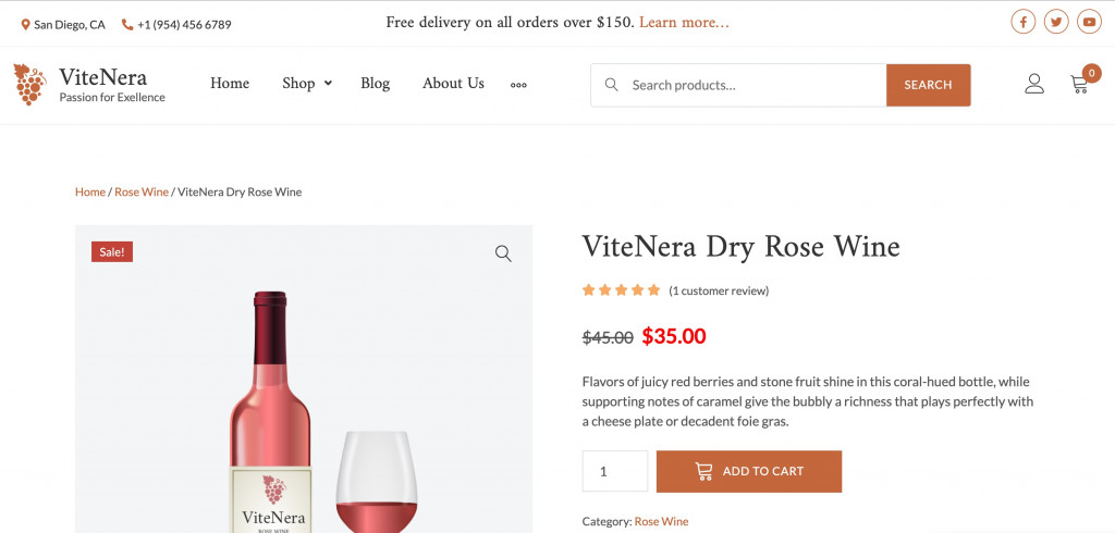
Source: ViteNera – Wine WooCommerce Template that work perfectly with WooCommerce.
Breadcrumbs help users navigate the site and go back to one or two previous sections. On top of that, using breadcrumbs improves SEO performance.
Types of breadcrumbs:
- Simple chain based on the site structure;
- Dynamic chain based on the site navigations of a particular user;
- Dropdown list for each section. Common for large online stores.
If your website has multiple sections and subsections, breadcrumbs will come in handy.
You can add breadcrumbs to your WordPress site using plugins like Breadcrumb NavXT and Yoast SEO.
6. Internal Linking
All website pages must be linked to each other, and here is why. As an internal link navigation example, look attentively at this post. You’ll notice links to the demos of some MotoPress themes and links to other blog posts.
Of course, internal links improve web navigation, in particular, behavioral factors. On the one hand, users find information faster, on the other hand, stay longer on the resource by ‘traveling’ from one link to another.
Also, internal links contribute to better site indexing. The search robot scans the site content (pages, images, links, etc.) and at the same time, navigates between pages using links. As a result, scanning runs faster. And as we already know, the faster it’s being scanned – the higher ranking it gets.
Finally, internal links give link weight to the needed pages. This means when search engines rank pages with the same relevance, those pages with more weight are more likely to get a higher ranking. From a customer perspective, these pages will be perceived as more authoritative.
To the internal linking examples, we may also refer a navigation menu in the header, sitemap in the footer, breadcrumbs, and links inside the sidebar.
7. Favicon
A favicon is a small icon of the site visible in the search results, tabs, and next to the URL:
![]()
Favicons should be associated with the topic of a website and stand out from others. A typical favicon is represented by the brand’s logo.
Why Should You Use A Favicon?
- Sites with favicons are more trustworthy;
- Favicons let you identify your site among multiple tabs;
- Favicon increases brand awareness.
The standard favicon sizes are 16×16 or 32×32 pixels. Other sizes vary by device type and operating system. A common favicon format is ICO, but PNG, GIF, JPEG, and SVG are also available. Nowadays, PNG and SVG formats are more common than ICOs. You may create a favicon in any graphic editor or online generator.
To install a favicon on a WordPress site, go to Live Customizer > Site Identity > Site Icon.
Final Thoughts
These were basic website navigation best practices that everyone needs to consider. If you work on the custom structure of an Elementor site, you are contributing to better SEO and best website navigation. Both components are vital for your site success, and ultimately, your project, whether it’s a business or a non-profit resource.
