Your Simple Guide to WordPress Global Styles and Global Style Variations [+Video]
Table of Contents
With this post, we’re continuing our site editing series. Today, we’re diving deep into WordPress Global Styles. Global Styles is a relatively new feature in WordPress introduced with Full Site Editing. Using a single set of styling rules, this system allows for setting and controlling the overall site aesthetics and layout.
With WordPress Global Styles, you can set global typography, colors, and layouts from a single interface rather than modifying styles for individual blocks or pages. The Global Styles interface has replaced the Customizer and is now the primary way of customizing styles in WordPress block themes.
The Evolution of WordPress Customization: A Journey from the Customizer to Global Styles
If you’re a WordPress beginner, it might be interesting for you to see a timeline of key milestones of WordPress toward more powerful customizations:
- WordPress 3.4, 2011: Early Customization with the Customizer
WordPress introduced the Customizer in version 3.4, which was released in 2011. This tool gave users a live preview of design changes, allowing them to adjust basic elements like colors, fonts, and layout options. While it was a powerful tool for customization at the time, the Customizer was still limited in its capabilities. - WordPress 5.0, 2018:The Shift to WordPress Full Site Editing (FSE)
The Gutenberg block editor was launched in 2018 with the release of WordPress 5.0. This major update allowed users to edit their entire site using blocks, from headers to footers. This shift opened up new site design capabilities but highlighted the need for a more advanced customization tool. Consider this period as the beginning of the shift toward full-site editing. - WordPress 5.9, 2022: Introduction of WordPress Global Styles
Finally, WordPress 5.9 introduced Global Styles as part of the Full-Site Editing features. Using this new interface, users could manage typography, colors, layouts, and block styles globally. Global Styles replaced the Customizer for block themes, and its main goal was to centralize all the controls so that users could easily maintain a cohesive look across their sites. - WordPress 6.0+, 2023 and later: Global Styles as the New Standard
By WordPress 6.0, rolled out in 2023, Global Styles had become the standard for customizing block themes. All the improvements to typography controls, gradient options, and advanced layout settings provided even more support for site-wide customization.
Global Styles has now become a real cornerstone of the WordPress design experience, as it offers users a reliable way to modify their site’s appearance with minimal effort. Before we dive into Global styles in more detail, let’s go over some basic requirements.
Consequently, to access WordPress Global Styles, you’ll need WordPress 5.9 or higher. In this post, I’ll be using WordPress version 6.7.2. If you’re using a different version, you may notice some differences in the interface and functionality.
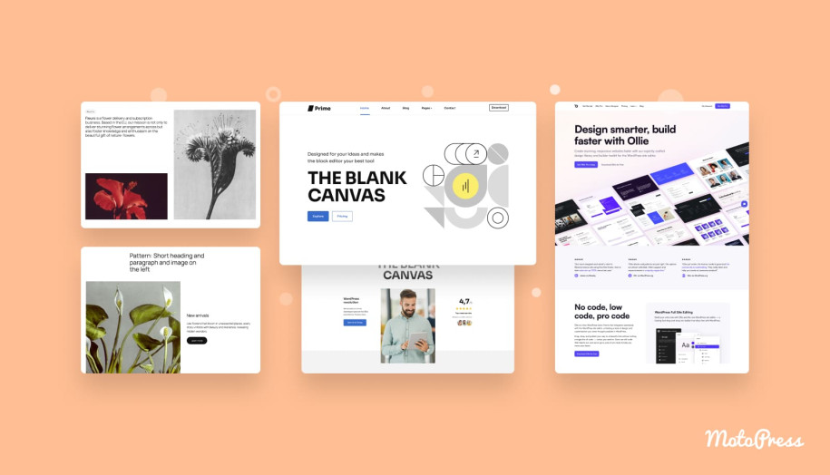
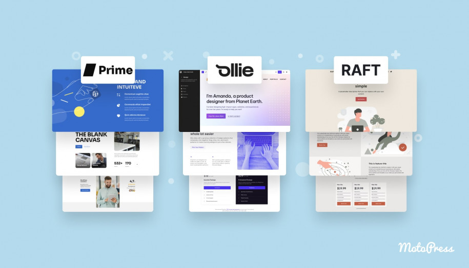
Second, you must use a block theme. In this tutorial, I’ll use Prime, a free MotoPress WordPress starter theme that fully supports full-site editing. You can download Prime from our official website or on wp.org.
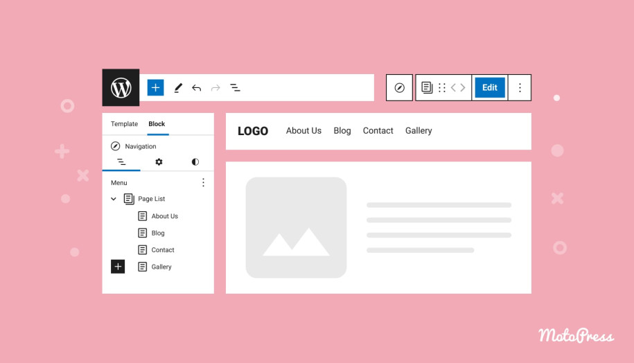
Finding Global Styles
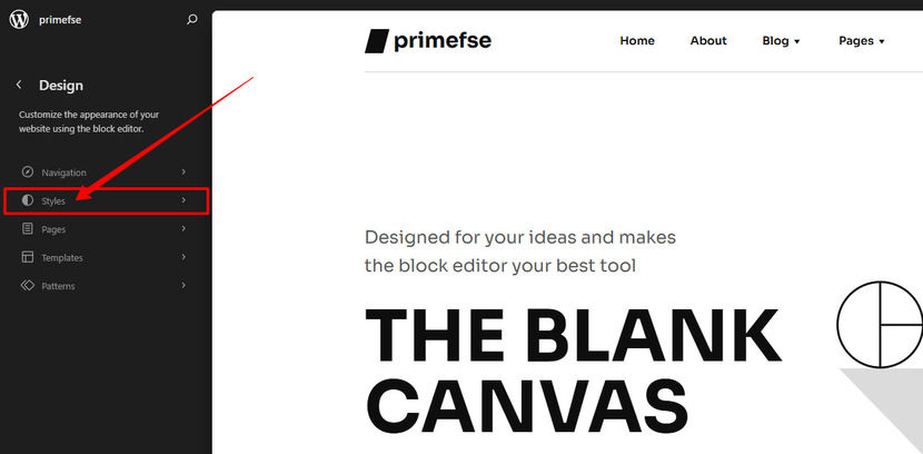
Navigate to Appearance > Editor in your admin menu to locate the global styles settings. Wait for the main screen to load, then select the page that appears. Click the Styles icon in the top right corner, which resembles a half-filled circle.
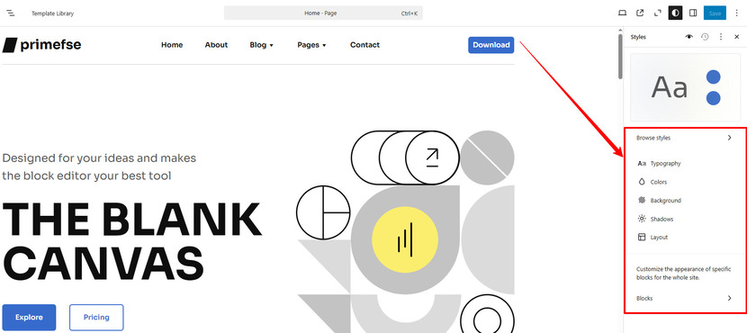
This will open the global styles panel for your website. Then click the Edit styles icon (pencil) to open a list of customizable elements, including Typography, Colors, Background, Shadows, Layout, and Blocks.
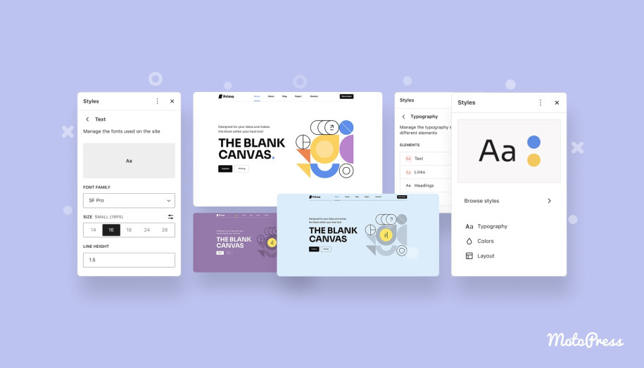
Some themes, like Prime or Twenty Twenty-Five, include different style variations. Think of style variations as a playground.
These allow you to experiment with various fonts, colors, typography settings, spacing, block styles, and more. Style variations are alternate versions of your block theme, you can easily swap them for a fresh look. If you don’t see the Browse styles option, don’t worry—you’ll still have access to predefined color palettes created by the theme author.
Typography
Now, let’s take a closer look at Typography. Click on the Typography menu to access the font settings. You can:
- Change the font using a list.
- Adjust font size, appearance, and line height, with a live preview of your changes.
- Reset any modifications using the three-dot menu.
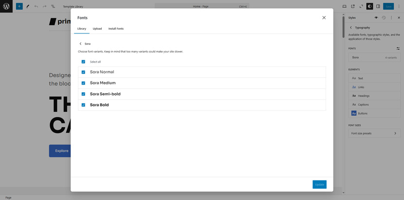
Each item allows you to change the font using a list of options in your theme. You can also modify typography settings, including font size, appearance, and line height. The main advantage is that you get a live preview of your changes as you make them. If you don’t like the result, open the three-dot menu and reset the changes.
For Links, you’ll find the same settings as for text but with an additional Decoration option, which includes strikethrough and underline.
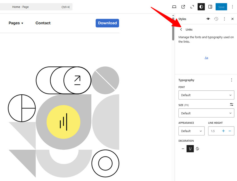
Some elements have extra settings. For example, Headings allow you to select the heading level. Letter spacing lets you control the space between characters. Additionally, you can choose text transformations such as all caps (AB), the first letter capitalized (Ab), and All lowercase (ab).
Next, you can adjust the typography for captions, which are used in the Image and Cover blocks.
Last but not least, Buttons. Since buttons include text, you can easily adjust their typography settings just like any other text-based element.
Colors
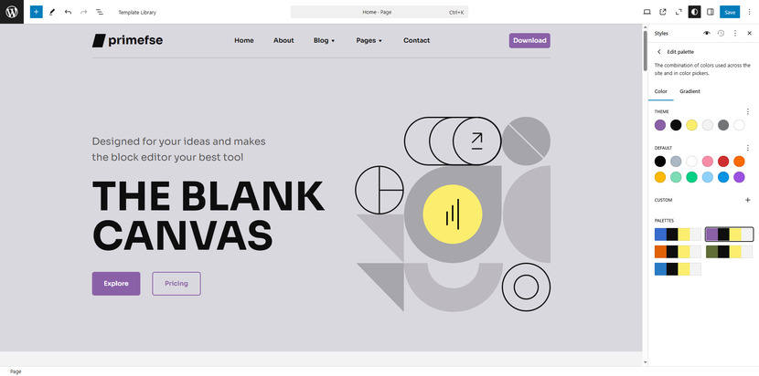
To customize your site’s colors, open the Colors panel. The first option you’ll see is Palette—click on it. The Palette panel opens to Solids by default, where you can edit Theme and Default colors or add Custom ones. The theme colors are defined by your theme’s designer and used throughout your site. The default colors appear in the block color settings when editing pages and posts.
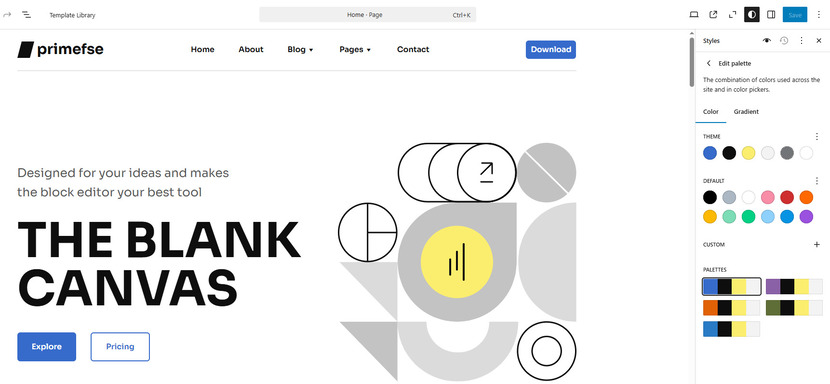
You can also add Custom colors to your site’s palette, and make them available across your color settings. To add one, click the + button under Custom, then pick a shade using the color picker or enter a HEX, RGB, or HSL value. By default, the new color is labeled Color 1, but you can rename it by clicking it. Click Done to save.
If you’re not satisfied with your custom color, remove it and start over.
You can also switch to the Gradients tab to add gradient color options. Like solid colors, you can set Theme, Default, and Custom gradients. Clicking on a gradient opens a slider that lets you customize it. Linear gradients create a smooth transition between two colors along a straight line. Radial gradients start from the center and extend outward. If you select Linear, you can manually adjust the gradient Angle by entering a value in the box.
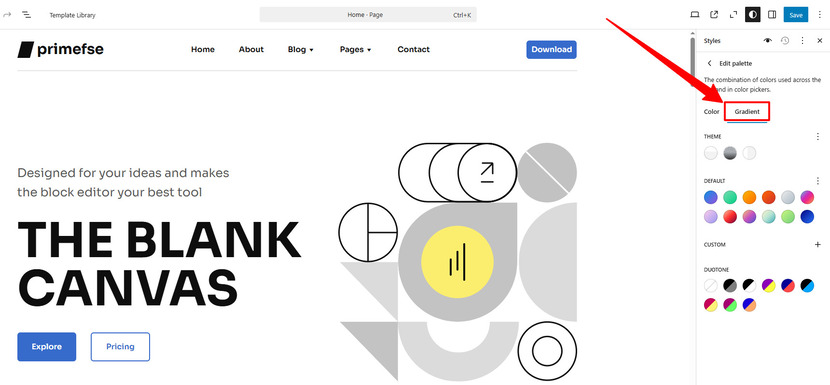
Another option is the Duotone filter, a two-tone color effect users can apply to images in Image and Cover blocks.
Once you’re done setting up your palettes, we can return to the Colors panel. Below the Palette section, you’ll find options to edit the colors for:
- Text
- Background
- Links
- Captions
- Buttons
- Headings
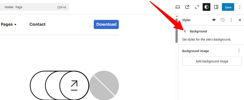
The Background and Shadows
Did you know that adding a background image to your website is another option? Just click the “Add background image” button and upload the image or choose one from the Media Library. Of course, you can click Reset to get rid of it all at once.
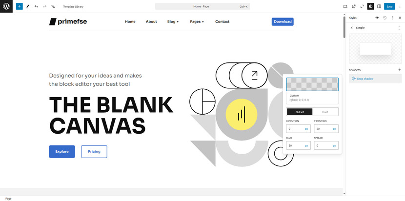
We then proceed to Shadows. For a variety of content pieces and content combinations, a drop shadow is an excellent design tool for creating a more dynamic look. With this section at your disposal, you can modify the default styles or make your custom shadows. You can give them the proper names after you’ve done the modifications.
Layout
The Layout panel lets you control the width of your site’s content area.
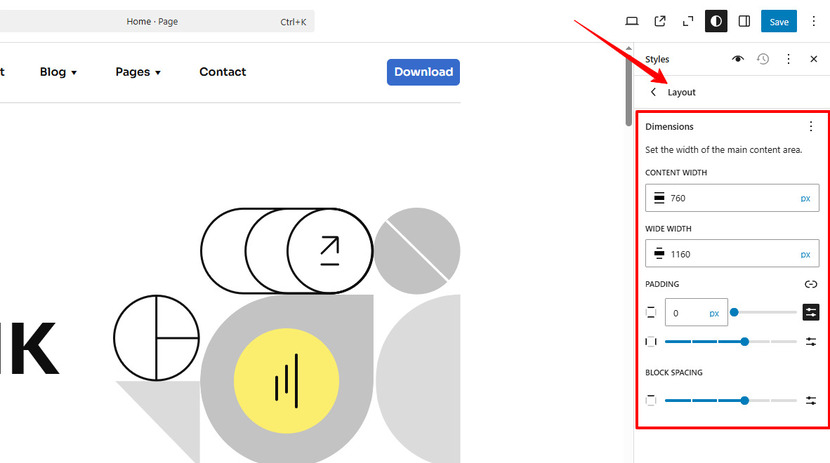
Under Dimensions, you can use the input fields to adjust the width. Content controls the width of blocks when alignment is set to “None.” Wide width adjusts the width of blocks when alignment is set to “Wide.”
You can also modify Padding, which is the space around elements. There are four padding areas: top, bottom, left, and right. By default, these are linked, meaning any adjustment applies to all four sides equally. Clicking the lock icon lets you adjust them separately.
The Block Spacing setting controls the space between nested blocks. If everything looks fine, you can leave these settings as they are.
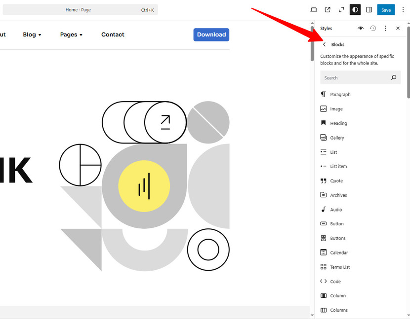
Change the Style of Specific Blocks
Finally, let’s look at Blocks. The Blocks section lists all available blocks that you can customize site-wide. Any changes you make here will affect all instances of that block across your site unless you’ve customized an individual block separately. Available customization options vary depending on the block. Explore each one to see what can be modified.
How to review your changes
To review your changes, use the WordPress Style Book (eye icon). The Style Book preview window contains six tabs, showing how different blocks will look after applying your global style changes. Clicking on a block preview takes you directly to that block’s global styles for further customization.
Additional customizations
If you have CSS skills and want to do additional tweaks, open the CSS window:
- Click the three-dot menu in the upper-right corner.
- Select Additional CSS.
- Enter your custom CSS in the provided box.
This feature allows for even finer control over your styles.
Resetting to Default Styles
If you want to revert to the default appearance, use the Revisions feature:
- In the Styles settings, click the three-dot menu in the upper-right corner.
- Select Reset styles.
Once changes have been saved, the Revisions option lets you restore previous versions of your Styles settings.
What’s new in WordPress 6.7
Now, as a bonus, let’s quickly explore some enhancements to Global Styles available with WordPress 6.7 or greater.
Touching design tools, since the 6.7 version, more blocks now support borders, backgrounds, shadows, and spacing controls. For example, with the Group block you now have access to shadow effects, and the Content block supports background images.
Another big improvement is the ability to create, edit, and delete custom font size presets directly within Global Styles. This new feature will help you to maintain consistent typography across your website to keep a cohesive design.
Moreover, there are new UI controls. To be more precise, users can now add background images to more blocks, including Verse, Quote, and Post Content. This means you can create visually engaging sections even without applying custom CSS. What’s more, WordPress 6.7 introduces a fixed background option, perfect for creating a parallax-like effect (an effect that allows images to stay in place while users scroll).
With these updates, WordPress 6.7 makes it simple to create well-designed websites without ever having to write any code.
Conclusion on WordPress Global Styles
In summary, Global Styles in WordPress is a real upgrade for users looking to create a consistent, professional look across their site without getting their hands dirty. WordPress global styles let you control typography, colors, layout, and block styles in one place. You can switch between style variations, adjust individual elements, and add custom colors or gradients. If you need to, you can reset changes or restore previous settings using style revisions. So share your experience working with Global Styles WordPress with us and hit like if you found this post helpful!
FAQs
Where can I find the Global Styles settings in WordPress?
What can I customize with Global Styles?
What if I don’t see the ‘Browse Styles’ option?
Some themes, like Twenty Twenty-Four, offer style variations, letting you switch between different design presets. If this option isn’t available, you’ll still have access to predefined color palettes set by the theme developer.
Can I reset my Global Styles if I don’t like the changes?
Yes! You can reset individual settings using the three-dot menu or restore previous versions using Style Revisions. If needed, you can also reset everything to default.
How do I apply custom CSS if Global Styles aren’t enough?
Click the three dots in the upper-right corner of the Styles panel and select Additional CSS. Here, you can enter custom CSS to adjust your site’s design further.
How can I apply custom CSS to further refine my site’s design with Global Styles?
If you know CSS, you can access the “Additional CSS” option in the Global Styles interface. This allows you to add custom styles in addition to those provided in the standard settings.
How do I test my changes before publishing them in Global Styles?
After applying your updates, you can preview your design changes using the Style Book, which shows how different blocks will look. This allows you to see the full effect before finalizing your edits.